Announcing Telerik UI for WinUI v0.5.0—the latest WinUI release is live, now fully packed with tons of new components and a brand new sample app.
Today we are adding to the suite: MaskedInput, Map, Expander, DataBars, Sparklines, RadialMenu, EventToCommandBehavior components and CRM application built with Telerik UI for WinUI and Prism Library.
Let’s go through all the new stuff in this release.
MaskedInput

The first addition to the suite is the MaskedInput control. This is a component that formats and constrains text to a predefined pattern or a pattern you define. It provides input validation and masks, such as date, IP Address, SSN, phone number, digits, currency and decimals.
You can find below all the supported masks as well as some information about each one of them:
- None: No mask, the control behaves like a regular TextBox.
- DateTime: Used for handling DateTime user input and returns a DateTime object.
- FreeFormDateTime: Tries to recognize a free-form string and convert it to a valid DateTime object.
- TimeSpan: Used for handling TimeSpan user input and returns a TimeSpan object.
- Numeric: Used for handling numeric user input and returns a decimal value.
- Standard: Used for handling standard (alphanumeric) user input and returns a string value.
- Regex: Used for handling and validating a standard user input against a regular expression. Provides errors if regex is not matched and returns a string value.
- IP: Used for handling and validating an IP address input and returns a string value.
- Email: Used for handling and validating an email address input and returns a string value.
The control provides numerous customization options that will allow you to achieve any scenario. Make sure to play around with RadMaskedInput in our online WinUI demo application and visit the MaskedInput control documentation.
Map
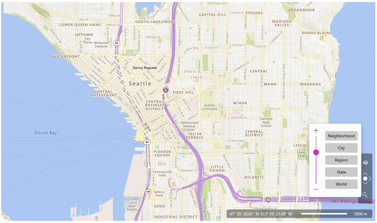
Introducing the first and fully featured Map WinUI component on the market! It will allow you to easily visualize rich geographical information—zoom and pan smoothly to any corner of the earth.
If you want to give geographical context to your data—that’s easy! RadMap allows adding any elements or shapes to it. The control supports items virtualization through web services to guarantee blazing fast performance and a great user experience.
Here are some of the main features of the control:
- Map Sources: Currently RadMap supports Bing Map Source, empty provider, OpenStreetMap provider and offers custom provider extensibility options.
- Pan and Zoom: Easily pan and zoom using the mouse, keyboard or built-in navigation UI.
- Navigation UI: The predefined navigation UI will give your users more flexibility when using the control.
- KML Data Import: RadMap provides support for stunning map overlays through its KML-import feature.
- Search: Easily search Locations via the search mechanism exposed by the BingRestMapProvider.
- Routing: The control provides Bing Maps routing support.
- Geocode: RadMap has BingRestMapProvider geocoding support.
There are many more features that the control provides—for more details check the RadMap section in our online help documentation. I’m sure you are going to like it!
Expander
RadExpander is a flexible control that helps you save space and achieve easier navigation through your application. You can place the expander anywhere on your page and embed any content inside its dropdown area.
The control offers the following main features:
- Direction: Supports four opening directions—Top, Bottom, Left and Right.
- Content Alignment: The expander control allows you to align its content in different positions.
- Click Mode: Through the ClickMode property, you can determine when the content of the control should be expanded.
- Animations: Easily customize or disable the expand/collapse animations.
- Icon: Easily customize the expand/collapse icon.
For more details check out the Expander help documentation.
DataBar
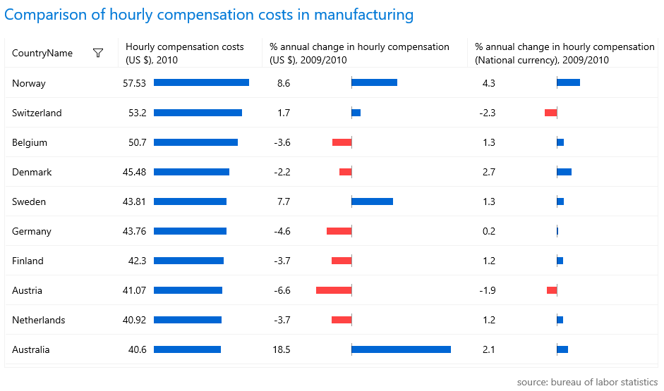
RadDataBar is a control that visually represents numeric values with a small-sized information graphic. It is a lightweight control that provides excellent performance. Find out the key features of the control below:
- Different Data Bar Visualizations: The control provides a few built-in visualizations like a single value bar or stacked bars.
- ToolTip Support: The tooltip feature allows you to display additional information about the displayed value when the mouse hovers the bar visual.
- Data Binding Support: The data bar controls can be data bound to properties in the view model.
- Customizable Axis and Bars: The appearance of the bar visuals and the axis elements of the control can be easily customized using the public API.
For more info, check out the DataBar section in our online help documentation.
Sparklines
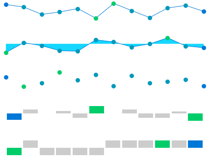
RadSparkline is a set of controls that show small-sized information in graphics. The Sparkline suite contains several lightweight and high-performant controls that provide different visualization for the plotted data. Here is list with main features of controls:
- Indicators
- Horizontal Axis
- Different visualization types:
- Line
- Scatter Point
- Area
- Column
For more info, check out the Sparklines section in our online help documentation.
RadialMenu
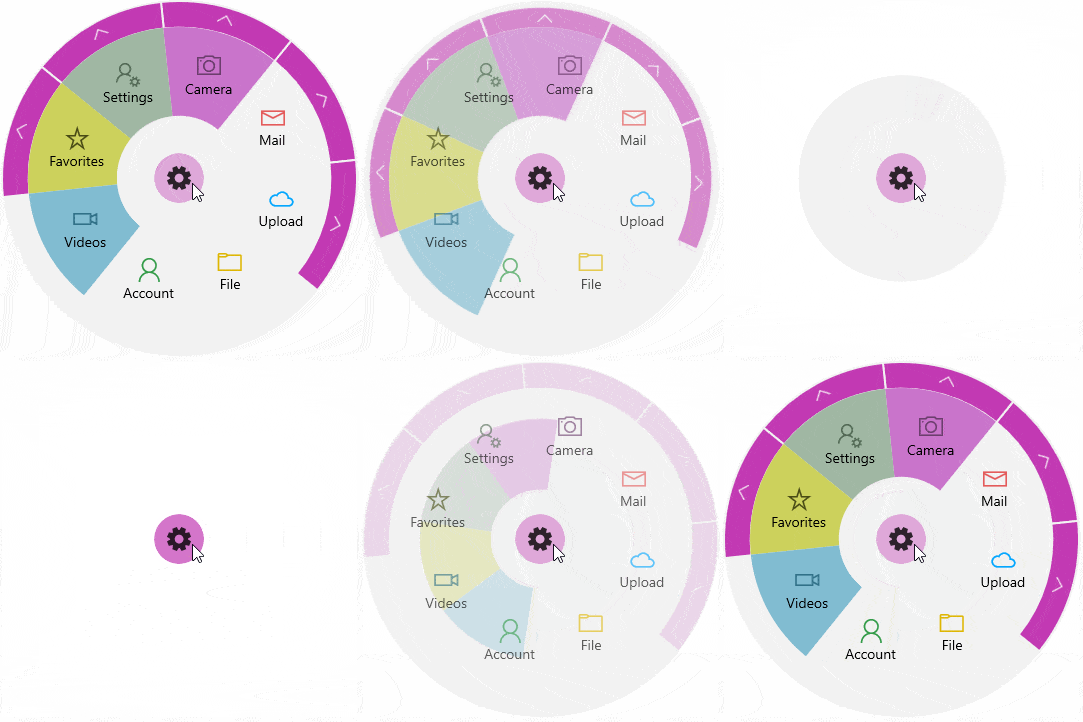
RadialMenu is a modern-looking and space-saving menu that easily provides the end user with a variety of options to choose from. It enables developers to place many commands and menu items in a flexible and dynamic UI container, providing an awesome user experience and quick navigation.
You can find below some of the key features of the component:
- Nested Items
- Context Menu Usage
- Triggers for Actions (Tap/Focus/Hover)
- Selection Mode
- Commands Supports
Make sure to visit the RadialMenu help documentation for more details.
EventToCommandBehavior
When working in more advanced development scenarios, we often find ourselves leaning toward the MVVM pattern for producing cleaner, loosely coupled, easier-to-test code. But along with this comes the responsibility of ensuring that all the controls we are using can follow this pattern.
While it is very easy to work with the event-based model that exists across the .NET framework, events do not play well into the mindset of reducing traditional code-behind and instead handling logic within a ViewModel. This is where the Telerik EventToCommandBehavior class comes into use to allow your events to fire and your code to respond accordingly, all in the ViewModel without touching the code-behind of the .xaml files.
For more info, check out the EventToCommandBehavior help article.
CRM Sample Application
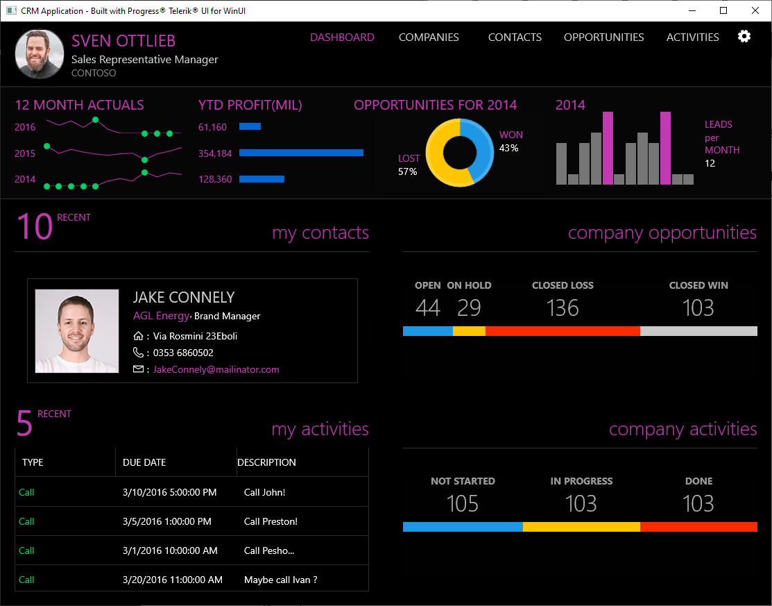
Many of you requested an advanced WinUI sample application—here it is! Introducing Telerik UI for WinUI CRM sample application. Built using many of the Telerik UI for WinUI components and the Prism Library, the Customer Relationship Management (CRM) sample application showcases a beautiful UI and real-time responsiveness while handling huge sets of data.
The CRM application allows for convenient data visualization of contacts, opportunities and activities used in day-to-day activities of any sales team. This powerful application incorporates the following Telerik UI for WinUI components:
You can find the Telerik UI for WinUI CRM app here—make sure to check it out and play around with it!
Check Out the Detailed Release Notes
We have a lot more! To get an overview of all the latest features and improvements we’ve made, check out the release notes:
Telerik UI for WinUI (Release Notes)
Sign Up for the Webinar
To see the new release in action, please join us on the Telerik R3 2021 webinar, on Wednesday, September 29, at 11:00 am ET - 1 pm ET.
Twitch Session
We are also hosting a Twitch livestream to cover our .NET desktop product updates on Tuesday, September 21, at 10:00 am ET.
Share Your Feedback
- Get in touch by email—drop us a line, for anything related to product or just to say hi at TelerikWinUI@progress.com
- Feedback Portal—share any feature request (or bug reports) that you might have
- Telerik Forums—if you need any technical assistance with our products, let us know and we will help
Get the Bits
Don’t wait—try out the latest:
In case you missed it, here are some of the updates from our previous release.