In this guide, we’ll look at five common dropdown issues and how you can fix them so your users’ experience with your product doesn’t get compromised.
Generally, I’d say there are two categories of dropdown features we use on websites and apps. Dropdown boxes for forms, action buttons, attribute options, country selectors and so on. And dropdown menus in the header.
This post is going to focus strictly on dropdown menu design.
UX Design Tips for Dropdown Menus
If it ain’t broke, don’t fix it. That’s a motto I absolutely, positively hate. It insinuates that, so long as the job gets done, there’s no point improving it unless someone complains. Which is just bad business.
I often worry that navigation falls into this category. After all, it’s a universal element across websites and apps, and users depend on it to get around. Because of this, I’m sure most people just deal with whatever the experience is no matter how clunky it feels.
Knowing this, have we become complacent when designing navigations and, more specifically, dropdown menus?
While a cramped dropdown menu, for instance, might not completely ruin a user’s experience, those tiny bits of friction can add up. So, let’s look at some common ways in which dropdown menus aren’t making the cut and the simple UX fixes you can use to improve them.
1. Consider a Click Trigger Instead of Hover
Think about how many times you’ve been on a website or in a web app and the menu accidentally opened because you hovered your mouse too close to it. It’s annoying.
So, you really have to think about what kind of effect a hover-triggered dropdown menu will have on your users. With a session recording tool like Crazy Egg or Hotjar, you should be able to see if the menu is too sensitive or perhaps the menu’s size or placement is leading to an increase in accidental dropdowns.
If you notice this happening frequently enough, then the fix is simple: Turn the hover trigger into a click trigger.
You can see how nicely it works on the PayPal website:
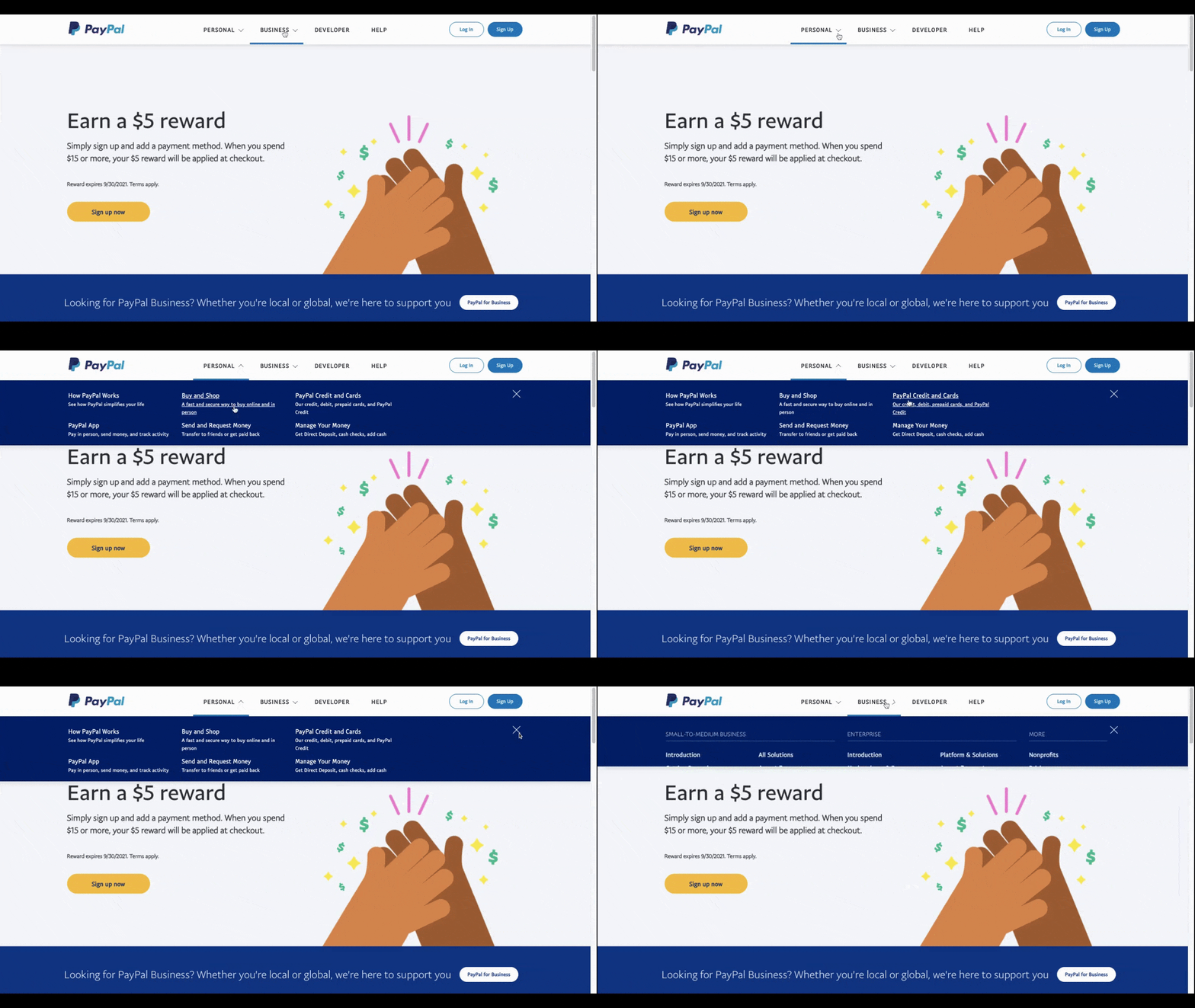
As a bonus, a click-triggered menu is good for consistency.
For starters, whether a top-level link drops open to reveal additional links or it takes visitors directly to a page, the user has to click on it. So users don’t need to change their mode of engagement when using the navigation.
It’s also good for the omnichannel experience:
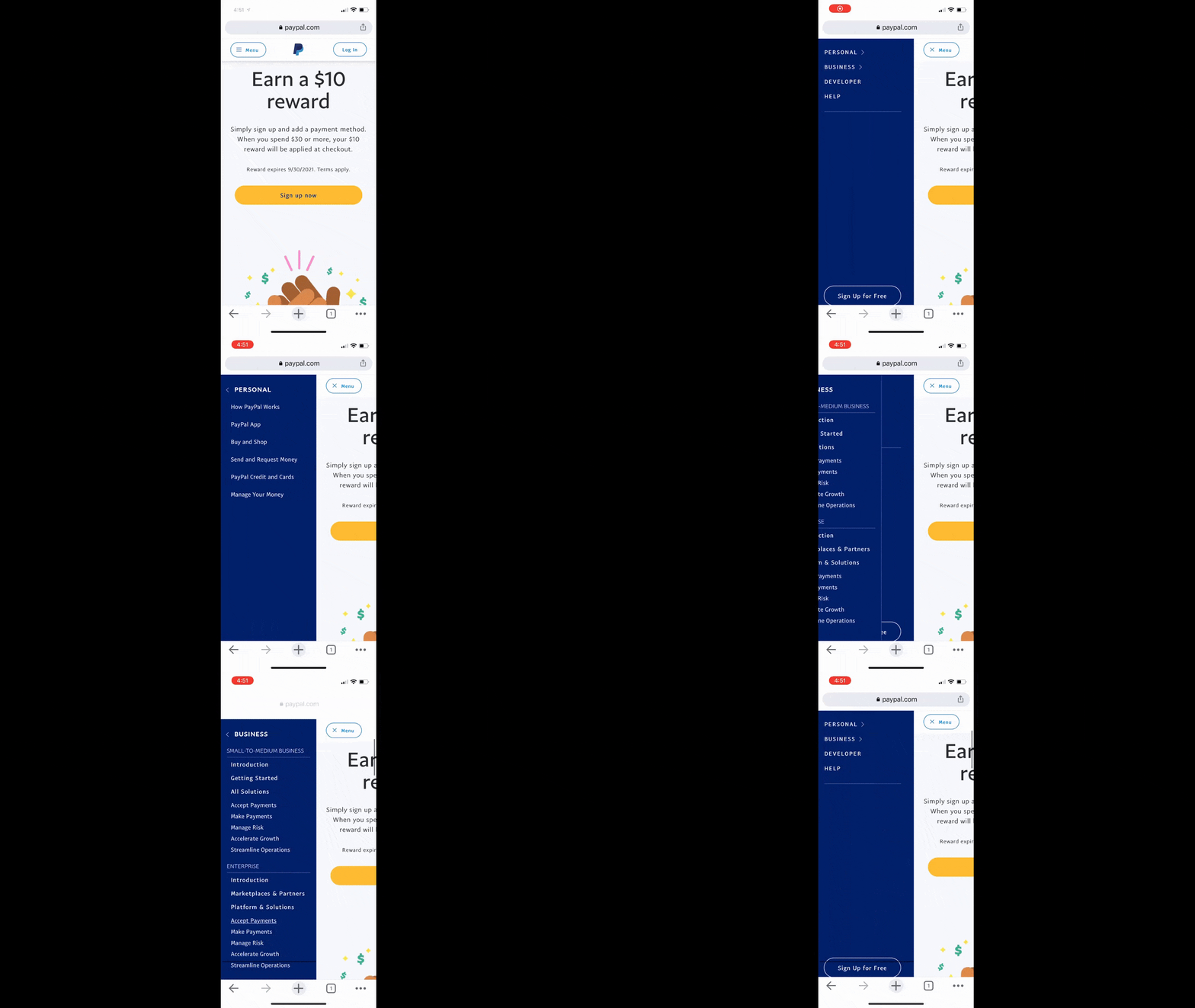
While it can’t be an identical experience since the top-level links are aligned vertically on mobile, the click experience is the same. So, users who interact with the site or app across devices don’t have to change the way they engage with it.
2. Use Dropdown Indicators
When your menu has mixed links—ones that drop open and ones that go directly to a page—it’s a good idea to let your visitors know which is which. Otherwise, they could end up spending time hovering over or clicking on each link to find out what their options are.
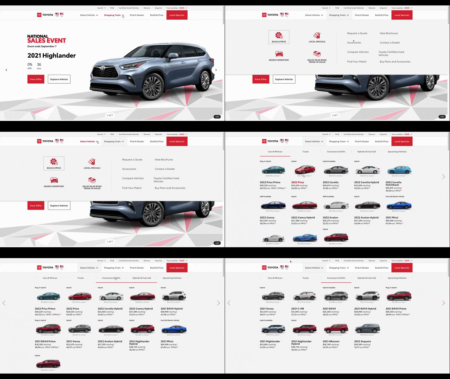
It’s wasted time and effort than can easily be avoided by including dropdown indicator icons the way the Toyota website does:
The red down-facing arrows in the navigation bar immediately let visitors know that the “Select Vehicle” and “Shopping Tools” links have more options hidden beneath them.
Also notice how Toyota uses various hover state changes like the red underline, the vehicle rotation animation and the icon grow animation. These UI changes make sure visitors never lose track of what they’re doing in the navigation.
These design choices should empower Toyota’s shoppers to more confidently and intentionally interact with the website.
3. Don’t Be Afraid to Add More Space
When it comes to hyperlinks, spacing isn’t really an issue since text links aren’t usually near competing links. So, when a user goes to click one, there’s no surprise or frustration if they go to a page or initiate an action they hadn’t intended on.
But when a dropdown menu is jam-packed full of links, that can easily happen.
Of course, you need to be cognizant of how much space you add around the links in a dropdown menu. You don’t want it to be so long that users have to scroll and scroll and scroll to see all of the links, especially on their smartphones.
I’d suggest taking a look at how Business Insider has handled it:
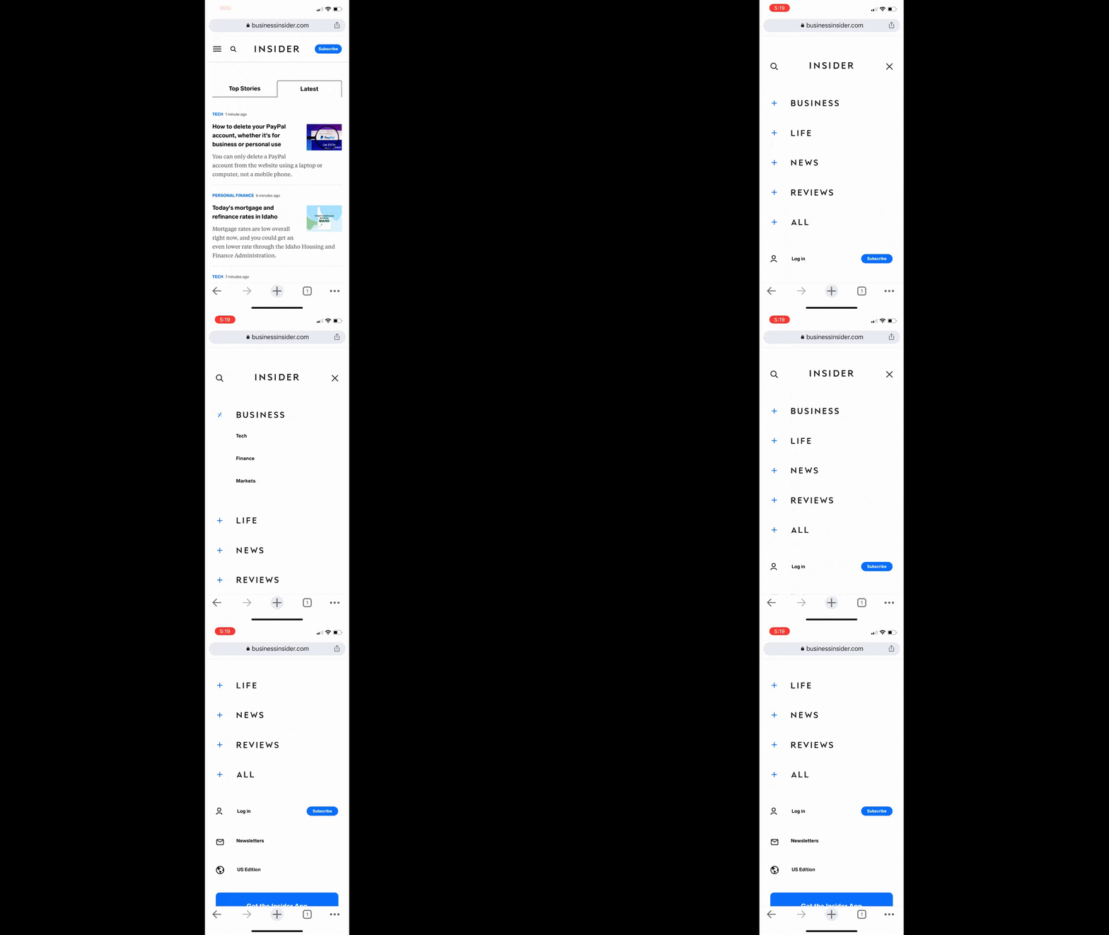
The first thing to pay attention to is the abundant space around each of the top-level links. Users should have no issue with accidental clicks. All of this padding will also make the labels easier to read.
When the user opens each of the accordions, they’ll find just as abundantly spaced subcategories within. Not only will this spacing improve click confidence, it’ll also make dozens of categories and subcategories much easier to sift through since the user will only see a small handful at a time.
By the way, this same dropdown menu is available on the desktop website, so this isn’t just a useful design for mobile.
4. Choose a Dropdown Menu Shape That Reduces Errors
Think about a time when you encountered a mega menu that you just couldn’t get through. Every time you moved your cursor to the right to select a subcategory, the whole thing collapsed because you didn’t stay within the lines.
The size of the dropdown links isn’t the only thing that increases click errors and frustrations. The size and shape of the dropdown menu as a whole can be problematic.
Flipkart demonstrates one way to solve this issue:
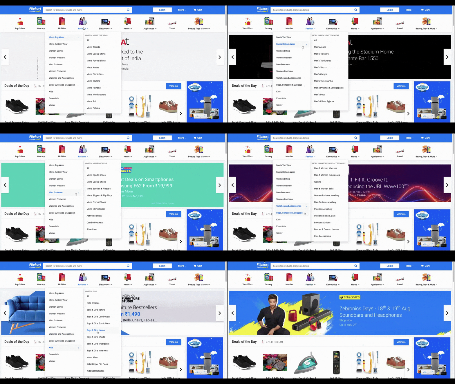
The dropdown menu is well-designed with succinct labels and ample space between each link. When users hover over the second-level categories, a third level opens up to the right.
Notice what happens to the shape of the dropdown menu. The entire thing reshapes itself to fit all of the content. This should make it much easier for shoppers to scroll through the options without dropping outside the boundaries of the menu and having to do it all over again.
5. Make Sure the Dropdown Animation Doesn’t Compromise Performance
There are different parts of a dropdown menu that can be animated:
- Dropdown indicators
- Hover states
- Dropdown slide animations
- Sidebar pullout menus
- Menus converting to full-screen pages
Sure, an eye-catching animation or two might wow your users, but not if it’s at the expense of performance. And it’s not just the speed of the dropdown menu that can be impacted. Animation overload can also slow down how quickly the links respond to clicks and hovers or, worse, flicker while the server attempts to load the animation.
Ideally, your dropdown menu will be as smooth as the one in the Duolingo app:
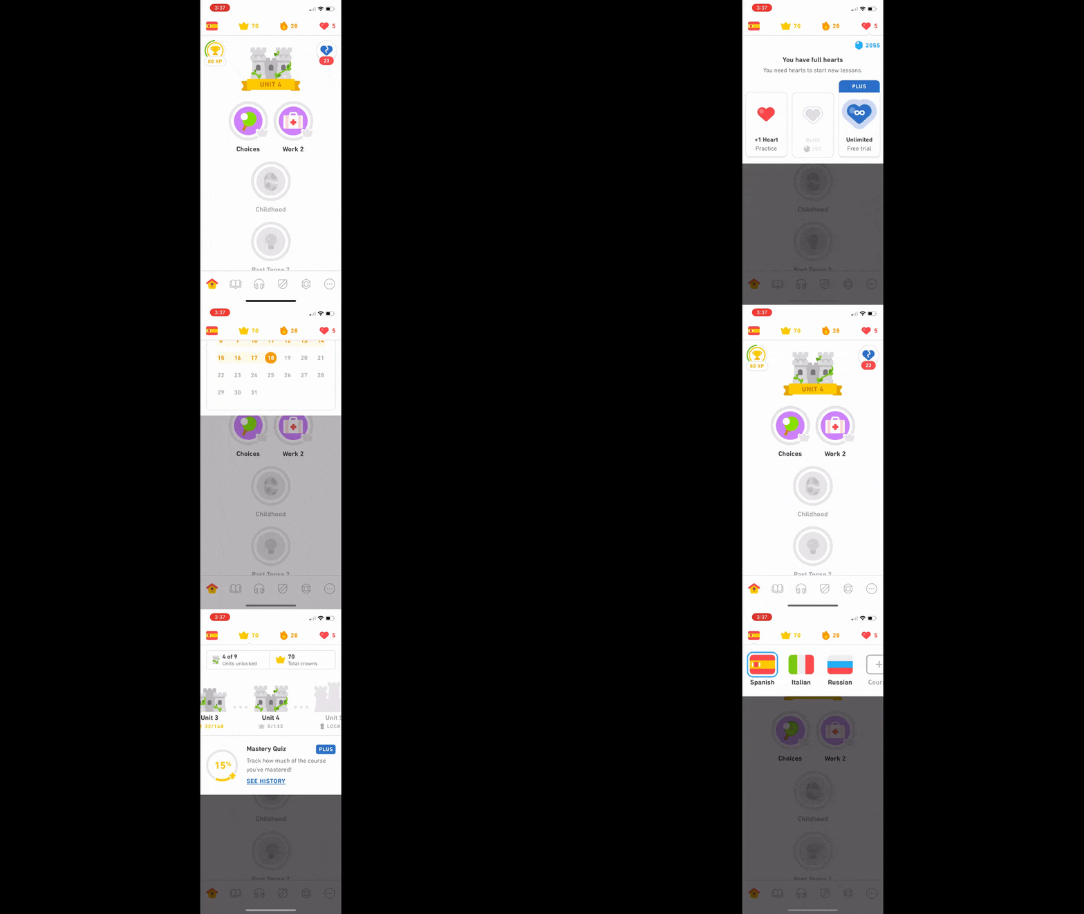
There are four “menu” links at the top where users can switch language areas, review their performance and so on. As they open each one, the corresponding menu drops down onto the page without delay.
As you perform the quality analysis for your website or app, watch carefully for these kinds of issues. You may have to use a simpler animation or fewer of them to ensure a fast and smooth transition like the one we see in Duolingo.
Wrap-up
We can’t take the navigation or dropdown menus for granted. They play such a critical role in websites and apps and it’s really not fair to our users if we allow them to set a bad impression for the brand and contribute to a subpar experience overall.
So, I have to ask: Why be satisfied with a so-so navigational experience when you can make it better?
Now that we’ve talked about dropdown design, be sure to learn more about how to use dropdowns in your code—read our Quick Guide to Dropdown Menus With React.
