I bet you never thought you’d learn how to be a more effective web designer from the likes of Twilight, Guardians of the Galaxy, Schindler’s List and John Wick. But in this article, we look at how directors’ specific color choices improve the movie and the moviegoers’ experiences with them.
Have you ever watched a movie before and suddenly found yourself crying like a baby or screaming at the screen? And you wonder, “How the heck did I get to this point?”
There are so many things filmmakers do to get us there. The dialogue and quality of acting help. So, does the soundtrack. But the usage of color can also bring viewers to that breaking point.
And I think there are some interesting lessons that designers can take away from the usage of color to elicit emotion in movies.
4 Creative Color Strategies to Steal From the Movies
In 2019, an interesting study on the correlation between color and emotion was published. It was entitled “What Color Is Your Anger? Assessing Color-Emotion Pairings in English Speakers.”
Now, there’s certainly a lot of validity to the idea of color psychology—that you can use color to elicit specific emotions or responses from people. However, it’s not always black and white. Sometimes it’s because colors mean different things in different cultures, like the color white signifies purity to some and death to others.
In other cases, there’s such a wide range of emotions that can be described by an equally diverse array of color. So it’s difficult to come to a consensus on what to use. For example, here’s a snippet of the survey results:
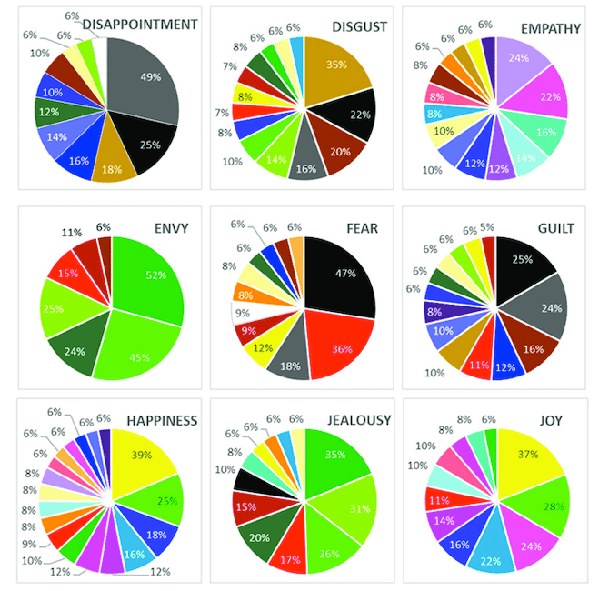
While there are at least one or two colors that survey respondents leaned heavily toward in relation to most emotions, some of their choices vastly differ. So, it’s not as simple as saying, “Lavender is the color of empathy,” because, for 76% of English speakers, it’s not.
What I’d like to do is not focus too much on trying to pair specific colors to exact emotions. Instead, what I think we can learn from filmmakers is how to creatively use color in an emotional way. I’ll leave you to decide which colors to use. But I do want to plant some seeds in terms of how to implement a color strategy based on some interesting movie examples.
1. Use a Small Pop of Color to Send a Strong Message
Minimal design is all the rage these days and with good reason. It allows us to build websites and apps that look good and are usable.
But just because you’re toning things down, that doesn’t mean you can’t add some bold color to it. Rather than make it part of the overall design and color palette, though, consider adding it in at the perfect moment.
Filmmakers do this all the time. They create a story and setting that are definitely intriguing, but there’s nothing visually spectacular about them. Then you see this bright flash of color and it changes something in you.
One of the best examples of this is Schindler’s List. The majority of the 3.25-hour runtime is in black and white.
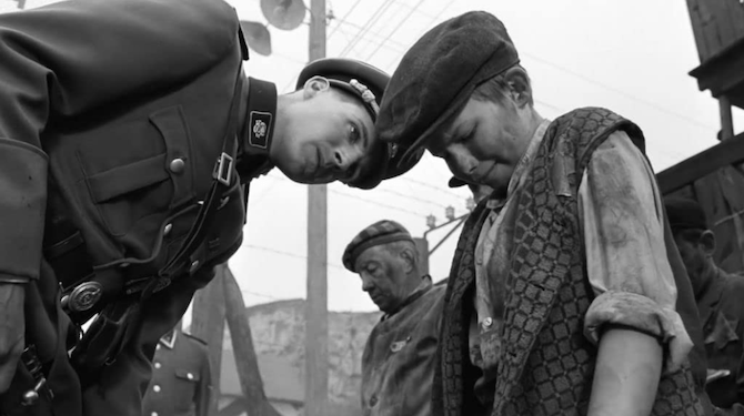
There are just a few times in the film when color appears. Two of which are pivotal scenes that pertain to a little girl in a red coat.
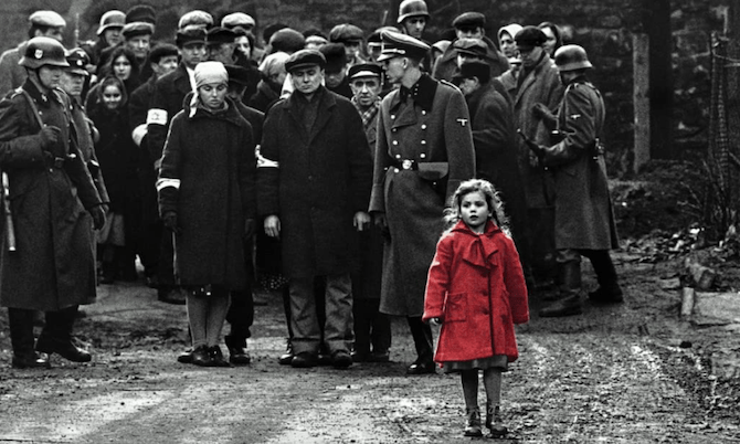
The first time we see her red coat is in the scene above. It’s a shocking moment where her innocence is juxtaposed against the horrors happening around her.
The second time we see her red coat is when her lifeless body is wheeled over to a pyre. There were plenty of children we saw over the course of the film, but it was her red coat that allowed us to feel the weight of that moment.
Obviously, your website doesn’t need to deal with such heavy material as the Holocaust to use color in a powerful way. You just need to identify where that turning point is going to be for your visitors and then use the color to help them feel something or react a certain way.
2. Add Color to Turn the Mundane into Something Surreal
Do you ever feel like the photos you have to work with are just too blah? Maybe your client’s photos are just okay or the stock photos you’ve found are fine, but not great.
If you’re building a site or app for a brand with a big or outlandish personality, you can use color to bring life to even the most boring or unimpressive of images. Let me show you an example.
Twilight came out in 2008 and it was a huge success.
Now, I’m not going to lie, I really wanted to dislike this movie. But there was something about it that sucked me in. A recent thread on Twitter might have the answer as to why so many people like myself fell in love with the silly vampire world of Twilight.
Twitter user @twilightreborn recently tweeted this:
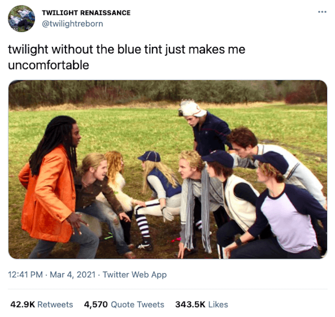
This is from the movie’s infamous baseball scene.
For those of you who don’t know the movie, vampires are so strong that they can only play baseball during thunderstorms to mask the sound of their bats. Yeah, I realize how ridiculous that sounds as I write it. And the movie still above makes it look just as stupid.
But the movie we ended up seeing had a blue-green filter applied to it, which gave it a cold, strange and otherworldly vibe.
Bad acting aside, the color actually helped transform this movie into something much more than your typical angsty teen movie. It felt like a world similar to and completely unlike our own, with vampires and werewolves and strange bug-eyed psychic kids in it.
So, if you’re feeling frustrated with the images you have to work with, don’t give up. If Twilight can use some creative color filters to change how it was perceived, you can do the same.
3. Be Careful with Color Grading
While it’s good to know that you have the ability to play around with color if the raw material isn’t working for you, be careful with what your photo manipulation does to the look and tone of it.
There was a study done on Instagram filters and the message people are unintentionally sending based on their choices. The same thing can happen by selecting the wrong filters or going too far in saturating an image.
Another possible risk in photo editing happens when the grading compromises the integrity of the subject. For this, I want to look at Marvel movies as a whole.
There’s this great YouTube video published by Patrick Willems called “Why Do Marvel’s Movies Look Kind of Ugly?”
The gist of his argument is this:
Marvel uses the same color grading across all its films. Willems calls it “muddy concrete” and he’s right. You can see the issue here in his retouching of this scene from Guardians of the Galaxy:
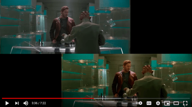
The one in the top-left is the “muddy concrete” grading from the original movie cut. The one in the bottom-right is Willems’ edit. See how much more vibrant and clear everything looks?
It’s such a strange choice by Marvel to edit its films this way, especially considering the source material. Comic books are anything but bland and unrefined as these issues of Guardians of the Galaxy demonstrate:
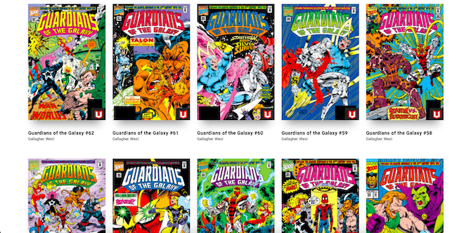
Comic books show bright shocks of color and a fine attention to details across every page. It’s what allows us as readers to get sucked into a story that’s very light on copy.
So, the message to take away from this is to be careful with how much editing you do as your images and brand identity could be compromised as a result.
4. Tell Someone’s Story with a Backdrop of Color
Think of this as a way of putting a spotlight on a product or a person. But rather than just use a white spotlight, select colors that instantly convey something more about what people on your site or in your app are looking at.
They might not know the color is sending them any signals, but it’ll be there in their subconscious.
Take the movie John Wick, for example.
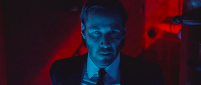
A lot of times when we see John Wick in this movie, he’s bathed in or surrounded by a mix of blue and red lights. Of course, he’s in a club that has blue and red lighting, so we could chalk it up to that.
However, if you think about this guy’s story, the colors remind us of what happened and what he aims to do. The blue is there because he’s grieving for the loss of his dog and, by extension, the loss of his wife. The red is there because he’s not going to stop until he gets revenge for the former.
It’s not something we consciously think about as it just seems like really cool mood lighting. But it’s there all the same, subconsciously reminding us of this former assassin’s story.
Obviously, you’re not going to be designing a website or app where the brand or product is dead set on murdering someone. So, perhaps this example is a bit extreme.
If you want to see a good online example of color spotlighting, take a look at MeUndies. This website uses this color strategy really well. Its products are all highlighted by bright and fun colors. It immediately lets shoppers know that these are not your conventional undergarments and that you can plan on having some fun in them.
Wrap-up
Color is a really powerful force in design. While it would be great if you could add a pop of yellow to your hero image and instantly get a smile from visitors, that’s not always the reaction that specific color will elicit.
Instead, focus on ways to build a connection with visitors and then use these color strategies in critical areas. You’re more likely to get the response you want if it’s part of a journey as opposed to a one-off attempt to get an emotional response.