Google Analytics is useful for detecting traffic trends on a website. But when it’s time to redesign, you need more than numbers. With heatmaps and recordings, you can visualize what visitors are doing on your site and what causes them to leave or convert.
Google Analytics and Google Search Console are helpful resources for finding out if something’s wrong (or awesome) with a website in terms of its traffic. The only problem is, Google’s tools can’t tell us precisely where issues exist on a website. Lower time on site and high bounce rates for certain pages might suggest there’s something wrong, but the rest we’re left to hypothesize.
This is why heatmaps and user recording tools are so valuable. By setting them up in anticipation of a website audit or redesign, you can see with your own eyes where the friction lies for your visitors.
Now, I could make this post be all about the generic problems that heatmaps or session recordings might be able to help you fix. Overloaded navigations. Hard-to-find CTAs. Low-converting forms. But, honestly, the possibilities are endless and it really depends on what type of site you have.
So, what I’ve done instead is this: I installed Hotjar on my website. I set up three heatmaps—for the Home page, Shop page and Blog page. I also activated session recordings.
Below, I’m going to walk through some of the data I received and show you some ways to use this type of user input to audit your web design and make data-backed redesign decisions from it.
Using the CLICK or TAP Heatmap
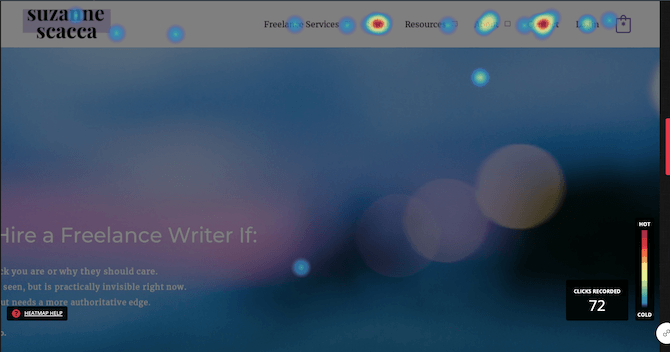
This is what your heatmap will look like when it tracks clicks on desktop:
Or taps on mobile or tablet devices:
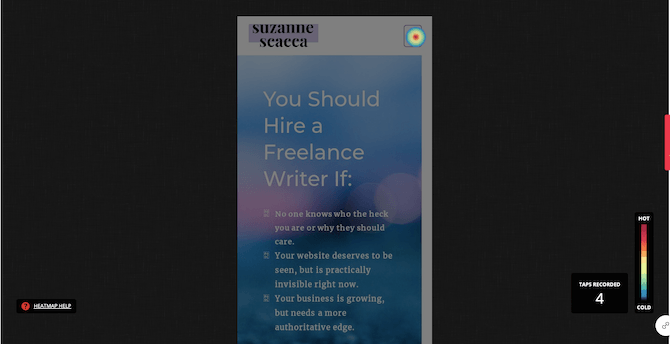
The legend on the right tells us that the “hottest” (most clicked) parts of the page are red while the coldest are blue.
Click heatmaps can tell us:
- If clickable elements are of any value
- If visitors are missing the most important CTA(s) on the page due to distractions or placement issues
- If touch targets are too small to hit on the first try
- What our visitors’ top priorities really are
- What the most common next step is from any given page
The hotspots we see in the example above suggest a couple things about this page.
The first is that the navigation is more popular than the hero image. Which means this top section is in need of a redesign and/or rewrite. If your leading offer and promise aren’t getting a good amount of attention, then it means your website’s priorities aren’t really in line with the majority of visitors’.
The second thing we see here is that the order of pages in the navigation isn’t an accurate reflection of what visitors care most about.
While it’s not that big of a deal for visitors to move their mouse or track their eyes a bit further to the right (or downward on mobile), your navigation really should be organized based on what’s most important to them. By reducing the effort it takes to get them inside your site and to their goal, the better their experience will be.
As you scroll through the page, also take note of how many clicks each part of your page receives. You’ll see this data when you hover over each section and clickable element:
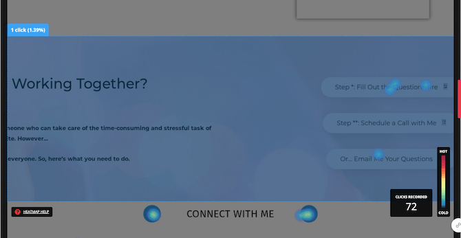
In the highlighted section:
- The CTA section got 1 click
- The “Fill Out Questionnaire” button got 3 clicks
- The “Email Your Questions” button got 1 click
What does this tell us? It could be a couple of things.
The first thing is that the CTA might be too far down the homepage if it’s getting such low engagement numbers compared to the rest of the hotspots.
Another thing it could be telling us is that bottom-of-funnel visitors who are getting ready to convert probably just skip the homepage entirely and go straight to the “Contact” page (which the top of the heatmap would corroborate).
And yet another option is that this CTA might be too complicated with the three buttons. As we see here, people don’t like the scheduling option. So, this suggests that doing away with the multiple buttons wouldn’t be a bad idea and instead we can just point everyone directly to the “Contact” page.
Using the MOVE Heatmap
This is what your heatmap will look like when it tracks visitor movements:
![]()
Again, red are the most common areas where users move their mouse or finger over; blue the least.
Move heatmaps can tell us:
- How people move around your website
- How people move through the copy on your site and if their gaze follows one of the common eye-tracking patterns
- Which elements catch their attention most and cause them to stop
- If you have ignored sections that are taking up space or need a better design
- If a poor or cluttered design causes visitors to scan through the page and miss the most important content or CTAs
In the above example, we see that the navigation is a common area visitors move over and one page, in particular, catches their attention over others.
As we look through the rest of the heatmap, however, we see that the navigation isn’t as big of a draw as some of the content on the page. So, make sure you take a look at the bird’s-eye view before making any assessments from a move heatmap.
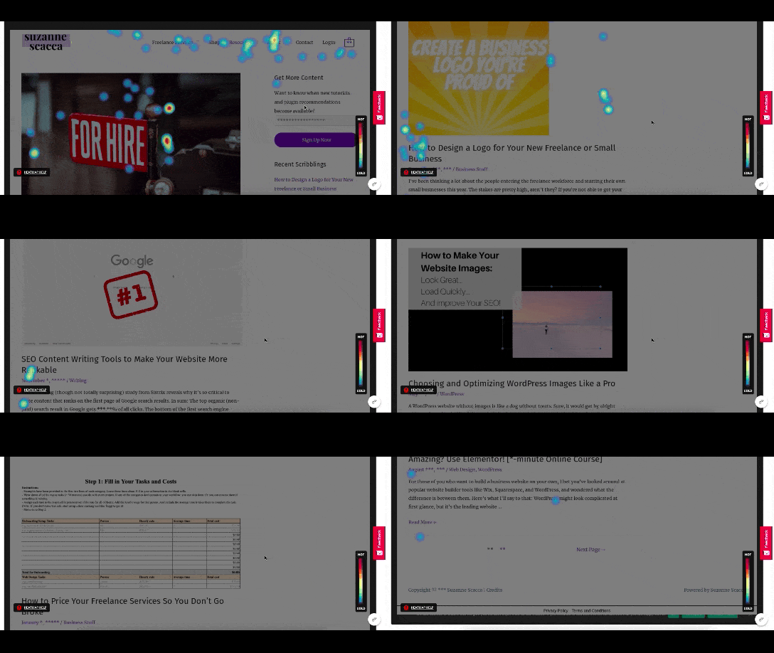
There are a number of things to notice as we scan this page for movement.
The first thing is the eye-tracking pattern. In this case, the F-pattern is very noticeable as the first blog post summary gets a lot of attention and then movement becomes mostly relegated to the left side of the page.
It doesn’t matter what type of page you’ve heatmapped. This is a common scanning pattern you’re going to see.
Knowing this, you’ll want to make sure your page is designed in a way that the most important piece of information or element is placed at the top. The rest of the page will then need eye-catching milestones (like images and header text) as well as bite-sized chunks of text to keep visitors glued to the rest of the page. Even if all they’re doing is scanning.
Another thing to think about as you look at the move heatmap is if there’s any dead space. In this heatmap, there definitely is:
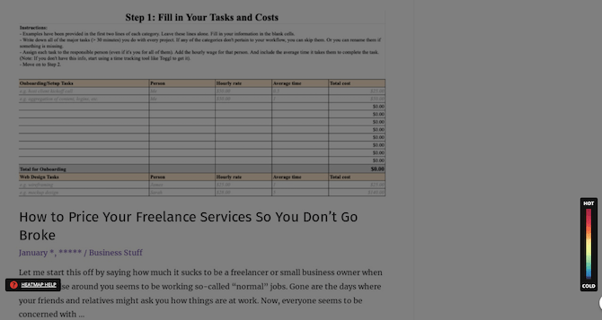
It occurs about two-thirds of the way down the page. All movement stops with the exception of the very last element on the page.
This could be telling us that the page is too long or that the content in the middle is irrelevant filler. Since this is a blog feed, it’s likely that there are too many entries or too much content to each entry. Now that I know this, I’ll experiment with different ways to trim down the length so none of the content goes unnoticed in the future.
You might also discover dead space as it pertains to the supplementary elements on your page—like a sidebar or chat widget. These elements can take up prime real estate on your website when in view, so make sure they’re actually valuable to your visitors. If visitors aren’t spending any time on them, then you may need to redesign or scrap them altogether.
Using the SCROLL Heatmap
This is what your heatmap will look like when it tracks your visitors’ scroll progress:
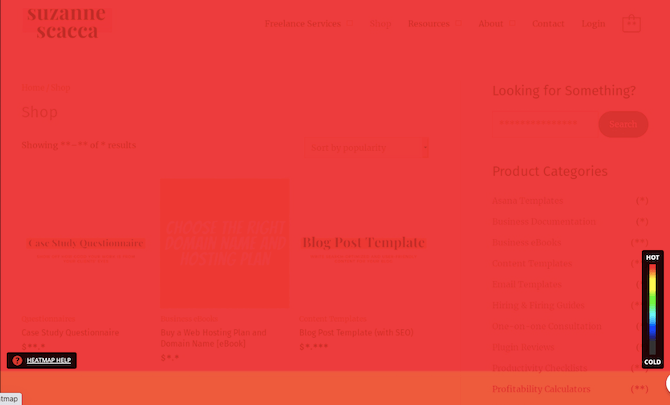
Red lets us know which portions of the page all visitors made it to. As the colors grow cooler, we naturally see the percentage of scrolls drop off.
Scroll heatmaps can tell us:
- If at any point on the page visitors completely give up on it
- If certain pages have more engaging content than others based on scroll progress
- If you need to reshuffle some of the sections on the page to get more views of your most important CTAs
- If you need to cut out some of the excess in order to shrink the size of the page
- If smartphone or tablet users are missing out on content that desktop users aren’t
Like the click heatmap, there’s extra data available when you’re looking at this in scroll mode. If you hover over the page at any given point, a line will appear and it will tell you what percentage of visitors made it that far down the page:
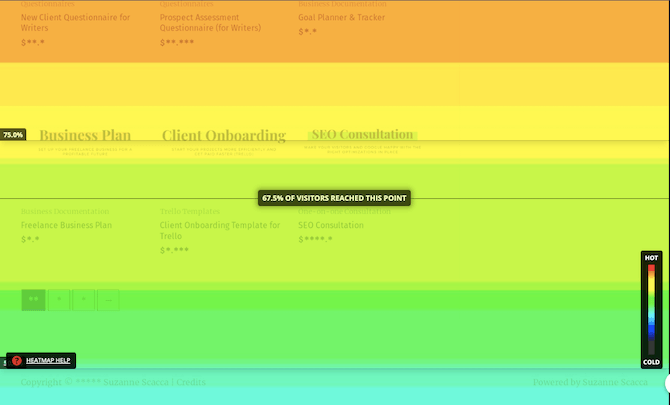
This is really valuable information as it can show you just how much of the content on the page is needed.
Don’t forget to review your scroll heatmap on tablet and mobile either:
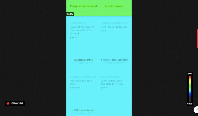
Just because your desktop visitors might see most of your content, that doesn’t mean that’ll be the case on smaller screens. In this particular example, we see that only 50% of mobile users reach the lower part of the search results whereas 67% of desktop users do.
There’s an important point to take away from this comparison.
You may be tempted to design different experiences for each device if mobile users aren’t getting anywhere close to the bottom of the page. However, the better option is that you design your websites to be mobile-first, so that you’re not having to present two different sets of content to mobile versus desktop users.
Using Session Recordings to Walk in Your Visitors’ Shoes
Heatmaps are definitely the next step up in terms of website analytics. Pair those two together and you’ll be able to figure out a lot of your website’s performance problems.
Now, the great thing about using Hotjar is that it doesn’t just come with heatmaps. It also has session recordings.
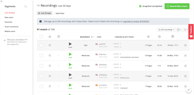
With session recordings, you get a ton of data in addition to being able to watch the walk-throughs:
- Relevance (in terms of how much time they spent on the site and engaged with the content)
- User location
- New vs. returning visitors
- Landing and exit pages
- Total number of pages visited
- Total time on site
- Date of visit
Session recordings can tell us:
- If the user journeys we originally mapped out match what the majority of visitors are doing
- What the common pathways are between two specific pages
- If those pathways differ depending on the device used
- Which parts of the site or activities are responsible for the longest visits, or for the shortest
- How new visitors react to the site as opposed to returning visitors
- If there are any major errors or choke points present
- How long people actually consider the content and CTAs you place before them before moving on
With recordings, there’s a vast amount of data you’re going to get, so it’s a good idea to use the filters so you’re not having to watch 100+ videos during each audit. I’d recommend handling this in batches and tackling them based on your top priorities.
For instance, are you trying to figure out why mobile visitors don’t stay as long as on desktop? If so, focus on those recordings first to see if something’s going on. You might discover that your mobile users are just much quicker to get everything done than desktop users. And that, in turn, might encourage you to design a more efficient journey on desktop (if they differ, that is).
It could also be a usability issue. If that’s the case, you should watch each of those recordings carefully to see if there are common pages or elements tripping them up, like the contact form:
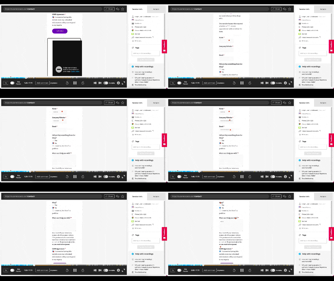
While any information they input into the site is hidden, you can see where they start engaging with the site, where they speed up or slow down, if any errors occur and what the outcome is.
It’s actually really neat being able to watch a visitor walk through your site like this. A lot of those assumptions you made when originally designing it might go straight out the window once you spend some time watching it from a visitor’s point of view.
Wrap-up
If you’re going to perform a redesign on a website, you can’t rely strictly on assumptions or even just Google Analytics. With heatmaps and recordings, you can actually see what’s happening on your site and what’s causing issues for your users.
Of course, heatmaps and recordings are just data. While you’re going to get clearer and more definitive answers about what’s happening on your site, you should still A/B test any changes you’re considering based on the results of your eye-tracking studies and user session recordings.