Quality cross-platform software development requires targeting different UIs. Learn how you can customize a UI theme and apply it to web and desktop apps.
Series Outline
This is the second post in a series detailing how to style applications across platforms, writing once and delivering everywhere. This post is about customizing a theme and applying it to a web and a desktop application. Here are the articles in this series.
- Sleek and Customizable UI for Any Design System and Technology
- Telerik and Kendo UI Theme Customization: Web and Desktop Demo (this post)
- Telerik Reporting Modern UI: Report Viewer Demo (coming soon!)
Introduction
Cross-platform software development has been a growing demand lately and for good reason. Software is increasingly involved in our daily lives. Understandably, some software is apparent, and some is not.
From connected homes to the computers in our pockets and televisions in our living rooms—everything is running some form of software, and all these devices are running on a plethora of platforms and form factors.
This makes the design and development process far more difficult because of the need to target the many operating systems and form factors. For example, imagine developing a home media streaming server that needs to work on televisions, phones, laptops and game consoles.
Quality cross-platform software requires targeting different versions of Linux, MacOS, Windows, iOS and Android at the same time. There is no exception when it comes the user interface (UI). As a society we are adapting to using software everywhere and will only use it if we like it and it works well.
Styling Across Telerik and Kendo UI Controls
When taking on the challenging task of designing and developing an application across a variety of platforms, Telerik and Kendo UI is a great option. For a full overview of the advantages and disadvantages of using a pre-built or a custom design system, I encourage reading the first post in this series. For this section, I want to address the problem that Kendo UI and Telerik solves when it comes to UI theme customization.
To put it simply, designing an application is hard. It requires a skillful designer, or a team of skilled designers, and they must work with the development team to ensure a consistent look and feel is achieved during the development lifecycle. Couple this with the desire to achieve a consistent look and feel across platforms and it becomes an even greater challenge.
To simplify this challenge, I articulated a hybrid scenario in the first post where the application started with a base theme and customized as the application evolved. We will follow the approach which will allow us the best of both worlds. We will start with a base design for each application platform and then customize as we desire. Let us review the demo application.
Overview of Applications
For the demo, we will need a backend to deliver some data along with the web and desktop applications.
For the backend, the sample uses ASP.NET Core Web API with static methods to return some generic data. The source for this can be found at Sample Data. Additionally, I have deployed this service to http://sampledataapi.azurewebsites.net. We will use this backend as data for the clients.
The clients will focus on the web and desktop. The applications for the web will use Kendo UI for Angular and Telerik UI for Blazor. The application for desktop will be Telerik UI for WPF.
It should be noted that I intended to keep the implementation simple to not take away from the major concepts about shared styling. The overall goal is to learn how easy it is to customize a base theme and reuse it across Kendo UI and Telerik UI applications.
Creating the Custom Theme
For the base theme, I like using the Material theme as it has a nice modern look. To create a custom theme, we will start with the Kendo UI Theme Builder and the WPF Color Theme Generator.
Kendo UI Sass Theme Builder
In the Theme Builder, we will begin at themebuilder.telerik.com/kendo-angular-ui and go through the process of customizing the Material theme.
First, we will select Start Theming, and ensure the Material base theme is selected and the Select All Components link is clicked. Then scroll down and click the Create button.
This will bring us to a screen that displays a usable preview of each control. This enables testing out the look and feel of the controls.
The customizations that I prefer when using a theme like this are changing the border radius and colors. In the theme builder, we can select a core color palette to choose from and customize as desired. For a nice visual, I created an animated walk-through below (fig. 1).
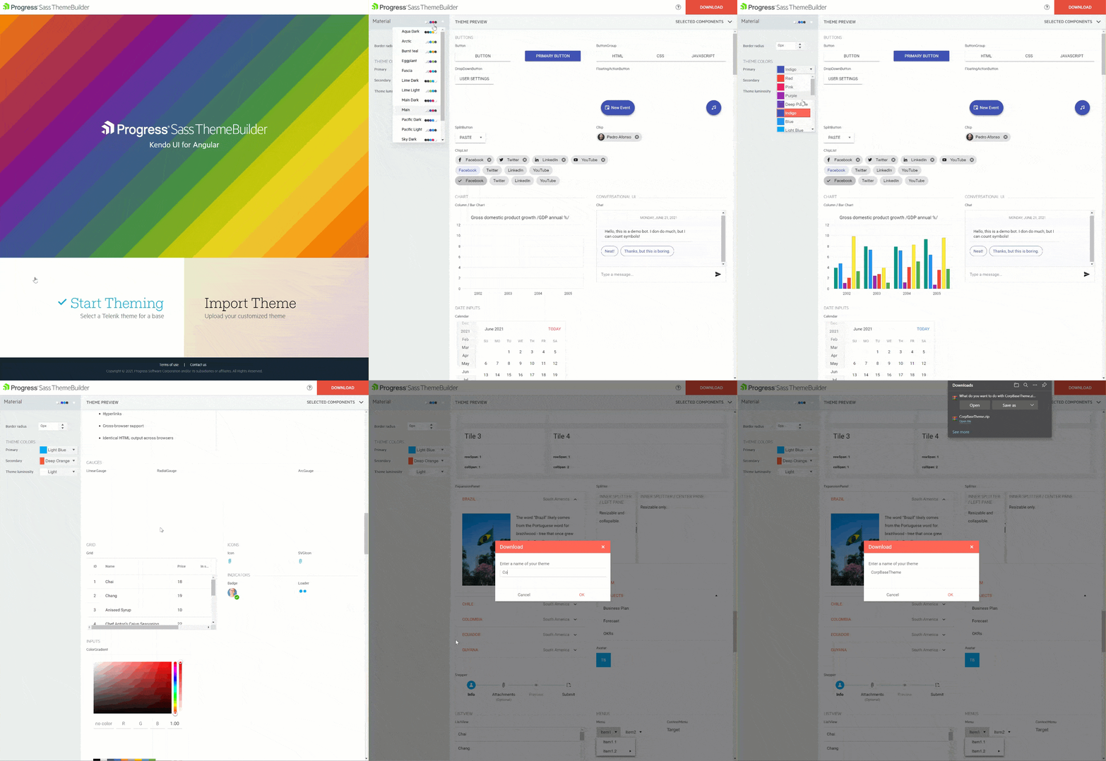 Figure 1: Create Kendo UI Sass Base Theme Walk-through
After creating the custom theme and downloading the resources, the archive includes a CSS file and a JSON file. The CSS file is a compiled version of our custom UI theme that can be used immediately in any web application, and the JSON file is for re-importing the custom theme back into the Sass Theme Builder and making any changes in the future.
Also included in the Sass Theme Builder resources download is an SCSS file that can be used within any pre-processing build step. For example, webpack, Gulp or Grunt. As with most web design systems, we expose a variety of variables that can be overridden through a Variable.scss file.
The ability to override the variables through SCSS gives the designer or developer an infinite number of customization options and even greater control. An example of this is described in the Angular Material Theme Customization documentation. In our case, however, the Sass Theme Builder is a tool that we provide to reduce the heavy lifting and do this for us.
The real power with the Sass Theme Builder is that it works with all our web products. Additionally, the above process is similar with our UI for WPF Desktop suite. The difference is the customization tool used is the Telerik Color Theme Generator. Let us look at that next.
Telerik Color Theme Generator
In the Color Theme Generator, we can select a base theme. We will choose Material as before. Then on the right-hand side of the application is a panel for Color Settings. Here is where we will choose the base color palette and our changes to the base theme as desired.
The theme generation in WPF enables more tweaking because the WPF suite uses a different base theming process. For example, instead of inputting only the Primary and Secondary color like the Sass Theme builder there are more parameters to configure.
To understand the available configurations for our selected base theme, we will reference the WPF Material Theme documentation. It will guide us in creating the same look and feel in our WPF application by matching the theme configurations.
Matching Theme Configurations
In Kendo UI, there are three settings to input—quite simple. However, in WPF there are a couple dozen, allowing for a rich UI theme customization. The good news is we can start by mapping the Kendo UI inputs to similar WPF color inputs. Let us look at this below (fig. 2).
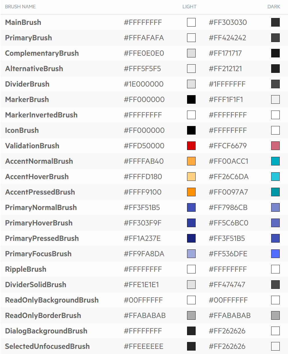 Figure 2: WPF Theme Color Inputs
For our case, the primary brush and accent brush are like the primary and secondary color inputs as before. As a result, we will consider the Primary Brush the Primary Color and the Accent Brush the Secondary Color. The Primary Brushes and Accent Brushes section of the WPF Material Theme documentation provides details on how the colors are applied.
For the default Material theme, the primary brush or primary color is indigo or blue. We will change this to light blue to match our custom style. The accent brush or secondary color is bright orange, and we will change this to our deep orange as well. Next, we will use the documentation to adjust the brushes as shown in the following table (tbl. 1) and gather variations using Coolers.co.
|
Brush |
Mapping Description |
Hex Code |
|
PrimaryNormalBrush |
primary hex code |
#03A9F4 |
|
PrimaryFocusBrush |
primary lighter variation |
#1EB6FD |
|
PrimaryHoverBrush |
primary lighter variation |
#1EB6FD |
|
PrimaryPressedBrush |
primary darker variation |
#022BF5 |
|
AccentNormalBrush |
secondary hex code |
#FF9800 |
|
AccentHoverBrush |
secondary lighter variation |
#FFA824 |
|
AccentPressedBrush |
secondary darker variation |
#FF4C00 |
Table 1: WPF Brush to Kendo Color Mapping
After adjusting the theme to our liking, the last step is to select the Copy Settings to Clipboard button and save the output into a separate file. This file will be used when customizing the base theme of the WPF application. Below is an animated walk-through of making these changes (fig. 3).
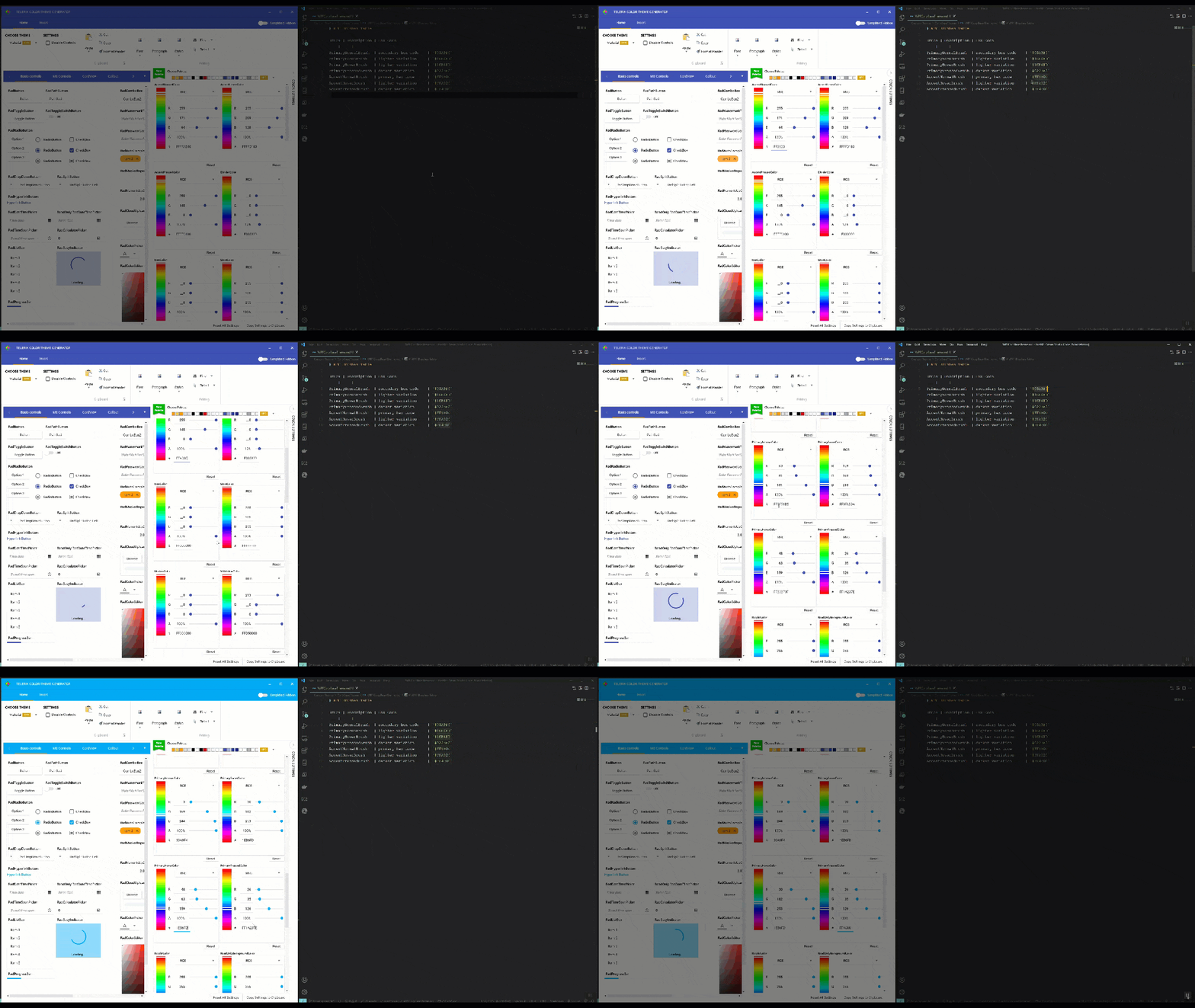
Figure 3: Create Telerik UI Base Theme Walk-through
The above process is the simplest way to start theming across products. I should also caution that there will be more involved with mapping the desktop application styling and web styling. However, the good news is, now we have all the assets needed for our client applications. Let us get started with building the web applications.
Styling the Web Applications
For simplicity, our client applications will use a straightforward grid because that will illustrate the same look and feel. We will also use the powerful template generators in each development environment, i.e., Visual Studio Code and Visual Studio 2019. We will start the Angular application and end with the Blazor application.
Angular Grid Application
To create our Angular Grid project, we will use the Kendo UI Template Wizard in Visual Studio Code Extension, which was created to scaffold Angular, React or Vue applications. This will help us get our Angular Grid application up and running quickly.
1. Launch the Kendo UI Template Extension in Visual Studio Code (fig. 4).

Figure 4: Launch Kendo UI Template Generator
Pro Tip: Use the CTRL + Shift + P shortcut (or or Command + Shift + P on a Mac) to launch the Command Palette.
2.Name the project and provide an output path (fig. 5).
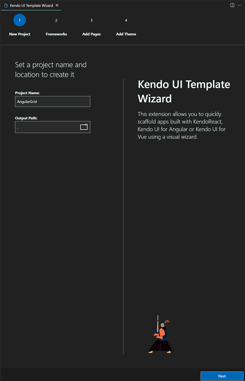
Figure 5: Name the Project and Select Output
3. Select the Angular Framework (fig. 6).
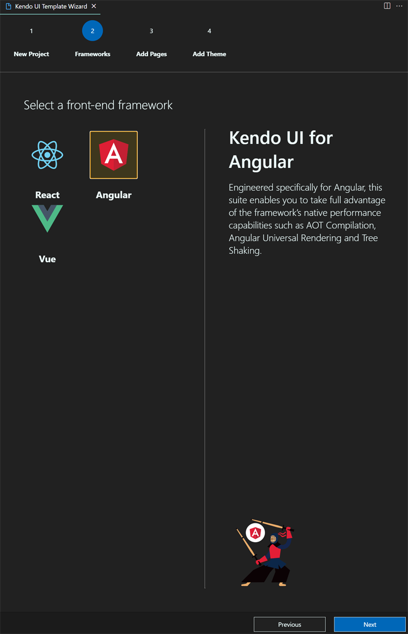
Figure 6: Select Angular for your Grid project
4. Add a Grid Page and name the page Grid. It will be added as a component to the project (fig. 7).
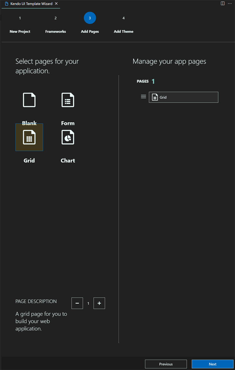
Figure 7: Add Angular Grid Page
5. Select the Material base theme (fig. 8).
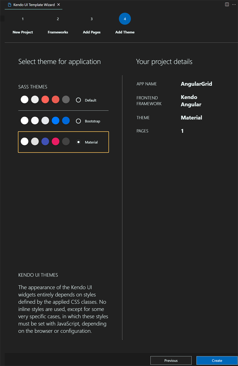
Figure 8: Select Material Base Theme
The above steps produce a basic Kendo UI for Angular project with a Grid component. The next steps are to include our custom theme. This process is outlined in the Using the Themes in Your Project section of the Styling & Themes—Theme Builder Angular documentation.
For our application, we will simply copy the contents of the SCSS file provided from the download of the Sass Theme Builder. We then paste this at line 1 of the styles.scss file in our Angular Grid application. Doing this will integrate the custom theme into our build process (fig. 9).

Figure 9: Add Custom Theme to Angular Application
Then we can run npm install and ng serve to install the npm packages and run the Angular application. It should give the following Grid output (fig. 10). It is great to see the primary color matches our custom theme.
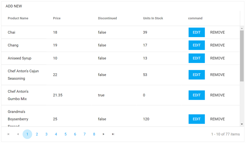
Figure 10: Custom Styled Angular Grid
The above walk-through illustrates how quickly a custom theme can be implemented in an Angular application. Understandably, we could take this even further by using a Variables.scss file and the styles.scss file in a comparable way. Let us review how this can be done in a Telerik UI for Blazor application next.
Blazor UI Grid Application
Telerik UI integrates nicely into Visual Studio and includes a great template to get started with. Let us create the Blazor Grid project next.
1. Launch Visual Studio and the Add New Project Dialog (fig. 11).
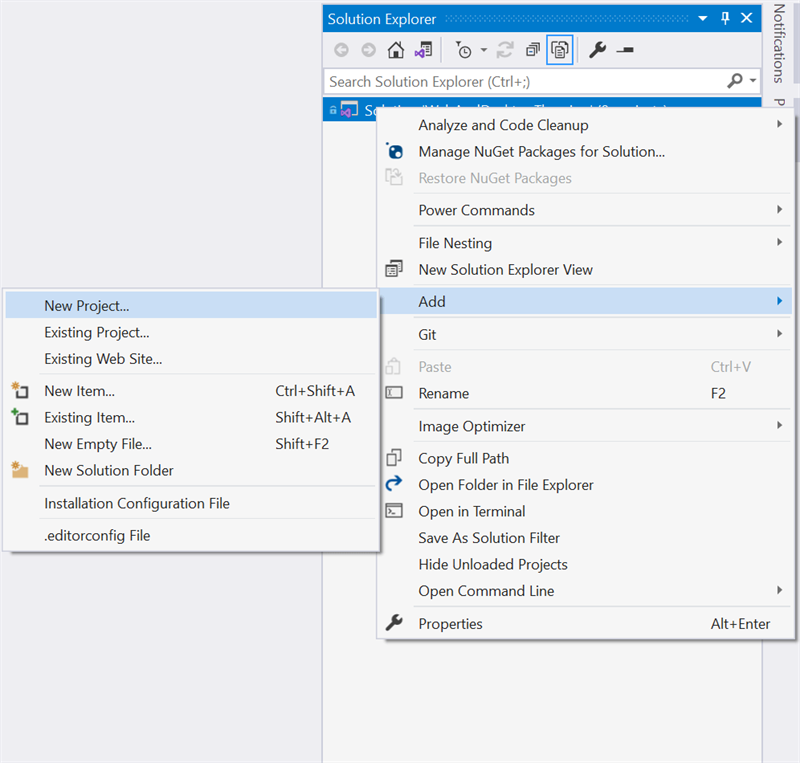
Figure 11: Visual Studio Add New Project
2. Search and Select the Telerik C# Blazor Application Project Template (fig. 12).
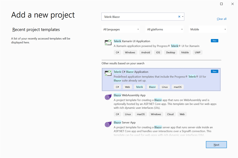
Figure 12: Select Telerik C# Blazor Application Project Template
3. Name the Project and Place it in a Folder (fig. 13).
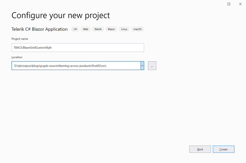
Figure 13: Name and Location of Project
4. Select .NET 5.0 and the Blazor Wasm Flavor (fig. 14).
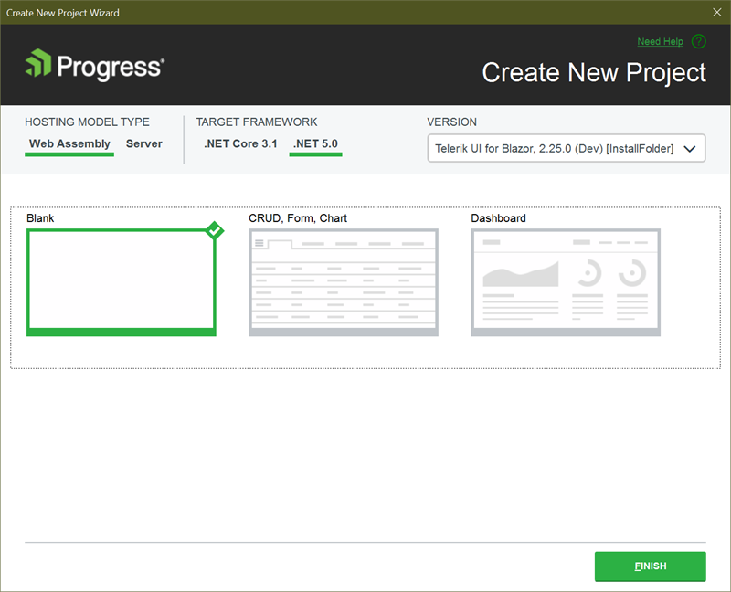
Figure 14: Select .NET 5.0 and Blazor Wasm
5. Remove the Bootstrap and Kendo Style References from index.html leaving only the site.css reference (code 1).
<!DOCTYPE html><html><head> <meta charset="utf-8" /> <meta name="viewport" content="width=device-width, initial-scale=1.0, maximum-scale=1.0, user-scalable=no" /> <title>BlankClientAspNetHostedBlazorApp</title> <base href="/" /> <link href="css/site.css" rel="stylesheet" /> <script src="_content/Telerik.UI.for.Blazor/js/telerik-blazor.js" defer></script></head><body> <div id="app">Loading...</div> <div id="blazor-error-ui"> An unhandled error has occurred. <a href="" class="reload">Reload</a> <a class="dismiss"></a> </div> <script src="_framework/blazor.webassembly.js"></script></body></html>Code Snippet 1: Blazor Wasm Index.html
6. Change the Index.razor page to an Editable Grid (code 2).
@page "/"@inject HttpClient HttpClient;@using TBACS.BlazorGridCustomStyle.Shared<TelerikGrid Data="@Products" Pageable="true" PageSize="10"> <GridToolBar> <GridCommandButton Command="Add" Icon="add">Add New</GridCommandButton> </GridToolBar> <GridColumns> <GridColumn Field="@(nameof(Product.Id))" /> <GridColumn Field="@(nameof(Product.Name))" Title="Product Name" /> <GridColumn Field="@(nameof(Product.UnitPrice))" Title="Price" DisplayFormat="{0:C}" /> <GridColumn Field="@(nameof(Product.Discontinued))" Title="Discontinued" /> <GridColumn Field="@(nameof(Product.UnitsInStock))" Title="Units In Stock" /> <GridCommandColumn Title="Command"> <GridCommandButton Command="Save" ShowInEdit="true" Class="k-button-primary">Update</GridCommandButton> <GridCommandButton Command="Edit" Class="k-button-primary">Edit</GridCommandButton> <GridCommandButton Command="Delete">Remove</GridCommandButton> <GridCommandButton Command="Cancel" ShowInEdit="true">Cancel</GridCommandButton> </GridCommandColumn> </GridColumns></TelerikGrid>@code { List<Product> Products; protected async override Task OnInitializedAsync() { Products = await HttpClient.GetFromJsonAsync<List<Product>>("https://sampledataapi.azurewebsites.net/api/v1/Products"); }}Code Snippet 2: Telerik Blazor Wasm Grid Index.razor Page
7. At this point, we can now integrate our custom theme. We’ll use the CSS file provided from the Sass Theme Builder download and paste it into the site.css file of the Blazor application.
Pro Tip: Leave the styles for the blazor-error-ui id.
The CSS file is quite large and not feasible to include in this post. However, it is included in the source repository.
Finally, we can add our Product class to the shared project and run the application. It will give the following Grid (fig. 15). The consistent look and feel of the grid are coming along.
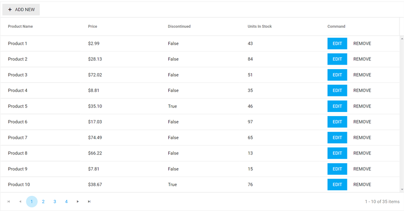
Figure 15: Custom Styled Blazor Grid
The above sections conclude setting up our custom styling for a Kendo UI for Angular Grid and a Telerik UI for Blazor Grid. In this section we have displayed the simplest steps for achieving consistent styling across two of our web products, which illustrates the basic concepts for achieving the same result in our other control suites. Next let us begin with our WPF application on the desktop.
Styling the Desktop Application
Our WPF controls are just as easy to get started with a Grid. We provide excellent integration with Visual Studio, and the Telerik Color Theme Generator gives us the sample code to apply our custom style. This is detailed in the Color Theme Generator article. Let us begin.
WPF Grid Application
For our WPF Grid, we are going to use Implicit Styling because it is a far superior way to use styling in WPF. This is also known as the NoXaml approach. Knowing this will come in handy when adding NuGet packages to the application. We will begin with adding a new project in Visual Studio.
1. Add a New Project in Visual Studio and Select the Telerik C# WPF (.NET Core) Template (fig. 16).
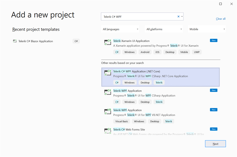
Figure 16: Add Telerik C# (.NET Core) WPF Project Template
2. Give the project a name and specify a location (fig. 17).
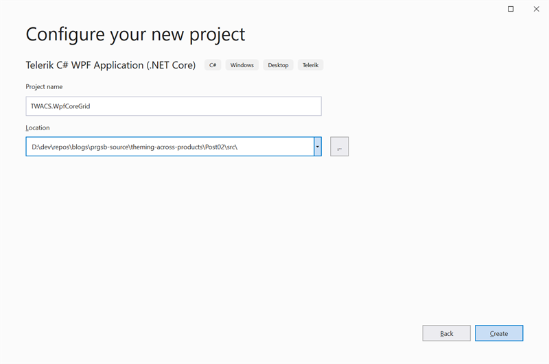
Figure 17: Specify the Name and Location of the WPF Project
3. Select the Blank Template (fig. 18).
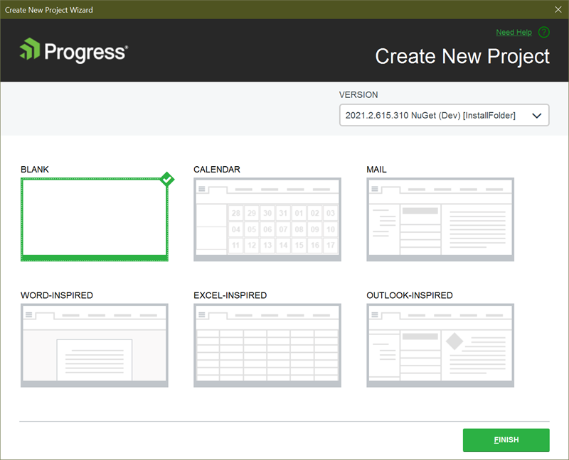
Figure 18: Select the Blank Project Template
4. Remove the template NuGet packages and add the Telerik.Windows.Controls.GridView.for.Wpf package (fig. 19).

Figure 19: Add Telerik.Windows.GridView.for.Wpf NuGet Package
5. Add the Telerik UI for WPF Material Base Theme NuGet Package (fig. 20).

Figure 20: Add Telerik.Windows.Themes.Material.for.Wpf NuGet Package
6. Add the Merged Resource Dictionaries to the App.xaml page (code 3).
<Application x:Class="TWACS.WpfNetCoreCustomStyleGrid.App" xmlns:telerik="http://schemas.telerik.com/2008/xaml/presentation" StartupUri="MainWindow.xaml"> <Application.Resources> <ResourceDictionary> <ResourceDictionary.MergedDictionaries> <ResourceDictionary Source="/Telerik.Windows.Themes.Material;component/Themes/System.Windows.xaml" /> <ResourceDictionary Source="/Telerik.Windows.Themes.Material;component/Themes/Telerik.Windows.Controls.xaml" /> <ResourceDictionary Source="/Telerik.Windows.Themes.Material;component/Themes/Telerik.Windows.Controls.GridView.xaml" /> <ResourceDictionary Source="/Telerik.Windows.Themes.Material;component/Themes/Telerik.Windows.Controls.Input.xaml" /> </ResourceDictionary.MergedDictionaries> </ResourceDictionary> </Application.Resources></Application>Code Snippet 3: WPF App.xaml Merged Resource Dictionaries
7. Use the provided code snippet to change the theme globally. We will add the output from the Telerik Color Theme Generator in the App.xaml.cs file before the InitializeComponent() (code 4).
Pro Tip: Use the Telerik.Windows.Controls and the Telerik.Windows.Controls.ColorEditor for the HEX to Color conversion. The output from the Telerik Color Theme Generator uses the .NET Framework implementation.
using System;using System.Collections.Generic;using System.Configuration;using System.Data;using System.Linq;using System.Windows;using Telerik.Windows.Controls;using Telerik.Windows.Controls.ColorEditor;namespace TWACS.WpfNetCoreCustomStyleGrid{ /// <summary> /// Interaction logic for App.xaml /// </summary> public partial class App : Application { public App() { MaterialPalette.Palette.AccentNormalColor = ColorConverter.ColorFromString("#FFFF9800"); MaterialPalette.Palette.AccentHoverColor = ColorConverter.ColorFromString("#FFFFA824"); MaterialPalette.Palette.AccentPressedColor = ColorConverter.ColorFromString("#FFFF4C00"); MaterialPalette.Palette.DividerColor = ColorConverter.ColorFromString("#1E000000"); MaterialPalette.Palette.IconColor = ColorConverter.ColorFromString("#FF000000"); MaterialPalette.Palette.MainColor = ColorConverter.ColorFromString("#FFFFFFFF"); MaterialPalette.Palette.MarkerColor = ColorConverter.ColorFromString("#FF000000"); MaterialPalette.Palette.ValidationColor = ColorConverter.ColorFromString("#FFD50000"); MaterialPalette.Palette.ComplementaryColor = ColorConverter.ColorFromString("#FFE0E0E0"); MaterialPalette.Palette.AlternativeColor = ColorConverter.ColorFromString("#FFF5F5F5"); MaterialPalette.Palette.MarkerInvertedColor = ColorConverter.ColorFromString("#FFFFFFFF"); MaterialPalette.Palette.PrimaryColor = ColorConverter.ColorFromString("#FFFAFAFA"); MaterialPalette.Palette.PrimaryNormalColor = ColorConverter.ColorFromString("#FF03A9F4"); MaterialPalette.Palette.PrimaryFocusColor = ColorConverter.ColorFromString("#FF1EB6FD"); MaterialPalette.Palette.PrimaryHoverColor = ColorConverter.ColorFromString("#FF1EB6FD"); MaterialPalette.Palette.PrimaryPressedColor = ColorConverter.ColorFromString("#FFFF4C00"); MaterialPalette.Palette.RippleColor = ColorConverter.ColorFromString("#FFFFFFFF"); MaterialPalette.Palette.ReadOnlyBackgroundColor = ColorConverter.ColorFromString("#00FFFFFF"); MaterialPalette.Palette.ReadOnlyBorderColor = ColorConverter.ColorFromString("#FFABABAB"); MaterialPalette.Palette.DialogBackgroundColor = ColorConverter.ColorFromString("#FFFFFFFF"); MaterialPalette.Palette.SelectedUnfocusedColor = ColorConverter.ColorFromString("#FFEEEEEE"); MaterialPalette.Palette.DividerSolidColor = ColorConverter.ColorFromString("#FFE1E1E1"); MaterialPalette.Palette.PrimaryOpacity = 0.87; MaterialPalette.Palette.SecondaryOpacity = 0.54; MaterialPalette.Palette.DisabledOpacity = 0.26; MaterialPalette.Palette.DividerOpacity = 0.38; this.InitializeComponent(); } }}Code Snippet 4: WPF App.xaml.cs Theme Customization
8. Add a GridView with to the MainWindow.xaml view (code 5). Note that I added some extra buttons to show how they look on the Desktop.
<Window x:Class="TWACS.WpfNetCoreCustomStyleGrid.MainWindow" xmlns:telerik="http://schemas.telerik.com/2008/xaml/presentation" Title="MainWindow" Height="800" Width="700"> <Grid> <telerik:RadGridView x:Name="RadGridView1" Loaded="RadGridView1_Loaded" AutoGenerateColumns="False" IsFilteringAllowed="False"> <telerik:RadGridView.Columns> <telerik:GridViewDataColumn DataMemberBinding="{Binding Id}" IsVisible="False" IsFilterable="False" IsSortable="False" IsGroupable="False"></telerik:GridViewDataColumn> <telerik:GridViewDataColumn DataMemberBinding="{Binding Name}" Header="Product Name" IsFilterable="False" IsSortable="False" IsGroupable="False"></telerik:GridViewDataColumn> <telerik:GridViewDataColumn DataMemberBinding="{Binding UnitPrice}" Header="Price" DataFormatString="{}{0:c}" IsFilterable="False" IsSortable="False" IsGroupable="False"></telerik:GridViewDataColumn> <telerik:GridViewDataColumn DataMemberBinding="{Binding Discontinued}" Header="Discontinued" IsFilterable="False" IsSortable="False" IsGroupable="False"></telerik:GridViewDataColumn> <telerik:GridViewDataColumn DataMemberBinding="{Binding UnitsInStock}" Header="Units In Stock" IsFilterable="False" IsSortable="False" IsGroupable="False"></telerik:GridViewDataColumn> <telerik:GridViewDataColumn> <telerik:GridViewDataColumn.CellTemplate> <DataTemplate> <StackPanel Orientation="Horizontal"> <telerik:RadButton Content="Edit" Margin="0,0,10,0" /> <telerik:RadButton Content="Cancel"/> </StackPanel> </DataTemplate> </telerik:GridViewDataColumn.CellTemplate> </telerik:GridViewDataColumn> </telerik:RadGridView.Columns> </telerik:RadGridView> </Grid></Window>Code Snippet 5: WPF MainWindow.xaml GridView Markup
The above steps will produce the following Grid output (fig. 21). The theming is looking quite consistent even on the desktop. Understandably, there are some noticeable differences, and these could be fixed with further tweaking.
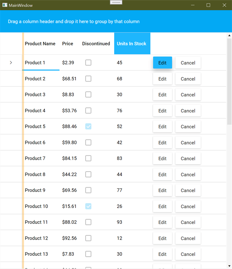
Figure 21: WPF Custom Styled GridView
This provides a nice overview of the WPF RadGridView and how quickly we can get our custom theme working in our desktop application. Most notably, the process is quite like the web applications. We set up our application for implicit styling with the Material base theme and apply our customizations as provided from the Telerik Color Theme Generator.
Conclusion
This concludes part two of our Sleek and Customizable UI series. In this post, we walked through creating a custom UI theme for web and desktop applications using the Kendo Sass Theme Builder and the Telerik Color Theme Generator. We achieved this by selecting an excellent base theme and customizing it to our needs. Finally, we walked through adding our customizations to Angular, Blazor and WPF applications. This has been an excellent exercise in understanding how quickly and easily a consistent look and feel can be achieved in Kendo UI and Telerik UI controls.
Try DevCraft Today
Get started with a Telerik DevCraft Trial today! Our DevCraft tooling is the most powerful collection of Telerik .NET and Kendo UI JavaScript developer tools. It includes modern, feature-rich, and professionally designed UI components for web, desktop and mobile applications; embedded reporting and report management solutions; document processing libraries; automated testing and mocking tools.
DevCraft will arm your developers with everything needed to deliver outstanding applications in less time and with less effort. With award-winning technical support delivered by the developers who built the products and a ton of resources and trainings, you can rest assured that you have a stable provider to rely on for your everyday challenges along your software development journey.