R2 2021 of Telerik UI for Xamarin is out and it brings our brand new BadgeView control—with it you can easily display badges on your application in a mobile scenario where a notification or update can be illustrated through a badge.
You’ve seen badges all around—indicating the number of unread emails, showing updates on a business app or presenting the status for a messaging app showing whether a person is online, offline or away. Whichever scenario you’re trying to achieve, the Xamarin BadgeView is packed with all the features you will need!

Get Started
The easiest way to use RadBadgeView is to add our Telerik.UI.for.Xamarin NuGet package to your Xamarin.Forms solution.
Then add a reference to the Telerik.XamarinForms.Primitives namespace:
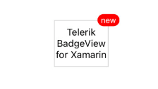
xmlns:telerikPrimitives="clr-namespace:Telerik.XamarinForms.Primitives;assembly=Telerik.XamarinForms.Primitives"Lastly, add the BadgeView control to the page. In the example below, the badge would be attached to a RadBorder control with a Label:
<telerikPrimitives:RadBadgeView BadgeText="new"> <telerikPrimitives:RadBadgeView.Content> <telerikPrimitives:RadBorder WidthRequest="80" HeightRequest="80" BorderThickness="1" BorderColor="LightGray"> <Label Text="Telerik BadgeView for Xamarin" FontSize="14" VerticalTextAlignment="Center" HorizontalTextAlignment="Center"/> </telerikPrimitives:RadBorder> </telerikPrimitives:RadBadgeView.Content></telerikPrimitives:RadBadgeView>Check the result on iOS simulator:

Use Predefined Badges
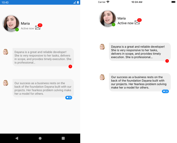
We thought of the most common scenarios where a badge would be needed and came up with a set of predefined badge types you can directly use in your app. Choose between “Available”, “Do Not Disturb”, “Out of Office” and more. Check the complete list in the Badge Types documentation topic.
Here is a quick example with a predefined badge marking the status of an app user:
<telerikPrimitives:RadBadgeView BadgeType="Available" BadgeHorizontalPosition="Center" BadgeVerticalPosition="Center" BadgeOffsetX="30" BadgeOffsetY="30"> <telerikPrimitives:RadBadgeView.Content> <telerikPrimitives:RadBorder WidthRequest="91" HeightRequest="91" HorizontalOptions="Center" BorderThickness="4" BorderColor="#DFDFDF" CornerRadius="46"> <Image Source="account_image.png" /> </telerikPrimitives:RadBorder> </telerikPrimitives:RadBadgeView.Content></telerikPrimitives:RadBadgeView>And the result with different badge types on iOS:

Create Your Own Badge
Alternatively, you can manually set the text shown inside the badge—this is quite useful when you need to show the number of new emails or messages, or add a specific tag, such as “new”, “updated”, etc.
<telerikPrimitives:RadBadgeView BadgeText="11" BadgeHorizontalPosition="End" BadgeVerticalPosition="End"> <telerikPrimitives:RadBadgeView.Content> <Image Source="envelope.png" WidthRequest="60" /> </telerikPrimitives:RadBadgeView.Content></telerikPrimitives:RadBadgeView>
In case only showing text inside the badge is not sufficient to achieve the desired scenario, you can completely modify the Badge ControlTemplate and add any content inside. Go to the Badge Customization topic page for more information if you’d like to explore that option.
Position It the Way You’d Like
Take advantage of the flexible position and alignment settings, so you can place the badge in the exact location you’d like it to appear. You can set its position depending on the view it is attached to, apply horizontal and vertical alignment and offset. For detailed information on the available options, check our BadgeView: Position and Alignment topic page.
Check out some different position оptions in the image below:

Style It per Your Own Design
As always, RadBadgeView comes with a variety of styling settings, so it will perfectly match the app design you’ve applied. You can modify the font settings, different colors (text color, background color, border color), badge size and corner radius.
Check below a quick example of BadgeView with a few styling properties applied. For the BadgeFontFamily, I’ve used our Telerik ttf file. For more details on this, read the Telerik UI for Xamarin Font Icons topic page.
<telerikPrimitives:RadBadgeView BadgeText=" 39" BadgeFontFamily="{StaticResource IconsFont}" BadgeBackgroundColor="#0E88F2" BadgeCornerRadius="20" BadgeHorizontalPosition="End" BadgeVerticalPosition="End" BadgeHorizontalAlignment="End" Margin="20"> <telerikPrimitives:RadBadgeView.Content> <telerikPrimitives:RadBorder BackgroundColor="#EFEFEF" CornerRadius="20" HorizontalOptions="Center" Padding="10"> <Label Text="Our success as a business rests on the back of ..." FontSize="15" /> </telerikPrimitives:RadBorder> </telerikPrimitives:RadBadgeView.Content></telerikPrimitives:RadBadgeView>

Learn More and Share Your Feedback
I hope I have managed to give you an overview on the basic features of the BadgeView control in Telerik UI for Xamarin. And feel free to check out the documentation.
In the meantime, we would love to hear your feedback about the BadgeView control and how we can improve it. If you have any ideas for features to add, do not hesitate to share this information with us on our Telerik UI for Xamarin Feedback Portal.
If you have not yet tried the Telerik UI for Xamarin suite, take it out for a spin with a 30-day free trial, offering all the functionalities and controls at your disposal at zero cost.