Recent research reveals more than half of consumers believe brands lie to them. How can you ensure that clients’ websites don’t send wrong signals to visitors?
There was a time when brands were able to fill their sites with meaningless buzzwords, promote made-up statistics about their success and lie through their teeth about the value of their offering. These days, it’s much harder to do that, as consumers have become more savvy when it comes to brand manipulation and deception.
That’s because there’s an overabundance of information online that makes it impossible for brands to hide from the truth. Places like Google, Yelp, TripAdvisor, the BBB and even social media empower consumers and businesses to report shady tactics.
That said, consumers don’t always need the words of others to believe that there’s something wrong with a brand. Distrusting brands has become second nature—even if the company is trustworthy.
Today, we’re going to look at what web designers can do to help remove the doubts and distrust from visitors’ minds when building a website.
What Can Designers Do to Make Websites Appear Trustworthy?
Pure Branding’s ROI of Transparency study found that 65% of consumers think that brands lie some of the time. And it’s not just the ones they’re thinking about buying from. 54% believe that brands they currently buy from aren’t always honest with them.
Assuming your clients or employers are running legit operations and not trying to deceive prospective customers or clients, how do you ensure that the design doesn’t suggest otherwise?
Let’s have a look.
1. Keep the Design in Line with Modern Trends
There’s a big difference between creating a retro-inspired design and building a website that feels like it hasn’t been touched since the year 1995.
Take, for instance, the website for Mom & Popcorn:

A brand that literally plays on the concept of a mom-and-pop shop should have a bit of an old-timey vibe. And this one does it beautifully.
The logo has a unique vintage style and the typography matches it perfectly. But, other than that, the website is designed for today’s consumers.
If you look at the Captain Marvel sub-site on the Marvel site, you’ll see an example of a problematic retro design:

When I first discovered it, I thought maybe it was a fan site. I didn’t understand why Marvel would build such a nightmare throwback of a site. Then I dug deeper and realized this was, in fact, part of the official sitemap for Marvel.
For a big brand like Marvel, the outdated design isn’t going to cause them any issues (especially since it’s buried in the navigation). For other companies, though, it most certainly would.
Auto-playing sound. Flashing neon colors. Pointless animations. A visitor counter. And a user unfriendly navigation. Any person encountering such an outdated and clunky design should question the authenticity of the company behind it.
I’d argue something similar happens when a website goes too far in the other direction with a futuristic or avant garde design that’s difficult to figure out. It’s like, if they can’t deliver a straightforward website experience, what else about the company is going to be convoluted and confusing?
2. Make Sure the Text Is Easy to Read
I know you don’t have much control over the copy on a website. Not the content anyway. What you can do, however, is look for opportunities to “design” the copy so that it’s more attractive and easier to read.
A brand that prioritizes legibility and readability, and creates a distraction-free reading experience, will have fewer visitors wondering what the brand is trying to hide behind its too-tiny copy or walls of text.
Let’s run through an example.
Your copywriter sends you the homepage copy. One of the sections looks like this:

Not only is this format unappealing for visitors, but it’s also going to make the homepage longer than it needs to be. So, the first thing you’ll do is turn all of this text into something more visually appealing.
The text above comes directly from the Zoom homepage. Here’s how the designer handled it:
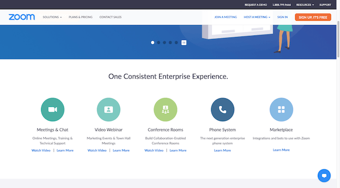
It looks good with the recognizable icons, clear headers and short descriptions. I wouldn’t stop there though.
The first thing I’d do is bump up the font sizes for readability. The headers are 18px and the descriptions and links are 14px. 16px is the minimum font size you should be using on a website, so all of these need to be enlarged.
The next thing I’d do is fix the imbalance in the section.
For some reason, the Marketplace description doesn’t wrap. But that’s an easy enough fix. Just force the break at “with Zoom” if you can’t get it to naturally happen with the font resizing.
The CTA links are also off balance. The first three include a “Watch Video” link while the other two only have “Learn More”. If you can’t provide a consistent number of CTAs for each, leave the video watching to the individual pages.
And if you look closely at the copy, you’ll see that the last two descriptions aren’t in title case (where all the initial letters are capitalized). It’s a small detail, but it’s one that I noticed and I’m sure all those nitpicky people who complain about people using the wrong their/there/they’re will notice it, too.
The assumption will be that the brand either didn’t proofread its copy or didn’t care to. And if that’s the case, what else would the company let slip through the cracks?
3. Use Accurate and Realistic Imagery
According to a study by Bazaarvoice, 51% of consumers don’t trust product info. By extension, it’s safe to assume that 51% of consumers also won’t believe the information a company provides about its services.
Like I mentioned before, it’s been very easy in the past for businesses to lie with their words. But what about their imagery?
Photos play a very big part in convincing people to open their wallets—not just on ecommerce sites, but on regular business websites, too. If your photos give off the perception that they’re deceptive in some way, it could spell big trouble for your brand.
So, when it comes to ecommerce sites, you need to use high-quality imagery. That means:
- High resolution
- Different views
- Alternate colors or sizes
Oh, and if it’s beneficial for them to zoom, make sure the zoom actually works. The Ann Taylor website, for instance, has a blurry and tiny zoom feature:
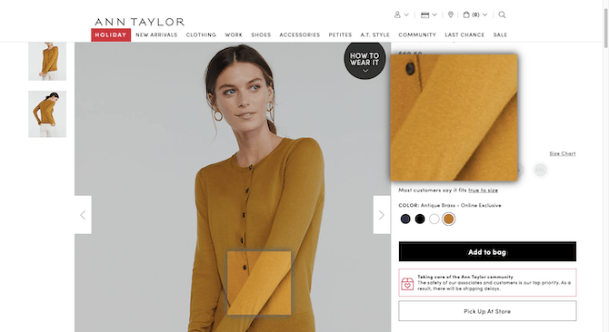
The whole point in being able to zoom into a product photo is to see the fine details. This doesn’t help with that and will probably make customers wonder why a company isn’t allowing them to see that level of detail online.
You need to apply the same level of care and logic to your usage of photos on business websites.
There’s nothing wrong with using stock photos or even photos provided by the brand itself. However, if they’re poorly shot, too vague, outdated looking or otherwise signal to visitors that the image isn’t telling the whole story, then you have a problem.
4. Cut Back on the Advertising
A report recently released by CMO Australia revealed that consumers are not happy with brand marketing.
“Customers are feeling lied to and over marketed to. Brands are not sending authentic messages to their customers which prevents them from activating the path to re-purchase.”
It’s not just the Australian consumer base that feels this way. Edelman research found that three in four consumers now avoid advertising altogether, with nearly half employing the use of ad blockers.
But what’s the point in building a website if it’s not for sales and marketing?
Well, there’s a difference between honestly providing consumers with information about what you offer and what the benefits are to them … and bombarding them with shallow advertising gimmicks. When the website’s profits are more important than the users’ experience, they have a right to question your motives.
Many editorial sites are guilty of this. Take, Gizmodo, for example:
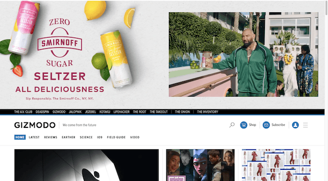
This is what a visitor sees when they enter the site. Sure, they can see the masthead and navigation, but that’s not what they’ll notice first. They’ll see Dave Bautista hawking Smirnoff’s latest product.
Let’s say the visitor is unfazed by the fact that the entry ad can’t be dismissed and takes up half of the page. So, they scroll down to explore the content … Until a smaller version of the ad slides back into view:
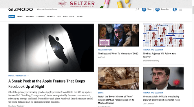
Again, is Gizmodo that hard up for cash that it’s willing to distract visitors from actually reading its content it worked hard to create?
This intrusive use of ads isn’t going to sit well with readers. And that’s not where the problems with advertising stops. The website is littered with ads and sponsored content:
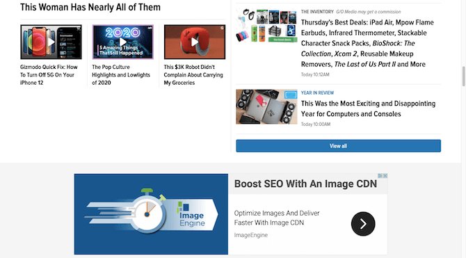
Ads and pop-ups are easy enough to identify. But sponsored content, if not explicitly called out, can create problems for brands wanting to be seen as honest.
So, what do you do with this as a designer? Well, cutting back on advertising whenever possible is a good place to start.
Also, spend time designing something special for sponsored content. The gray, italicized “G/O Media may get a commission” included next to the best deals post isn’t going to cut it. It’s also very ambiguous. Instead, design a special block with a big “SPONSORED” notice so that visitors can quickly decide whether to take the plunge or not.
5. Provide Verification for Social Proof
According to Bazaarvoice, 54% of global consumers won’t buy a product if they think some of its reviews are fake.
Considering how many people believe brands are dishonest, it’s not too far of a stretch to see how they’d have a hard time believing that much of their social proof—customer reviews and client testimonials—is faked.
The only way to ensure that people 100% believe the social proof on your website is to provide verification they can follow up on. That means the following are unacceptable:
- Faceless pics or avatars for client testimonials
- Testimonials without personal details (e.g. name, professional title, location, etc.)
- Customer reviews without a “Verified” stamp to confirm they purchased the product
If you want to see a good example of this, turn your attention to Unicorn Ink Tattoo & Piercing:
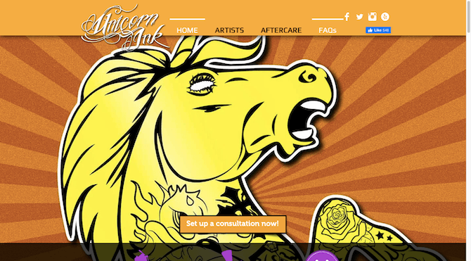
The four links in the top-right corner of the site all work and all point to recently updated social media pages where the tattoo and piercing studio shows off its work. What’s more, the Yelp link goes directly to their well-managed page with glowing reviews.
You’ll also find a section a bit lower on the homepage that shows off testimonials from real customers:
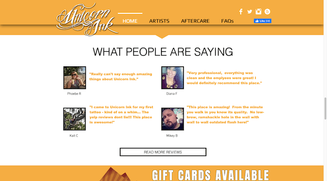
You can see their faces, names and you can tell that these natural-sounding reviews are legit. For anyone who doubts them, they can click on “Read More Reviews” and go to the Yelp page where the reviews live (along with 89 others).
6. Don’t Bury Important Information
One last thing you can do to ensure that visitors’ warning signals don’t go off on your website is to leave all important information out in the open.
Melissa Kinch of communications consultancy Ketchum says:
“We found two particularly fascinating takeaways in this year’s study. First, the same proportion of people—66%—are worried about data privacy as are concerned about data security … Second, people don’t trust brands when they say their data is safe, suggesting there has already been a significant erosion of trust as a result of high-profile privacy lapses."
It’s no surprise that user privacy and security are huge concerns. They have been for years. But web designers do have a way to put some of those worries at ease.
For starters, your cookie consent notice can make a good first impression—just not if it asks visitors to “Accept” or dismiss the notification bar. That’s no better than saying, “You have no control over what we do with your data. Just accept this so we can get on with selling you our stuff.”
Instead, follow IKEA’s lead:
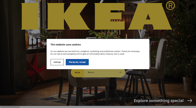
First, it explains the purpose of the cookies and how it allows IKEA to better serve its online customers.
Second, it provides a “Settings” option for visitors that want to modify how much data IKEA can actually take from them:
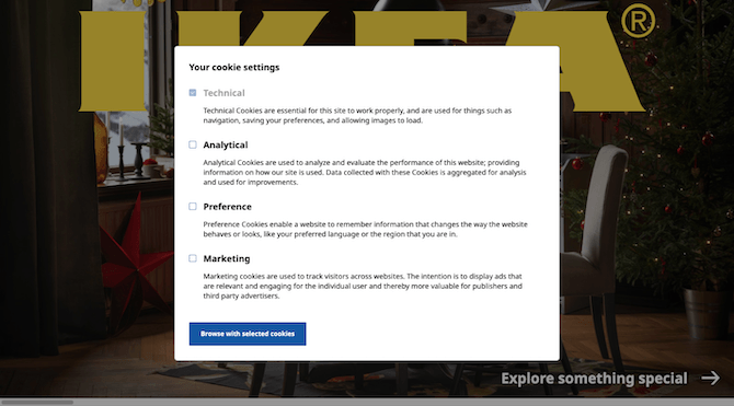
If you want visitors to trust the website and brand to be responsible with their data and experience, this information needs to be laid bare for all visitors to see.
Don’t forget about the website policy pages. You can’t just bury them in the sitemap and expect that visitors won’t be upset when they can’t find the information they’re looking for.
Again, follow IKEA’s example and create a dedicated space for them in the footer where visitors expect the links to be:
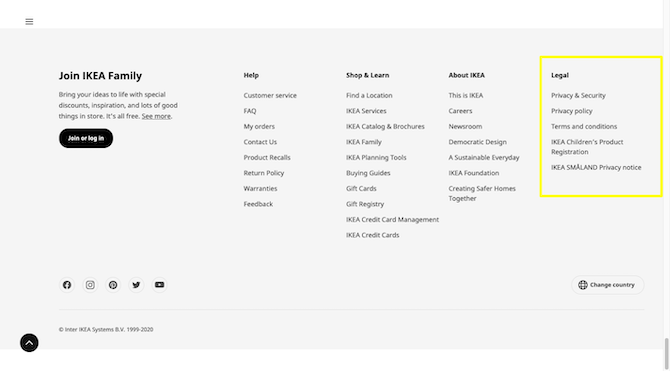
The ROI of Transparency report revealed that 73% of respondents value brand transparency. Not only that, but transparency makes consumers more likely to pay extra.
It’s not just ecommerce sites that benefit from transparency. For instance, placing a link to your privacy policy and explanation of what you do with the information within a contact or checkout form can create more confidence at the point of conversion.
Wrap-up
While honesty and transparency have to come from within a company first, the choices web designers make can impact how well-received brands are by consumers.
Focus on the details that might force someone to call into question the authenticity of the message or the trustworthiness of the approach. Then, design them in a way that removes any possible doubt and distrust from the encounter.