Shadow effect around any UI element for your mobile and desktop apps—possible with Telerik Shadow component for Xamarin, WinUI and UWP.
Material is a widely used design system of guidelines, components and tools that helps you use the best practices of user interface design in your mobile, web and desktop applications. Shadows are one of the three-dimensional qualities of Material Design Support. They are commonly used to create depth in the interface and help users differentiate UI elements.

With Telerik UI for Xamarin, WinUI and UWP R2 2021 Official Releases, we have introduced a Shadow component. Now you can easily put a highly customizable shadow effect around any UI you have and achieve a modern look and feel for your mobile and desktop apps.
The various features of the Telerik Shadow component give more depth and usability to your application interface on Android, iOS and Windows devices.
In this blog post I will show you how to use shadows in your mobile and desktop applications and all the features Shadow provides.
Perhaps you’re wondering about the following questions:
Why do I need a shadow effect?
Of course to add a material/fluent design look and feel of your desktop and mobile apps. Shadow effect is one of the directions you should go.
How can I add/use shadows in my application?
- Add the required assemblies manually or using the Telerik NuGet Server.
- Add the Shadow control using XAML or C#.
- Add the namespace.
What are the features included in the Shadow component?
Telerik Shadow for Xamarin, WinUI and UWP share the same features. You can easily adjust the shadow’s look and feel—just play with its color, position, transparency, corner radius and blur radius settings to achieve the ultimate result on Android, iOS and Windows applications.
Does it integrate with other controls?
Yes, simply add a shadow around UI elements like ListView items, input controls, buttons and others in order to achieve a nice modern user interface in your application.
Shadow Effect in Xamarin.Forms Applications
In order to use the Telerik RadShadow control in your application, you have to add the needed assemblies manually or using the Telerik NuGet server. Check this link for more details.
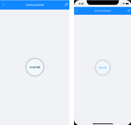
In our example, we will add a shadow to a button.
Add the RadShadow to your page and position a Button inside the Shadow:
<StackLayout HorizontalOptions="Center" VerticalOptions="Center"> <telerikPrimitives:RadShadow CornerRadius="50"> <Button Text="Click me" Background="AliceBlue" BorderColor="#B5B6B8" BorderWidth="1" HeightRequest="100" Padding="20, 0" CornerRadius="50"/> </telerikPrimitives:RadShadow></StackLayout>Add the required namespace:
xmlns:telerikPrimitives="clr-namespace:Telerik.XamarinForms.Primitives;assembly=Telerik.XamarinForms.Primitives"Shadow Effect for Android and iOS

Features in Telerik UI for Xamarin Shadow Control:
- Change the color of the shadow using the Color property.
- Control the color transparency through the ShadowOpacity feature.
- Specify the shadow’s position relative to the position of the view that is casting it using the OffsetX and OffsetY properties.
- Explore options for applying CornerRadius and BlurRadius to the shadow effect.
Example:
<StackLayout> <telerikPrimitives:RadShadow OffsetX="20" OffsetY="20" Color="#D6D7D7" ShadowOpacity="1" CornerRadius="4" HorizontalOptions="Center" VerticalOptions="Center"> <Button Text="Click me" TextColor="White" CornerRadius="4" BackgroundColor="#4488F6" HeightRequest="44"/> </telerikPrimitives:RadShadow></StackLayout>
Integration With Other Controls
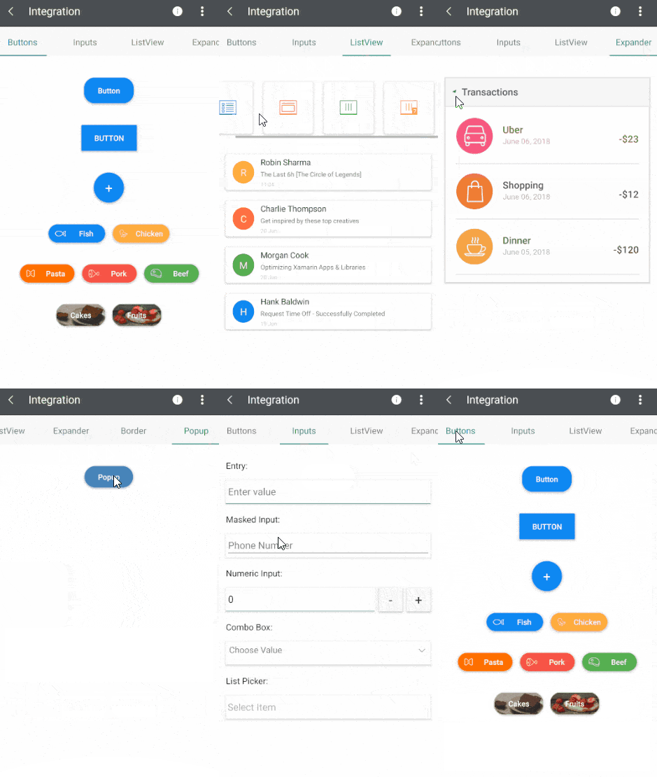
Our Telerik UI for Xamarin Samples App has different Shadow examples. One of them is the Integration example, which demonstrates the shadow effect around UI for Xamarin controls like Button, ListView, Expander, Popup, Border, and Input Controls like Entry, Masked Input, Numeric Input, ComboBox, List Picker and many more.

The source code of the Telerik UI for Xamarin Samples Application can be found in our GitHub repository.
Shadow Effect for Your Windows Apps
Add a modern look and feel for your Windows applications with the freshly released Shadow control in Telerik UI for WinUI and Telerik UI for UWP
You can easily change the shadow color, position, transparency, blur radius and corner radius. You can add shadow effect to any UI element to your WinUI applications and UWP applications.
Let’s use this XAML in a WinUI and in a UWP project:
<StackPanel HorizontalAlignment="Center" VerticalAlignment="Center"> <telerikPrimitives:RadShadow ShadowCornerRadius="50"> <Button Content="Click me" Background="AliceBlue" BorderBrush="#B5B6B8" BorderThickness="1" Height="100" Padding="24, 0" CornerRadius="50"/> </telerikPrimitives:RadShadow></StackPanel>Add the following namespaces inside the WinUI and UWP page:
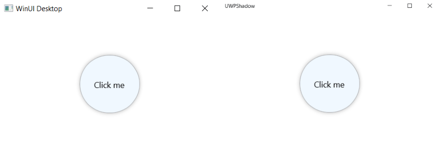
xmlns:telerikPrimitives="using:Telerik.UI.Xaml.Controls.Primitives"The images below show how the Shadow effect is applied to a Button in both instances.
In a WinUI app: In a UWP app:

Features
Telerik Shadow for Xamarin, WinUI and UWP all have the same features. You can change the shadow’s color, transparency, position, corner radius and blur radius.
<StackPanel HorizontalAlignment="Center" VerticalAlignment="Center"> <telerikPrimitives:RadShadow OffsetX="20" OffsetY="-20" ShadowCornerRadius="10" Color="#D6D7D7" ShadowOpacity="1" CornerRadius="4" BlurRadius="5"> <Button Content="Click me" Foreground="White" CornerRadius="10" Background="#4488F6" Width="150" Height="75"/> </telerikPrimitives:RadShadow></StackPanel>
Check Telerik UI for WinUI Shadow documentation and Telerik UI for UWP Shadow documentation for more details about the control’s usage and features.
Share Your Feedback
We believe the Shadow control will help you achieve the desired modern appearance of your mobile and desktop applications. As always, we encourage you to share your ideas or opinions on the controls and thus play a role for shaping our roadmap. Share your feedback on:
- Telerik UI for Xamarin Feedback Portal
- Telerik UI for WinUI Feedback Portal
- Telerik UI for UWP Feedback Portal
Happy coding with our controls!