From staying in hotels to taking walks around new cities, there’s a lot we can learn from time spent on the road. Here are some important UX lessons learned from the physical world that we can apply to the web.
I recently made the move from Rhode Island to Florida. All in all, I drove 1,523 miles over eight days, stayed in six different hotels and had two dogs to keep entertained along the way.
It was actually a great trip and a much-needed break from my business. If you’re feeling burned out from last year and haven’t given yourself a real break, I’d strongly recommend you do so ASAP. We all deserve a good mental and physical reset right now.

While I successfully disconnected from technology during that trip, I couldn’t get myself to stop thinking about what I normally think about Monday to Friday: good and bad UX.
Old habits die hard, I guess.
Rather than waste those observations from the many roads I navigated, the hotels I stayed in and the cities I visited, I thought I’d share them here and draw some parallels to the UX design perils we deal with online.
UX Design Lessons I Learned from a Week on the Road
I saw a lot of things over the course of my trip that got me thinking about what good and bad user experiences look like. But rather than just relegate them to the physical world where they (mostly) occurred, let’s look at how we can use these lessons to build better digital products:
1. Don’t Hide Elements That Are Critical to the User’s Success
For the most part, I planned everything ahead of time so I could minimize surprises along our journey. But, of course, it’s not possible to plan for everything.
For example, I spent 36 hours in Dewey Beach, Delaware. My plan was to take the dogs onto the beach at night and in the morning.
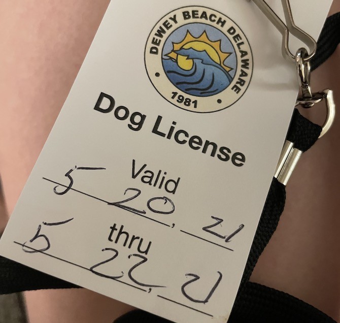
When I checked into the hotel, the concierge was kind enough to remind me that the beach was indeed dog friendly during those hours, but that I would need a permit in order to partake. She gave me a map and pointed me to a kiosk where I could easily buy the permit.
The only problem was that the kiosk wasn’t where she’d indicated on the map. I reluctantly opened my smartphone and did a search for “dog permit Dewey Beach” and it pointed me to the same place on Google Maps:
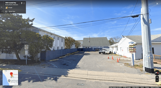
I walked around every inch of the building and parking lot and couldn’t find the kiosk.
When I inevitably got stopped the next morning on the beach because I didn’t have a dog permit, I asked the man where the kiosk was. He laughed, said it was hard to find and let me buy it directly from him instead.
How do we apply this lesson to the web?
Have you ever made an appointment somewhere—say, a doctor’s office or a spa—and they told you to fill out a form before you came in? That was something that Premier Dermatology did when I first became a patient there:
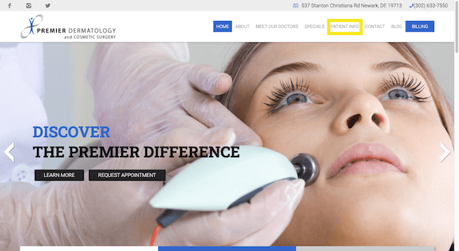
As more businesses digitize their internal operations, I’ve experienced this more and more. It can be a great time-saver as it keeps people from having to show up early to appointments to fill out a mound of paperwork.
Premier Dermatology, for instance, has forms available for new patient visits, automatic billing, insurance and medical release forms. And there’s no need to print and fill them out. It’s all online.
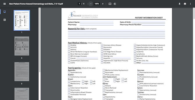
Many times, though, this isn’t the experience. Instead, it’s more like what I went through trying to find the Dewey Beach dog permit. You call to make the appointment and the scheduler says you need to fill out some forms before your visit. However, they either point you to a part of the site that doesn’t exist or they have to give you the exact URL because they know everyone has a hard time finding it.
Here’s what I’m wondering:
If you have a page or component that’s a critical part of the user experience, why wouldn’t you build it into the primary navigation or make it otherwise readily visible on the homepage?
So, the next time you debate moving something out of arm’s reach on a website, really ask yourself why you’re doing it. And if it’s not something that anyone will ever need, why carve out a space for it to begin with? You’re only going to waste your server space.
2. Personalized Checkout Processes Will Boost Conversions and Loyalty
Traveling with two older dogs, I expected a number of challenges to appear along the way. The first was how the heck was I going to do normal things like go to the bathroom, order food or buy things I needed while on the road. Most places aren’t dog friendly, so I had to get creative.
That said, I didn’t end up having to do all the work myself.
One place that helped me out was PetSmart. In addition to providing dog-friendly restrooms, some of the checkout areas have hooks where you can tie up your dogs while you pay.
Trying to pull money out of my wallet, and my wallet out of my bag, when two rambunctious dogs are wanting to sniff everything in sight is such a pain. So having those hooks to keep them in place while I paid made checkout much easier.
There was also this random coffee shack I discovered as I was leaving Delaware called Mudslingers:
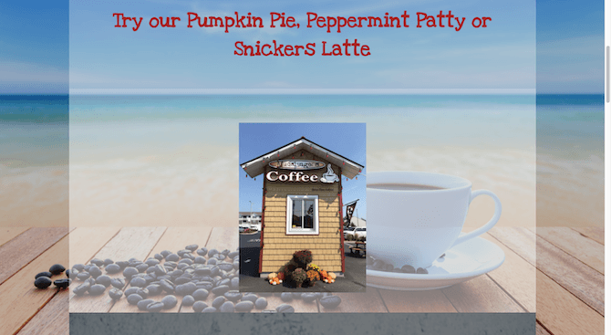
I was tired of hotel coffee, but not quite desperate enough to go to a Starbucks or Dunkin’ Donuts drive-thru. Finding this place was a huge win.
Not only that, when I went up to the window to order, she had two dog biscuits with whipped cream ready to go. Again, it can be difficult trying to wrangle money and coffee with two dogs. But those treats kept them calm and happy while I got my delicious coffee fix.
How do we apply this lesson to the web?
The two experiences I describe above are going to stay with me for a long time to come. It’s not just because they made my trip less stressful and more enjoyable, but it’s so rare to find checkout experiences that feel so personalized.
This lesson can easily be applied to any website with a checkout. The key to finding the right personalized shortcuts or extras is to study your user personas carefully.
Often, we focus on the pain that brings them to our websites in the first place. But if you want to create a pain-free and personalized checkout, then you also need to think about their pain at that moment.
Since you now know that I’m a crazy dog lady, we can use the PetSmart website as an example. As a logged-in user, here’s what the product pages look like for me:
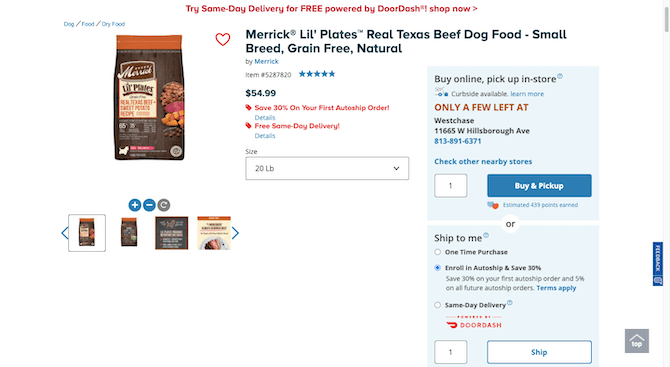
There are five options for buying this product. For dog owners who can accurately predict when they’ll run out of dog food, the Autoship & Save 30% option is fantastic. Just buy it once, set up your delivery schedule and never have to bother with it again.
For dog owners who have to buy their food on the fly, there are tons of other options available. It all depends on how convenient they want it to be and when they need to get it.
Regardless of which option they choose, PetSmart has factored in the pain of realizing too late that you forgot to buy more dog food and relieved that stress at the time of checkout.
For other websites and users, it could be as simple as streamlining the data entry piece as Bed Bath & Beyond does:
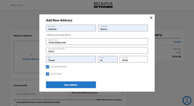
This is a common checkout pain point. Shoppers take the time to fill out the delivery address information, only to find out they have more data to enter. But if the information is the same—as it often is with shipping, billing and profile addresses—why not just enable them to instantly duplicate it?
If you can add personalized shortcuts and other streamlined actions to the checkout experience, you’ll not only increase the success rate but you’ll also improve your shoppers’ overall satisfaction. And the more memorable you make the experience, the greater the loyalty you’ll see in return.
3. Keep the Experience Predictable and Comfortable So Your CTAs Stand Out
If you stay in enough hotels, you generally know what to expect from the experience. Check-in will be at the front desk as soon as you walk in. There’ll be fresh linens waiting for you in the room. Even if there isn’t a dedicated restaurant or breakfast bar on site, you’ll find snack and soda vending machines down the hall from your room.
It’s this kind of consistency that makes even the most novel hotel, bed-and-breakfast or other lodging concept a somewhat comforting experience that guests can ease into. And if guests feel comfortable and confident in navigating the premises and the experiences offered, it gives them the chance to look around and notice the special calls to action around them.
There were a number of times when this happened to me over the course of our journey.
The first time it happened, I had just moved our overnight bags into our room at the Comfort Suites in North Carolina. I fed the dogs and took them for a walk afterward. As we were walking out of the elevator, I noticed a sign I had missed the first time around: Express Checkout.
Directly beneath it was a black box with a slot in the top. There was a note that directed guests to drop their room keys in the slot for an expedited departure. If I hadn’t taken notice of the box, I would’ve ended up stuck in the checkout line in the morning.
Another time I noticed a hotel’s call to action was at the East Bay Inn in Savannah. Check-in was fast and easy. Getting up to the room was easy, too.
The second we entered the room and put our bags down, I noticed the goody bag on the entry table.
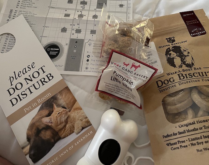
In addition to leaving all of us with a bunch of treats, there was also an envelope included for housekeeping tips.
That’s a really smart move. You add all of this extra value to the guests’ stay and then say, “By the way, if you’re happy with what we’ve done, feel free to reward our staff.” How many people are going to ignore that (optional) call to action when their mouths are full of local popcorn and their dogs are crunching away on healthy snacks?
How do we apply this lesson to the web?
You don’t want to design a website that’s too much of a spectacle. It’s the brand and its offering that should remain the main attractions. When that doesn’t happen, it’s very difficult to spot the calls to action when they appear.
Here’s an example of what can happen if you deviate from what’s expected on a website. This is from Bienville Capital:
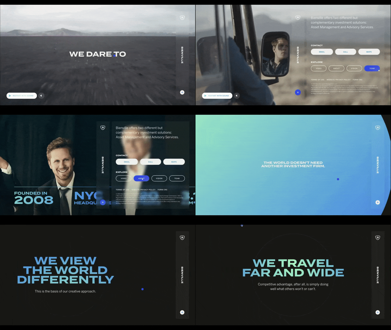
I sped up the video, so you can’t really see how long this took me to navigate. But it’s slow. The blue cursor has a lag, so I’m willing to bet it causes issues for first-time visitors. There’s also the fact that the navigation isn’t where it’s supposed to be and the internal pages scroll horizontally. This site is chock-full of friction.
Like I said, if the site becomes the spectacle, visitors will lose sight of what they need to get done.
So, the goal instead is to flex your creative muscles without doing so at the expense of your visitors’ comfort and convenience. In the case of some brands, that may mean doing less flexing and just focusing on getting the information out there.
When it comes to financial institutions like Satovsky Asset Management, that’s probably a good idea:

It might not be as exciting or experimental as Bienville’s website, but it’s much more effective when it comes to educating visitors and bringing them along on the journey to conversion.
If you can’t afford to risk alienating some visitors or causing those who stay to miss the most important CTAs, then you need to prioritize simplicity, clarity and predictability in the design.
Wrap-up
There are a few things you should take away from this post.
The first thing is the three lessons I outlined above. These are things we know we should be doing, but sometimes it’s good to have a real world reminder of why you have to be careful when designing the UX.
The second thing is that there are lessons all around us—especially when you give your brain a break. When you clear out the stress and deadlines and clutter, you give yourself the freedom to focus on your surroundings. And there are some really interesting and relevant lessons that can be taken from our physical world and applied to our work.
And the third thing is that you need to take a break if you haven’t had one in a while. You might be worried about losing money during that time, but a burned-out brain is no good for creativity and you’ll end up losing focus, productivity and money that way anyway. So, go have some fun this summer!