Google now ranks websites based on how good the mobile experience is. We’re going to look at some design strategies used to make websites extremely fast.
Web developers have a variety of ways to speed up a mobile website. They use optimizations like:
- Fast web hosting and CDNs
- Caching
- Gzip compression
- Image formatting, compression and resizing
- Database cleanup
- HTML, CSS and JavaScript minification
- Render-blocking JavaScript removal
But is that enough? It’s a necessary place to start, but it isn’t going to be enough for many websites.
Web designers need to contribute to solving the problem by creating more lightweight UIs.
What exactly does that entail though? I spent some time testing out websites with Google PageSpeed Insights to try to get a definitive answer.
I started with a sample of the most popular websites around the world hoping to find that they were all optimized to the gills in terms of speed.
YouTube, unsurprisingly, was among the most visited sites according to Ahref’s data. Its mobile loading speeds, however, were a bit of a surprise:
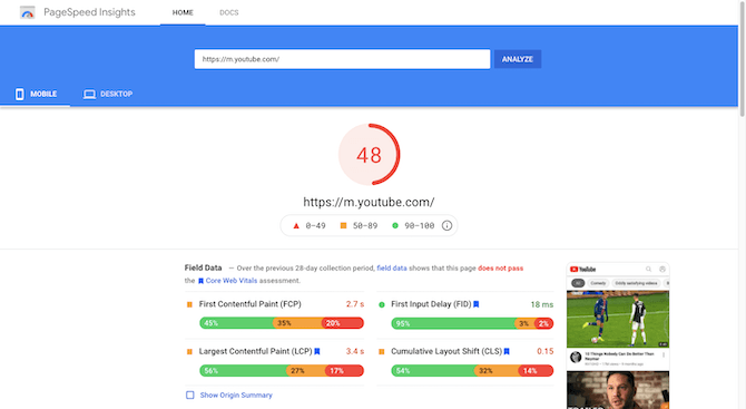
It’s not a great score, considering it doesn’t even breach the so-so score range (50-89).
Wikipedia, on the other hand, had a fantastic mobile score, even with the URL redirect:
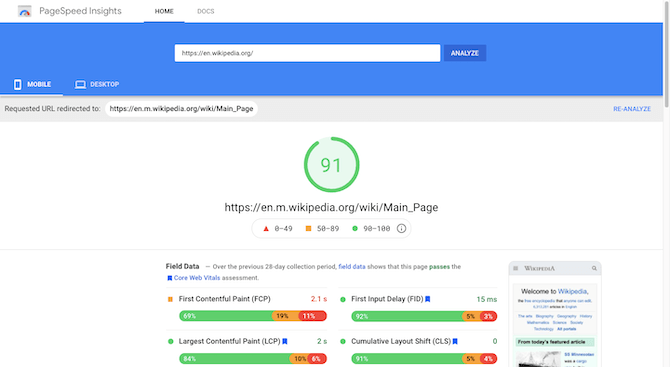
That’s not all that surprising considering how copy-dense the pages are compared to YouTube that hosts videos.
Most of the other websites that rounded out the top 10 were all over the place with their scores:
- Amazon = 51
- Facebook = 91
- Twitter = 73
- Fandom = 16
- Pinterest = 24
- IMDb = 16
- Reddit = 30
- Yelp = 56
With the exception of Facebook’s and Twitter’s mobile sites, most of the remaining top 10 underperformed by quite a bit in terms of speed.
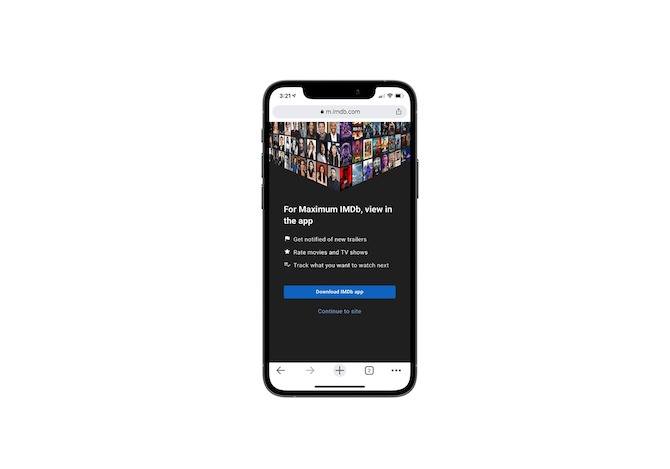
That said, these websites can afford to deliver slower experiences because they have millions of devoted fans who are already deeply invested in what they offer. Plus, their mobile app counterparts can provide a superior mobile experience and the sites usually refer them there for that reason. Just as IMDb does here:
Your website, however, might not have the advantage of having a mobile app counterpart or to have visitors who are understanding of slower-than-ideal page speeds. So, here’s what you need to do:
What You Can Do to Create Lightweight and Faster Mobile UIs
Outside of the top 10 most visited sites, I found some interesting trends.
To start, most of the websites that I expected to be fast on mobile most definitely weren’t. For instance:
- Travel and booking sites
- Entertainment sites
- Food reservation, review and other related sites
- Ecommerce stores
- Digital influencer sites, wedding sites, popular news sites … and so many more
These are the kinds of sites that consumers would have reason to visit on their smartphones and, yet, most of their mobile speed scores were abysmal, like I’m talking between 10 and 30.
As for the speedy mobile sites I discovered (which I consider to be a score of 70 and up—kind of like in school), I was able to identify a number of UI trends that I believe to be responsible for their fast loading times.
Let’s get a look at these sites:
BDS Content
This is the website for Bárbara D. Szteinberg, a translator, interpreter and editor:

Szteinberg’s website receives a score of 82 from Google:
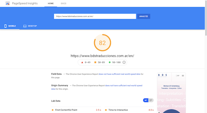
We can likely attribute this high score to the following:
- It’s a one-page PWA.
- Despite the light animation found throughout, each section lazy loads.
- Media files are scarce: there is one photo, three icons and a couple dozen black-and-white client logos. Instead, data visualization elements and geographic shapes keep the visitors engaged with the content.
Boldly
This is the website for Boldly, a London design studio:

Boldly’s website receives a score of 84 from Google:
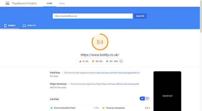
We can likely attribute this high score to the following:
- The home page scrolls vertically, one panel at a time, which seems like a more efficient way to present content since it doesn’t all have to load at once.
- With the exception for some light image rotations, there aren’t any resource-heavy animations or processes happening behind the scenes.
- They’re using Varnish as well as a number of CDNs (Fastly, Cloudfront and S3).
The Karol Hotel
This is the website for the Karol Hotel, a boutique hotel in Clearwater, Florida:
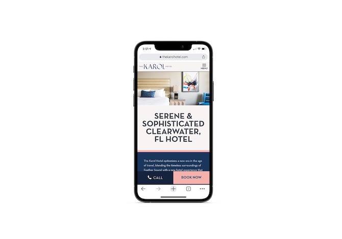
The Karol Hotel’s mobile website receives a score of 84 from Google:
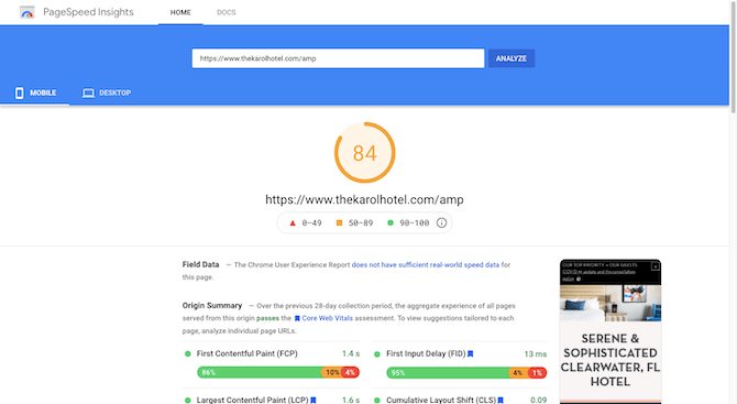
We can likely attribute this high score to the following:
- It uses Cloudflare web hosting and CDN.
- When I ran it through PageSpeed Insights, it directed me to the AMP version of the site. So, that alone is going to vastly improve the loading speeds for the mobile site.
- Despite the size of the site and the number of great looking images on it, it still loads very quickly. It appears as though the images have been resized and compressed before being loaded into the site.
Matt Morris Wines
This is the website for Matt Morris Wines, which is part photography portfolio and part winery website:
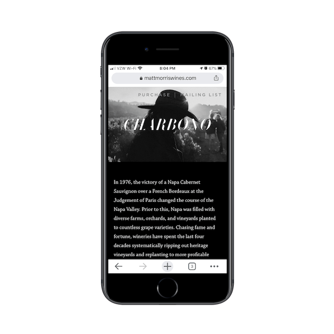
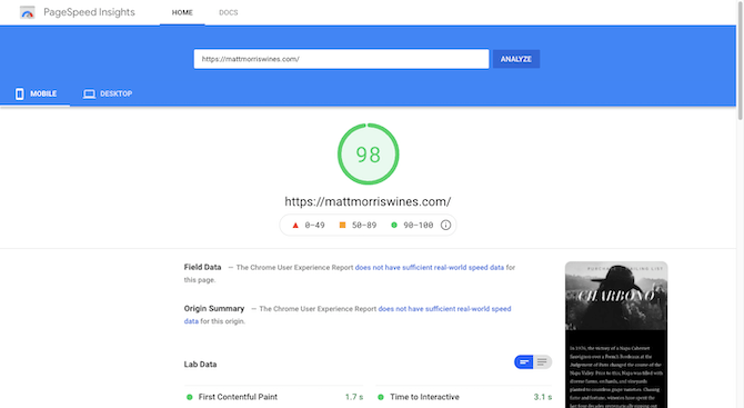
We can likely attribute this high score to the following:
- For the most part, it’s a one-page website. The “Purchase page” only displays four products and the “Mailing List” page links to a subscribe pop-up.
- There isn’t a contact form. The “Contact” button offers to open the visitor’s email client for them.
- There are 17 JPG photos on the site. However, a number of the panels contain numerous images, revealing each as the visitor scrolls. I suspect the designer’s choice to turn each image transparent (effectively phasing it out) as a new one becomes opaque (phasing it in) helps keep things fast as not all images have to load or display at once.
Woof Gang Bakery
This is the website for Woof Gang Bakery, a chain of pet stores in the United States:
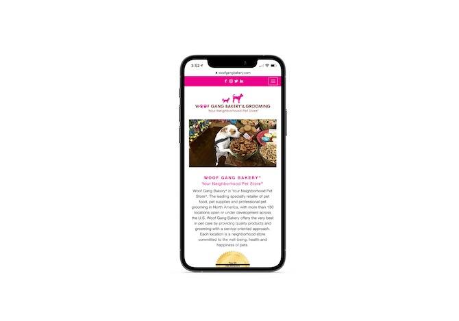
Woof Gang Bakery’s website receives a score of 73 from Google:
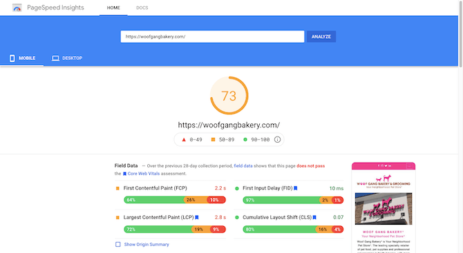
We can likely attribute this high score to the following:
- The site utilizes two web-hosting services: Heroku and Amazon EC2.
- It’s hosted on a Cowboy server and uses a Heroku Vegur Proxy for load balancing, which means it’s optimized for low latency and memory usage.
- It’s connected to a number of CDNs: Amazon S3, Cloudflare JS and CDN JS.
The White House
This is the website for the White House:
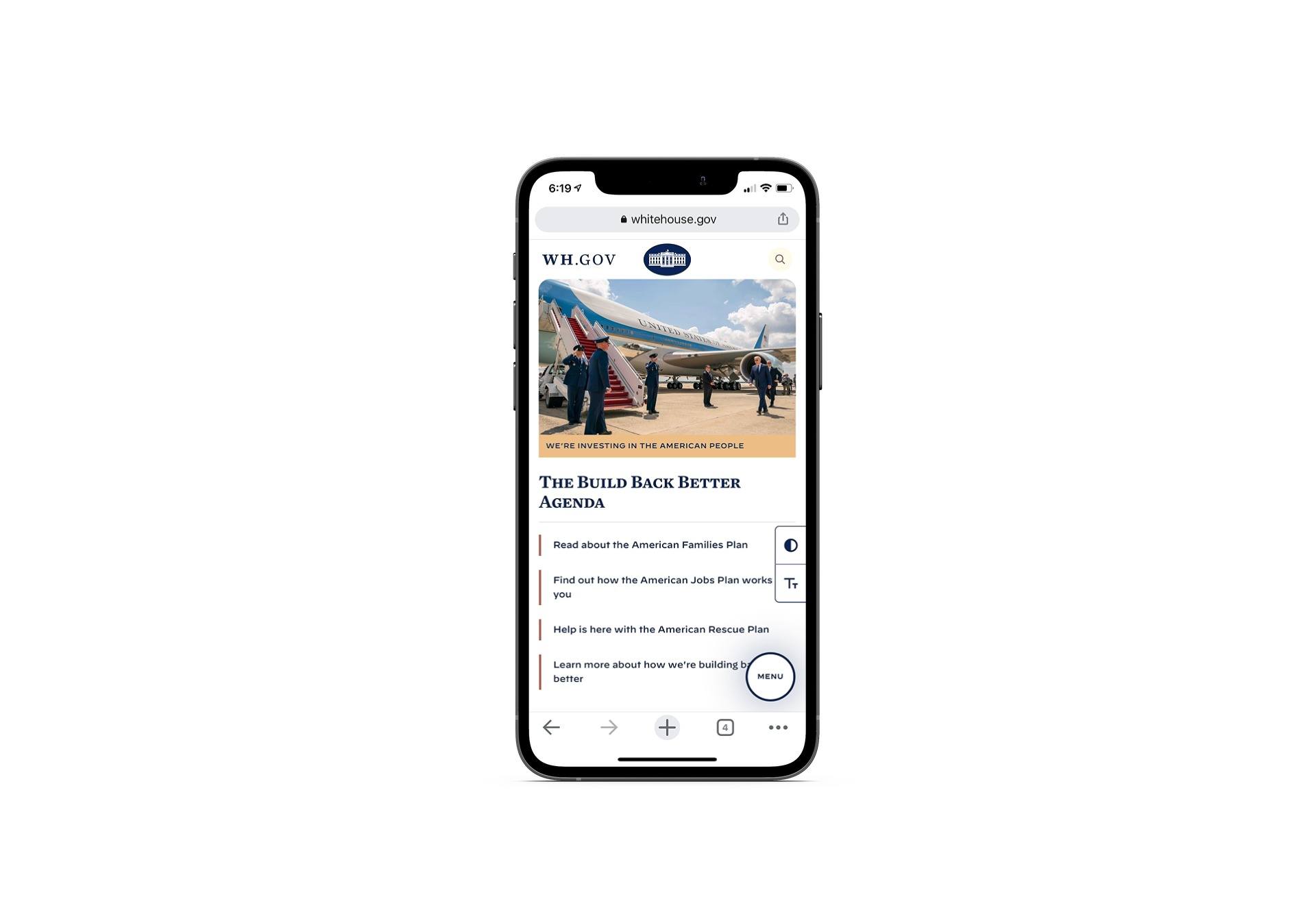
The White House’s website receives a score of 71 from Google:
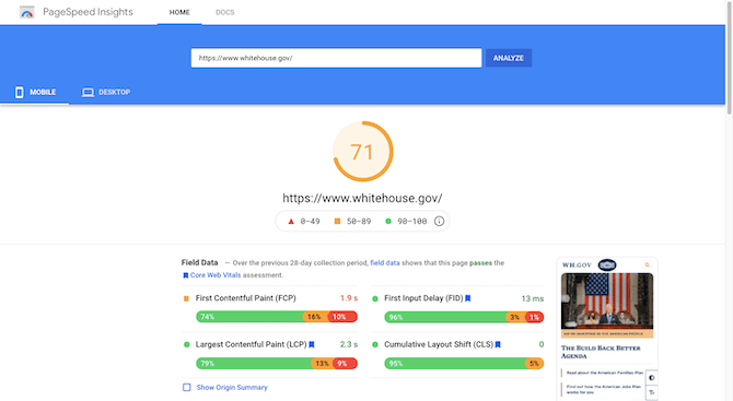
We can likely attribute this high score to the following:
- While the site is large, it has an impeccably neat navigation, with secondary and tertiary layers of pages rather than creating oversized pages that take too long to process.
- Redis caching is enabled, which is a highly efficient way to cache a page when there’s a lot of PHP functions working in the background.
- It leverages the Akamai network for web hosting and CDN functionality.
Wrap-up
Web page loading speed is a really important part of the visitor experience as well as one of Google’s top ranking factors. And as Google’s algorithm prioritizes the mobile experience over desktop when ranking a website, this has become a huge problem because most sites today fail to deliver on speed.
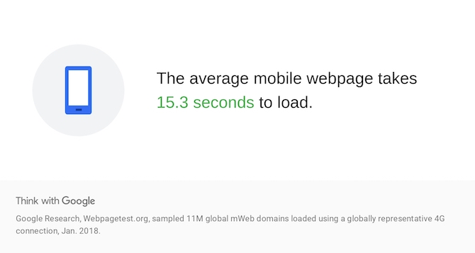
Google Research and Webpagetest.org tested over 11 million websites. And what they found was startling:
We’ve known for years that consumers are really only willing to wait three seconds for a website to load, if that.
So, if the average mobile web page takes over 15 seconds to fully render, your site is going to bleed visitors, leads, sales and customer satisfaction (if they even make it there in the first place).
Here’s what you can do to help keep that from happening:
- Skip the decorative fonts and stick to no more than three web-safe fonts or CDN-served Google fonts.
- Put a limit on how many images you use if you’re not going to enable lazy loading or other delayed-loading techniques.
- Design each page to be as short as possible. When possible, break longer pages up and use internal links and well-laid-out navigations to keep visitors moving between them.
- Don’t use pop-ups, banner ads, loading animations and other resource-hogging extras.
- Consider designing it to be a one-page website or PWA if you have fewer than six or seven pages of information to share.
- Talk to your web developer about installing a CDN—for the whole site or just to serve your image or video assets through.
Use these strategies to trim the fat from your mobile UIs and give your clients’ websites a fighting chance to impress visitors before they go reaching for the browser “Back” button.