We, from the Telerik Reporting team, believe that creating data presentations should be easy and that’s what we always strive to achieve. In this blog post, we will show you how to make a beautiful report with our latest masterpiece—the Telerik Web Report designer.
Why is embedded reporting important? By using reporting, we can keep track and represent data, provide analysis of how the business is going, give information about growth and profits, and so on. It can be used to identify trends over time, make future forecasts and plans, even help us in decision making. Having a reliable reporting tool is a must for a successful business, and Telerik Reporting can definitely help you with that.
Telerik Reporting is a powerful .NET embedded reporting tool that makes the magic of visualizing data easy when you use the different report items we provide. A report can be displayed in most of the technologies that you can think of—ASP.NET Core, Blazor, ASP.NET MVC, ASP.NET Web Forms, Angular, React, Vue, HTML5, WPF, WinForms, UWP and so on.
The Telerik Web Report Designer is an HTML5/JavaScript/CSS3 jQuery-based widget that allows you integrate a report designer into your web applications. It can be added to .NET Framework and .NET Core applications. With it, your users can create or modify existing reports directly from your web application. You can also use it from the Telerik Report Server, which makes editing reports that are hosted on the server much faster.
In this demo, you will see how to create a report showing the latest values of a cryptocurrency. During the report creation, we will use different methods for data representation and styling. Let’s see what we have prepared for you.
Integrating the Web Report Designer to .NET5 Application
The Web Report Designer can be added to .NET Core 3.1 and .NET 5 projects in three easy steps by using the Visual Studio item template:
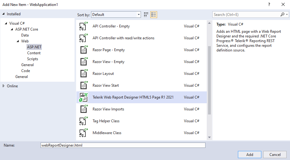
- Right-click over the project -> Add -> New item.
- Select the Telerik Web Report Designer HTML5 Page.
![AddWrd Add New Item - WebApplication 1. Installed > Cisual C# > ASP.NET CORE > Web > ASP.NET. Telerik Web Report Designer HTML5 Page. Buttons to add or cancel.]()
- Follow the Wizard until it is completed.
Once you have added the designer, run the application. To create a new report, click on Menu -> New -> type the report’s name and hit the Save button. This was fast, don’t you think?
Adding the Report’s Data Source
Let’s continue with adding the data source that will contain the report’s data. In this case, our data is in JSON format, and it contains information about three cryptocurrencies—name, image, price, etc.
To add the data source, go to the Components tab -> JSON DataSource. Once the component is added, set it as a value for the DataSource property of the report.
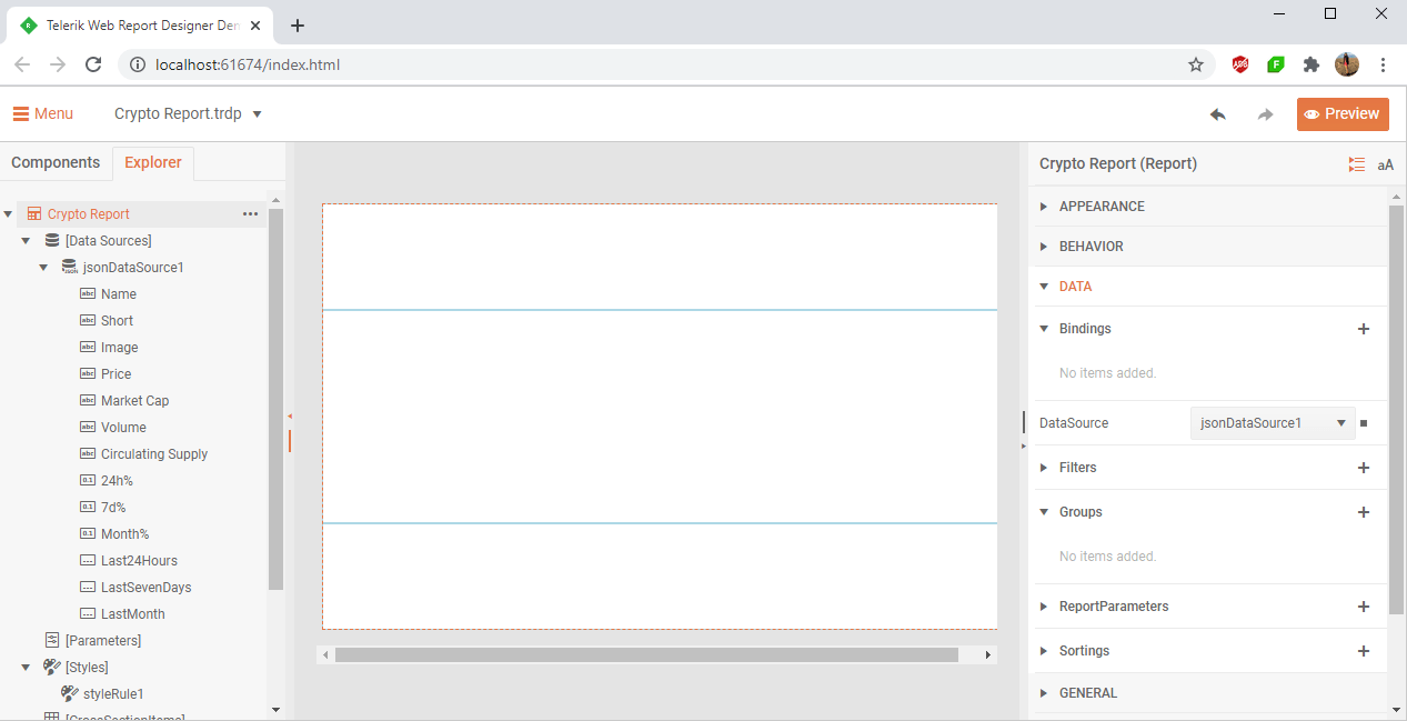
Finally, add a new to Grouping to the report which is based on the cryptocurrency name.
Displaying Information About the Cryptocurrency
In the group header, we will show information about the cryptocurrency name, market cap, volume for the last 24 hours, as well as the circulating supply.
Let’s add the logo of the cryptocurrency with a PictureBox. We will set its Value property to be a field from the data source which is an URL.
Now it is time to display if the percent of the last 24 hours is increasing or decreasing. To do that, add a TextBox and set its Value property to be: “= Fields.[24h%] +"%".”
To make it even fancier, add a Panel and move the TextBox into it. We want to color the Panel depending on the percent value. By using ConditionalFormatting in Telerik Reporting, you can change the visual appearance of the report items based on the changing conditions in the report data without any coding or events.
In our scenario, we will set conditional formatting rules for the font color and background color of the TextBox. If the percent is more than 0, we will color it in green, otherwise in red.
We will also add a triangle shape in the Panel that will indicate if the percent is going up or down. Set the following properties of the ShapeType:
- Type: Polygon
- StartAnglе: 270
- VertexCount: 3
- Also, mark the Stretch property.
Define a new Binding to the Shape in order to set its Angle depending if the percent is increasing or decreasing:
- Path: Angle
- Expression: = Fields.[24h%] > 0 ? "0" : "180"
Click on Preview to see the current outcome:

Identifying the Trends for the Last 24 Hours
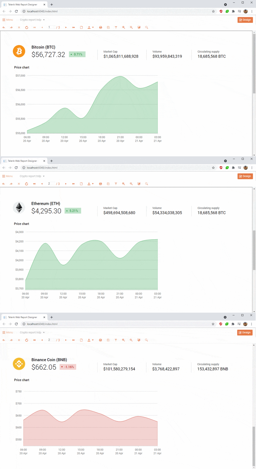
What is a report without any graphs?! We want to see the growth and decrease of the cryptocurrency value by using a chart. It will show us the movement of the cryptocurrency’s price for the last 24 hours.
To do this, go to the Components tab -> Charts -> Area. Set the graph’s DataSource, Categories and Value properties. Again, we want to color the graph’s area if the percent of the last 24 hours is increasing or decreasing. For that reason, we will add two Conditional Formatting rules to the areaSeries.
We also want to set the Minimum and Maximum Scale Value of the XAxis and YAxis by adding a Binding to the Coordinate system, as well as special Label Format of the XAxis.
Let’s preview the outcome:
Showing Past Data
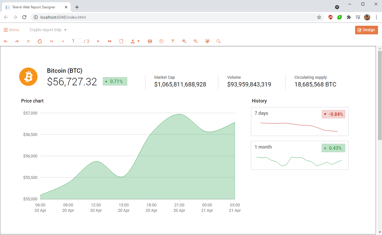
Of course, we are also interested in the past values of the cryptocurrencies. What better way of getting this information than using charts that represent the movement of the values for the last week and for the last month. This is something that can help us decide whether to invest or not.
This time, we will use line charts and, again, we will define some style rules depending on the values. Again, by defining conditional formatting rules, we will color the graph series based on the percent of increase or decrease. And here is the outcome:
Sell / Hold / Buy?
So far, so good. We displayed the data. However, there is one big question remaining—should we invest or not? Let’s add a risk indicator that, based on the health value which comes from the data source, will “advise” whether to sell, hold or buy. Add a TextBox and use the following Expression for its Value:
= Fields.Health < 300 ? "Sell" : (Fields.Health > 700 ? "Buy" : "Hold")
Let’s continue with inserting three Shapes colored in red, yellow and green. Set the following properties of the ShapeType:
- Type: Polygon
- StartAnglе: 45
- VertexCount: 4
Add a fourth Shape with Line type that we will use to indicate the value. It will be moved based on a value through a Binding for the Location.
We use bindings to make modifications of the report items at runtime. While the report is being processed, the expressions are evaluated, as are property values. Expressions can include a combination of operators, constants, references to built-in values and even external or custom code.
And voilà! We are done with our master report prepared in the Telerik Web Report Designer. Below you can see the result.
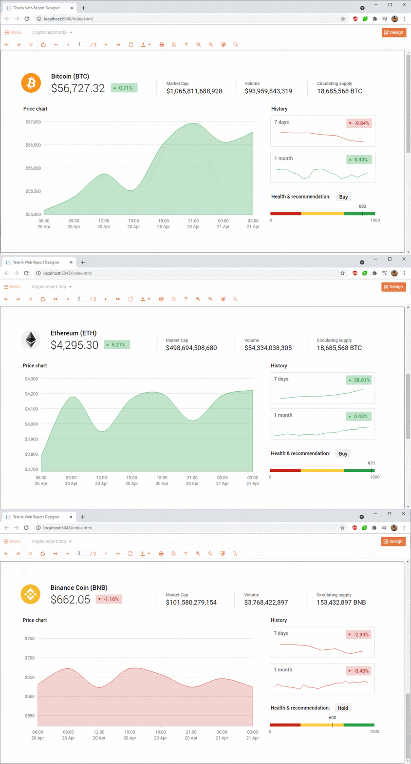
You can also review the report in our online demos—Crypto Dashboard Report Demo. The full project can be found in our GitHub repository with sample projects.
Want to Try Telerik Reporting?
Telerik Reporting is a complete, easy-to-use and powerful .NET embedded reporting tool for web and desktop applications that support: Blazor, ASP.NET Core, ASP.NET MVC, ASP.NET AJAX, HTML5/JS, Angular, React, Vue, WPF, WinForms and UWP. Also available as a part of our Telerik DevCraft bundles, Reporting allows you to create, style, view and export rich, interactive and reusable reports to attractively present analytical and any business data. Add reports to any business application through report viewer controls. Export the ready reports in more than 15 formats.
