The second major release of 2021 for Telerik UI for Xamarin for is here, and it’s packed with exciting new components and improvements for you to enjoy.
We understand UI design is a highly important part of every mobile app, and our brand new Badge and Shadow components can help you achieve appealing designs. We’ve also enhanced our Barcode control with the newest Swiss QR symbology and improved font support for the PdfViewer control. Read on for more details.
Badge
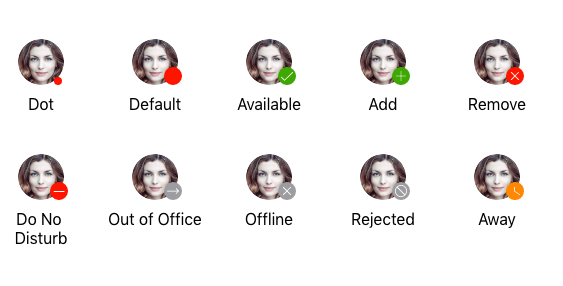
Badges are those small notification icons placed at the corner of the view and used to subtly alert users of your app to status changes, notifications or short messages. With the newest addition to the Telerik UI for Xamarin suite, namely RadBadgeView control, you can easily create and display badges in your Xamarin apps. Take advantage of some of the predefined badges or create one from scratch—either way BadgeView is here to help achieve the desired look and feel for your users.
Let me quickly walk you through the key features of our Xamarin BadgeView control:
- Predefined badges types – choose any of the predefined badge types used in the most common scenarios:
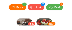
- Badge position and alignment – easily position the badge at the exact location you’d like it to appear:
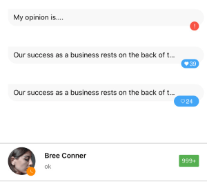
- Badge animation – display the badge with initial scale animation, control the animation duration and easing:

- Badge styling and customization – fully control the visual appearance of your badges so they fit to the design requirements you have. You can modify the badge text, font settings, colors (text color, background color, border color), size and corner radius. Furthermore, if you need even more refined customizations, you can directly modify the Badge ControlTemplate. For detailed information on the styling options of the control, go to Badge Styling and Badge Customization topics in our documentation.
Shadow
You asked and we listened: Shadow functionality was one of the most requested features in our public feedback portal—that’s why I am very excited to share the news with you. With R2 2021 release, we’re shipping RadShadow—a shadow control that can add a highly customizable shadow effect around any view you might have. The Shadow can be integrated with ListView items, input controls, buttons and others in order to achieve a nice modern user interface in your application.
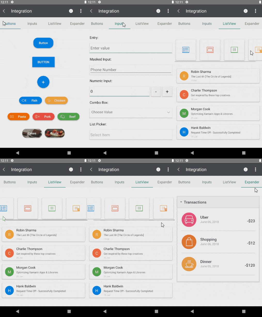
You can easily adjust the shadow look and feel—just play with its color, position, transparency, corner radius and blur radius settings to achieve the ultimate result on Android and iOS:

Swiss QR Code
The QR-bill makes issuing and paying invoices simpler, and is being introduced throughout Switzerland to modernize payment transactions. Its most striking feature is the Swiss QR code, which contains all the payment information in a digital format, which can be read using a smartphone or a slip scanner.
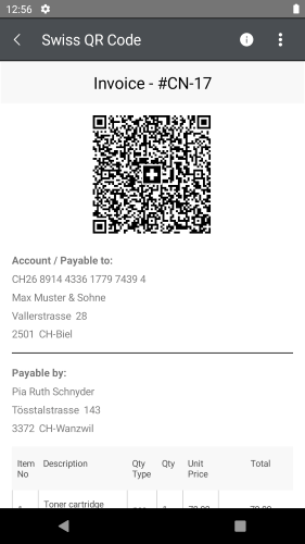
The Swiss QR Code encodes all the information necessary for a payment in specific format and structure. Along with the printed information, the Swiss QR Code forms the payment part of the QR-bill. The allowed currencies for payments are CHF and EUR. The QR-bill also guarantees compliance with the regulatory requirements arising from the revised Anti-Money Laundering Ordinance. All this, built right into RadBarcode, the control you already know.
PdfViewer Updates
If you often work with PDF documents, you may have experienced issues with incorrectly displayed texts due to missing fonts in various PDF viewers. RadPdfViewer for Xamarin works with 14 standard fonts, such as Helvetica, Courier, Times New Roman, etc. (you can find the complete list in the PdfViewer Fonts topic). And in case the PDF document uses a different font, for example, any TrueType font, you’d need to take care of this and explicitly provide the font data to the viewer.
Now, with R2 2021 release, RadPdfViewer for Xamarin comes with a built-in mechanism for importing custom fonts. For the exact approach, please check out our guide here: PdfViewer: Registering a Font.
Telerik and Kendo UI Community Forums Revamp
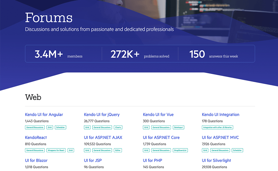
And last but not least, we revamped one of the favorite places that developers love hanging out—the Telerik and Kendo UI Community Forums. Check out the complete story of why and what in the dedicated blog post.
Try It Out and Share Your Feedback
R2 2021 release is already available for download in customers’ accounts. If you are new to Telerik UI for Xamarin, you can learn more about it via the product page. It comes with a 30-day free trial, giving you some time to explore the toolkit and consider using it for your current or upcoming Xamarin development.
We would love to hear what you think, so should you have any questions and/or comments, please share them in our Telerik UI for Xamarin Feedback Portal.
Sign Up for the Webinar or Catch Us on Twitch
Don't forget to sign up for our release webinar on Tuesday, May 18 at 11 am ET to learn more about the latest features. You can also catch our live sessions on Twitch on May 19 from 9:00 – 10:30 am ET and May 20th from 1:30 – 3:00 pm ET, where our developer advocates will dive into all your favorite features.