57% of the time people spend on our fintech homepage is dedicated to the content above the fold. Knowing this, what kind of first impression do you think your hero image makes with prospective users? If you’re not feeling confident that it’s a good one, here are 5 ways to fix that.
When it comes to designing your fintech app’s website, there’s one component in general you have to be careful about creating: The homepage hero image.
It’s usually the first thing people look at when they enter your website and it could realistically make or break their decision to click the “Download” or “Sign Up” button.
In this post, we’re going to look at what makes for a click-worthy hero image design for fintechs along with some examples you can follow.
Designing the Hero Image for Fintech
What is the goal of the hero image? Similar to splash screens for apps, the website hero image allows you to provide users with an attractive and descriptive introduction to the product. If it doesn’t quickly convey what the product does and make an enticing offer, you’re likely going to lose a lot of people.
We’re going to leave the copy accompanying the image to your writer. For now, let’s focus on five things you can do to enhance the design of your hero images and encourage more app signups in the process.
1. Take It to the Fold
An NNG study in 2018 took a look at the correlation between the parts of a web page and how much attention was paid to each.
Here’s what it found:
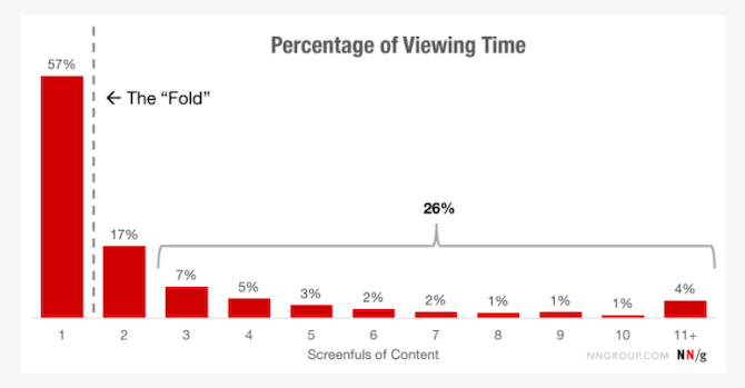
57% of the total time spent on a page is focused on the content above the fold. While that might suggest that it’s better to shorten the hero image so that more content and sections can be visible at once, I’d argue that it means the opposite.
The first reason why is because internet users are smart. They know that if a website prevents them from scrolling—which is a natural instinct at this point—they need to go to the navigation. So, it’s not like the visibility of the next section of content provides a signal to scroll.
Secondly, the hero image deserves to be seen without distractions. When you allow more content to peak out from above the fold, you risk giving visitors too much to process at once. And with a technical solution like a financial app, that could be a problem.
Instead, make the first impression really count. Design a simple, yet eye-catching and visually descriptive banner to match your writer’s concise and convincing sales pitch and CTA.
Here’s one example of how to do this from Honeydue on desktop:
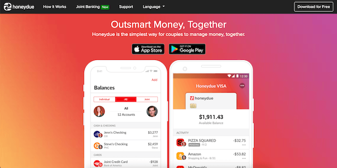
There’s no doubt what this app is for, and the preview even allows users to get a sense for its ease of use, too.
On mobile, the same exact hero image is used. The only difference is that the surrounding white space is gone:
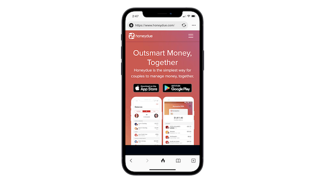
The banner doesn’t go all the way to the fold, but that’s okay. While we can see the darker part of the next section, it doesn’t take anything away from the engaging visuals as well as the promise that sit front and center.
2. Leave Users with One Clear Choice
I know it’s tempting to present prospective users with a variety of options:
- Learn More About the Product
- Download on the App Store
- Try the Demo
But, really, if you know your user persona, then you know the journey they’re most likely going to take from discovery to conversion. And knowing this, your hero image should present them with the CTA that makes the most sense for all visitors.
Let’s use the example of Venmo:
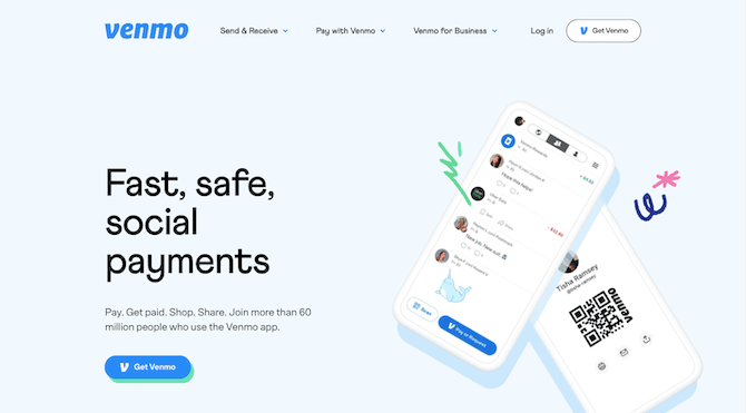
Here’s how people might view this hero image based on where they are in the sales funnel:
Top-of-funnel visitors (those in the discovery phase) will look at this and think:
- “Fast, safe, social payments” sounds promising.
- Looks like I can pay and get paid really easily with this app.
- Hmmm… Not sure I’m ready to sign up yet. Let me scroll down and see what else there is.
Even though they might not be ready to convert, the seeds have been planted. They know what they potentially stand to get by downloading this app and they know where and how to get started.
Bottom-of-funnel visitors (those ready to take action) who return to the site or page will look at this and think:
- Yep, this looks perfect for my needs.
- 60 million+ users will come in handy as I expand my network of people to pay and get paid by.
- Alright, let’s do this.
If the banner contained a variety of CTAs, though, the choice might not be as fast or as clear a one to make. Go ahead and make that choice for them by simplifying next steps. People who are still on the fence know what they need to do to better inform themselves and can go hunting for more information on the app while the rest can instantly click through to get started.
3. Choose the Right Imagery
There’s no specific formula when it comes to designing a background or imagery for your fintech hero banner. That said, here’s something to think about before you settle on a design:
What’s the goal of the product?
I’ve seen fintech hero images where smiling users take a front seat to the app that’s barely visible on a device placed in the background. Here’s what I’ll say to that:
Of course you want your users to be happier once they start using your app. However, that’s not typically the end goal. Users download and/or purchase fintech apps for more pragmatic purposes.
They have a problem that they need solved by a highly technical solution. Budget management. Investing. Invoice generation. And your app is designed to take that complexity out of their lives.
So, doesn’t it make more sense to position your product front and center and show them right away what they can accomplish with it? As opposed to highlighting some superficial response to using the app, like people smiling around a conference table?
Here’s an example from Acorns that I think works nicely:
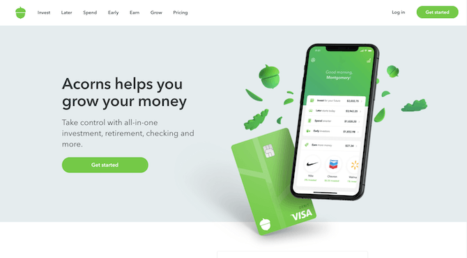
The design is simple, clean and very descriptive. It would take a visitor no more than a couple seconds to realize Acorns gives them an app and a VISA card with which to grow their money.
If you feel as though something this simple and tech-centric doesn’t conform to your branding, that’s fine. There are other ways to handle designing the background and imagery for your hero image.
Here’s an animated example from Betterment:
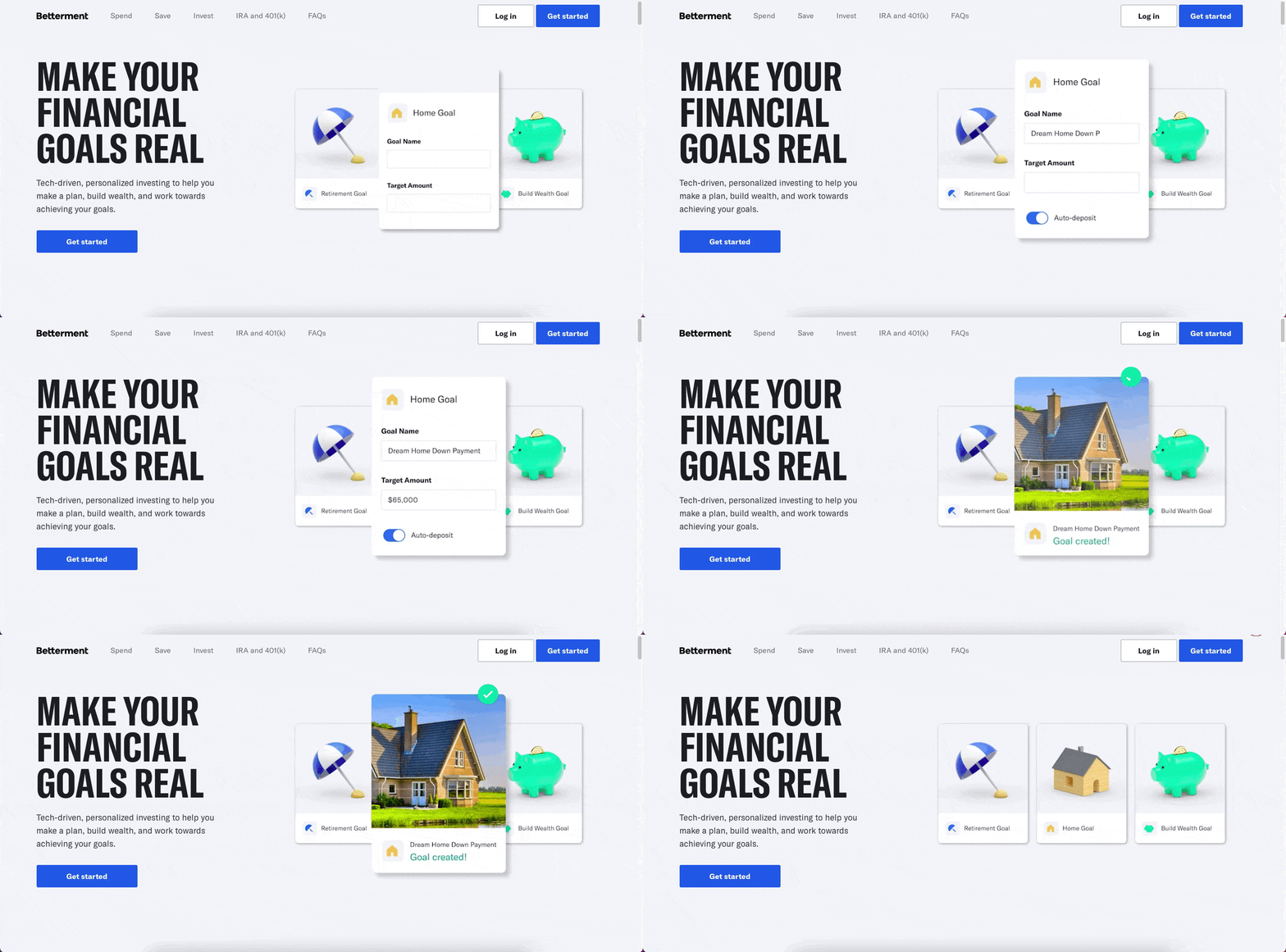
This design is unique in that it’s not just an image of a smartphone or desktop monitor with the app on it. This one actually shows people how easy it is to set goals—which is a critical component of an app like this. And it keeps you from having to settle for a stock photo of people that won’t be very effective at selling the solution.
4. Add Meaningful Trust Marks
Any time you build an app where money is involved, trust needs to be baked into the design.
With fintech, there are a number of ways to gain the trust of prospective users without overwhelming the hero image design or messaging.
Take a money management app like Emma:
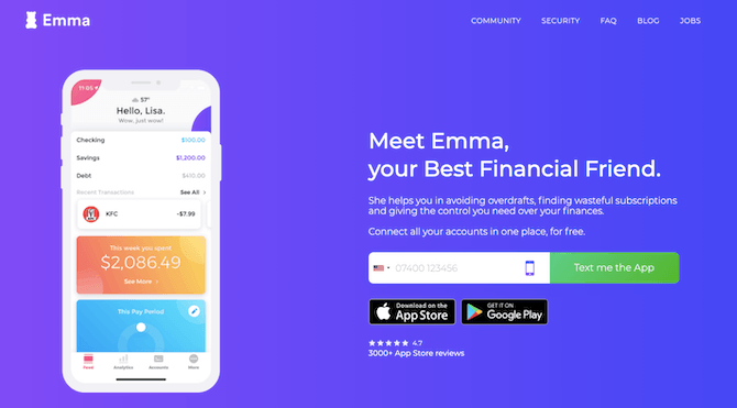
Look below the app store buttons and you’ll find Emma’s trust mark. It’s a 4.7-star rating (as opposed to an unrealistic 5-star) from over 3,000 app store reviews. Someone wondering if it’s worth taking the leap might need only see that to be convinced to convert.
Here’s a different type of trust mark found on the FreshBooks hero image:
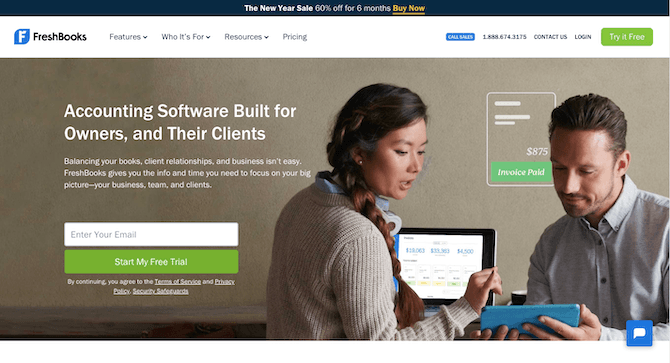
FreshBooks provides prospective users with links to three of its policy pages:
- Terms of Service
- Privacy Policy
- Security Safeguards
And it does this right beside the very first form and CTA on its website. As we’ll see in tip #5, this is a much better way to inform users about privacy matters while gaining their trust early on.
Of course, there are other ways to build trustmarks into this section. You might want to include a notice about being an FDIC member, a TRUSTe privacy certification seal or a testimonial from a powerful organization or publication that vouches for the app. It all depends on why users may be doubtful or concerned about taking the next step and what sort of trust builder will ease those fears.
5. Minimize Distractions
Just as it’s a good idea to design your hero image to hit the fold, it’s also wise to remove any distractions that would keep visitors from focusing on the hero image.
Let’s look at the example of Blend:
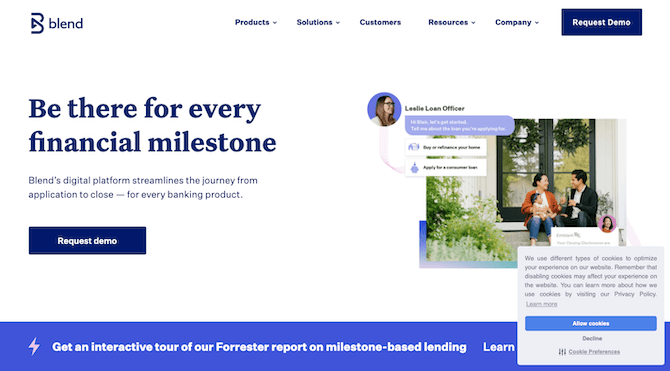
I’m willing to bet that heatmaps and user recordings would reveal that visitors are immediately drawn to the pop-up messages at the bottom of the screen instead of the hero image.
The one in the corner is, of course, an essential notice to share with visitors. However, considering how pervasive these cookie consent notices are, chances are good that most visitors will blindly accept the terms without considering the ramifications of that decision. There’s a better way to handle this, which I’ll explain below.
The other distraction promotes a Forrester report. There are two reasons why this one needs to go.
For starters, it can’t actually be engaged with until visitors deal with the cookie consent notice, so it’s likely to cause undue frustration within seconds of someone entering the site. Secondly, something like this should play a secondary role to the primary goal of the site (i.e. to turn visitors into paying users), though it’s not designed that way.
It gets worse on mobile:
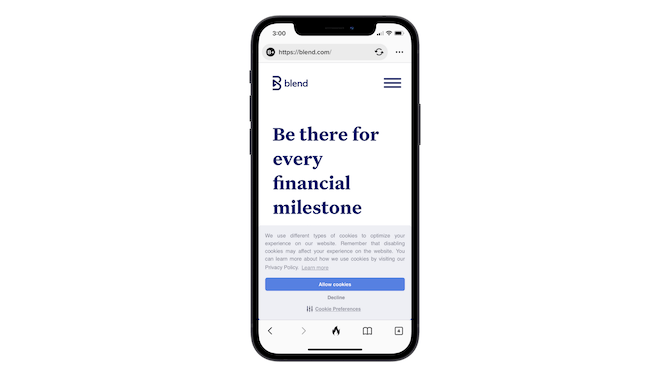
This is the first thing visitors see when they enter the site. Only the headline is visible above the large cookie consent notice.
While this notice is necessary for GDPR and CCPA compliance, there’s nothing that says it needs to be given the second someone enters the site. In fact, it’s probably better to insert this notice when it becomes relevant—like someone filling out a form or making a purchase.
Here’s the second problem with Blend’s mobile site:
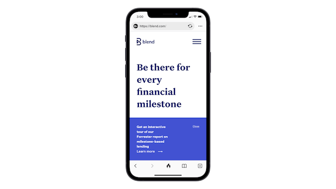
After visitors deal with the cookie consent bar, they see the big blue bar promoting the Forrester report. Still, the hero image remains compromised as roughly a third of the screen is covered by this sticky pop-up.
This banner should only appear on pages where it’s relevant or, at the very least, once visitors get further down the homepage. There’s no reason the main message of the site should be covered up like this.
Only after the two pop-ups are dismissed do mobile visitors see part of the hero image:
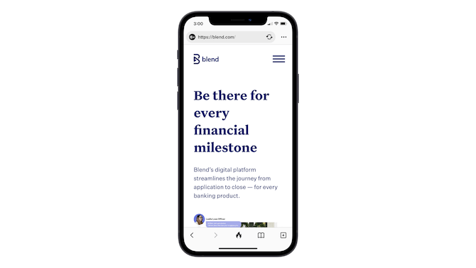
Even then, the image and the “Request demo” button are hidden beneath the fold.
Rather than take up so much precious space and so many valuable seconds to capture the attention of prospective users, move the distractions out of the way.
Wrap-up
Considering how much time is spent looking at the content above the fold on your homepage, you should pay extra special attention to the design of your hero image. Do it right and you could make a strong and lasting impression with prospective users in a matter of seconds. Do it wrong and you could lose them to the competition forever.
The five tips above will help you remove the distractions, ease the decision-making process and boost confidence so that yours is the only app they want to use in the end.