Having the ability to put data into the hands of your users is a good thing. This is a valuable feature for a lot of different apps, too. For instance:
- Project management tools that enable users to track and manage their tasks
- CRMs that help users keep tabs on prospects and clients, sales pipelines and cash flow
- Gaming apps that display statistics, progress bars and more
- Marketing and sales tools that provide performance analytics
- Booking apps that turn location data into interactive maps
But it’s not just the inclusion of a data visualization feature that matters. How it’s designed within the space of your mobile app matters as well.
So, today, what I’d like to do is briefly talk about what good data visualization design can do for your users’ experience. Then, I’m going to share some tips for improving data visualizations in mobile apps.
Why Data Visualization Matters for Mobile App Users
Let’s be honest: Even though big data has definitely improved the way we run our businesses as well as our lives, not many people enjoy having to pore over that data to get meaning from it.
Data visualization is, of course, a useful solution for this.
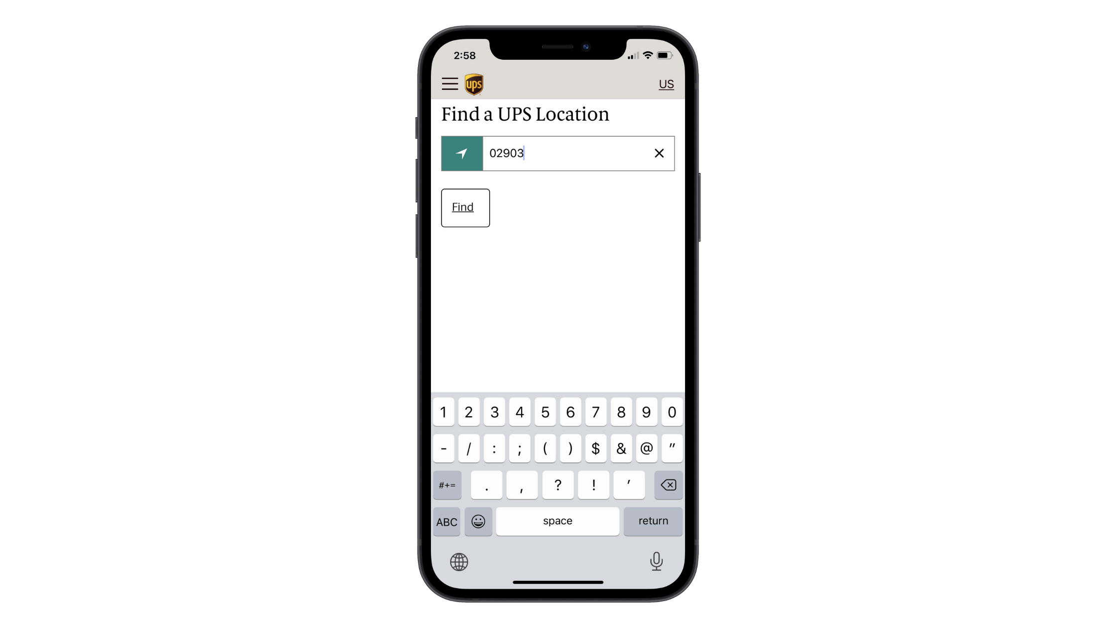
Take, for instance, the UPS mobile app’s location finder tool:
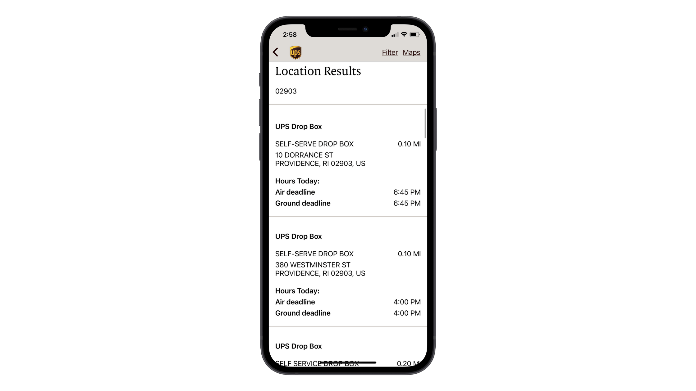
UPS is a huge company, with more than 5,000 stores across the United States and Canada. In metropolitan areas like Providence, users might realistically end up with dozens of nearby locations to choose from.
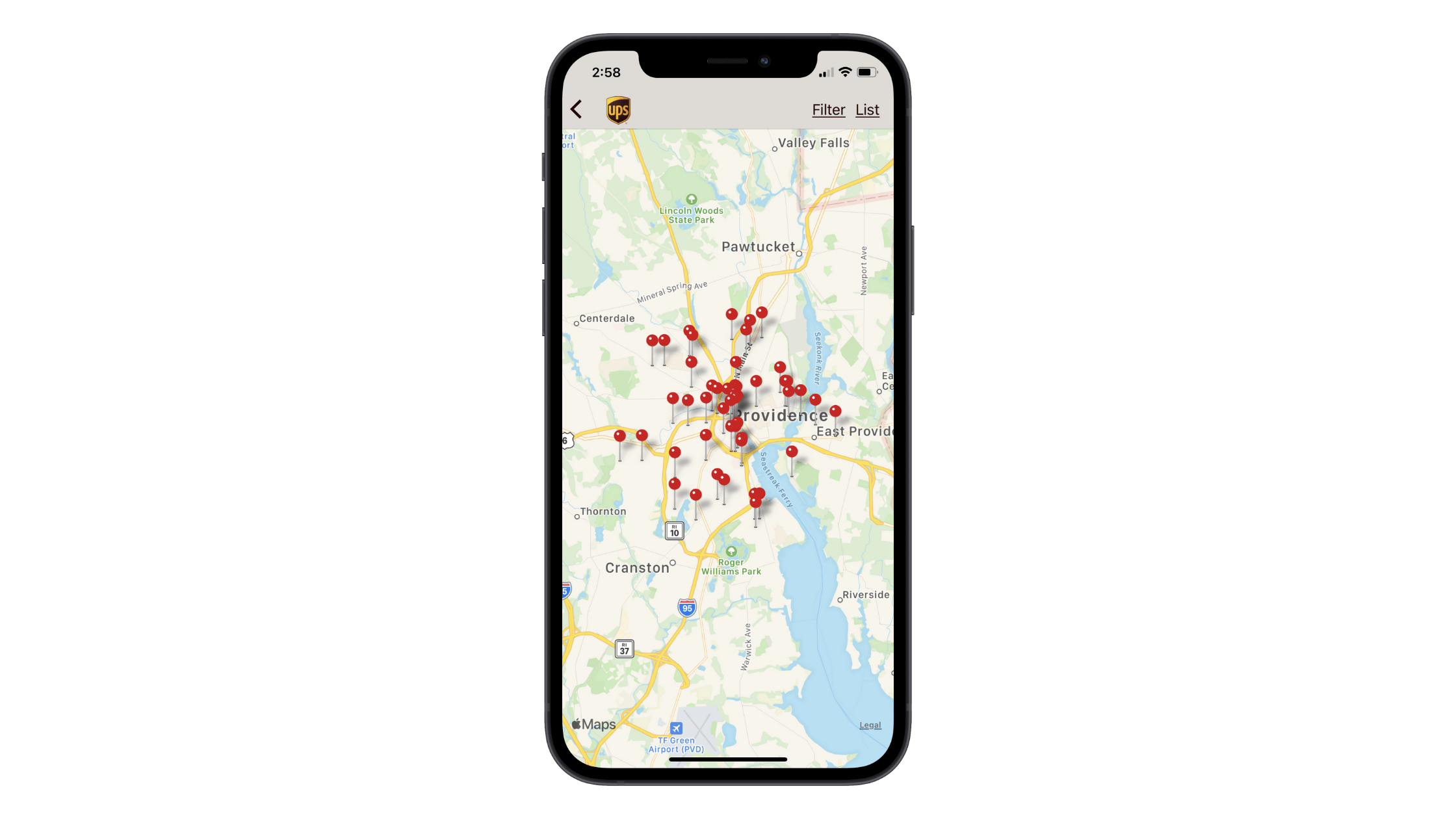
This is a lot of information to digest at once. By visualizing this data on a map, however, users can more quickly pick out the stores nearest their location:
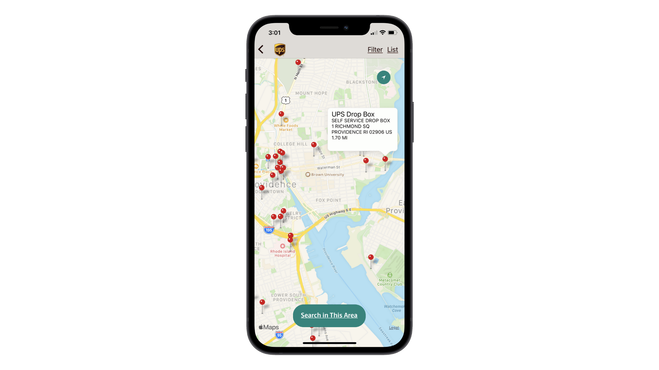
What’s also nice about this data visualization is that the corresponding location data doesn’t show until the user clicks on one of the pins:
This makes all of this information much easier to digest as they only need to consider one location at a time.
This is one such way in which good data visualization design can improve a mobile user’s experience: To hasten the research and decision-making processes.
Good data visualization takes all that ugly raw data and turns it into something beautiful and, in turn, improves the user’s:
- Comprehension
- Comprehension speed
- Pattern detection
- Monitoring
- Analysis
- And more
As a result, your users can make better, more confident choices for themselves or for their businesses. And when this occurs, you’ll find that they engage with your solution more frequently and become more loyal advocates of it.
So, again, this brings me back to my original argument. It’s not enough to translate raw data into a graphic. It needs to be done in a way that doesn’t frustrate, confuse or otherwise hinder the users’ experiences with the app.
Next, we’ll look at what you can do to ensure that your data visualizations add real value.
How to Make Data Visualization Design Better on Mobile
In 2019, I did a write-up on the 5 tips that would help designers improve data visualization design:
- Choose the right type of data visualization element
- Don’t be creative with copy
- Only include what’s necessary
- Order the data logically
- Be careful with color
It’s been over a year since I wrote that post, but all of those tips are just as true today as they were then. That said, if we’re specifically talking about data visualization design for mobile apps, I have a few more tips I want to add to the list.
If you’re curious to know where I pulled the following examples from, they’re all Telerik Xamarin UI components and samples:
1. Minimize How Many Data Visualizations Are Shown at Once
One of the reasons you use data visualizations instead of tables or long lists of information is because they’re easier to focus on and faster to understand. However, placing too many visualizations in a given space could cause users some issues.
So, you’ll need to think about how many graphics you can reasonably show at once without it becoming cognitive overload.
For example, with something like a gauge, it’s probably best to only show one at a time:
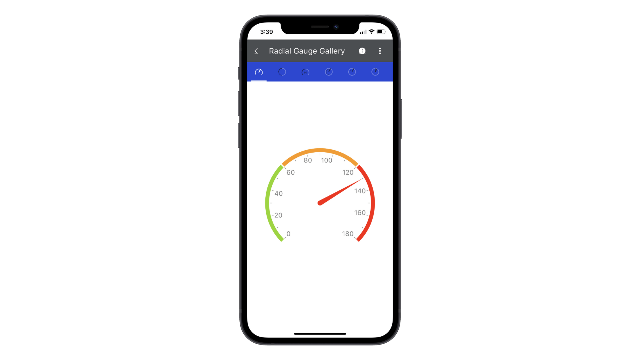
It’s not like this is a difficult graphic to interpret. It’s perfectly sized and the numbers are as clear as day. However, the information contained within something like a gauge is very precise and deserves its own space, free of distraction.
On the other hand, more traditional data visualizations like graphs and charts can be shown simultaneously. Within reason, of course.
Here’s a CRM sample that shows how that could work:
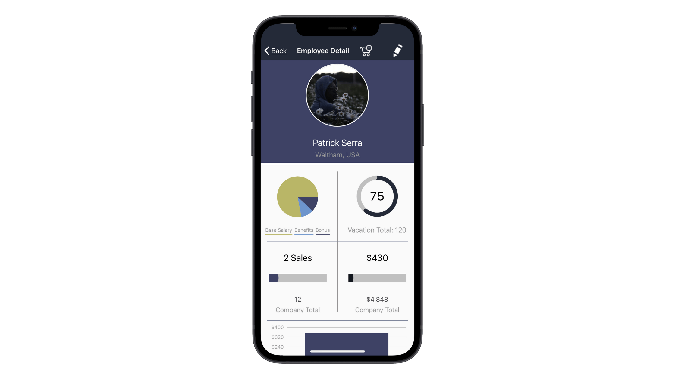
This is an employee profile page. There are four data visualizations here, but I think it’s okay that they’re displayed all at once.
One reason is because they each have a distinct design, so someone familiar with the app would know immediately where to look to find the relevant data point. Also, this selection of data tells a “story” about the employee, which can be valuable for employers and HR managers who use this portal to evaluate their team.
One thing I will say, though, is that if you do place multiple data visualizations together, order them based on priority just so you make it easier for users to find the most important data.
2. Design It with Click Confidence in Mind
Not every data visualization is going to be interactive. The gauge above, for instance, is a graphic that wouldn’t need someone to click on it for them to understand what they’re seeing.
Charts and graphs don’t usually need to provide additional information either. So long as there are labels for the x- and y- axes or a legend down below, interactivity isn’t really necessary. Like this photo analysis sample:
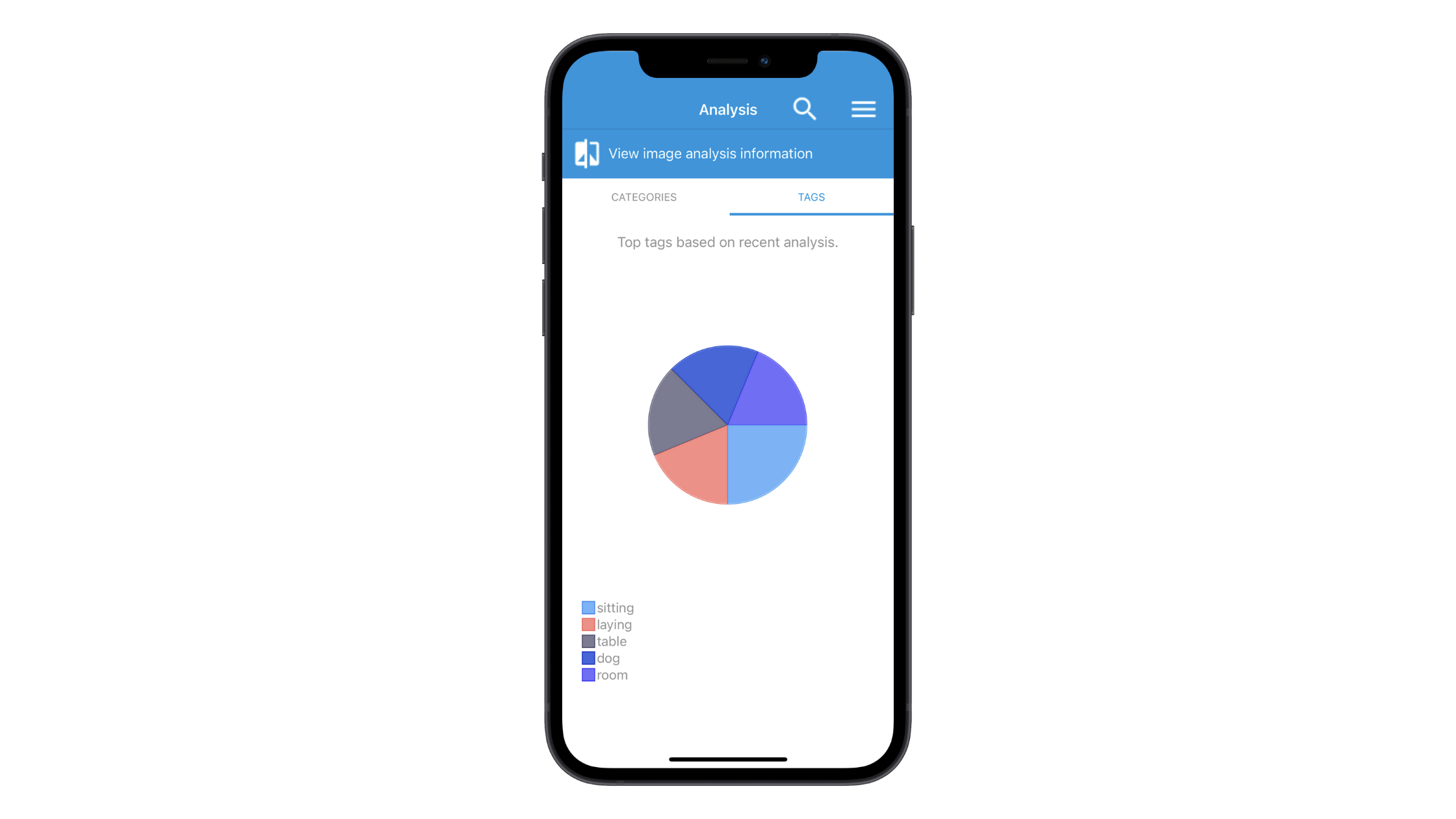
That said, think about something like a seating chart for a plane or a stadium. It would be very difficult to place all the details about the section, seat numbers and other pertinent information within or even outside the graphic.
This is where designing your data visualizations to be clickable comes in handy.
Let’s look at this map component as an example of how valuable this feature is:
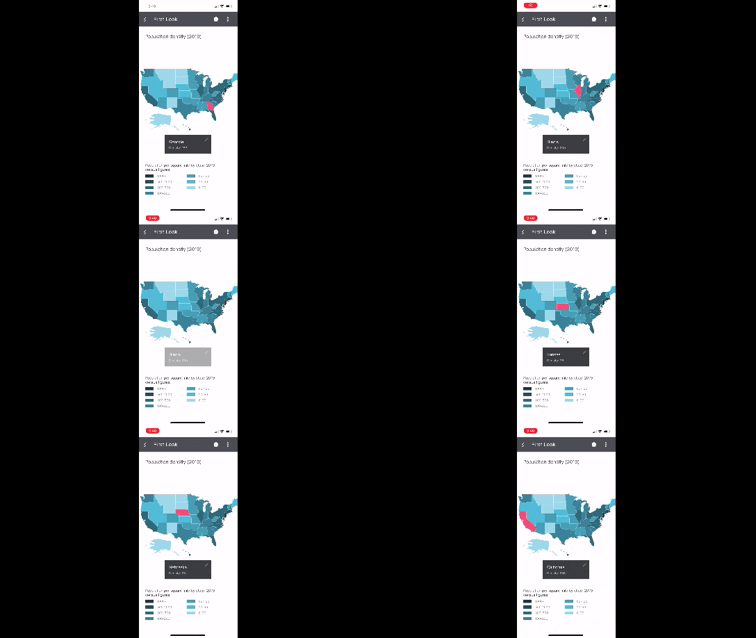
Notice how the user doesn’t need to zoom in and out of the graphic to get additional information about each state. As long as each individual component in your visualization is large enough to tap on, this is a great way of displaying a lot of information within a very truncated space on a mobile app.
3. Allow for Personalized Views and Filtering
One of the beautiful things about presenting data in a graphical format is that there are often a variety of ways to handle it. While you as the designer know what’s best in terms of overall usability, there’s going to be some differences in terms of personal taste you can account for as well.
Rather than hope you choose the design or layout that appeases most users, give them the option to customize it themselves.
There are a number of ways to do this:
- Dark/light mode toggle
- Normal/high contrast toggle
- Customizable dashboard widgets
- Chart, graph or table filters
- View alternatives
Let’s have a look at how you might handle the last one with a scheduling component. This is what it looks like in the agenda view:
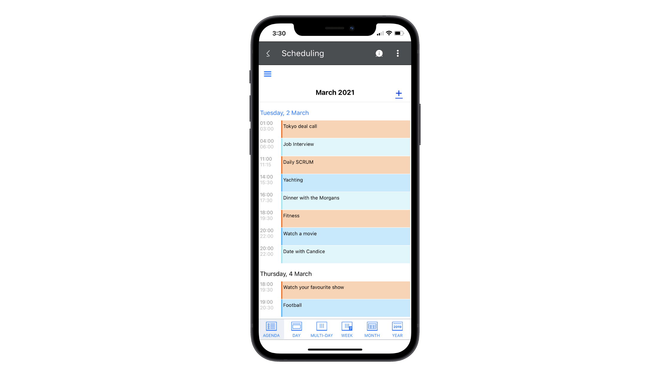
This is closest to the list view we often see in project management tools. The colors improve task distinction. However, each task is relegated to an equally-sized line, regardless of how long the task is scheduled for, so this isn’t the best view for someone trying to manage the hours in their day.
Now let’s look at this same scheduler in the day view:
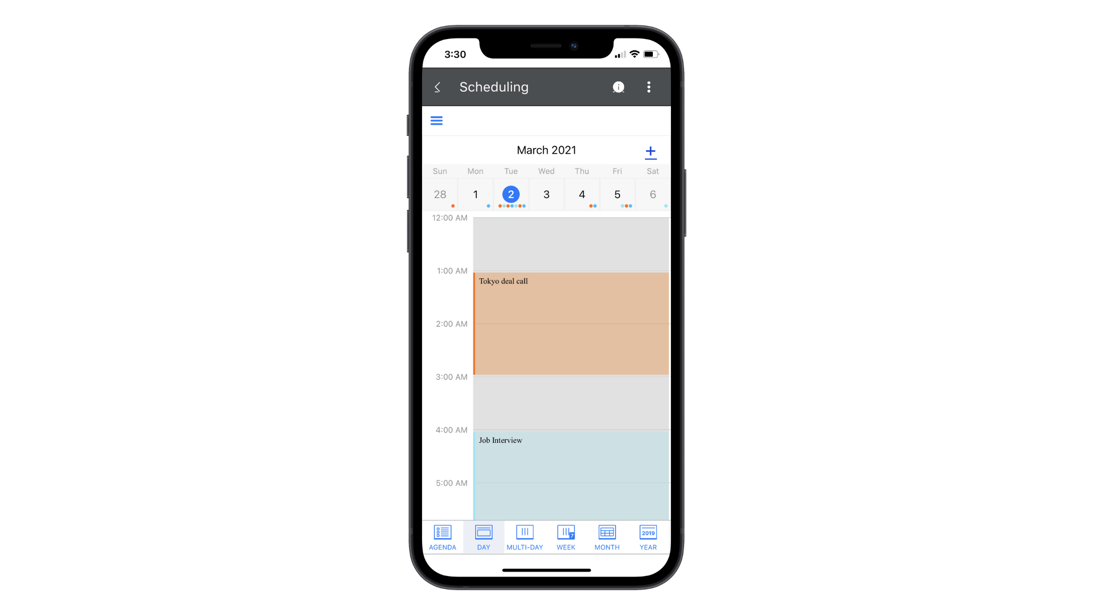
From this view, we now see the calendar days above with colored dots indicating where and how many tasks are scheduled. In the middle, we see tasks color-coded and spaced out based on how long each will actually take.
This view gives users a more realistic representation of their workload on any given day as well as throughout a week.
Again, by providing these view options, your users can customize the app’s data so that it gives them the most value.
Wrap-up
It doesn’t matter if your data visualizations are a core feature of your mobile app or a smaller portion of it. How they are presented can make or break the experience for many of your users. And when user retention and loyalty is crucial to the success of an app, this is something you can’t afford to get wrong.
As we’ve seen above, Telerik has a solution ready to help. It’s called Telerik UI for Xamarin. In addition to providing you with pre-designed and easily customizable data visualizations, you’ll find a general library of components that make designing mobile apps a breeze.
