In this post I’ll introduce you to Angular view encapsulation and show why each member is important and how and when to use them.
Angular
Angular, Google’s JavaScript (TypeScript) framework for building web applications, mobile or desktop, has over 71,000 stars on GitHub. It’s maintained by the Angular team at Google and a host of community members and organizations.
Before You Start
To be able to follow along with this article’s demonstration you should have:
- A integrated development environment like VS Code.
- Node version 11.0 or higher installed on your machine.
- Node Package Manager version 6.7 or higher (usually ships with Node installation).
- Angular CLI version 8.0 or higher.
- Version 8 of Angular or higher.
- Download this tutorial’s starter project here to follow through the demonstrations.
- Unzip the project and initialize the node modules in your terminal with this command:
npm install
Other things that will be nice-to-haves are:
- A working knowledge of the Angular framework at a beginner level.
In this post, you will have an introduction to viewing encapsulation in Angular for styling your Angular components.
Using Components in Angular
Angular is a JavaScript framework that is component-based. This means that your application should be ideally built in components. Building apps in components is important because you can easily extend them or decouple them, allowing you to be efficient by having the capability to reuse them. They also create a distinction between presentation and logic of the application.
How Angular Handles Styling
An Angular component ideally consists of the presentation file, the style sheet, the component file itself and the test file. This means that for every component created or generated by the CLI there is a specific style sheet for it. Angular was built in such a way that the styles defined inside the component style sheet are scoped to only that component alone no matter the class name. This is a lot like local and global variable definition and how they are scoped; this scoping mechanism is known as encapsulation.
First Things First: Shadow DOM
Encapsulation is a very critical aspect of the modern web components standard which supports keeping every component modular and independent. The shadow DOM is a part of the modern web component standard that ensures encapsulation is carried out through its API, providing a way to attach a separated DOM to an element. So basically the shadow DOM allows you to hide DOM logic behind other elements without affecting any other part of the application so that you can use scoped styles in your component in isolation.
Shadow DOM in Angular
Angular elements are designed to make Angular components function as web components and so they have access to the shadow DOM API. When you run the command below in your CLI:
ng g c test
the new component test generated can actually be set to have the template in a shadowRoot of the DOM so that scoped style sheets can be encapsulated.
Not all browsers support shadow DOMs yet, but Angular still implements the framework to achieve encapsulation by emulating the shadow DOM. We will see that later in this post.
View Encapsulation
This defines template and style encapsulation options available for an Angular component. There are three members of the Angular view encapsulation:
- Emulated
- None
- Shadow DOM
We are going to use a demo application to understand the various members of the Angular view encapsulation.
Demo
We are going to build a simple app with buttons and styles to illustrate various members. If you followed this post from the start, you would have downloaded and unzipped the Angular canvas from GitHub. Load up the app in your integrated development environment (I use VS Code). Open a new terminal and generate a new component with this command:
ng g c test
Now add these styles to the styles.css file in the root folder:
/* You can add global styles to this file, and also import other style files */
.btn {
  display: inline-block;
  background: rgb(166, 190, 126);
  color: white;
  padding: 0.4rem 1.3rem;
  font-size: 1rem;
  text-align: center;
  border: none;
  cursor: pointer;
  outline: none;
  border-radius: 2px;
  margin-right: 0.5rem;
  box-shadow: 0 1px 0 rgba(0, 0, 0, 0.45);
}
.btn:hover {
  opacity: 0.8;
}
These are styles for the buttons we are going to use and a small effect on hover. Open the app.component.html file and clean it up to look like this:
<div style="text-align:center">
  <h1>Angular View Encapsulation</h1>
</div>
<h2>Hover over these dummy buttons</h2>
<ul>
  <li class="btn">
    <h2>
      <a target="_blank" rel="noopener" href="#">Tour of Heroes</a>
    </h2>
  </li>
  <li class="btn">
    <h2>
      <a target="_blank" rel="noopener" href="#">CLI Documentation</a>
    </h2>
  </li>
  <app-test></app-test>
</ul>
<router-outlet></router-outlet>
Here we have a simple list and we also brought in the test component. Go to your test.component.html file and replace the test works content with the code block below:
<li class="btn">
  <h2>
    <a target="_blank" rel="noopener" href="#">Angular blog</a>
  </h2>
</li>
Finally, go to the test.component.css file and add these rules:
.btn:hover {
  opacity: 0.8;
  background: black;
}
This changes the color of a button on hover to black. Now everything is properly set up to test our view encapsulation members.
Run the application in the development server:
ng serve

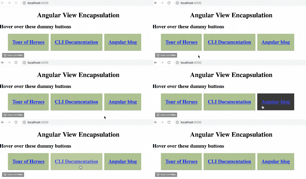
This is how your application should look when you go to the localhost:4200 in your browser. You can notice how the scoped style in the test component does not affect the rest of the application.
The None Member
One of the options you have as an Angular developer is to specify that you do not want any kind of encapsulation of defined styles in your project. This can be very viable for projects which have a lot of contributors, like a distributed team. You might have specific style sheet or style guides that you do not want people modifying so you opt for this option. This also means that every style sheet or CSS rule you create inside the project is global no matter the location.
For our demo, we see that by default the view encapsulation is not set to none, so let’s set it ourselves. In your test.component.ts file, go under the style section and modify the component definition section to this:
@component({
  selector: "app-test",
  templateUrl: "./test.component.html",
  styleUrls: ["./test.component.css"],
  encapsulation: ViewEncapsulation.None
})
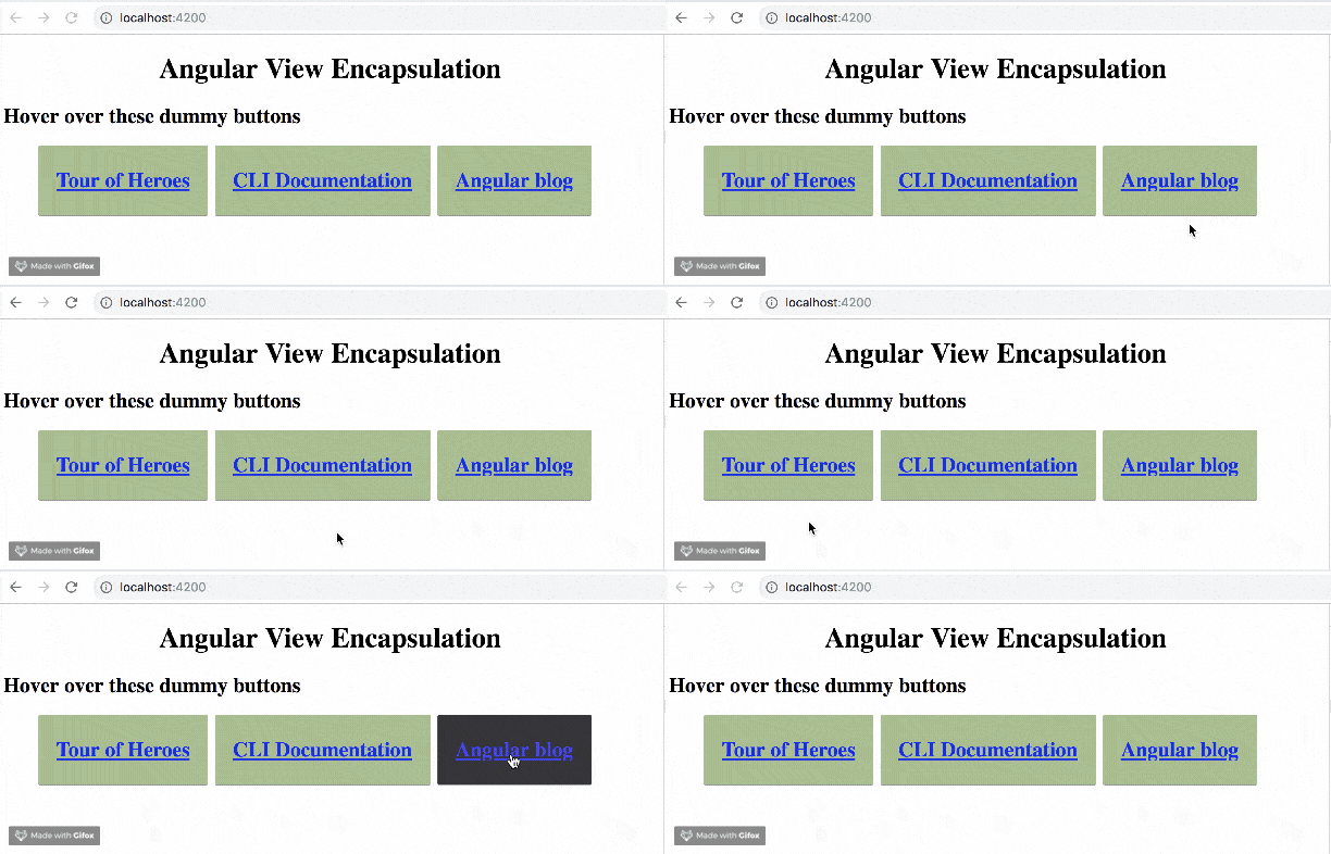
Now when you save your app, notice the difference in the user interface:

You can see that the scoped styles are now global, so for any component you can grant access of your style sheet to your parent component and other components in your project.
The Emulated Member
This is the Angular default setup; it is simply a shadow DOM emulator. Angular achieves this by assigning custom attributes to the elements affected, especially as some browsers do not support shadow DOM. It kind of engineers a shadow DOM mechanism.
To test this out, you can remove the setup you added in the section above or explicitly define it like this:
@component({
  selector: "app-test",
  templateUrl: "./test.component.html",
  styleUrls: ["./test.component.css"],
  encapsulation: ViewEncapsulation.Emulated
})
If you run the application you see it goes back to how it was at the very start. This is the default Angular setting so without explicitly setting it up, it still does the same thing.

The Shadow DOM
Here for all the browsers that support shadow DOM, you will see the same output as you saw in the emulated section. The difference is that styles are written in the document head for emulation but in the shadow DOM a shadow root is used at component level.

If you inspect, you will find that emulation used foreign ghost attributes like ng content and ng ghost but all you see with shadow DOM is the shadow root parent element. The complete code for this tutorial can be found here on GitHub.
Conclusion
You have been introduced to Angular view encapsulation and shown why each member is important and how and when to use them. There used to be a fourth member called native, but it is now deprecated in Angular. Happy hacking!