People are calling neumorphism the new “it” design trend. But with roots in skeuomorphism (which we’ve more or less been happy to do away with) and usability issues, why is it getting hyped?
I’ve been writing about design for almost eight years now. In that time, I’ve watched apps go through a strange evolution in style.
Around the time I entered this field, skeuomorphism was on its way out and flat design was on its way in. Flat design then led to Material Design. And shortly thereafter the two merged and gave us flat design 2.0.
Now there’s talk that skeuomorphism is getting a reboot as neumorphism. But why?
Why do we bring back old trends that we were more than happy to put behind us (and with good reason)? Is it because consumer behavior and preferences change so much that we need to have those old standbys ready to boot up again?
Or are we just making things more complicated than they need to be?
Today, I want to look at this so-called neumorphism trend, where it came from, and when (if at all) you might want to use it in app design in 2021.
Where Did Neumorphism Come From?
While the past decade’s app design trends have had different looks, the biggest difference between them is their tactile nature.
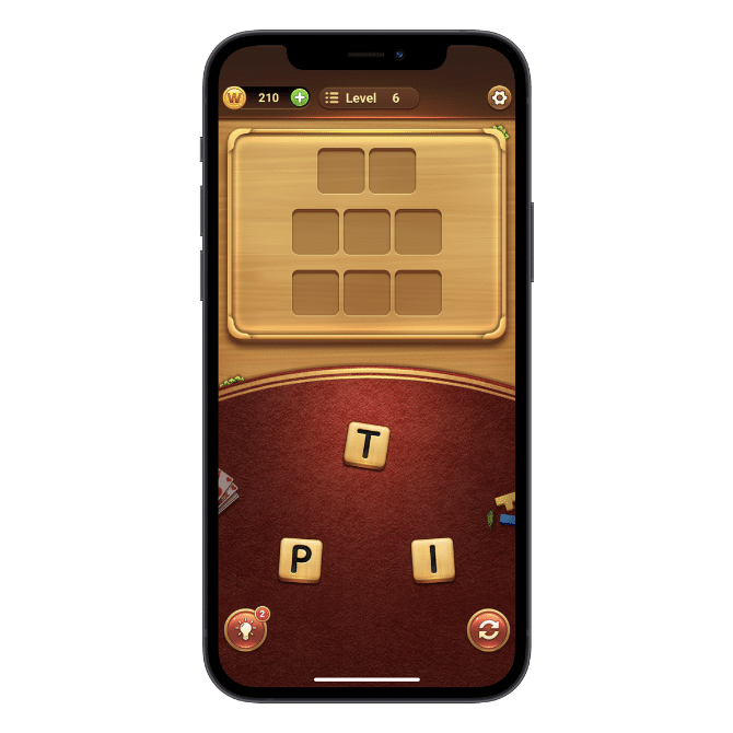
Skeuomorphism, for instance, sets out to make UIs resemble their real world counterparts. The goal is to make interfaces feel more realistic and touchable.
The Word Connect mobile game, for instance, uses skeuomorphism to create a Scrabble-like board where letters fit neatly into place:
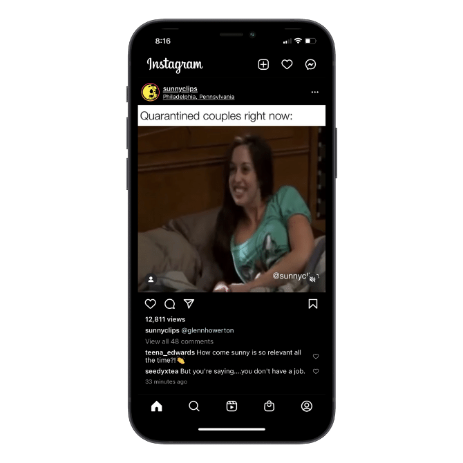
Flat design removes the realism and gives us an entirely flat surface that doesn’t get bogged down with realistic details and edges.
Instagram is a good example of this style:
Because of this lack of depth, though, there are some usability issues with flat design, as it’s not always clear which UI elements are clickable.
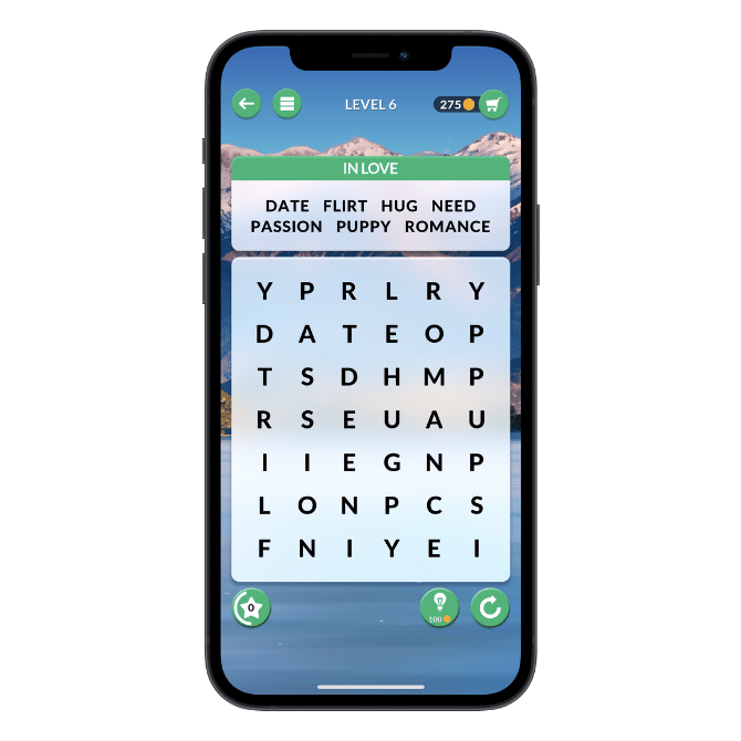
This is one of the reasons why we got Material Design. This style uses flat, colorful elements, but places them on different planes, mimicking how paper and other objects behave in the real world.
Although there aren’t too many apps that adhere to the original style guide, Wordscapes Search holds onto many of the original principles like bright colors, layered elements and animations:
This style came with its own set of issues though. The biggest one was that the strict guidelines provided by Google led many app designers to create identical-looking apps.
Flat design 2.0 is a hybrid of the good parts of flat design (minimal and clean UIs with friendlier colors) and Material Design (layered elements that improve click confidence).
Rover has a nice example of how this is done:
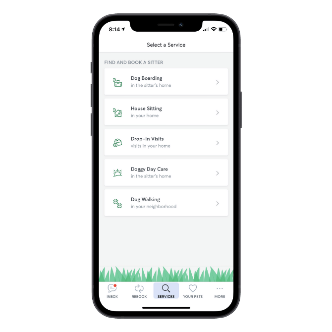
The UI is simply designed, but the clickable elements are raised and the animations are purposeful.
That could’ve been the end of the decade’s app design evolution. But no. Since the start of 2020, there’s been talk that neumorphism is next in line.
Neumorphism—also known as soft UI—is similar to skeuomorphism in that it makes UIs feel more real and tactile than flat design. However, this trend isn’t gaudy the way old school skeuomorphism was.
It has two distinguishing characteristics:
- A monochrome color palette so the background and elements feel like they’re part of the same surface
- Depressed UI elements, which give the interface a soft, touchable appearance
The following example comes from the aptly named Neumorphism mobile game:
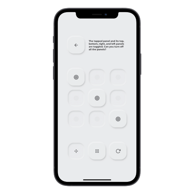
Notice how the all-gray interface helps the embossed buttons stand out more than the depressed ones. I’m going to talk about why that’s problematic next.
Does Neumorphism Have Any Place in App Design?
There’s a big problem with neumorphism. It’s not accessible.
It’s not just the low contrast between the background and clickable elements that’s an issue. A poorly chosen monochrome color palette could make the interface hard to read or engage with for some users as well.
Some designers have suggested adding color to the borders of the UI element or to the text or icon within it. But that goes against one of the key defining characteristics of the trend.
So, if you can’t design neumorphism as is … what’s even the point?
Despite a number of people calling neumorphism the latest design trend for 2020 and now 2021, I could barely find it anywhere in the app store. So, I think designers may already realize there’s not a whole lot you can do with this style out of the box.
That said, it’s not a total lost cause.
In terms of app types that you could design in a neumorphic style, one would be simple puzzle games like the one we saw above. It’s certainly easier to focus on a gameboard when there aren’t a ton of garish colors and ads and animations distracting you from play. So, neumorphism would be helpful in that sense.
Another type of app this works for is calculators. Here’s how neumorphism looks on the Soft Calculator:
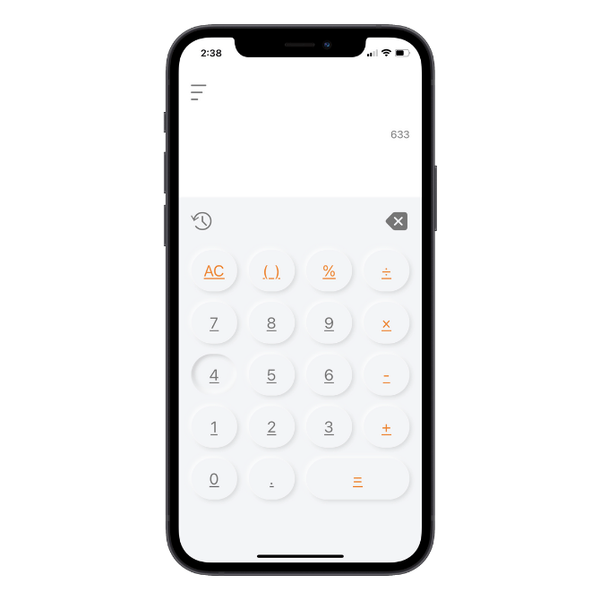
I’ve seen UI templates made for analytics dashboards in the neumorphic style. I just don’t think that’s a good choice as the monochrome would make it hard to understand the data presented.
One last thing I will say is this:
If you like the look of the softer depressed UI elements, there’s nothing that says you have to use them in conjunction with a monochromatic palette. In fact, that depressed look could give your app’s UI a unique look if you use it in the right places.
Specifically, you could use the depressed button style in place of any elements that would otherwise use a hover-layer style. You could also use this for your app’s search bar, form fields, toggle sliders, profile images, clickable icons and so on.
Wrap-Up
Why does it feel like we need a new design style to hype up each year? And why do we bother when it’s nothing more than a reboot of a design trend that fell out of fashion nearly a decade ago?
Unless we find that mobile app users have grown weary of a design trend or are starting to experience usability issues with it, I’m not sure if we need to change up app styles that frequently. Not only does it require a lot of work on your part to learn the new style and apply it to new and existing apps, but it’s going to require consumers to readjust (yet again) to a new design trend.