When profitability is the main driver, apps can become dangerous, unhealthy places for users. Here’s how an ethical design approach keeps that from happening.
Ethical design is an approach to app design and development that prioritizes good, positive and healthy experiences over negative ones.
More specifically, it means creating:
- Positive experiences
- Usable interfaces
- Healthy and safe digital environments
Ind.ie’s ethical design manifesto aptly summarizes what this entails:
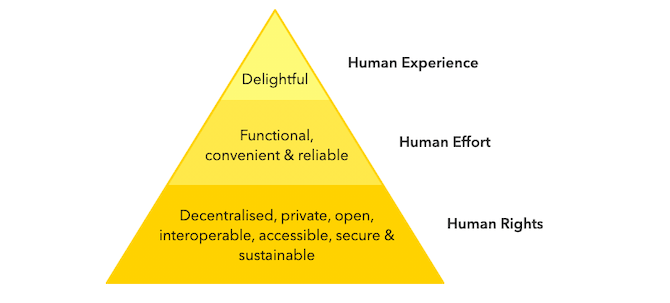
As you can see, ethical design isn’t about imposing your subjective views or tastes on other people, nor is it about virtue signaling. It’s about designing an app (and, really, the web as a whole) to be an objectively better place for people to go.
It also means prioritizing the user experience over the company’s profits.
That doesn’t mean you can no longer build profitable apps. In fact, an ethically designed app should be more profitable, as it removes the fear, hesitation and anxiety that often drive down user engagement rates and drive up user attrition.
8 Ethical Design Tips for Apps
Let’s take a look at eight ways in which you can build better apps through ethical design.
1. Present Fewer Options for More Confident Decision-Making
There are many scenarios in life that leave people feeling overwhelmed by too many choices, rendering them incapable of confidently making a decision, being satisfied with their choice or making one at all. This is a psychological phenomena called analysis paralysis.
In recent years, mobile apps have become one of those sources of analysis paralysis.
For ecommerce apps in particular, it can have serious consequences. Higher rates of shopping cart abandonment. Greater levels of dissatisfaction with purchases. More returns and refund requests.
Tips:
Minimal design, first and foremost, is an absolute must. By creating simple, distraction-free interfaces, you’ll keep users from being overwhelmed by how much the app throws at them at once.
This goes for any type of app—from gaming to news apps and everything in between.
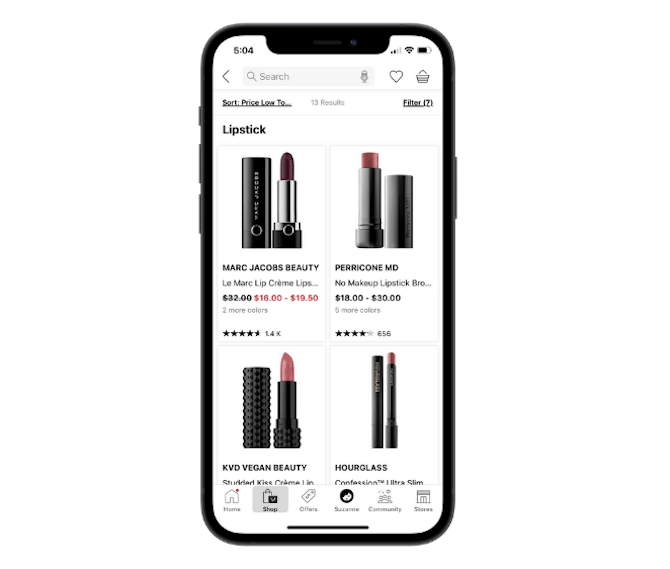
Here’s an example of how Sephora’s large card design improves focus, as only four products are shown at a time:
With apps that have huge inventories of products or content, you need to give users the ability to control how much they see at once.
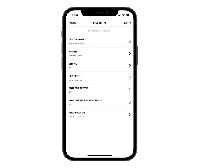
Filtering is a feature that helps with this:
This example shows you what the filters are for lipsticks. Note that they change based on the product category the user is looking at.
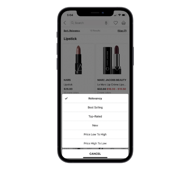
Sorting is also a critical element for these kinds of apps:
This enables users to decide which results they see first. So, if something like price or customer reviews weigh more heavily in the decision-making process, they don’t have to waste time looking at an overpriced lipstick, for instance.
2. Remove the Pressure from Your Color Scheme
As a designer, you’re well aware of how certain colors and color combinations will make your users feel.
For instance, you can use bright red to convey a sense of urgency or danger. But unless you’re a horror game designer or building apps for urgent care centers, does that color or sentiment really have any place in your app’s design?
2020 was a stressful and anxiety-filled year for many. If you’re building an app that you want users to feel calm inside of (so they can make clearer, more confident decisions), you may need to reconsider that hyper-emotional color palette your client wants.
Tips:
Again, minimal design is going to be a big help in keeping users’ emotions steady.
So, don’t be afraid of designing your apps with solid backgrounds of white or black. You can then use bright, but gentle pops of color to draw attention to the important areas of the app.
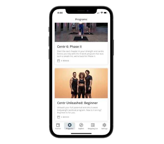
The Centr app is a good example of how you can infuse color into your design without overwhelming users:
Obviously, a workout app wants to build energy and enthusiasm in its users. However, this one doesn’t use harsh or manipulative colors to do it. Instead, the colors and imagery convey a healthy, positive mood.
3. Provide Honest Product Details
There’s nothing you can do about a client that wants to include unrealistic photos or false details about their products or services.
Assuming that’s not the case, there are still ways in which app design can manipulate users into clicking on and buying stuff they didn’t mean to or wouldn’t have without the app’s encouragement. Images, content and even the layout of apps can do this.
For example, an ecommerce app that always puts sponsored products above organic product matches is going to mislead many users into believing those are the most relevant results.
Bottom line: When your design is driven by boosting profitability instead of getting users to the best-match content, products or results, that’s a problem.
Tips:
Any app that has a vested interest in driving users to engage more with certain products or content over others needs to be 100% clear with users what’s going on. It’s along the lines of why the FTC has to crack down on influencers for not disclosing when a recommendation is actually a paid sponsorship.
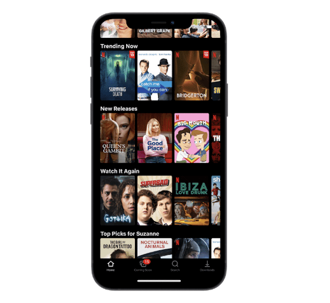
Netflix does a good job of keeping this deception out of its app by labeling each of its shows or movies with its bright red “N” logo:
This way, users can make the determination if they want to watch Netflix-owned content.
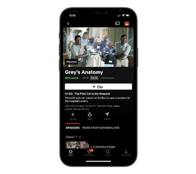
Another way to help users feel more confident about what they choose to spend their time (or money) on is by providing user reviews, ratings or personalized recommendations. This is another thing that Netflix does well:
Most shows or movies come with a personalized match rating based on how the user rated other content on the app as well as their watch habits.
4. Create a User-centric Design
When an app’s design prioritizes profits over the user experience, it’s going to be crystal-clear to users what’s going on.
The first place they’ll notice it is in the navigation—as Instagram users recently did.
When the most valuable parts of the app are not placed within the thumb zone, or the first content they see is self-promotional, you’re only going to increase frustration and disappointment with the app.
Tips:
Usable apps are clear, easy to use and user-first in design. This removes the fear and hesitation they face when they have to fight their way to find the value in an app.
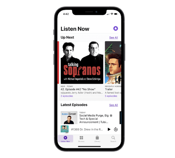
The Apple Podcasts app is a good example to follow:
For starters, the navigation is simple and easy to follow thanks to the four large, descriptive icons and labels.
The app’s design also prioritizes what the users actually want to do in the app. So, notifications stay out of the way, as do advertisements. All the user sees is their subscribed content and customized suggestions.
5. Stop Thinking of Small Print As “Small”
Your app will primarily consist of content that conveys the most important details for users. In addition, you’ll need small print to provide context, guidance or secondary information to users.
Just because we call it “small print,” though, doesn’t mean it should literally and figuratively be small.
When you design small print to be too tiny to read, or you hide it deep within the recesses of the app, you only give your users more reason to distrust the brand.
Tips:
Consumers demand transparency from brands and that’s what your app is going to have to do. The small print is usually where brands and apps have the opportunity to do this, whether it:
- Explains things related to shipping, fees or other purchase “extras”
- Elaborates on the app’s privacy policies
- Details what a form’s fields are for and why an error occurred when filling them out
- Points out that an ad or an article is sponsored
- And so on
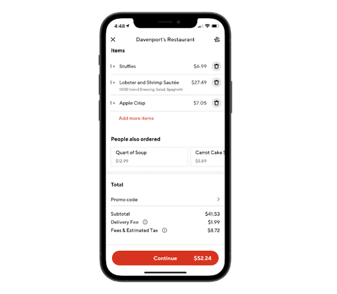
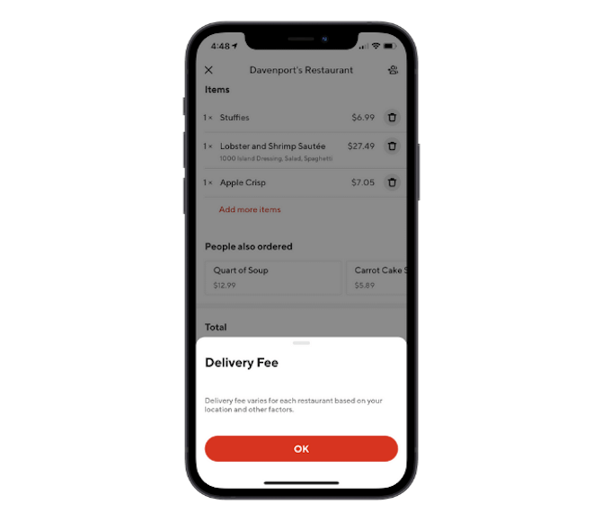
DoorDash, for instance, doesn’t hide the breakdown of fees associated with ordering through the app:
Users can click the easy-to-recognize “i” information icons to expand on the small print, too:
Their purchase isn’t disrupted by their desire to learn more about what they’re being charged. The app keeps them where they are while using a pop-up to elaborate on the fine details.
6. Be Crystal-Clear About Your Privacy and Security Policies
Technically, this is part of the small print issue, though it deserves a category of its own because of the severity of it.
For a long time, consumers have been worried about the security of their data—especially when it comes to credit card information and other sensitive details—on the web.
Apps that don’t clearly display information about what they’re doing with user data or how it’s securely stored can expect a greater reluctance from users to use the app or keep it installed.
Tips:
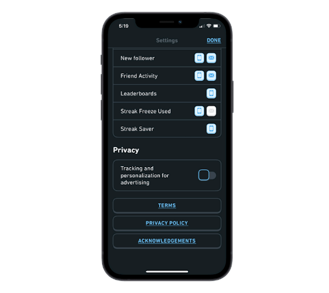
The first thing to do is to make sure the privacy and security settings are easy to find and control, just like Duolingo does:
Notice how it doesn’t just provide big and colorful links to its Terms and Privacy Policy pages (though that’s a plus). It also includes a toggle switch to enable or disable tracking and personalization for the purposes of advertising.
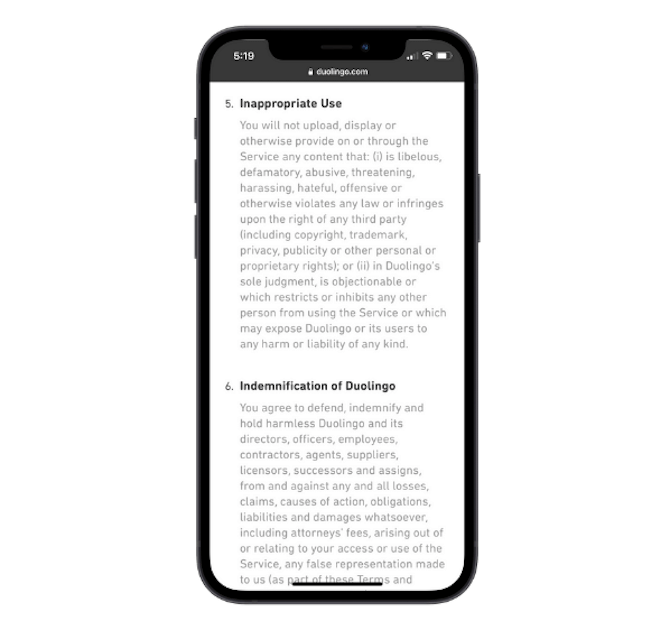
What’s more, the policy pages are nicely formatted and easy to read so users can actually read or scan through the legalese if they want to.
7. Remove the Addictiveness from the Design
Apps take up precious space on users’ smartphones, so they’re going to keep the ones installed that they actually use and ditch the others.
That said, building your app to be addictive isn’t a viable long-term strategy for making your app one of the ones that stays installed. It may be the reason the app stays installed at first. But, eventually, the constant urge to play the game, swipe on dates or scroll through the news feed will wear the user out.
If you want to build an app that users want to keep installed on their phones and to re-engage with regularly, build it chock full of value instead.
Tips:
There are ways to encourage users to fight their cravings to use the app more than is healthy. Like by setting a time limit in the app’s settings.
As a designer, though, there are choices you can make that help with this, too.
For instance, remove the infinite scroll on never-ending feeds, the shaming messages asking “Why haven’t you logged in today?” and multiple push notifications a day.
Calm lets its users not only choose which notifications to receive, but to schedule them, too:
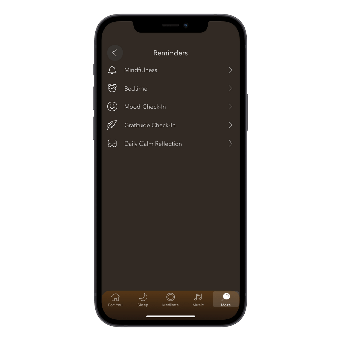
This way, users control when and how frequently they use the app, and there isn’t a constant push from the app to get them back inside. This allows them to actually enjoy what they’re getting from the app.
8. Make App Accessibility a Priority
Although many of the high-profile ADA lawsuits we’ve seen in recent years have targeted websites, don’t expect that consumers will only aim their dissatisfaction at them.
If you’re building an app that you want everyone and anyone to use, then accessibility has to be part of the design process.
Some of the tips above will contribute to greater accessibility, like minimal designs, friendlier colors and larger fonts. But there’s more you can do to empower every user to step inside your app and make it a uniquely user-friendly experience regardless of their limitations or impairment.
Tips:
Accessibility is a big topic that covers a lot of ground. However, I do want to show you some popular ways in which designers have been equipping their apps with accessibility features.
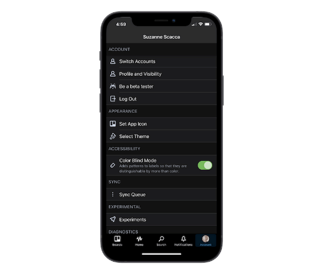
Trello, for instance, includes a theme switcher (between light and dark) as well as color blind mode:
As dark themes become increasingly more popular online, this is a good feature to have on any app that isn’t designed with a dark theme out of the box.
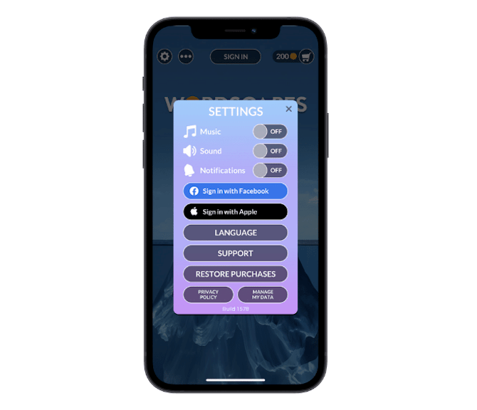
Wordscapes takes aim at the accessibility issues caused by having a “noisy” app.
So, its settings include toggles to turn the app’s music and sounds on or off:
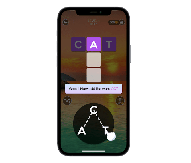
Another useful accessibility feature in Wordscapes is the mini tutorial that appears during the first round of gameplay:
The screen explains how the dragging gesture works while the hand demonstrates how to spell out various words on the board.
This particular feature might not be traditionally accessible-friendly, but it certainly ensures that every user can play the game with ease.
Wrap-Up
Ultimately, ethical design is about human-centered design. This is something we’re going to need more of as if we’re to help consumers not just feel satisfied with their in-app experiences, but to walk away from them without any of the negative impacts that too much screen time leads to.
