Check out the newest additions to the Telerik UI for WinUI in our latest release—new components, improved examples application and more!
New year—new Telerik WinUI controls with the R1 2021 release! Ladies and gentlemen please welcome onboard: Barcode, BusyIndicator, Pagination, Rating and the one and only RibbonView! In addition to all that, we also updated our examples application with new cool features and ensured support for the latest available preview of WinUI (preview 3).
Let's see what is new in this version of Telerik UI for WinUI!
RibbonView

Yes, it is here—the most desired component from the WinUI community! Extend your application with our full-blown MS Office-like “ribbon” UI.
RadRibbonView will allow you to easily organize the navigation functionality of your application into a single compact toolbar control. All the built-in controls, popups, dynamic resizing and the powerful customization capabilities make RadRibbonView your shortcut to creating powerful navigation systems. On the top of that the native Windows appearance as well as the Simplified layout will allow you to implement complete and modern WinUI 3 application.
Here are the key features of control:
- MS Office Interface at your Fingertips: The RibbonView control provides a UI very similar to the one provided by the MS Office ribbon
- Automatic Resizing and Minimization: The ribbon provides built-in mechanisms that allow you to minimize and automatically resize the ribbon content
- Rich Set of Ribbon Specific Controls: The ribbon control works with special built-in components (buttons, galleries, tabs, groups, etc.)
- Backstage: Built-in backstage menu where you can display information related to the content
- Quick Access Toolbar: The quick access toolbar is an easily accessible toolbar displayed in the header of the ribbon where you can place buttons for quick actions as print, copy, etc.
- Screen Tips: The ribbon allows you to display a small window that appears when the mouse cursor hovers over an icon or a ribbon element (command)—the popup window will provide details that explain the command's function
- Contextual Tabs: The control allows you to organize your tabs in groups by using contextual tabs—this way the user can see multiple tabs available for a specific context
- Keyboard Support: The control supports two types of keyboard navigation—via key tips and via arrow keys
- Simplified Layout: The ribbon allows you to define a more compact, simplified layout, using less space
- MVVM Support: RadRibbonView supports data binding and manual population with data out of the bo.

Hope you like it! I can't wait to see what you, guys, can achieve with RadRibbonView
For more details please visit the RibbonView section from our help documentation and make sure to play around with the demos here.
Barcode
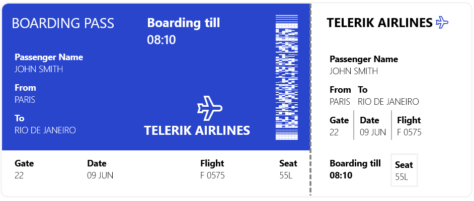
The next control is Barcode—it will allow you to create and show barcodes in your application. RadBarcode is using low level rendering (Composition API) thus it is providing the best performance and highest quality appearance.
With the initial release the control we provide support for 25 different one- and two-dimensional barcodes including the most popular QR code and Data Matrix—for the full list you check this article. However if you don’t see type of barcode you need, please drop me a line in the comments section below.
Key features of RadBarcode:
- Support for one-dimensional barcodes: including EAN13, EAN8, UPC-A, UPC-E and Code39 symbologies
- Support for two-dimensional barcodes: such as the popular QR code, PDF417, and Data Matrix
- Three sizing modes: Different sizing modes that will help you fine-tune the rendering of your codes
- Styling capabilities: Easily configure the appearance of the control
Make sure to visit the Barcode section in our online help documentation.
BusyIndicator
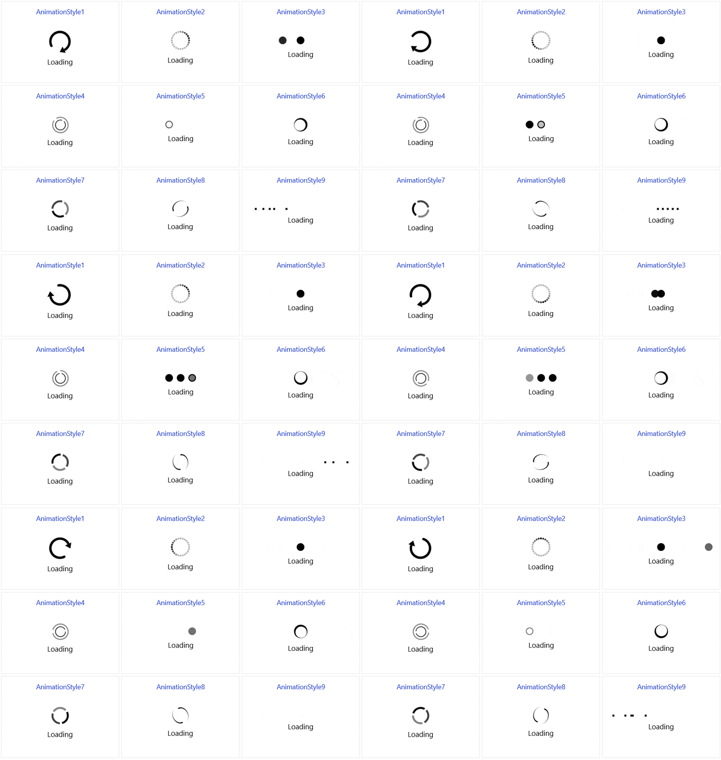
Introducing RadBusyIndicator—a component that will allow you to display an animation while your application is busy waiting for an async operation to finish. The control comes with nine cool built-in animations and the option to implement custom ones to achieve unique appearance.
You can find more information in the BusyIndicator section of our online help documentation.
Pagination
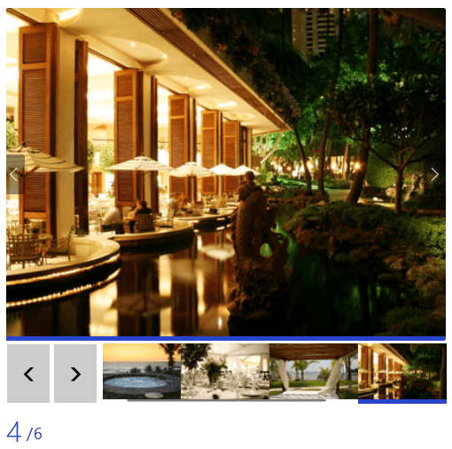
The new Pagination control is a helper control designed to work with any ItemsControl in order to provide a better user experience and enhance its functionality. It allows current item tracking as well provides previous, next and exact item navigation.
Check out the Pagination control in our documentation.
Rating
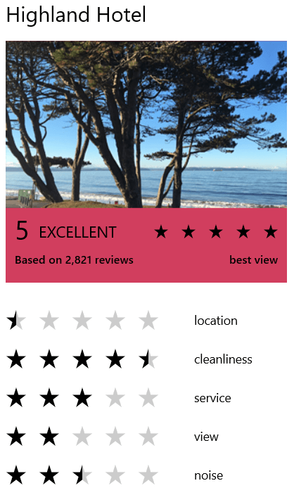
Another new control is RadRating ⭐. This control enables the end user to evaluate something by selecting a value. The rating value can be changed either by click or by pan gesture over the rating items. The control provides two different selection modes, different precision modes as well as options to specify the appearance of the rating items in the different states.
You can find the RadRating documentation here.
Examples App
First things first—our examples application is now available on the Telerik site! You can install it directly from https://demos.telerik.com/winui and start your journey in modern world desktop applications. Also when installed from the site the app will auto update with every next release. Let’s see now what is new in the application:
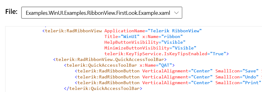
- Code Viewer – Easily see the code of the current demo by clicking the Code tab above it:
![Examples-CodeViewer Examples-CodeViewer]()
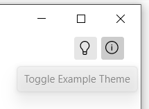
- Example Theme Button – Shortcut for changing the theme of current example only:
![Examples-ToggleTheme Examples-ToggleTheme]()
- Statuses in the NavigationView – Better indication of current status of all the available controls
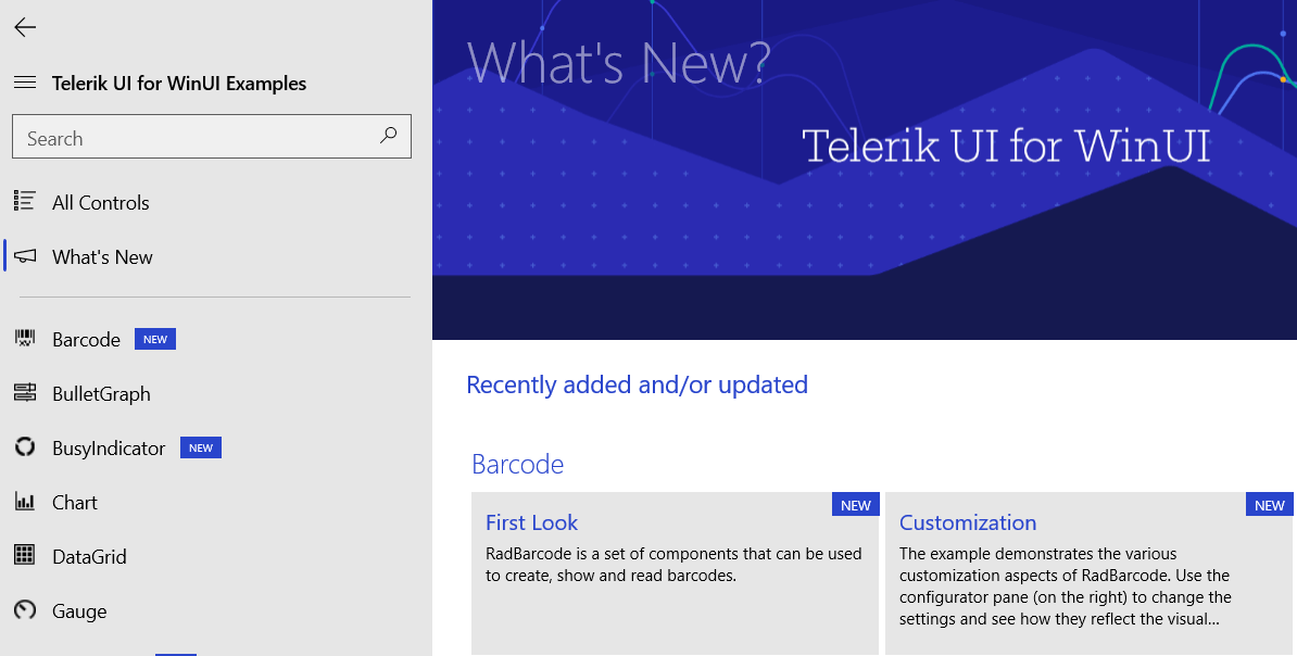
- What’s New Page – New page that shows all the new and updated examples in the application:
![Examples-What'sNew Examples-What'sNew]()
I hope you will now enjoy the app and our controls even more!
Experiment with Us
Delivering stellar products can only happen with your help. We invite you to become a collaborator—share your feedback (see Contact Us section below) and help us shape the future of Telerik UI for WinUI. Suggest or recommend anything you’re missing, and we’ll use your input to add amazing new components and APIs to the roadmap.
During the experimental phase, Telerik UI for WinUI will be a free trial, and we hope you will continue sharing your use cases, experience and roadblocks with us.
Contact Us
- Get in touch by email – Drop us a line, for anything related to product or just to say hi at TelerikWinUI@progress.com
- Feedback Portal – Share any feature request (or bug reports) that you might have
- Telerik Forums – If you need any technical assistance with product let us know and will help
Get the Bits
Try Telerik UI for WinUI Preview Now!
Sign Up for the Webinar and Catch us on Twitch
To see the new release in action, please join us on the Telerik R1 2021 webinar, on Tuesday, January 26, 2021 11:00 AM ET - 1:00 PM ET. You can also catch our full-day live session on Twitch on January 29th from 8:00 AM - 5:00 PM ET where our developer advocates will dive into all your favorite features.
In case you missed it, here are some of the updates from our last release.
