Check out everything that's new in our Telerik UI for WPF R1 2021 release!
The first release for 2021 is already a fact—I’m happy to announce the availability of R1 2021 of Telerik UI for WPF and Telerik UI for Silverlight! It brings a powerful new control in CardView, as well as tons of features for TileList, RadialMenu, RichTextBox, WordsProcessing and other components. We did also significantly improve the accessibility of the suite and ported some sample apps to .NET Core & .NET 5!
Let’s dive in all the great new goodies.
CardView (beta)
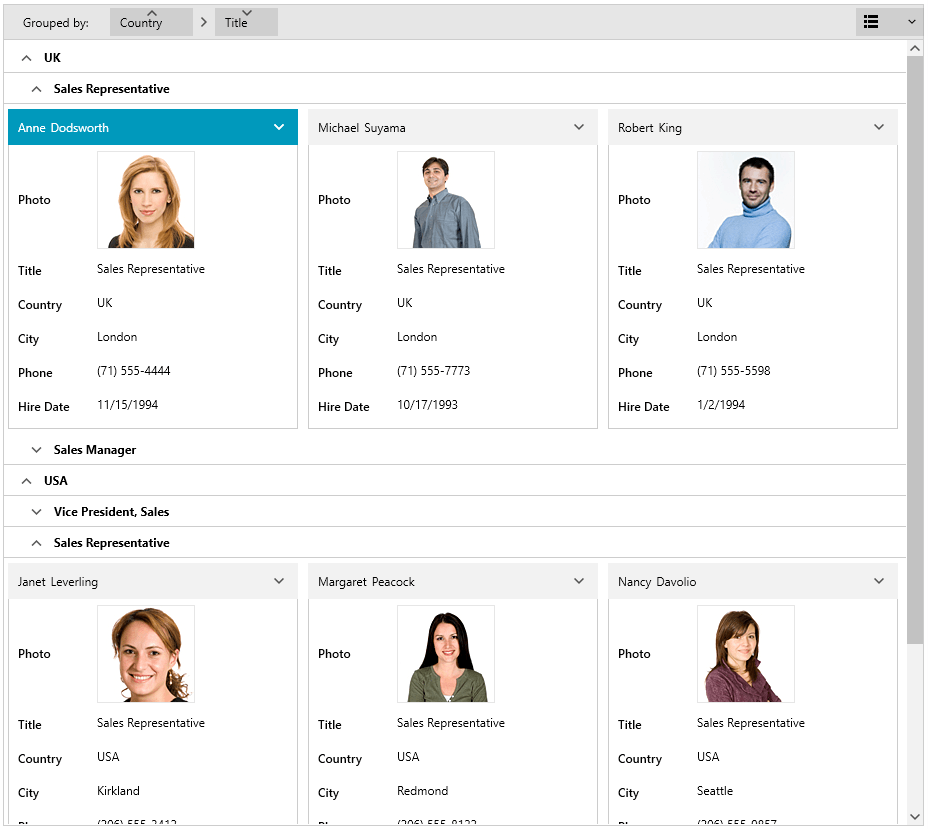
Introducing the new control of this release—RadCardView. This is a powerful component, packed with features for visualizing data in card-like format. The control provides built-in sorting, grouping and filtering as well as card editing with options to easily customize the editors. The control is designed with performance in mind, so you can display a lot of cards with ease, benefiting from UI virtualization. Indeed, it is great and fast control!
Let’s go now through the key features of RadCardView:
- Editing: The underlying data item could be easily edited through the built-in DataForm.
- Selection: Built-in single selection support.
- Grouping: Data can be grouped according to several criteria, effectively creating a tree of groups with the leaf nodes holding the actual data records. Groups can be easily expanded/collapsed through the UI.
- Filtering: Built-in filtering support.
- Sorting: Built-in sorting support.
- Layouts: The layout of the cards and groups can be altered between row and column-based ordering.
- Customizable elements: Cards can be easily customized using the control's API.
- Localization support: The text used in the settings areas of the controls is localized.
- Data Validation: Each card will display the current data validation errors when editing.
- UI Virtualization: You can display millions of items with ease.
In addition to the control we are also providing a way to use our famous QueryableCollectionView in Xaml through the brand new QueryableCollectionViewSource. This way you can easily shape the data in Xaml and directly bind it to the CardView (or any other similar control). The following snippets demonstrate how this is done below:
<Window.Resources>
    <local:MainViewModel x:Key="viewModel" />
    <telerik:QueryableCollectionViewSource Source="{Binding Employees, Source={StaticResource viewModel}}" x:Key="qcvSource">
        <telerik:QueryableCollectionViewSource.GroupDescriptors>
            <telerik:GroupDescriptor Member="Title" SortDirection="Descending"/>
        </telerik:QueryableCollectionViewSource.GroupDescriptors>
        <telerik:QueryableCollectionViewSource.SortDescriptors>
            <telerik:SortDescriptor Member="FirstName"/>
            <telerik:SortDescriptor Member="LastName"/>
        </telerik:QueryableCollectionViewSource.SortDescriptors>
    </telerik:QueryableCollectionViewSource>
</Window.Resources>
And here the CardView definition:
<telerik:RadCardView ItemsSource="{Binding View, Source={StaticResource qcvSource}}" />
See the control in action our WPF demos and make sure to check out the documentation here.
TileList—Horizontal Orientation Support
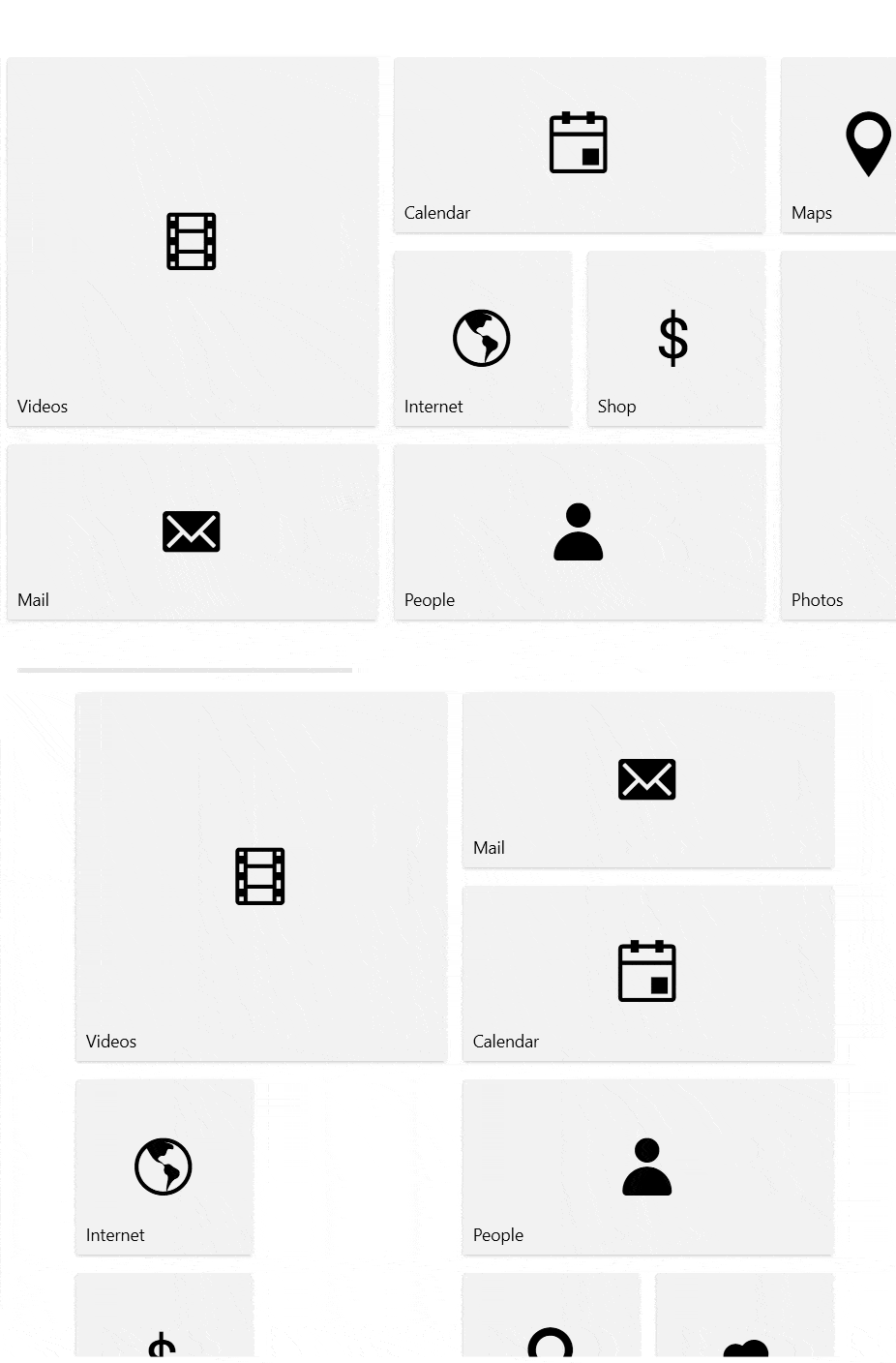
Previously the tiles of the TileList were only vertically aligned in columns, and with this release we are adding horizontal alignment as well. The new mode supports all the features of the control like grouping and provides an additional option to adjust the horizontal tiles alignment. See how both of orientations look below:
For more information make sure to check the Orientation article from the TileList help documentation.
RadialMenu—Auto Size Menu Items Support
Two of the most desired features for RadRadialMenu come to live together through the auto item size mode. Setting the AutoSizeMenuItems property to true enables you to make the items fill the whole space if they are less than eight and in the same time if you want to display more than eight to shrink them in order to fit more items in the circle. Here is an example that demonstrates both scenarios:
<telerik:RadRadialMenu IsOpen="True" AutoSizeMenuItems="True">
    <telerik:RadRadialMenuItem Header="Item 1">
        <telerik:RadRadialMenuItem Header="Item 1.1" />
        <telerik:RadRadialMenuItem Header="Item 1.2" />
        <telerik:RadRadialMenuItem Header="Item 1.3" />
        <telerik:RadRadialMenuItem Header="Item 1.4" />
        <telerik:RadRadialMenuItem Header="Item 1.5" />
        <telerik:RadRadialMenuItem Header="Item 1.6" />
        <telerik:RadRadialMenuItem Header="Item 1.7" />
        <telerik:RadRadialMenuItem Header="Item 1.8" />
        <telerik:RadRadialMenuItem Header="Item 1.9" />
        <telerik:RadRadialMenuItem Header="Item 1.10" />
        <telerik:RadRadialMenuItem Header="Item 1.11" />
        <telerik:RadRadialMenuItem Header="Item 1.12" />
    </telerik:RadRadialMenuItem>
    <telerik:RadRadialMenuItem Header="Item 2" />
    <telerik:RadRadialMenuItem Header="Item 3" />
    <telerik:RadRadialMenuItem Header="Item 4" />
</telerik:RadRadialMenu>
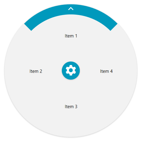
And this is how the top level (with only four items) will appear:
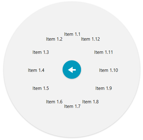
Let’s navigate now in Item 1 and see how more than eight items looks:
I hope you find it useful. For more details please check this article from the Telerik UI for WPF documentation.
WordsProcessing: Content Controls
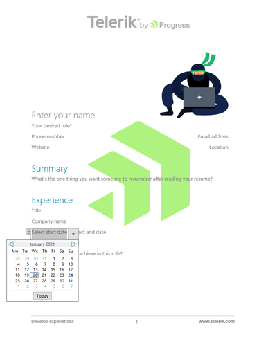
Structured Document Tags (SDT) or content controls enable users to add specific semantics to the document: restricting input, modifying editing behavior etc. Usually, this functionality is used for creating separate fields that should be filled and the user interaction is improved by providing specific UI controls like checkboxes, calendars, combo boxes and other. The currently supported content controls by WordsProcessing include CheckBox, ComboBox, Date, DropDownList, Image and other. You can see the full list and more details in our documentation: Content Controls for WordsProcessing.
WordsProcessing: Floating Images PDF Export
Floating images allow you position the images according to a specific anchor and change the way the text surrounds them. Now this feature is supported when exporting the images to the PDF format as well.
PdfViewer: Type3 Fonts
The Type3 fonts are a feature specific to the PDF standard. The Type3 fonts consist of glyphs defined with PDF graphic operators. Usually, the entire font is embedded in the PDF document which allows you to view it on devices without accessing fonts from the operating system. RadPdfViewer now supports this font type and you can view documents that contain such fonts in it.
Accessibility Improvements for all WPF Controls
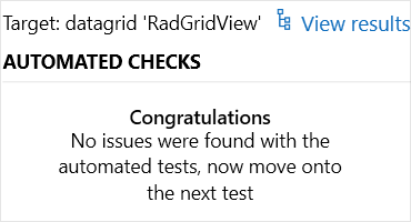
One of our goals as a component vendor is to provide beautiful, feature rich and highly customizable controls as well as to provide great automation and accessibility support for them. This release we significantly improved the accessibility of the all UI for WPF controls with the help of the Microsoft Accessibility Insights for Windows tool. The tool automatically checks for compliance with more than 60 accessibility requirements and we ensured all our WPF controls successfully pass those tests with zero errors. In addition to this we will make sure that every new control passes the tests and provides the required accessibility support quality.
CRM and ColorThemeGenerator—.NET 5 Support
We updated our CRM and ColorThemeGenerator sample applications in order to provide .NET 5 support—their source code files now include a multitargeting project with NuGet references. This way by downloading a single zip archive from your account you’d be able to run and explore the same app in all the supported frameworks—full .NET framework, .NET Core and .NET 5.
At same time we are also updating the ColorThemeGenerator click once to be .NET 5 app—install it from here. And the CRM is .NET 4.6.1 due to some .NET 5 limitations, however as soon it is resolved we will upload .NET 5 click once on the site—install it from here. Note that the CRM app is also updated to support the latest Prism version 8 as some of you requested. Cheers
Other Features
- NotifyIcon: Added option to configure the popup close behavior (link)
- DataForm: Single editor mode for editing fields (link)
- Callout: Added CustomPopupPlacementCallback to the CalloutPopupSettings (link)
- SyntaxEditor: Added option to implement custom margins (for example breakpoints) via UI or via code (link)
- SyntaxEditor: Added option configure the SearchPanel width (link)
- SyntaxEditor: Added SearchPanelOpened and SearchPanelClosed events (link)
- SyntaxEditor: Added API to enable or disable the automatic scroll when the document text is changed (link)
- Docking: MinWidth of the auto-hide area flyout elements can now be set (link)
- ChartView3D: Exposed ActualRange property for the 3D linear axis (link)
- GridView: The cursor now changes to a busy one when performing a sort operation by clicking on a group cell in the Group panel
- GridView: Better recycling mechanism for cells when virtualization is on
- Window: The control now has shadow in the Office2019 theme
- ToolBar: Provide support for ToolBarRepeatButtonStyle and ToolBarRadPathButtonStyle for
- ToolBar: The themes from Office Black to Green including now support setting of the Background visibility for the RadButtons
- FileDialogs: Improved loading performance of the local drives
- FileDialogs: Users now can navigate to the previous directory when pressing the Backspace key
- RadRichTextBox: Added UI to choose from different list formats for numbering style
- RadRichTextBox: HtmlFormatProvider can now import and export the alignment of tables and table cells.
- SpreadProcessing: Implemented properties for working with document metadata information like title, author, subject, keywords, description (link)
- WordsProcessing: : Implemented properties for working with document metadata information like title, author, subject, keywords, description (link)
- PdfProcessing: Improved performance when inserting tables using the RadFixedDocumentEditor
Check Out the Detailed Release Notes
We have a lot more! To get an overview of all the latest features and improvements we’ve made, check out the release notes for the products below:
Sign Up for the Webinar or Catch Us on Twitch
To see the new release in action, please join us on the Telerik R1 2021 webinar, on Tuesday, January 26, 2021 11:00 AM ET - 1 PM ET. You can also catch our full-day live session on Twitch on January 29th from 8am - 5pm ET where our developer advocates will dive into all your favorite features.
Share Your Feedback
Feel free to drop us a comment below sharing your thoughts. Or visit our Feedback portals about UI for WPF, Silverlight and Document Processing Libraries and let us know if you have any suggestions or if you need any particular features/controls.
Try out the latest:
Telerik UI for WPF Telerik UI for Silverlight
In case you missed it, here are some of the updates from our last release.