First things first: Any mobile app you build needs to serve a clear purpose and fulfill an actual need. For example:
- A dating app needs to help users find local mates with similar values, lifestyles and relationship goals
- An international news app needs to provide timely and easily digestible reports on stories from around the globe
- A distraction-blocking app needs to give users control over which apps are accessible and can send them messages during given time frames
But that’s easy enough, right? You present a much-needed solution to users and they install your app with the expectation that it’ll do as promised. That’s more a testament to the sales and marketing of an app though.
What happens when users step inside your app and actually begin to engage with it? Providing a seemingly perfect-fit solution is just one-half of the equation. The experience is ultimately what makes or breaks a user’s relationship with an app.
What I want to look at today is how app designers can use Google’s E-A-T ranking factor to design experiences that better earn the trust, respect and loyalty of their users.
Using E-A-T to Get More Loyal Mobile App Users
While Google uses a number of factors to determine which websites appear at the top of search results pages, there are three qualities that are especially important:
- Expertise
- Authoritativeness
- Trustworthiness
But why these three factors specifically?
According to Google, these characteristics are often signs that a web page is:
- Of the highest quality
- From a reputable source
- Can be trusted by consumers
So, if your mobile app can send these kinds of signals, it would be incredibly useful in convincing users to engage with your app regularly and commit to it over competitive solutions.
While I can’t cover every use case, I’d like to give you some examples below of how you might translate Google's E-A-T formula into something usable for mobile app design:
Building Expertise into a Mobile App
First, let’s think about the kinds of things that make someone an expert.
The amount of time they’ve been doing something is surely an indicator, but that isn’t really something you can convey through design. At least not in a way that would be perceptible to your users.
Having a track record of success is another good measure, but not something you can really build into an app without cluttering it with awards, notable mentions and so on. Unlike a website (or even the promotional landing page for your mobile app) that needs these kinds of trust marks, there’s no place for them in an app.
Another sign that someone is an expert is their measurable skill in an area. Many times, consumers look to the quality of content to suss out whether the person knows what they’re talking about or not.
I would argue that the quality of the app experience is just as valid an indicator.
For one, a great user experience—from start to finish—demonstrates a deep understanding of what the users need, want and expect. This serves as proof that the company behind the app really is an expert in delivering this kind of experience.
It also proves that the company was smart enough to hire an expert designer who could execute their vision to perfection. App users might not actively consider this when the experience is so good that it feels effortless (because why should they question a good thing?). However, if the experience sucks and is fraught with friction, you better believe they’re going to wonder:
- Who the heck built this app?
- Why the app owner didn’t shell out more for a pro to handle it?
- Where else they cut corners if they compromised on something as monumental as the user experience?
So, expertise really is a big part of how users respond to your app—the expertise of the company as well as the designer who built it.
Let me show you an example of expertise in action.
This is the first screen new users see when they visit the Target mobile app:
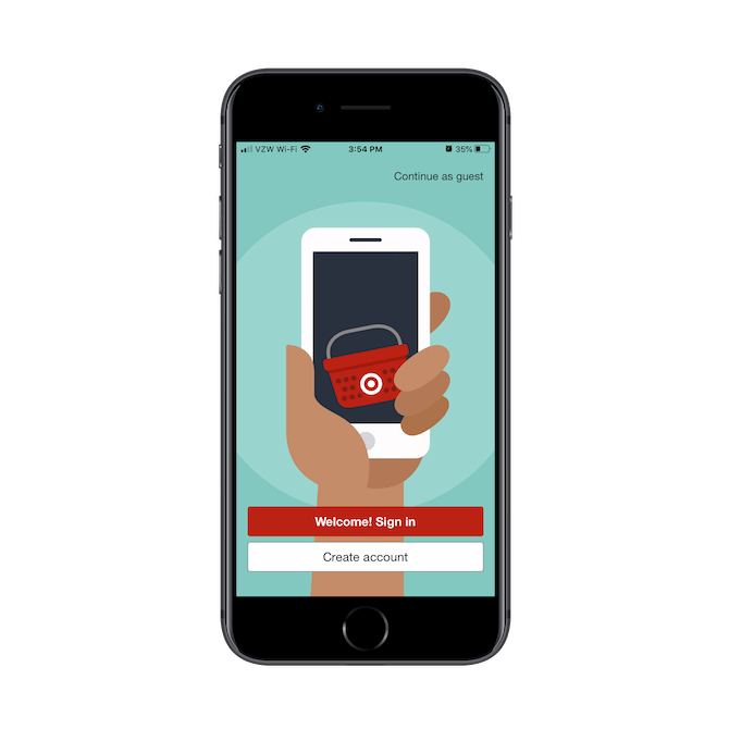
Target prominently displays two options for getting into the app:
- Welcome! Sign in
- Create account
However, unlike some apps that force the sign-in, Target doesn’t do that. It provides curious window shoppers and those protective of their privacy to “Continue as guest”.
Next, Target asks users about their location:
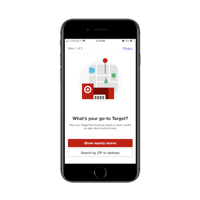
What’s neat about this page is it demonstrates two things:
- Target understands that the mobile app is a great companion to in-store shopping.
- Target gets that people might be nervous about allowing them to track their location, which is why the “Privacy” link is present.
Now, what’s interesting is that Target doesn’t just take this location-tracking information and save it for a rainy day. It puts it to use right away:
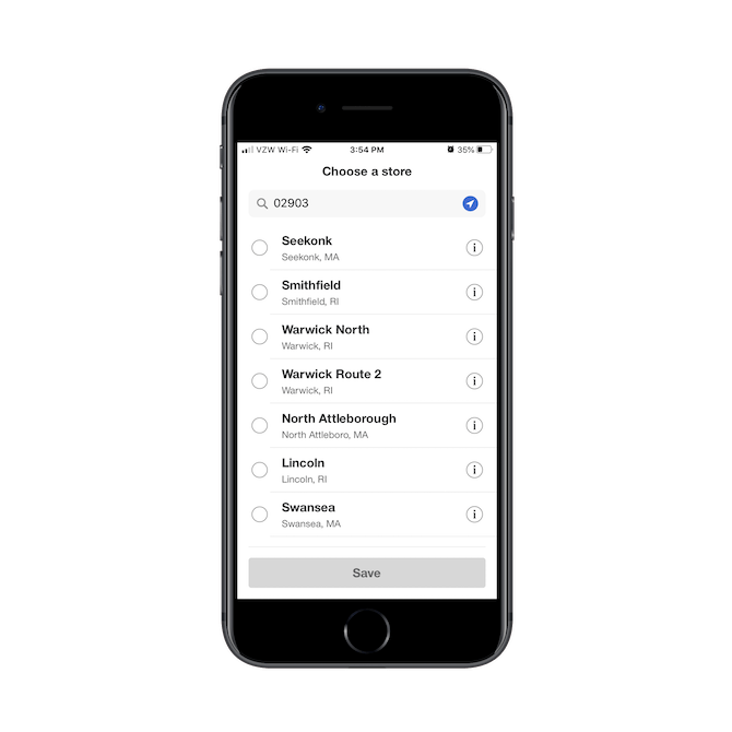
There’s no assuming which store a user wants to save as their home location. Target uses the ZIP Code provided or the geotracking information enabled to give them nearby options. But this isn’t just a list of store locations.
When users click the information “i” icon next to any of the locations, they see something like this:
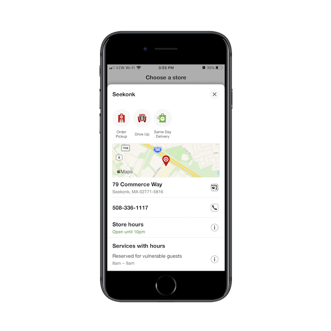
Each location comes with information on:
- Services available: Order Pickup, Drive-Up, Same-Day Delivery
- The physical address
- Phone number
- Store hours
- Special notices
This can aid in the user’s decision-making process if they’re unsure which location they want to go to, especially if they’re trying to pick up something in store before it closes for the day.
When a location is selected, users will see this page:
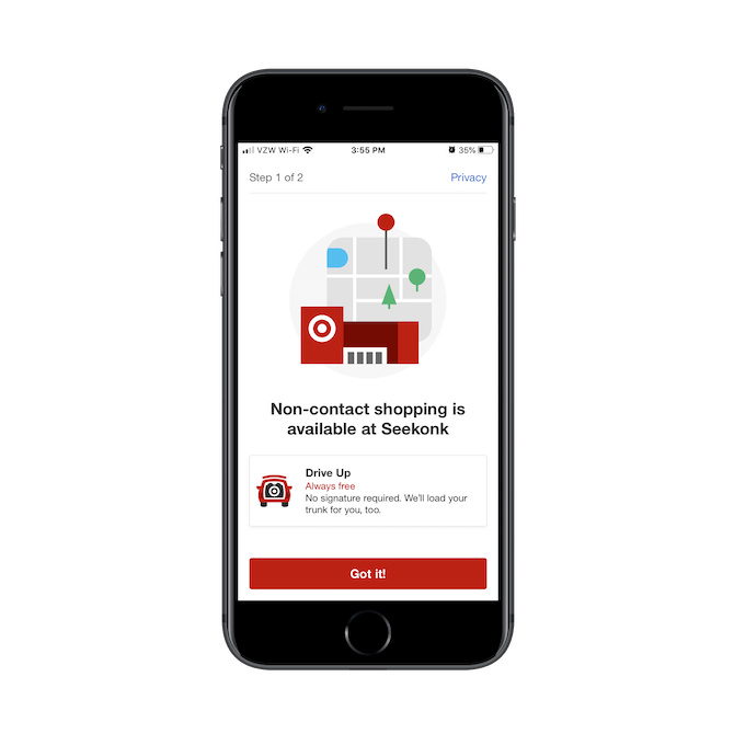
This notice won’t always be relevant, but for shoppers concerned about COVID-19, it’s a critical one to display in this onboarding process.
The last page users have to go through before they get to the home page is this one and it’s wisely placed here:
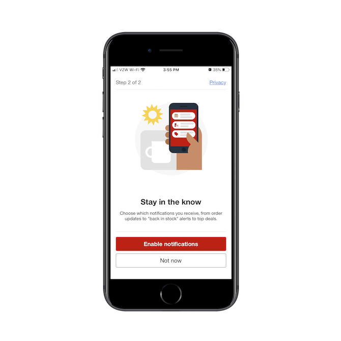
There are a number of reasons why this is so well done.
First, it’s not how many apps handle the push notification request. Many times, the user will install the app to their phone, open it up and get bombarded with pop-ups asking about enabling push notifications, Bluetooth, camera access, etc. Target doesn’t do that. It gives them time to ease into the app and then introduces it in a non-pushy way.
What’s more, Target has already taken the user through various steps that demonstrate its expertise as well as its care for its customers. By the time they reach this stage, I’m willing to bet there are more users thinking, “Sure, I trust Target to send me messages,” than there would’ve been if it had delivered the request as a pestering pop-up.
These may all seem like simple things, but the whole onboarding process is very well-thought-out. It’s clear that Target’s designers weren’t just focused on the conversion rate when designing this onboarding experience. Otherwise, they would’ve just pushed the users into the app to fend for themselves. They considered all those concerns and fears that crop up along the way when shopping online (especially on mobile) and took every chance they got to put those fears to rest.
That’s really good proof that these designers (and Target) are ecommerce experts.
Building Authoritativeness into a Mobile App
When we think about authorities in the real world, what is it that makes them so special? And in what ways do people respond to them differently than they would others?
Let’s use the example of Steve Jobs.
What made Steve Jobs an authoritative figure? It wasn’t like he was a brilliant designer or programmer who built every Apple product that flies off the shelves today.
What Jobs truly excelled at was selling consumers on an image, on a lifestyle, on a relationship. He was a master salesman who understood consumers and what would get them to choose whatever he put in front of them over the competition’s product every time.
There were a number of things about him that made this possible:
- He was incredibly confident and willing to build new products that challenged the norm
- He spoke in plain terms that consumers could understand
- He was a perfectionist when it came to design
- He believed that sophistication in design could be found through minimalism
- He prioritized usability and innovation over price
Like all authorities, Jobs gained the respect and trust of Apple users as well as his peers. And if you can design your mobile app in a way that it becomes authoritative, you’ll find that your users are more willing to listen and follow and commit without any doubt or hesitation.
Canva is a great example of an app that embodies this air of authoritativeness:
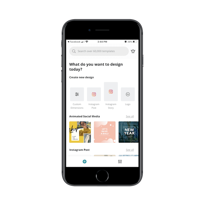
There’s actually a lot here that reminds me of the kind of authority Steve Jobs was:
- The clean, clear and almost geometrically “perfect” interface
- The super-minimal navigation
- The natural-sounding welcome: “What do you want to design today?”
In addition, Canva’s choice to lead the user into one of its design building blocks or pre-made templates is a smart one. Many users will feel reassured knowing that they don’t have to do it all on their own; that someone like Canva and its team of designers have done some of the legwork already.
An authority should not be afraid to lead.
Another Jobs-esque quality you’ll find in this app is the search bar:
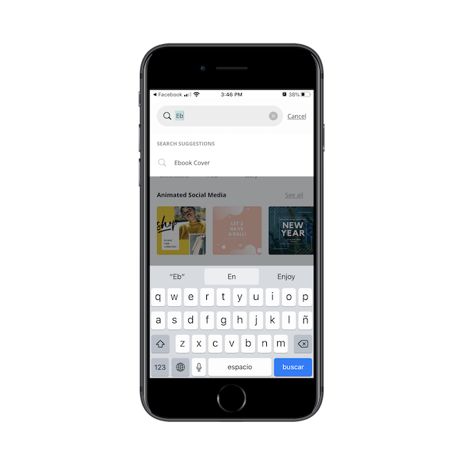
Canva can be used to design a variety of products, so having a search bar equipped with predictive search functionality is incredibly important. Again, users who might not know what they’re doing when it comes to design will be happy to know that they have this guidance and support built into the app.
It doesn’t end there.
Canva provides helpful tips as users work their way through their first project:
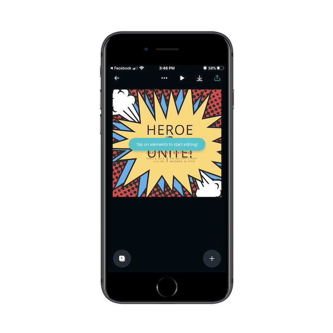
Just as Jobs and other authority figures understand their users’ pains and proactively design solutions to ease them, Canva has done something similar with its mobile app.
Keep in mind that there’s a fine line between being an authority in the eyes of your users … and being seen as a condescending jerk who treats them like children and talks down to them at every turn. So, focus on the authoritative qualities that’ll keep them on your good side. A good, rock-solid design. Helpful hints when they’re needed. And a laser-like focus on the powerful product before them and not on how they’re going to put more money into your pocket.
Building Trustworthiness into a Mobile App
Building trust into an app is a really complicated matter because you have to consider it from so many different angles.
For instance, can users trust that you won’t:
- Spam them with push notifications?
- Share their personal information or contact details with other companies?
- Put them at risk by not maintaining the security of your app?
- Waste their time with an app that seems good on the outside, but ultimately fails to deliver on its main promise?
- Degrade their experience all for the sake of driving up profits?
- Make it impossible for them to use the app because you didn’t consider their impairment when designing it?
- Employ unethical tricks to get them to spend too much money or time on the app?
There are a ton of concerns when it comes to mobile apps, which is why most users only keep a handful of them installed for the long run. So, how do you make sure these concerns don’t even occur to your users in the first place?
There are a number of characteristics that the most-trusted companies share:
- Transparency
- Consistency
- Compassion
- Respectfulness
- Personalization
By keeping these ideals in mind as you design your app, you can steadily build trust with your user base. And that trust will eventually turn into positive reviews, which will bring more users into the app with the mindset that yours is an app that can be trusted from the start.
Let’s look at how OpenTable achieves this.
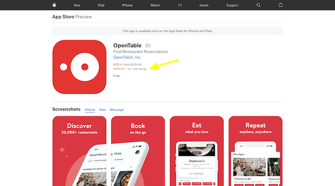
In Apple’s App Store, the OpenTable app has received 1.4 million user ratings and a score of 4.9 out of 5.0. In Google Play, it’s accumulated 118,886 reviews and a score of 4.8 out of 5.0.
That’s seriously impressive.
When you install the app, you’ll see why it is that many users respond so positively to it, too.
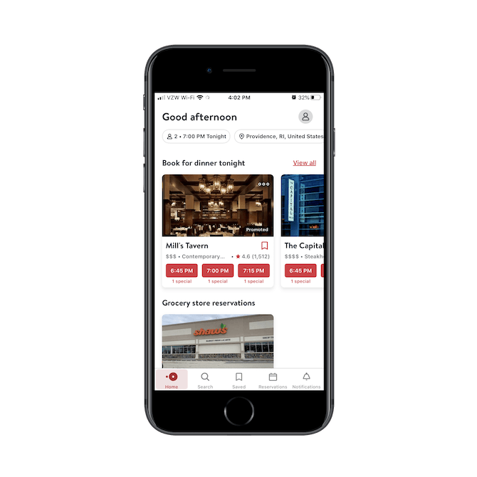
To start, there’s no pressure for the user to create an account or log in. If they do, they get access to account features like “Saved”, “Reservations” and “Notifications.” But it’s not necessary for them to reap the benefits of the experience.
We should also look at the consistency in the design. With some aggregator sites, listings will be sized, shaped or colored differently depending on whether they’re sponsored or not. Of course, that’s a conscious decision by the app designer and owner because disruptive design choices get users to pay more attention to sponsored listings over organic results.
That doesn’t happen within this app.
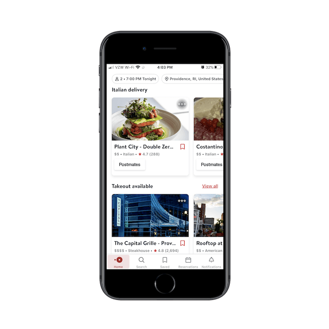
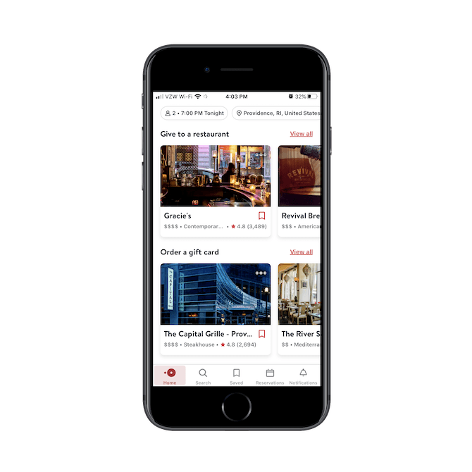
As users scroll down the page, each card and section is consistently designed.
So, there’s no disruption to the flow, which allows users to focus on the content and not on the sponsored elements drawing in their attention most.
You’ll also notice that OpenTable displays a CTA button when it’s relevant to do so. For instance, if a user is looking for a delivery or takeout option, the CTA button will tell them exactly which provider handles the service (like Postmates). This level of transparency is great because it can quickly help users decide if that restaurant option is viable or not (say, if they have an app like UberEats they use, but not Postmates).
Another reason why this app is so highly trusted is because it doesn’t prioritize profits over placement.
You’ll notice this a lot with apps like Yelp or Amazon where ads, sponsored products or even proprietary offerings end up at the front of search results. And really, it compromises the whole legitimacy of the operation because users who take notice will wonder how honest the rest of the recommendations are.
OpenTable doesn’t do this. From top to bottom, personalized recommendations are provided in a hierarchy based on usage:
- Restaurant reservations
- Restaurant delivery
- Restaurant takeout
- Restaurant donations
- Restaurant gift cards
In addition, each restaurant card publishes important information like the type of restaurant, general price point, as well as average customer rating. This app is the embodiment of transparency, consistency, respectfulness and all the other things that go into making a company worthy of trust.
Wrap-Up
Just keep in mind that expertise, authoritativeness and trustworthiness may need to be depicted differently from app to app. For instance, an ecommerce app might demonstrate its trustworthiness by providing security and privacy trust marks along the way. On the other hand, a news app might limit ads to the home page (or monetize in another way) so that users can focus on reading stories and not be disrupted by ads promoting irrelevant products or services.
So, E-A-T in app design is going to be a somewhat subjective matter. That said, if you know your users well enough and what it is that creates the most fear, doubt and hesitation for them, you can design experiences that put them at ease and build long-standing trust with them.