Learn how to use the new RadTaskDialog control in Telerik UI for WinForms to help your users in many ways.
With the R3 2020 release of Telerik UI for WinForms, we have added a new RadTaskDialog component to the suite. A task dialog is a small window that displays information to the users and prompts them for a response. Compared to a regular Message Box the task dialog has a lot of configuration options, can show additional UI elements like radio buttons and progress bar, and supports event handling.

Overview
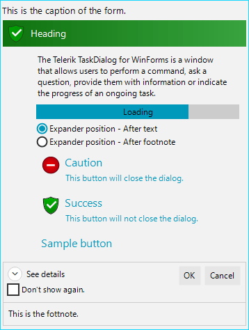
RadTaskDialog is a themable alternative of the windows dialog box and the newly released TaskDialog for .NET 5. The dialog box is a window that allows users to perform a command, ask the users a question, provide users with information or indicate the progress of an ongoing task. RadTaskDialog represents an extended version of the standard System.Windows.Forms.MessageBox and respectively the RadMessageBox. Compared to a regular Message Box, it can show additional controls like a progress bar and supports event handling.
Features
- Auto-Size: The size of the window is based on the content added to the page.
- Paging: Provides navigation to a new page (by reconstructing the dialog from the current properties). The task dialog can act as a small wizard with several pages. Microsoft recommends using no more than three pages.
- Supported Elements: The task dialog supports a wide range of predefined elements (like flat buttons, regular buttons, progress bar, waiting bar, radio buttons, check box, expander button, expander area, footer) which can be assigned and will be automatically arranged with no need to write any layout logic.
- Icons: In addition to the standard icons which indicate Error, Warning, Information, the task dialog has green, yellow, red, gray or blue bar over the whole heading/title background. Additionally, custom icons and images are also supported out of the box.
- Modal vs Non-Modal: Can be shown modal or non-modal, via the ShowDialog or the Show methods.
- Localization: Localization for each of the predefined strings.
- Theming: More than 25 predefined themes.
- Customization: RadTaskDialog can be constructed according to the specific requirement that you need to cover and allows adding or removing any elements and customizing any of the predefined elements.
It has one main element which holds all the necessary user information—the RadTaskDialogPage. The RadTaskDialogPage exposes some useful properties that allow you to setup a whole dialog with just a few lines of code:
- Caption: The text in the title bar of the RadTaskDialogForm when this page is displayed.
- Icon: Comes with vector images, and can show a green, red, yellow, blue or gray bar as the header background.
- Heading: The header/title of the page.
- Text: Display descriptive information about the dialog's purpose.
- ProgressBar: Used to indicate determinate or indeteminate progress.
- RadioButtons: A radio button collection that allows users to choose from different options.
- ContentAreaButtons: A collection of flat buttons that are displayed in the top part of the dialog. These buttons are flat and have three main elements: icon, header and description texts.
- Expander: Defines the details/description text, which can be collapsed by a toggle button.
- Verification: A check box can be used to receive confirmation from the user.
- CommandAreaButtons: A collection of regular buttons displayed in the bottom part of the page.
- Footnote: For optional additional explanations and help, typically targeted at less experienced users.
Usage
After describing the main features of the dialog, it is time to show some use cases. But before that we need to clarify two important things:
- RadTaskDialog needs a RadTaskDialogPage as a parameter to show.
- RadTaskDialog does not return a System.Windows.Forms.DailogResult (like the MessageBox), but the instance of the button that was clicked by the user.
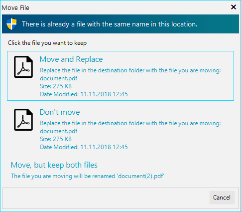
Here is a sample case during a PDF file move. The user must decide whether to replace the original file, cancel or keep both files.

And here is the code. As you can see most of the lines are used to configure the command link buttons:
RadTaskDialogPage page = new RadTaskDialogPage()
{
    SizeToContent = true,
    Icon = RadTaskDialogIcon.ShieldBlueBar,
    Caption = "Move File",
    Heading = "There is already a file with the same name in this location.",
    Text = "Click the file you want to keep",
    CommandAreaButtons = {
        RadTaskDialogButton.Cancel
    },
    AllowCancel = true,
    UseWideContentArea = true
};

RadSvgImage pdfIcon = RadSvgImage.FromFile(@"..\..\Resources\file-pdf.svg");
pdfIcon.Size = new Size(50, 50);
RadTaskDialogCommandLinkButton moveButton = new RadTaskDialogCommandLinkButton(
    "Move and Replace",
    @"Replace the file in the destination folder with the file you are moving:" + Environment.NewLine +
    "document.pdf" + Environment.NewLine + "Size: 275 KB" + Environment.NewLine + "Date Modified: 11.11.2018 12:45");
moveButton.SvgImage = pdfIcon;
page.ContentAreaButtons.Add(moveButton);

RadTaskDialogCommandLinkButton dontMoveButton = new RadTaskDialogCommandLinkButton(
    "Don't move",
    @"Replace the file in the destination folder with the file you are moving:" + Environment.NewLine +
    "document.pdf" + Environment.NewLine + "Size: 275 KB" + Environment.NewLine + "Date Modified: 11.11.2018 12:45");
dontMoveButton.SvgImage = (RadSvgImage)pdfIcon.Clone();
page.ContentAreaButtons.Add(dontMoveButton);

RadTaskDialogCommandLinkButton keepBothButton = new RadTaskDialogCommandLinkButton(
    "Move, but keep both files",
    "The file you are moving will be renamed 'document(2).pdf'");
page.ContentAreaButtons.Add(keepBothButton);

RadTaskDialogButton clickedButton = RadTaskDialog.ShowDialog(page);
if (clickedButton == null || clickedButton == RadTaskDialogButton.Cancel)
{
    // the user cancelled the action
}
else if (clickedButton == moveButton)
{
    // move and replace
}
else if (clickedButton == dontMoveButton)
{
    // do not move
}
else if (clickedButton == keepBothButton)
{
    // move and keep both files
}
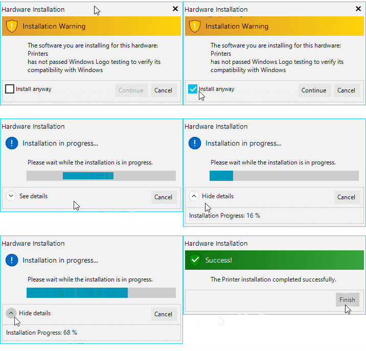
Another interesting case is when you need to create a multi-page dialog. To switch through the pages, you simply need to call the Navigate method of currently displayed RadTaskDialogPage.
Here is a printer installation sample:

RadTaskDialogButton initialButtonYes = RadTaskDialogButton.Continue;
initialButtonYes.Enabled = false;
initialButtonYes.AllowCloseDialog = false;

RadTaskDialogPage initialPage = new RadTaskDialogPage()
{
    Caption = "Hardware Installation",
    Heading = "Installation Warning",
    Text = "The software you are installing for this hardware:\nPrinters\nhas not passed Windows Logo testing to verify its compatibility with Windows",
    Icon = RadTaskDialogIcon.ShieldWarningYellowBar,
    AllowCancel = true,

    Verification = new RadTaskDialogVerificationCheckBox()
    {
        Text = "Install anyway"
    },

    CommandAreaButtons =
    {
        initialButtonYes,
        RadTaskDialogButton.Cancel
    },
    DefaultButton = RadTaskDialogButton.Cancel
};

RadTaskDialogPage inProgressPage = new RadTaskDialogPage()
{
    Caption = "Hardware Installation",
    Heading = "Installation in progress...",
    Text = "Please wait while the installation is in progress.",
    Icon = RadTaskDialogIcon.Information,

    ProgressBar = new RadTaskDialogProgressBar()
    {
        State = RadTaskDialogProgressBarState.Marquee
    },

    Expander = new RadTaskDialogExpander()
    {
        Text = "Initializing...",
        Position = RadTaskDialogExpanderPosition.AfterFootnote
    },

    CommandAreaButtons =
    {
         RadTaskDialogButton.Cancel
    }
};

RadTaskDialogPage finishedPage = new RadTaskDialogPage()
{
    Caption = "Hardware Installation",
    Heading = "Success!",
    Text = "The Printer installation completed successfully.",
    Icon = RadTaskDialogIcon.ShieldSuccessGreenBar,
    CommandAreaButtons =
    {
        new RadTaskDialogButton("Finish")
    }
};

RadTaskDialogVerificationCheckBox checkBox = initialPage.Verification;
checkBox.CheckedChanged += (sender, e) =>
{
    initialButtonYes.Enabled = checkBox.Checked;
};

initialButtonYes.Click += (sender, e) =>
{
    initialPage.Navigate(inProgressPage);
};

inProgressPage.Created += delegate (object s, EventArgs e)
{
    RadTaskDialogProgressBar progressBar = inProgressPage.ProgressBar;
    Timer timer = new Timer();
    timer.Interval = 2800;
    int progressValue = 0;
    timer.Start();
    timer.Tick += delegate (object sender, EventArgs args)
    {
        timer.Interval = 40;
        if (progressBar.State == RadTaskDialogProgressBarState.Marquee)
        {
            progressBar.State = RadTaskDialogProgressBarState.Normal;
        }

        progressBar.Value = progressValue;
        inProgressPage.Expander.Text = string.Format("Installation Progress: {0} %", progressValue);
        if (progressValue == 100)
        {
            timer.Stop();
            timer.Dispose();
            inProgressPage.Navigate(finishedPage);
        }

        progressValue++;
    };
};
Last, but not least our designers have also created three different sets of vector icons: gradient, flat and white:
![]()
We have added three different methods that return different format and size based on our internal needs. To access these images you can use the following code:
// Returns a vector image
RadSvgImage svgIcon = RadTaskDialogIcon.GetSvgImage(RadTaskDialogIconImage.FlatShieldQuestion);

// Returns a raster image with size 16x16px
Image smallIcon = RadTaskDialogIcon.GetSmallImage(RadTaskDialogIconImage.FlatShieldQuestion);

// Returns a raster image with size 26x26px
Image largeIcon = RadTaskDialogIcon.GetLargeImage(RadTaskDialogIconImage.FlatShieldQuestion);
Try it Out
Make sure to download and try the latest version of Telerik UI for WinForms to explore all the new features and themes. Customers can get the latest bits from their account, or you can start a free trial today:
We'd love to hear how this all works for you, so please let us know your thoughts by visiting our Feedback portal or by leaving a comment below.