76% of mobile users churn just a week after installing a fintech app. Do you really want such a costly rate of churn? Of course not. To ensure your users get inside the app to see its value, you need to remove friction from the signup and onboarding process.
Getting users to install your finance app is only the first step of many. Unlike other mobile apps that can move new users into the experience right away, most fintech apps have to take users through a rigorous signup and onboarding process.
Because of this, there are extra opportunities for user churn before they’ve even seen the inside of your app. And CleverTap’s 2020 Industry Benchmarks for Fintech Apps suggests that this may be a common issue in fintech:
- 26% of new users take three days, on average, to sign up for an account with a newly installed app
- 76% of users will churn within a week of installation
User churn is costly, especially when it takes place so early on.
As there are typically four components involved in the fintech user signup and onboarding process, I want to look at where the friction exists within each and how you can deal with it:
- The splash screen
- The permission request pop-ups
- The signup form
- The onboarding questionnaire
If you can avoid the following design faux pas, you should be able to improve your odds of not only signing up more users, but retaining them:
1. Making a Bad Impression with the Splash Screen
The first thing anyone is going to see when they open your app for the first time is the welcome splash screen.
Now, there are two arguments for how you can handle this.
The first suggests that it’s better to provide users with a simply designed static screen, with no content, and just signup and login buttons. The logic is that the app store has already provided the user with screenshots and details of the app and that repeating any of that information here is excessive.
However, a study done by storemaven reports that 60% of users decide if they’re going to install an app based solely on the first impression frame:
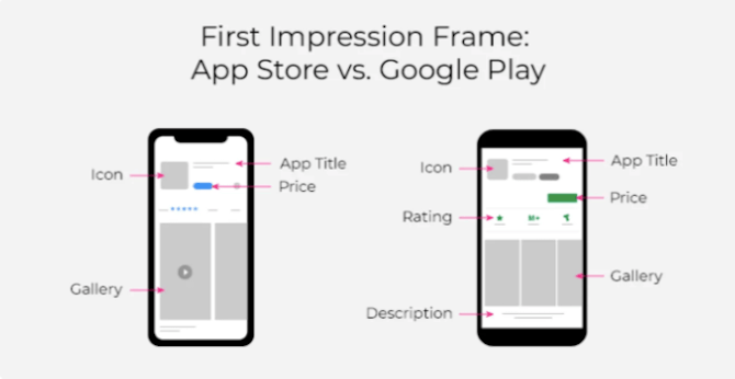
What’s more, most people only read the first line in the app store description.
That’s why I subscribe to the second argument for splash screen design. You can’t assume that your users are going to flip through every screenshot or read your description.
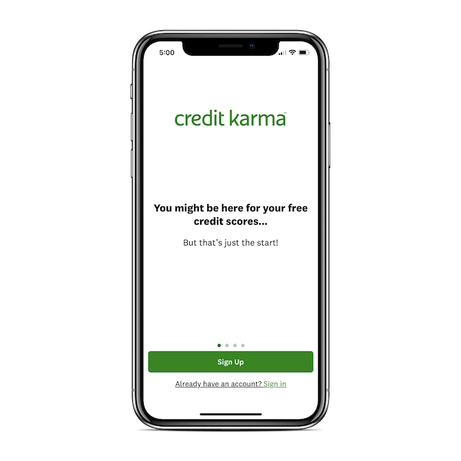
So, follow Credit Karma’s lead and use the splash screen to:
Welcome new users with a minimal interface and friendly message:
Make sure the buttons to “Sign Up” and “Sign In” remain present regardless of which screen they flip to:
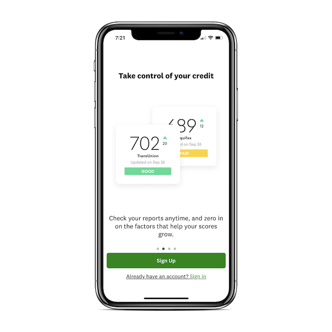
Give your users a succinct and eye-catching recap of the app’s features:
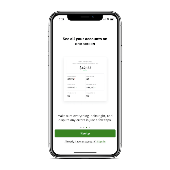
You can highlight users’ favorite features, announce recently added features or call attention to features the competition doesn’t have. You could also use this space to provide pro tips that help them get more from the app.
One last thing I’d suggest is that you turn off the auto-rotate on the slider:
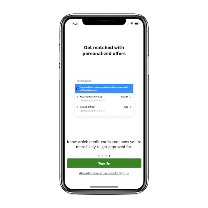
This way, users who want to read through the slides can control the pace and those who just want to sign up and get started won’t be distracted by the animation.
2. Bombarding Users with Unnecessary or Too Many Requests
One of the benefits of building a fintech app is that you can use mobile features to enhance the experience, like push notifications, location-tracking, camera access and more.
While I can’t find data on how much users appreciate those features but hate the app permission requests that enable them, I have a sneaking suspicion that’s the case based on what we know about website pop-ups.
Here’s what a recent survey from G2 revealed:
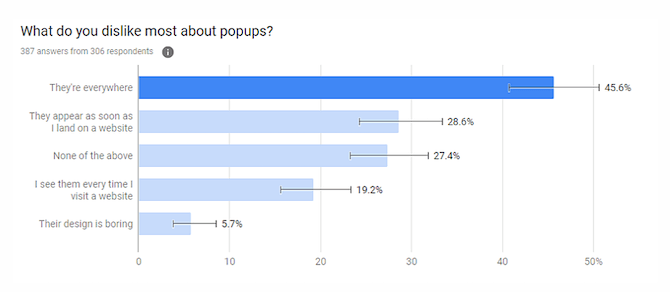
Let’s start with the second most common reason: “They appear as soon as I land on a website.”
This is actually a huge no-no in Google’s book, so much so that a few years back it began penalizing mobile websites that displayed pop-ups before the visitor could actually see the website. Even though Google can’t punish your app for doing the same, consider this a good rule of etiquette across all mobile experiences.
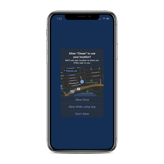
So, first things first: Never display a permission request the second someone enters your app the way Chase does:
Now, let’s look at the most common reason people dislike pop-up notifications: “They’re everywhere.”
While it would certainly suck if your new users saw your permission request pop-up and were annoyed by it, there’s something more serious to worry about: Banner blindness.
This actually means that the least common reason—“Their design is boring”—goes hand-in-hand with the most popular one. Because when you bombard your users with the same ugly permission request that everyone else uses, there’s a good chance they’ll dismiss it without reading it… or accept it and then regret the choice later.
So, there are a couple things you can do to fix this.
The first is to do as Emma does and actually design an onboarding screen for the request.
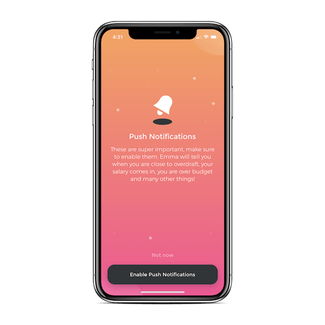
When the request becomes part of the well-designed onboarding process and there’s a valid reason given for enabling permissions, you’re more likely to see a positive response from users.
The other thing you can do is use the default permission request design, but not display it until the user tries to access a feature in the app that requires it (like asking for camera access when they want to scan a check in). It’s going to make a whole lot more sense to them to click “Allow” when the request appears in context.
3. Having a Signup Form That’s Difficult to Fill In
There’s no getting around the signup form in fintech apps, so you’ll want to spend extra time on this to make sure you get it right.
The good news is that there’s a winning formula when it comes to good mobile form design.
First, only include required fields. You can gather optional details from your users in the Settings panel.
Next, make sure the fields are properly formatted:
- Place the labels and any hints outside of the fields.
- Use a larger, bold font for labels and a slightly smaller, italicized font for hints.
- Make the fields stretch the full width of the form.
- Stack each field vertically. There should be no side-by-side fields (even for “First Name” and “Last Name”).
H&R Block’s account signup form is a good one to model yours after:
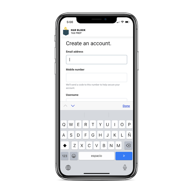
There are a couple other details worth noting here, too.
First, look at the message under the Mobile number field: “We’ll send a code to this number to help secure your account.”
Not only does this get users thinking about their security as early on as the signup process, but it lets them know why this bit of info is necessary (i.e. “It’s not for spamming you with messages; it’s to secure your login”).
The other detail to pay attention to is the up/down tabbing just above the keyboard. This is something that all mobile forms should have, but, sadly, I haven’t seen many fintech apps use them. It doesn’t matter how short your form is. Users can more quickly fill in fields if they’re not having to stop to tap the fields in order to type.
One thing H&R Block doesn’t do is change the keyboard for the field. For instance, when the Mobile field is selected, it should automatically switch to the numeric keypad. (I’ll show you an example of this in the next section.)
One last thing your form design needs is proper error handling:
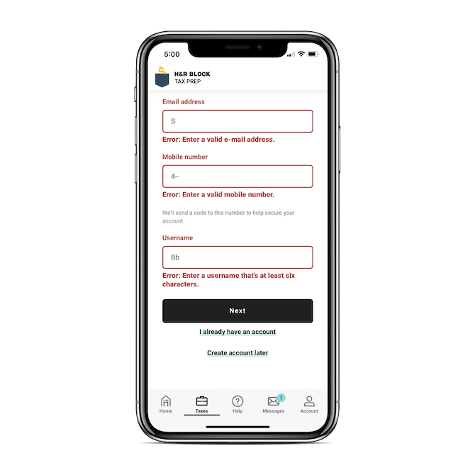
For starters, if a field is incorrectly filled out, the error message should appear right away. Not after they hit the “Next” button.
Secondly, the error message should appear in the form and not as a pop-up. It’s not your users’ responsibility to remember what the error message said if they dismissed it too quickly or didn’t read the tip properly. Build it into the page so they have an ever-present reminder of what to do.
Which leads me to the next point: Make your error messages descriptive. Don’t just say “Error.” Explain what the error is and how to fix it, like “Enter a username that’s at least six characters.”
Lastly, be mindful of accessibility here. A red font won’t help some color-blind individuals notice the message. If you have room for it, include a small error icon (like an exclamation point) to call attention to it.
By designing your form in this way, you’ll find that more users will happily sign up and get started.
4. Forgetting About the Onboarding Questionnaire
Not every fintech app needs an onboarding questionnaire. That said, if there’s a way for you to personalize the in-app experience or to cut down on the time users spend configuring their settings, this is a great feature to include up front.
Just make sure it will actually improve their in-app experience.
If not, don’t waste their time with one and don’t mislead anyone into thinking that it’s worth filling out if there’s no value. Even if you present a questionnaire with a “Skip” option, curiosity will get the better of some of your users. And they won’t be happy down the road to find out that it was unnecessary.
As for designing an onboarding questionnaire, let’s have a look at the good example MoneyCoach sets.
Users are told right off the bat that these questions will enable the AI-powered app to provide personalized recommendations:
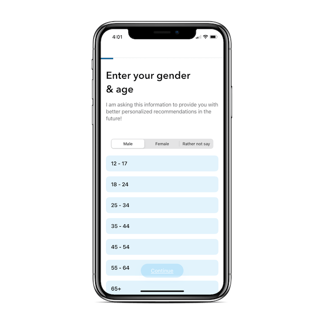
Without this explanation, users might be wondering how information like their gender and age has anything to do with budgeting their money.
The next detail to take away from this design is the progress bar at the top of each page:
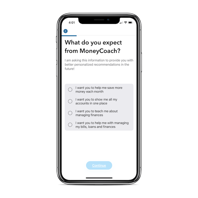
Not only can users keep track of how much more they have to fill out, but there’s a back-arrow button that allows them to backtrack and change their answer.
While the onboarding process is consistently designed in terms of the visual appearance of each page, the way in which users select their answers changes:
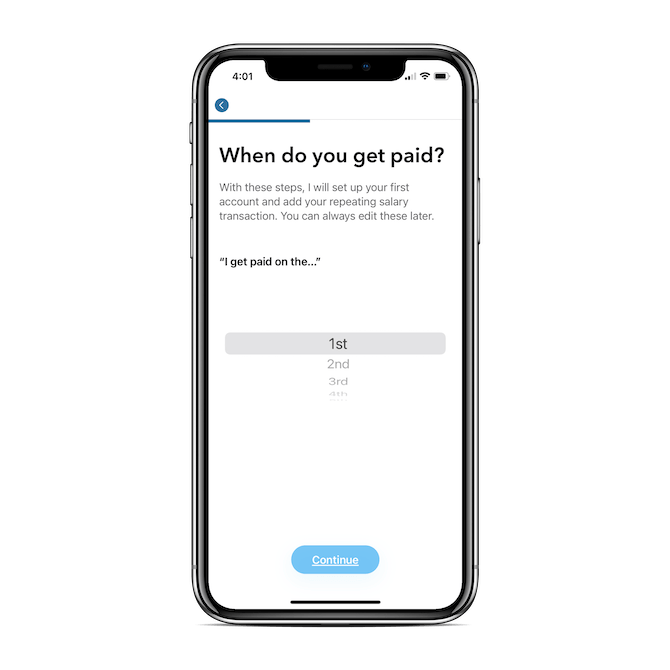
In this example, because users are being asked about when they get paid—and there are 31 options—a scroller makes the most sense.
So, the data point dictates the design.
But it’s not just about qualitative vs. quantitative answers. Here’s another question that requires a numerical response:
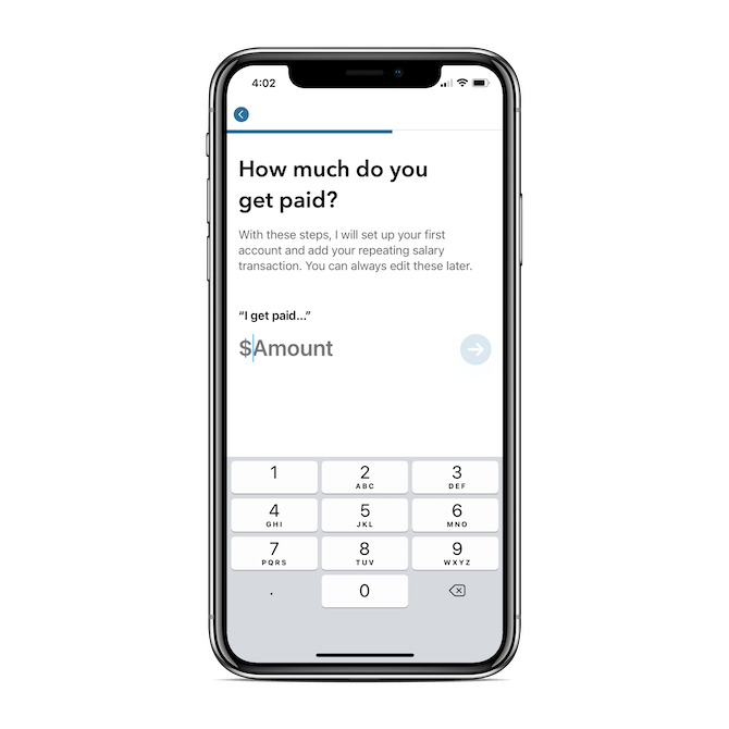
Here, an open field makes much more sense. Notice how the right (numerical) keyboard is displayed for a faster response.
And here’s another example of a quantitative response being collected in yet another way:
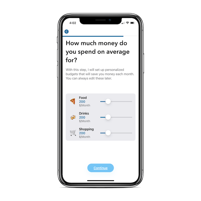
Although it’s similar to the question about how much the user earns, this is a space-efficient way of collecting the same type of numerical response for three questions.
Notice the icons next to each category as well. This isn’t the only page in this questionnaire that uses descriptive icons to improve the speed of recognition and response either.
Again, if it’s beneficial for your fintech users to spend time filling out a questionnaire, design it with their convenience in mind. That means providing justification for why you need the data, consistently presenting each question to them, and then designing the response intake based on the context.
Improving the Fintech Signup/Onboarding Process for Greater User Retention
It costs a lot of money to build a fintech app, optimize it for visibility in the app store and search engines, and then actually motivate people to install it. So, the last thing you want is for three-quarters of those users to uninstall the app before they’ve ever had a chance to use it.
A good way to keep that from happening is by designing the signup and onboarding process for success.
Design a friction-free experience and watch as more users have the chance to see the value of the app, rather than pass unfair judgment because of a lackluster signup or onboarding experience.