The KendoReact R3 2020 release is here, bringing new React UI components like the Gantt Chart, AppBar, TextArea, Rating, and more! The Editor and Grid also received several updates.
The KendoReact team has put the pedal to the metal over the last couple of months, creating eight new UI components and a whole slew of features for existing React components. This includes the new Gantt Chart component along with several layout-focused UI components like the AppBar, Badge, and Chip & ChipList components. If that has you excited let’s cut the intro and jump into what’s new in KendoReact with the R3 2020 release!
New React Components
New Component: Gantt Chart
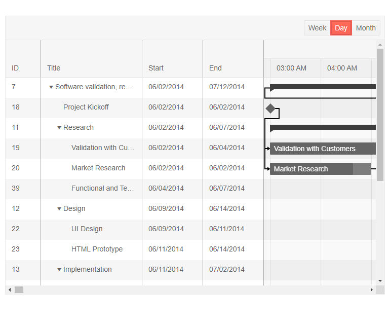
One of the most-anticipated UI components with the R3 2020 release is the new React Gantt Chart!
For those of you not familiar with what a Gantt chart is the quick and dirty is that the Gantt is a type of a bar chart that illustrates a project schedule. It allows for users to see various tasks, how they are related (does Task A need to be finished before Task B can start?), and how long each task should take to complete. As you see in the screenshot above, tasks have a visual bar to indicate the start and end of a task, how far along a particular task is, whether the task is on-time or late, and much more.
There’s a lot to uncover in this component already from v1, way too much to cover in this blog post, so head on over to the KendoReact Gantt documentation section to see the component in action along with a list of available features.
New Component: AppBar

The AppBar has become a staple for many web applications targeting both desktop and mobile devices. A pretty standard scenario can be seen in the image above where the AppBar is rendered at the top of a page and it contains the title of the current page, a Drawer icon to expand or collapse a navigation, as well as some action buttons that are contextual to the current page.
This is just one of many scenarios where this component can fit in though! The goal behind the React AppBar component is to serve as the main area of action for your application, allowing a developer to add several action buttons, change available action items based to change the look and feel as well as available options based on context, and much more!
The KendoReact team designed this component to be as flexible as possible, giving the developer tons of options when adding this React UI component to their applications, so wander on over to the React AppBar UI component docs & demos page to see how you can go about adding this component in your React applications today!
New Component: TextArea
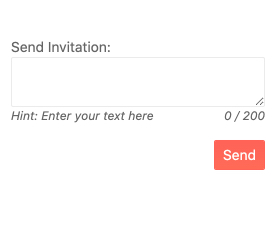
Continuing to expand on the list of available form components in KendoReact, we are introducing the new TextArea React component! The KendoReact TextArea component, also known as a Multi-line TextBox, is suitable for any scenario that requires multiple lines of text to be entered as a part of a form. Thanks to the various KendoReact themes, this component fits naturally into any design language and can adjust its look-and-feel based on available UX requirements.
To see the new React TextArea component in action head on over to the KendoReact TextArea documentation page.
New Component: Rating
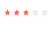
The new React Rating UI component is pretty self-explanatory—it allows users to provide a rating in a very digestible and visual way!
Whether requirements call for just displaying a rating value, or if users should be allowed to change a value through the component, the KendoReact Rating component can handle it with ease. With built-in support for half steps, so a user can rate something 3.5 stars for example, this new React component works well by itself or integrated in to other React UI components (like the KendoReact Grid ).
Check out the KendoReact Rating component documentation for more information!
New Component: Chip & ChipList
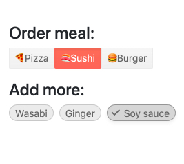
The new KendoReact Chips and ChipList components lets developers add stylized containers, often referred to as a “pill,” to their React application.
The React Chip component is responsible for a single “pill” and can contain text, an image or avatar (optional), as well as a built-in icon like an “X” to indicate that an action can be taken. The Chip can be used by itself or be used as a part of other components to showcase unique selected values that have been selected by the user.
The React ChipList component takes the React Chip and provides additional functionality related to a list. This includes the ability to manage a collection of Chips, like adding and removing items as well as managing currently selected items from a list of Chips.
Jump over to the KendoReact Chips component demo page or the KendoReact ChipList component page for more information!
New Component: Badge
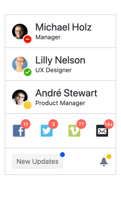
Popularized by the icons that mobile operating systems utilize to indicate unread messages or notifications, the Badge component has expanded its usage and has become a big part of web applications. With the new KendoReact Badge component React developers can easily attach their own Badges to existing UI elements. With built-in support for text, visibility, settings for positioning and overlap as well as overall size, and the ability to just showcase a simple dot, the new React Badge component can be added to any existing user experience with just a single line of code and some quick property settings.
Check out the KendoReact Badge component docs and demos page to see the component in action.
New Component: Loader

While KendoReact has some CSS styling for a loading indicator, the team wanted to take this experience to the next level. With R3 2020 we are introducing the React Loader component—perfect for letting your users know that something is happening on the screen (loading of remote data, or fetching a view) while being visually pleasing. With several built-in animations for indicating that something is loading, as well as a whole slew of configuration options to help make the KendoReact Loader component your own, this component is sure to make your application pop with its gorgeous UX.
To see more available Loader styles, as well as get ideas for how you can customize the component to make your own, head on over to the KendoReact Loader component section in our documentation!
Enhancements to Existing React UI Components
Grid - Row Pinning
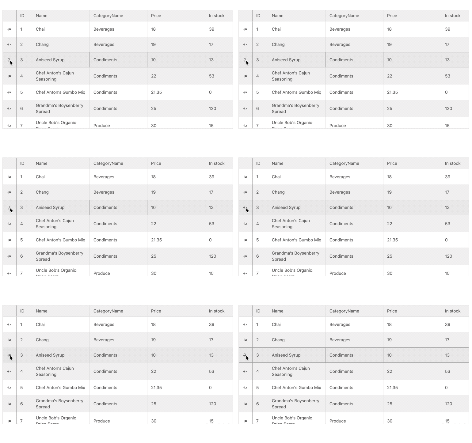
Adding to the growing list of Data Table features in the KendoReact Grid, with the R3 2020 release the React Grid can now pin rows that stick to the header as users scroll through the rows of the Grid.
This is fairly simple to implement in your own Grids, so head on over to the React Data Table documentation to see how!
Grid - Customizable Pager
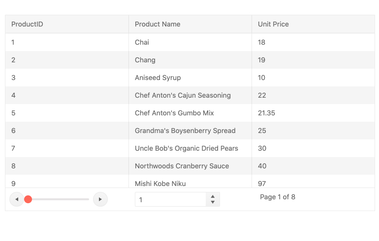
While the KendoReact Data Grid has had a built-in paging mechanism since its first release, it has been based on exactly that—something that is built-in. With the introduction of the standalone KendoReact Pager component we wanted to move away from something that is purely built-in and move into a more extensible model, which means the KendoReact Grid now uses the KendoReact Pager to serve its paging mechanism.
From most developers' perspectives nothing really changes. However, a bonus effect of using the standalone React Pager component is that the KendoReact team has now opened up the ability for React developers to completely override the paging user experience of the KendoReact Grid without even using the Pager component at all. The KendoReact Data Table provides all the internals that developers can hook in to and at that point any UX can be implemented to page through the React Grid data.
To see examples of what kind of customization you can do, head on over to the KendoReact Grid Paging section of our docs & demos!
Grid - Pin Columns through Column Menu
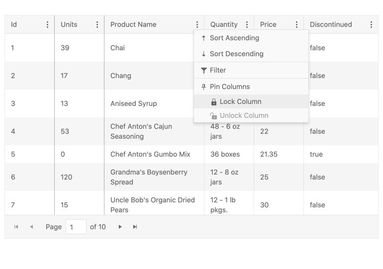
Column pinning, also known as frozen or sticky columns, is a feature that already exists in the KendoReact Grid. With this release we are enhancing the user experience of the Grid’s end-user, letting them select which columns to pin through the already available column menu.
Check out what the Column Menu Pinning option looks like in action right here!
Editor - Insert Image Dialog Updates
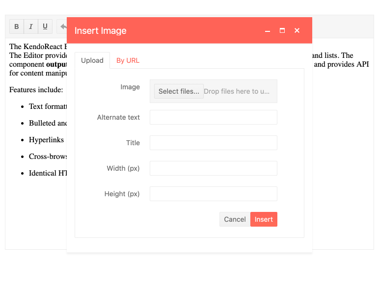
The KendoReact Editor also received some updates with this release, the first feature allowing images from the local file system to be uploaded into the content of the Editor. Previously the Editor was limited to images that were hosted somewhere on the web and required a URL to be added. With this new enhancement, end-users can select images from their own devices and upload them into the Editor content.
Editor - Font Color & Background Color Tools
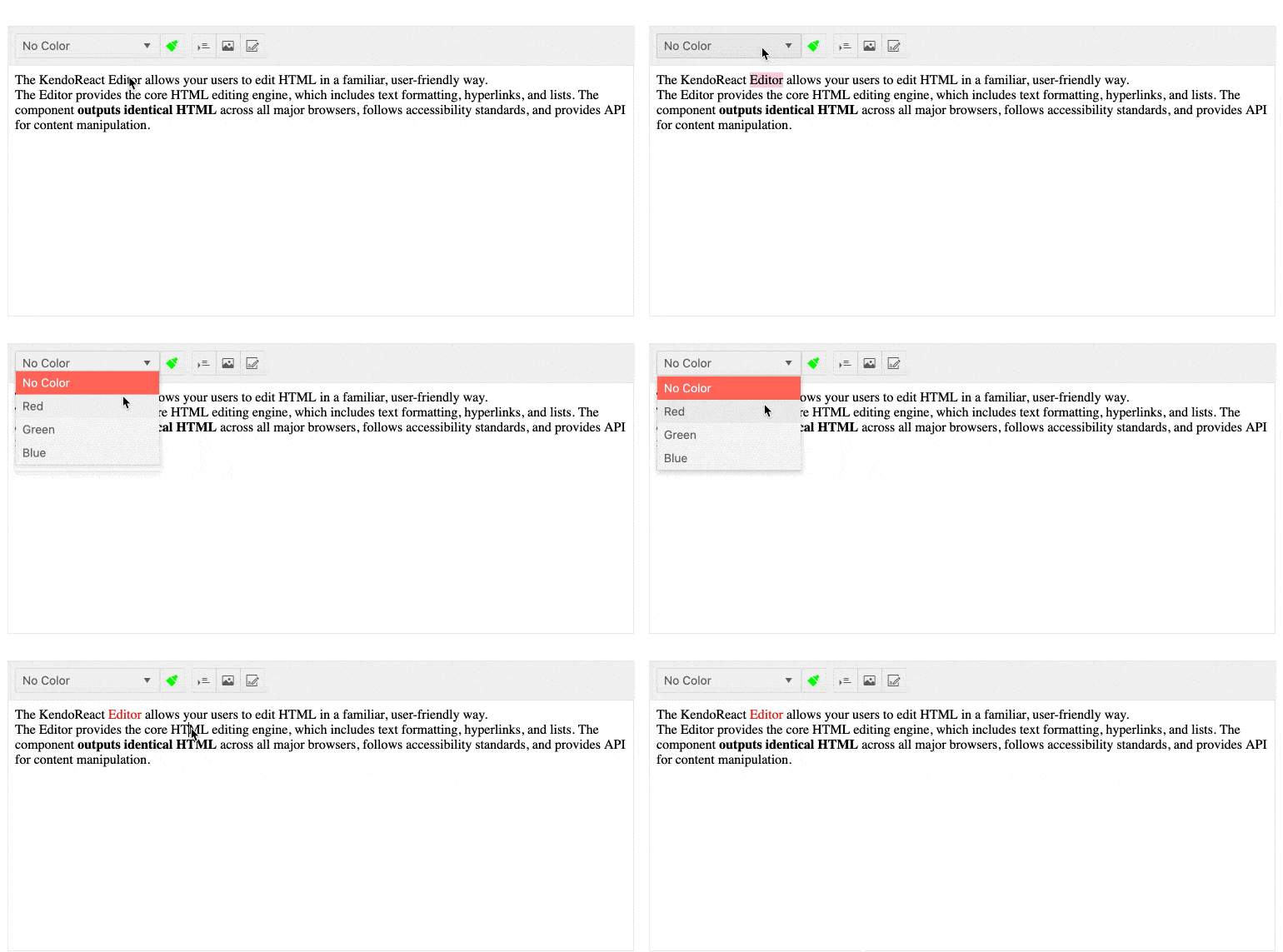
Extending the KendoReact Editor features further, with R3 2020 we have now added additional tools to control both the Font color and the Font Background—just like the equivalent tools you find in word processors today.
Editor - Find and Replace Tool
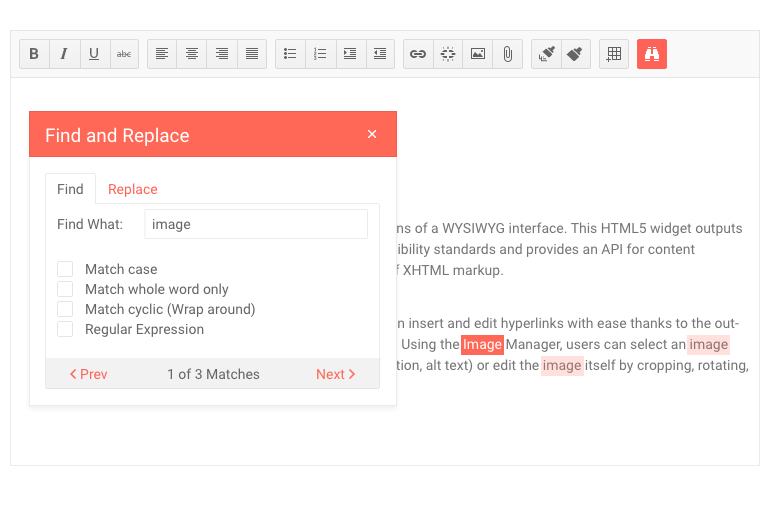
A quality of life update to end-users of the React Editor component, the find and replace tool lets users search through the content of the Editor exclusively (no need to rely on browser tools to search through the entire page) and potentially do a find and replace throughout the entire content.
To see this and all of the other Editor tools and features that we added with R3 2020, head on over to the KendoReact Editor demos!
New and Improved Documentation and Demos
Over the last couple of months, we have focused heavily on increasing the performance of our documentation pages. After all, most of you are using these pages multiple times a day and any performance tweaks we can do can have significant impact on daily users of the KendoReact docs & demos.
That’s why I’m excited to note that with R3 2020 we have increased the performance of the KendoReact docs across the board! Our goal was to achieve a score of 90+ on average across all of our KendoReact documentation pages and happy to say we not only met this goal but overachieved in several areas! With this we have seen performance increases upwards of 4x on certain pages, improving the experience for desktop and mobile device users alike.
Got Feedback?
Everything mentioned in this blog post has been requested by KendoReact users. We drive the KendoReact roadmap from your feedback! Did we miss a component or feature that you really need, or do you have any pie-in-the-sky requests for items we should add to KendoReact? Check out the KendoReact public feedback portal where you can submit your ideas or vote on existing ideas to raise their awareness.
Register for our Live R3 2020 Webinar & Stream!
Like always, we are hosting a webinar to cover everything mentioned above! However, this year we are doing things a little bit differently.
On Tuesday, September 29th we are hosting both a webinar and a live Twitch stream where we will dive into the latest content! We kick things off at 11 AM ET where we will cover what is new with KendoReact and Kendo UI for Vue. Then, at 12:30 PM ET we are starting a Twitch live stream where we will do a deep dive session in to the latest and greatest bits. This session will let us do a true deep dive in to the new components and features and should be a fun time for everyone .
To sign up for either session, or both if you’re feeling in the spirit, head on over to the our What’s New in KendoReact and Kendo UI for Vue in R3 2020 Webinar Page and reserve your seat!