Gathering user input is an important part of every application and with our Xamarin input controls you can do it in style. In our R2 2020 release we added a new TimePicker component to Telerik UI for Xamarin suite which will help in scenarios when users need to choose a time.
With our TimePicker for Xamarin you can allow your app users to easily pick a time within the range of a single day. The control is highly customizable to ensure consistency across the user experience of your Xamarin.Forms app. In this blog post I will get you familiar with the TimePicker control features in details. I am sure you will love it!

Pick a Time
The sole purpose of the TimePicker control is to provide an easy and intuitive way for users to choose a time. It displays a list of time values in a popup where the individual time “elements” such as hours, minutes and seconds are visualized through spinners. What spinners are shown depends on the defined time format—we’ll look into this in the next section.
Choose the Time Format
RadTimePicker supports standard as well as custom time formats—whether you need only the hours and minutes, or 12 or 24 hours format, all could be set through the SpinnerFormat property. Depending on the format you choose, the control visualizes spinner controls with prepopulated values to be picked.
In addition, through DisplayStringFormat you can apply a different format to the selected Time value when the popup is closed.
Check a quick example below on how both properties can be applied to the TimePicker control:
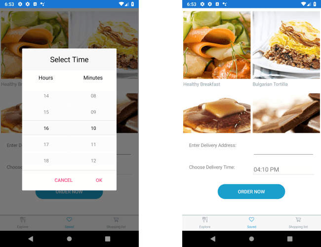
<telerikInput:RadTimePickerx:Name="timePicker"SpinnerFormat="HH:mm"DisplayStringFormat="hh:mm tt"/>Here is the result on an Android emulator when the TimePicker is open as a popup and after a selection is made. For the purpose of the example I've been using a sample food delivery app.

Apply Min/Max Time Values
In some cases, you may not want to show all hours of the day, for example, in the case of delivery service, it’s appropriate to show only the hours the service is available. This can be easily achieved through the MinimumTime and MaximumTime properties of the TimePicker which will allow to choose time only within the defined time range.
Let’s move on with our example and adjust min and max time values:
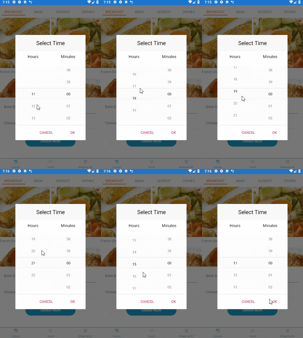
<telerikInput:RadTimePickerx:Name="timePicker"SpinnerFormat="HH:mm"DisplayStringFormat="hh:mm tt"MinimumTime="11:00"MaximumTime="22:00"/>To illustrate the result better, I've created a short video that shows the popup with the available time values:

Choose the Time Intervals
By default, the TimePicker shows all available values for the hours, minutes, seconds, etc. According to the scenario at hand, you may need to show only certain time values. To continue our example with the delivery service, when choosing a delivery time, it’s more convenient to show only 15 minutes intervals of each hour. This can be easily configured through the MinuteStep property of the control. HourStep and SecondStep are supported as well to give more flexibility when setting up the available time values.
<telerikInput:RadTimePickerx:Name="timePicker"SpinnerFormat="HH:mm"DisplayStringFormat="hh:mm tt"MinimumTime="11:00"MaximumTime="22:00"MinuteStep="15"/>Check the minute spinner now inside the popup:

Style it per Your Own Requirements
Take advantage of the flexible styling API of the TimePicker control—you can modify the appearance of the popup, the spinners, header, footer, as well as the text that is displayed when time is picked. TimePicker is designed in a way that with some tweaks it can fit to any design. For detailed information on the styling capabilities of the control please refer to our documentation.
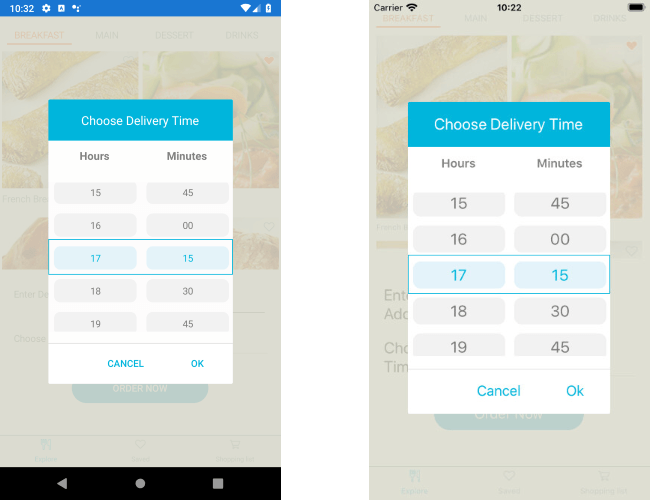
To finish the delivery app example, let's customize the TimePicker like this:
<telerikInput:RadTimePickerx:Name="timePicker"Grid.Row="1"Grid.Column="1"SpinnerFormat="HH:mm"DisplayStringFormat="hh:mm tt"MinimumTime="11:00"MaximumTime="22:00"MinuteStep="15"SpinnerHeaderStyle="{StaticResource spinnerHeaderStyle}"SpinnerStyle="{StaticResource spinnerStyle}"SelectionHighlightStyle="{StaticResource selectionHighlightStyle}"><telerikInput:RadTimePicker.SelectorSettings><telerikInput:PickerPopupSelectorSettingsPopupOutsideBackgroundColor="#D9D9D9CC"PopupViewStyle="{StaticResource popupViewStyle}"HeaderStyle="{StaticResource headerStyle}"HeaderLabelText="Choose Delivery Time"HeaderLabelStyle="{StaticResource headerLabelStyle}"FooterStyle="{StaticResource footerStyle}"AcceptButtonStyle="{StaticResource acceptButtonStyle}"CancelButtonStyle="{StaticResource cancelButtonStyle}"/></telerikInput:RadTimePicker.SelectorSettings></telerikInput:RadTimePicker>Add the referenced StaticResources to the page:
<ResourceDictionary><StyleTargetType="Label"x:Key="spinnerHeaderStyle"><SetterProperty="TextColor"Value="#7F7F7F"/><SetterProperty="FontAttributes"Value="Bold"/><SetterProperty="HorizontalOptions"Value="FillAndExpand"/><SetterProperty="VerticalOptions"Value="FillAndExpand"/><SetterProperty="HorizontalTextAlignment"Value="Center"/><SetterProperty="VerticalTextAlignment"Value="Center"/></Style><StyleTargetType="telerikDataControls:RadSpinner"x:Key="spinnerStyle"><SetterProperty="ItemStyle"><Setter.Value><StyleTargetType="telerikDataControls:SpinnerItemView"><SetterProperty="TextColor"Value="#797979"/><SetterProperty="BackgroundColor"Value="#F2F2F2"/><SetterProperty="CornerRadius"Value="10"/><SetterProperty="Margin"Value="6, 4"/></Style></Setter.Value></Setter><SetterProperty="SelectedItemStyle"><Setter.Value><StyleTargetType="telerikDataControls:SpinnerItemView"><SetterProperty="TextColor"Value="#00B5DC"/><SetterProperty="BackgroundColor"Value="#E4F3F9"/><SetterProperty="CornerRadius"Value="10"/><SetterProperty="Margin"Value="6, 4"/></Style></Setter.Value></Setter></Style><StyleTargetType="telerikPrimitives:RadBorder"x:Key="selectionHighlightStyle"><SetterProperty="BorderColor"Value="#00B5DC"/><SetterProperty="BorderThickness"Value="1"/><SetterProperty="Padding"Value="0,6,0,6"/><SetterProperty="HeightRequest"Value="40"/><SetterProperty="VerticalOptions"Value="Center"/></Style><StyleTargetType="Label"x:Key="displayLabelStyle"><SetterProperty="TextColor"Value="Black"/><SetterProperty="VerticalTextAlignment"Value="Center"/><SetterProperty="HorizontalTextAlignment"Value="Center"/><SetterProperty="HeightRequest"Value="50"/></Style><StyleTargetType="Label"x:Key="placeholderLabelStyle"><SetterProperty="TextColor"Value="#4A4949"/><SetterProperty="VerticalTextAlignment"Value="Center"/><SetterProperty="HorizontalTextAlignment"Value="Center"/><SetterProperty="HeightRequest"Value="50"/></Style><StyleTargetType="telerikInput:PickerPopupHeaderView"x:Key="headerStyle"><SetterProperty="BackgroundColor"Value="#00B5DC"/><SetterProperty="HeightRequest"Value="60"/><SetterProperty="Margin"Value="0"/><SetterProperty="Padding"Value="0"/><SetterProperty="HorizontalOptions"Value="FillAndExpand"/><SetterProperty="VerticalOptions"Value="FillAndExpand"/></Style><StyleTargetType="Label"x:Key="headerLabelStyle"><SetterProperty="TextColor"Value="White"/><SetterProperty="HorizontalOptions"Value="Center"/><SetterProperty="VerticalOptions"Value="Center"/><SetterProperty="FontSize"Value="Medium"/></Style><StyleTargetType="telerikInput:PickerPopupFooterView"x:Key="footerStyle"><SetterProperty="BackgroundColor"Value="Transparent"/></Style><StyleTargetType="telerikInput:PickerPopupContentView"x:Key="popupViewStyle"><SetterProperty="BackgroundColor"Value="White"/><SetterProperty="WidthRequest"Value="270"/></Style><StyleTargetType="Button"x:Key="acceptButtonStyle"><SetterProperty="BackgroundColor"Value="Transparent"/><SetterProperty="Text"Value="OK"/><SetterProperty="TextColor"Value="#00B5DC"/></Style><StyleTargetType="Button"x:Key="cancelButtonStyle"><SetterProperty="BackgroundColor"Value="Transparent"/><SetterProperty="Text"Value="X"/><SetterProperty="TextColor"Value="#00B5DC"/></Style></ResourceDictionary>Here is the final result after completely modifying the look & feel of RadTimePicker control:

Let Us Know What You Think
We would love to hear what you think about the Time Picker Xamarin control and how we can improve it. If you have any ideas for features to add, do not hesitate to share this information with us on our Telerik UI for Xamarin Feedback portal.
Don’t forget to check out the various demos of the control in our SDK Sample Browser and the Telerik UI for Xamarin Demos application.
If you have not yet tried the Telerik UI for Xamarin suite, take it out for a spin with a 30-day free trial, offering all the functionalities and controls at your disposal at zero cost.
Happy coding with our controls!