When implementing 3rd-party UI components, it can be hard to match the design of your application. See what the KendoReact team does to make this process easy.
On the KendoReact team, we are aware of the perceived difficulty around aligning 3rd-party UI components to your application's design. We have spent a lot of time ensuring that styling our components is as easy as possible.
To showcase how easy this is, we're going to build a simple React application with the KendoReact Form component and customize it through SASS variables to match our Design Language.
Creating an App
We'll use create-react-app for project scaffolding, due to its seamless integration with Sass.
Let’s start by creating an empty application:
npx create-react-app custom-kendo-themecd custom-kendo-themenpm startVisiting localhost:3000, we see the default create-react-app index screen:
Now, let's head over to the App.js file and add some KendoReact UI components.
Starting Simple
In every web application, you can see components such as Button, Checkbox and Input and then any number of others depending on the type of app you’re building. No matter how many UI components you’re using, you probably would like to have consistent styling in terms of colors, spacing, border-radius etc.
A Form component is a simple yet versatile example that can combine multiple components within it. It is often used when building dashboard applications, e-commerce websites, or a CMS, for example – and in each of these cases, you’ll likely have to apply custom branding and styling. Let’s build a simple form with KendoReact and see how it looks with the KendoReact Material Theme.
The KendoReact components are distributed through NPM and are split into packages. We can import only what we need from the different packages.
For now, we’ll stick with the .css distribution of the theme, and change it with sass in the next step.
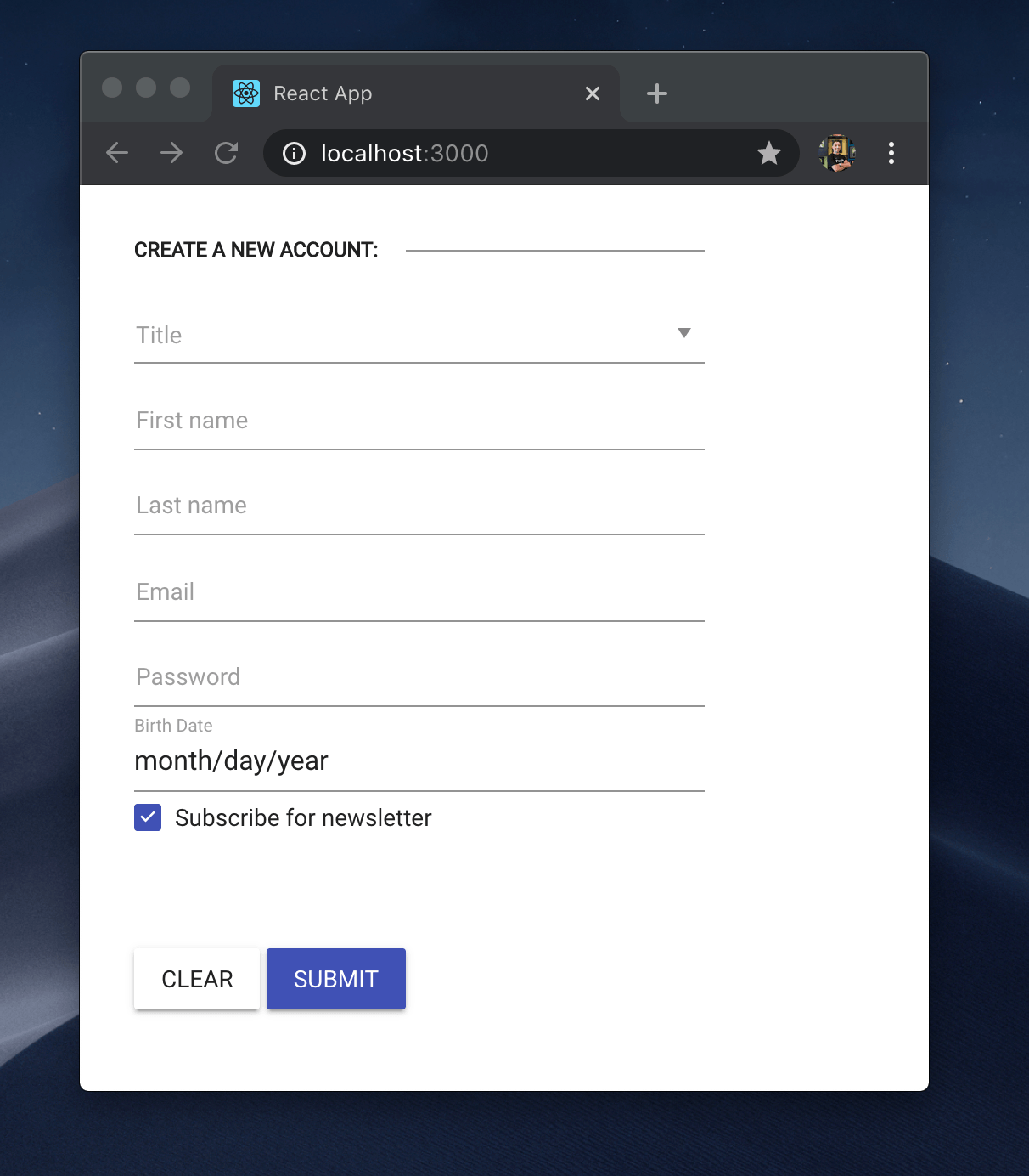
import React from 'react'; import { Button } from '@progress/kendo-react-buttons';import { Form, Field } from '@progress/kendo-react-form';import { DateInput } from '@progress/kendo-react-dateinputs';import { Input, Checkbox } from '@progress/kendo-react-inputs';import { DropDownList } from '@progress/kendo-react-dropdowns';import { Editor } from '@progress/kendo-react-editor'; import "./kendo-theme-custom.scss"; const App = () => { const handleSubmit = (event) => { console.log(event); } return( <Form onSubmit={handleSubmit} render={(formRenderProps) => ( <form onSubmit={formRenderProps.onSubmit} className={'k-form k-form-inline'} style={{ width: 400 }} > <fieldset className="k-fieldset"> <legend>Create a newaccount:</legend> <Field name={'title'} component={DropDownList} label={'Title'} style={{ width: '100%'}} data={['Mr.', 'Mrs.', 'other']} /> <Field name={'firstName'} component={Input} label={'First name'} style={{ width: '100%'}} /> <Field name={'lastName'} component={Input} label={'Last name'} style={{ width: '100%'}} /> <Field name={"email"} type={"email"} component={Input} label={"Email"} validator={emailValidator} style={{ width: '100%'}} /> <Field name={"password"} type={"password"} component={Input} label={"Password"} style={{ width: '100%'}} /> <Field name={"birth-date"} type={"Birth Date"} component={DateInput} label={"Birth Date"} style={{ width: '100%'}} /> <Field name={'subscribe'} component={Checkbox} label={"Subscribe for newsletter"} style={{ width: '100%'}} defaultValue={true} /> <Field name={'subscribe'} component={Editor} label={"Subscribe for newsletter"} style={{ width: '100%'}} defaultValue={true} /> </fieldset> <Button onClick={formRenderProps.onFormReset} > Clear </Button> <Button type={'submit'} primary={true} disabled={!formRenderProps.allowSubmit} onClick={formRenderProps.onSubmit} > Submit </Button> </form> )} /> );}; const emailRegex = newRegExp(/\S+@\S+\.\S+/);const emailValidator = (value) => (emailRegex.test(value) ? "": "Please enter a valid email."); export defaultApp;Heading over to localhost:3000 we see the following:
TIP: You can learn more about how the KendoReact Form component works in "How to Build Forms with React the Easy Way"
The form looks nice and clean and has the default color scheme that the Material theme provides. However, there may be aspects of this overall theme that might not match our design requirements – even if it is something as simple as changing the color of the primary button. For our example we’ll aim to modify the coloring and spacing aspects of the whole KendoReact Material theme through SASS variables – in essence, creating/applying our own theme. This will allow us to modify not just the Form component we just built, but every other KendoReact component used in our application.
Adding Sass
The process of adding the sass pre-processor to your application may vary depending on your build configuration.
We are using create-react-app so in order to allow sass pre-processing we need to install node-sass.
npm install –save-dev node-sassAfter we’re done installing the necessary dependencies, we have to replace the import statement of the KendoReact theme with its scss distribution. Let’s create a kendo-theme-custom.scss file and import it instead in our App.js.
import "./kendo-theme-custom.scss";We are able to import only the styles of the components we're going to use. In our use case, the following styles should be imported in the kendo-theme-custom.scss file:
@import "~@progress/kendo-theme-material/scss/_variables.scss";@import "~@progress/kendo-theme-material/scss/functions/_index.scss";@import "~@progress/kendo-theme-material/scss/mixins/_index.scss"; @import "~@progress/kendo-theme-material/scss/button/_index.scss";@import "~@progress/kendo-theme-material/scss/dropdownlist/_index.scss";@import "~@progress/kendo-theme-material/scss/datetime/_index.scss";@import "~@progress/kendo-theme-material/scss/input/_index.scss";@import "~@progress/kendo-theme-material/scss/forms/_index.scss";@import "~@progress/kendo-theme-material/scss/checkbox/_index.scss";@import "~@progress/kendo-theme-material/scss/common/_index.scss";We now have everything setup to start customizing.
Customizing the Theme
We first want to change the color swatch of the KendoReact Material Theme. Heading over to material.io, we can see the list of Material Design color palettes:
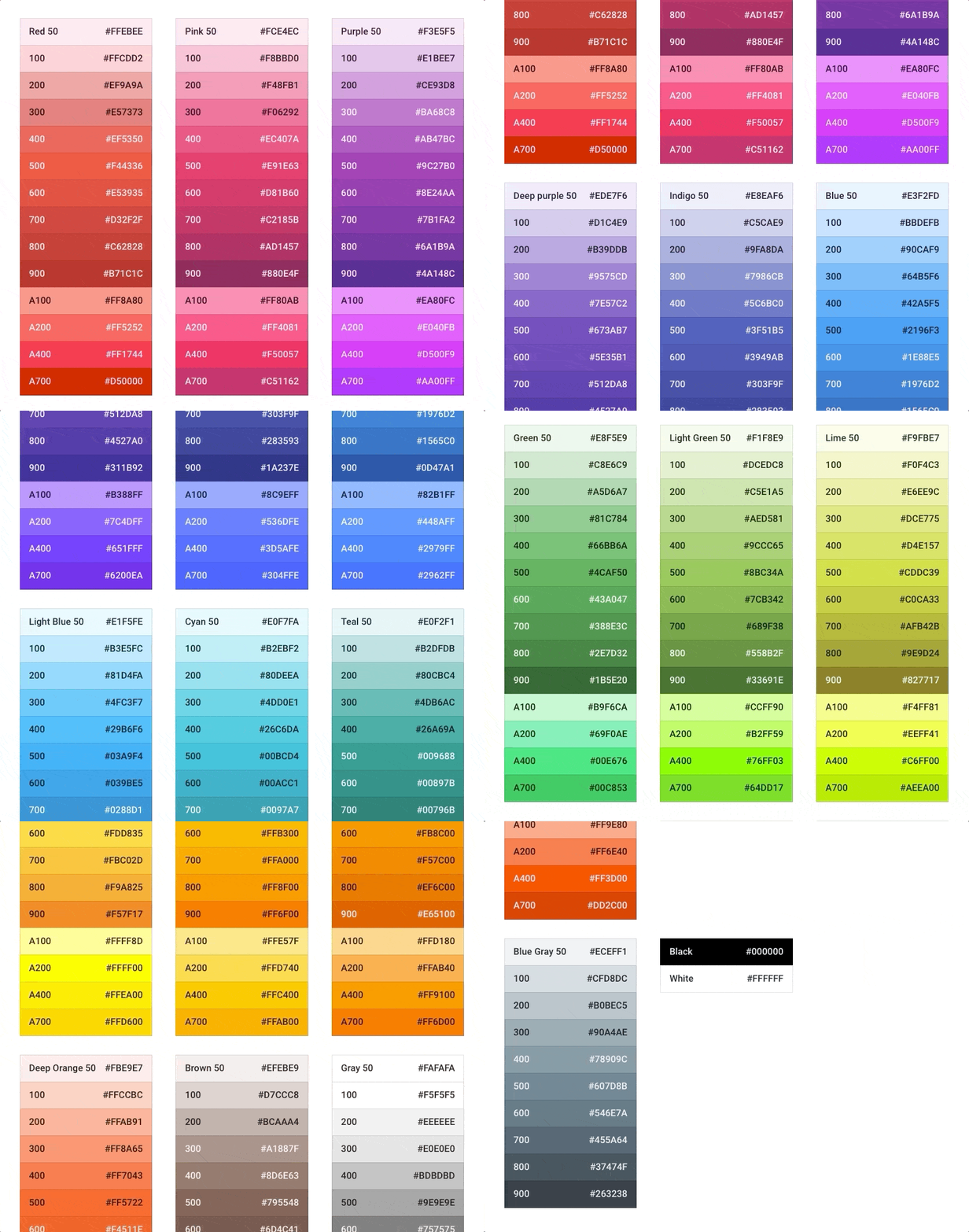
For the demo today, we are going to modify our theme to use the inverted primary-secondary colors of the default Material swatch.
All we must do is declare the $primary and $secondary variables before we import the theme.
I know those variables because I'm a KendoReact developer, but if this isn't the case with you, you can refer to the official documentation of the KendoReact Material Theme or the _variable.scss file inside the theme's repository.
Additionally we will change the $error variable to deeper orange color. Our kendo-theme-custom.scss file looks like this:
$primary:#009688;$secondary:#B39DDB;$error:#B71C1C; @import "~@progress/kendo-theme-material/scss/_variables.scss";@import "~@progress/kendo-theme-material/scss/functions/_index.scss";@import "~@progress/kendo-theme-material/scss/mixins/_index.scss"; @import "~@progress/kendo-theme-material/scss/button/_index.scss";@import "~@progress/kendo-theme-material/scss/dropdownlist/_index.scss";@import "~@progress/kendo-theme-material/scss/datetime/_index.scss";@import "~@progress/kendo-theme-material/scss/input/_index.scss";@import "~@progress/kendo-theme-material/scss/forms/_index.scss";@import "~@progress/kendo-theme-material/scss/checkbox/_index.scss";@import "~@progress/kendo-theme-material/scss/common/_index.scss";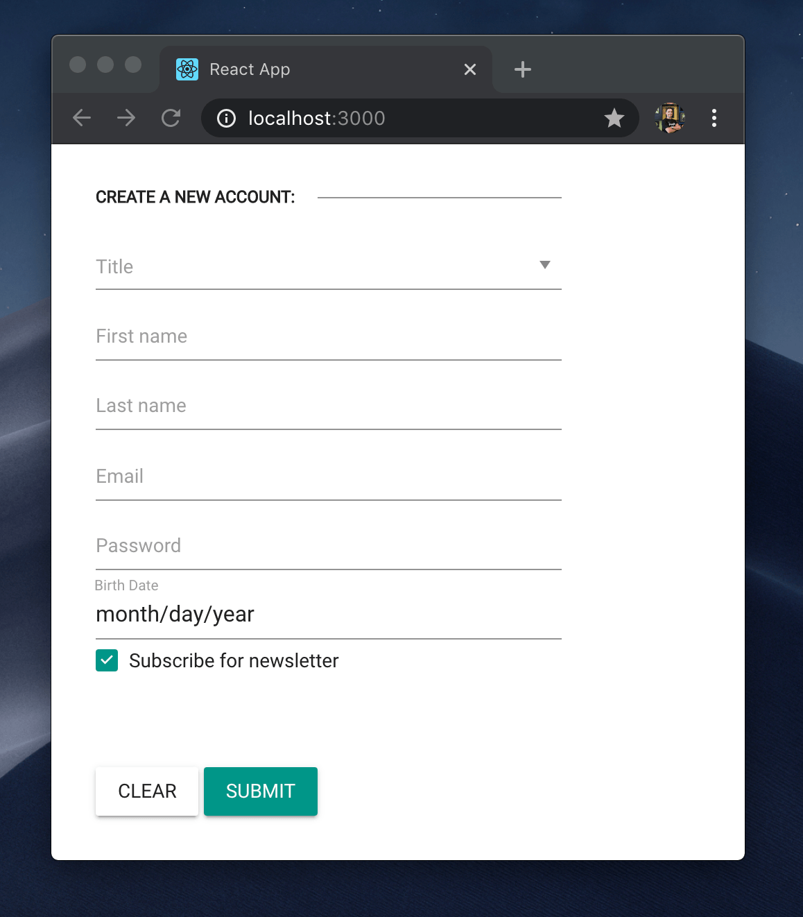
Scoping
The next customization I'd like to make is to modify the spacing inside the button. Since I want to modify the Button styles only, I will use the $button-spacing variable instead of the global $spacing variable. This approach allows us to tweak only some components.
Lets see how our kendo-custom-theme file looks after the addition of the $button-spacing-x and $button-spacing-y variables.
$primary:#009688;$secondary:#B39DDB;$error:#B71C1C; $button-padding-x: 48px;$button-padding-y: 8px; @import "~@progress/kendo-theme-material/scss/_variables.scss";@import "~@progress/kendo-theme-material/scss/functions/_index.scss";@import "~@progress/kendo-theme-material/scss/mixins/_index.scss"; @import "~@progress/kendo-theme-material/scss/button/_index.scss";@import "~@progress/kendo-theme-material/scss/dropdownlist/_index.scss";@import "~@progress/kendo-theme-material/scss/datetime/_index.scss";@import "~@progress/kendo-theme-material/scss/input/_index.scss";@import "~@progress/kendo-theme-material/scss/forms/_index.scss";@import "~@progress/kendo-theme-material/scss/checkbox/_index.scss";@import "~@progress/kendo-theme-material/scss/common/_index.scss";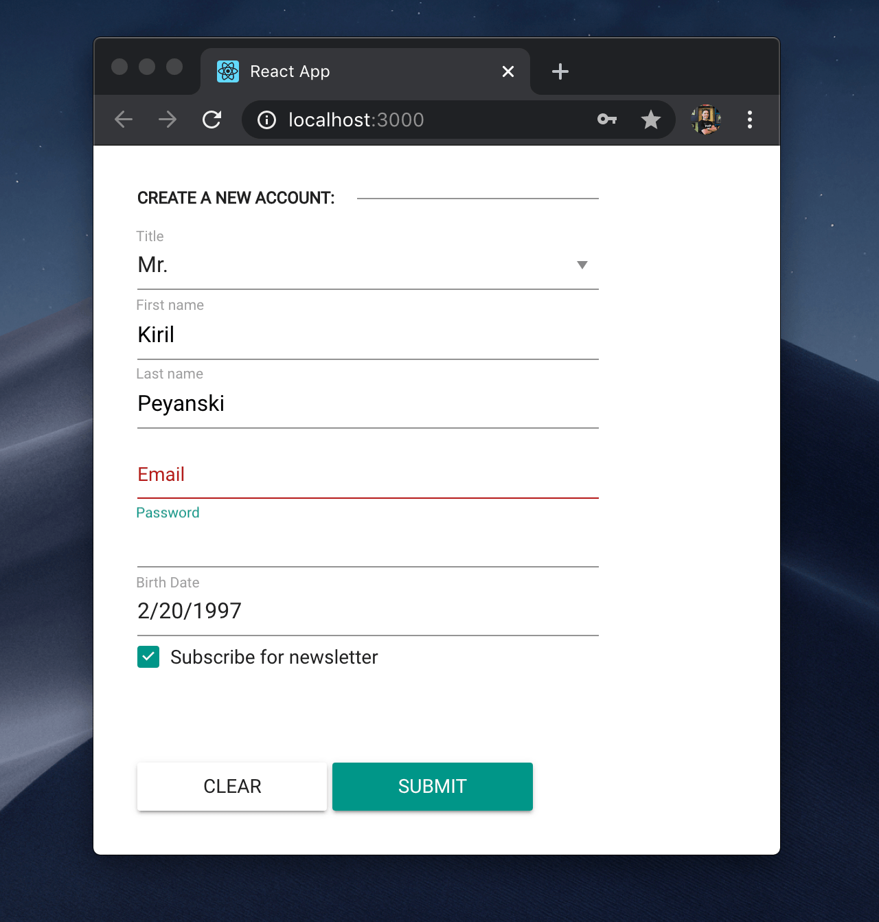
Features Toggle
Last but not least, since this is my Form app, I’ll apply some styling based on my own preference and suggest some design practices I personally like a lot.
Give us sharp buttons back!
Apart from colors and pixels, we can assign SASS variables to be true or false. For this case I will apply the following variable and see what happens.
$enable-rounded: false;Taking a closer look at the buttons and we can see that they look exactly as they are supposed to - sharp and edgy:
Wrap Up
The source code for the final version of our app can be found here.
And couple words of wisdom from the author...
We often search for a 3rd-party UI library in order to reuse a complex component we don't want to implement by ourselves. An even bigger advantage, which is often ignored, is how easy is it to standardize the styling and behavior of your applications by using a complete library.
The KendoReact themes enable you to use ready-made UI components, while still allowing you to customize your designs to meet your needs. Through the use of SASS variables, you can ensure you have a consistent look and feel throughout your applications.
If you want to see how all of this works, start your free, 30-day KendoReact trial today.