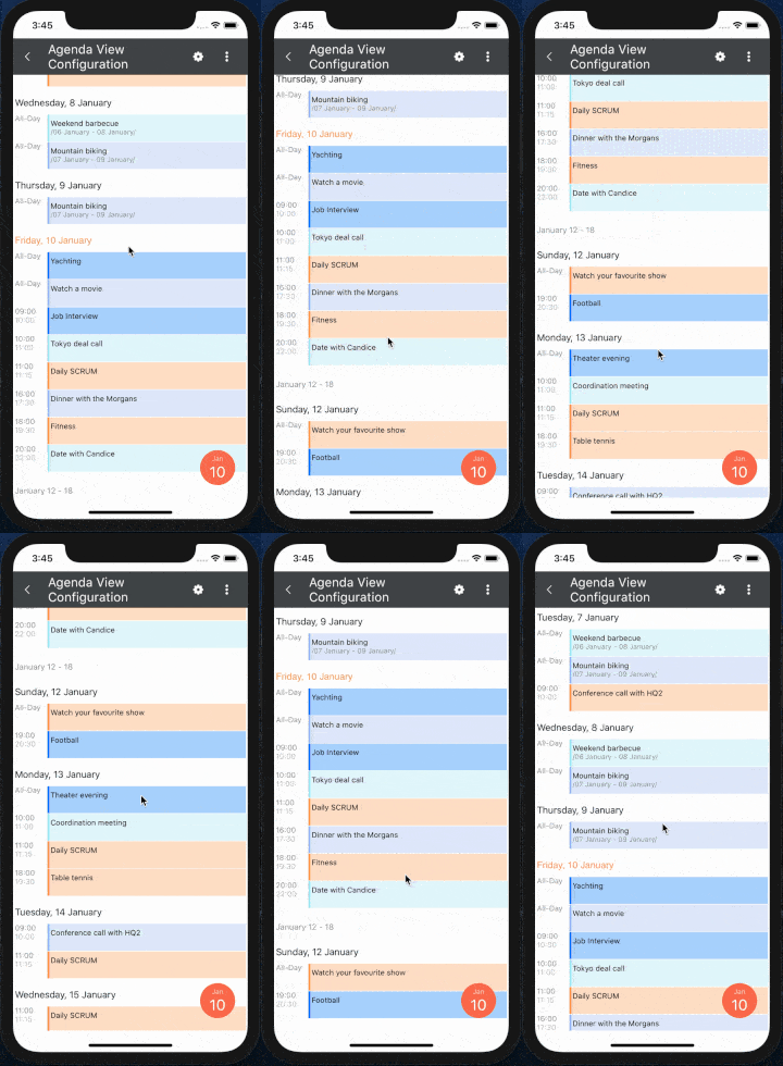
Get to know the new AgendaView in Telerik UI for Xamarin. This feature, natively implemented on both iOS and Android, gives you a new way to visualize appointments in your app.
With the R1 2020 release of the Telerik UI for Xamarin controls we have added a new view mode for the Telerik Xamarin Calendar control – the AgendaView mode. This new option is available for the iOS and Android platforms. The feature is natively implemented on both technologies which guarantees fast and smooth performance.
The agenda view mode shows a list of appointments grouped by date, providing a convenient way to display events chronologically. This option grants users the ability to see all the upcoming appointments and their details by simply scrolling an endless list without the need to change the visible days, making it a great choice when you would like to visualize the upcoming events for several days or a whole week ahead.
The native implementations of the view mode in both Android and iOS support two-way endless scrolling which brings great performance with minimum memory usage.

This blog post aims to familiarize you with the main features of the view mode and show you how easy is to accommodate it to your project requirements.
Getting Started with Xamarin Calendar Agenda View
The first step when you are going to add agenda view to your application is to declare the calendar itself and simply set its ViewMode property, which in our case would be Agenda.
<telerikInput:RadCalendarx:Name="calendar" ViewMode="Agenda"></telerikInput:RadCalendar>You can add as many appointments as you need by simply setting the AppointmentSource of the control. For example:
this.calendar.AppointmentsSource = newObservableCollection<IAppointment>(){ newAppointment() { StartDate = DateTime.Today.AddHours(11), EndDate = DateTime.Today.AddHours(11).AddMinutes(15), Title = "Daily SCRUM", Color = Color.FromHex("55A6FF"), }, newAppointment() { StartDate = DateTime.Today.AddDays(-7).AddHours(10), EndDate = DateTime.Today.AddDays(-7).AddHours(11), Title = "Tokyo Deall call", Color = Color.FromHex("FFA200") } , . . . };Now that we have the Calendar element in agenda mode and have added some events, we can continue with setting some custom time formats as well as customize the different items.
Xamarin AgendaView Date and Time Format Settings
As most of the items within the agenda are associated with a date or time, we have provided an easy to use API for you to set formats for these items. For example, you can set a specific format of the month, day and week items. For more information on the available properties you can go through the Agenda View documentation page.
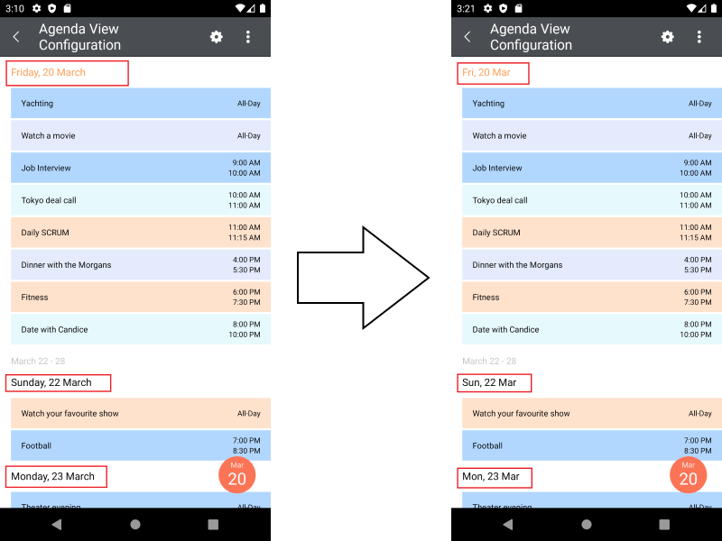
If you did not have the chance to check the documentation page to see how easy is to modify the formats, here is a short example on how to change the format of the "day item" in the Agenda:
<telerikInput:RadCalendarx:Name="calendar" ViewMode="Agenda"> <telerikInput:RadCalendar.AgendaViewSettings> <telerikInput:AgendaViewSettingsDayItemFormat="EEE, d MMM"/> </telerikInput:RadCalendar.AgendaViewSettings></telerikInput:RadCalendar>And here is the result:

Styling the Agenda Items
Another useful feature we have added to the Agenda View is the option to style the different agenda items. We have decided to implement the functionality through a StyleSelector class as this approach provides you with the ability to apply styles for single items and not for exact types. The approach might require slightly more time at your end to add but when compared to just setting styles for specific item types - it is definitely more powerful and flexible. Below you can find an example on how to modify the different items' appearance.
First, let's create the custom StyleSelector class which is used to identify what Style to apply for which item. You should inherit from the AgendaItemStyleSelector class and override one of its SelectStyle methods depending on the items you are going to alter.
The available methods to override are:
- SelectMonthItemStyle
- SelectWeekItemStyle
- SelectDayItemStyle
- SelectAppointmentItemStyle
For this blog post we are going to override just the methods that take care of the day and week items. Here is the actual implementation:
publicclassCustomAgendaViewItemStyleSelector : AgendaItemStyleSelector { privateDateTime now = DateTime.Now; publicAgendaTextItemStyle WeeksStyle { get; set; } publicAgendaTextItemStyle TodayStyle { get; set; } publicoverrideAgendaTextItemStyle SelectWeekItemStyle(AgendaWeekItem item) { returnthis.WeeksStyle; } publicoverrideAgendaTextItemStyle SelectDayItemStyle(AgendaDayItem item) { if(this.now.Date == item.Date.Date) { returnthis.TodayStyle; } returnnull; } }As you can see from the above code - we are going to update all week items in the Agenda and just the style of the current day item.
You can create the custom styles in XAML, apply the customizations you want and simply assign the CustomAgendaViewItemStyleSelector to the AgendaItemStyleSelector property of the RadCalendar control:
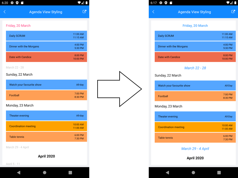
<telerikInput:RadCalendarx:Name="calendar" ViewMode="Agenda"> <telerikInput:RadCalendar.Resources> <ResourceDictionary> <local:CustomAgendaViewItemStyleSelectorx:Key="CustomAgendaViewItemStyleSelector"> <local:CustomAgendaViewItemStyleSelector.WeeksStyle> <telerikInput:AgendaTextItemStyleTextColor="#218CFF" FontAttributes="Italic" FontSize="16" HorizontalTextAlignment="Center"/> </local:CustomAgendaViewItemStyleSelector.WeeksStyle> <local:CustomAgendaViewItemStyleSelector.TodayStyle> <telerikInput:AgendaTextItemStyleTextColor="#5EB1FF" FontAttributes="Bold" FontSize="15" HorizontalTextAlignment="Center"/> </local:CustomAgendaViewItemStyleSelector.TodayStyle> </local:CustomAgendaViewItemStyleSelector> </ResourceDictionary> </telerikInput:RadCalendar.Resources> <telerikInput:RadCalendar.AgendaViewSettings> <telerikInput:AgendaViewSettingsAgendaItemStyleSelector="{StaticResource CustomAgendaViewItemStyleSelector}"/> </telerikInput:RadCalendar.AgendaViewSettings> </telerikInput:RadCalendar>The picture below illustrates the effect of the applied styles:

Note that it is just the current day item that has the specific style applied whereas all the week items will be changed accordingly.
Let Us Know What You Think
We hope the new view mode will find a place in your application and will be useful for your users. If you have issues with the functionalities or you are missing a feature – do let us know so we can help you over the matter. Your feedback is very important for us and we are always discussing it when considering future additions to the Telerik UI for Xamarin suite. You can either leave a comment below or reach us through the Telerik UI for Xamarin Feedback portal.
For more information on the Calendar component and the different features it provides – refer to our documentation page: Telerik UI for Xamarin – Calendar & Scheduling. You can also check the Telerik UI for Xamarin Samples and the Telerik SDK Browser applications which showcase basic usages of the control as well as some more sophisticated scenarios.