WPF developers, let’s rejoice together! What a better way to start the new decade than the brand new R1 2020 Release? No more need to wander the organizational tools labyrinth. Get the new Telerik UI for WPF TaskBoard control and make the most of it. Let me guide you through it.
Have you ever wondered what agile really means? Agile means able to think and move quickly and easily. I believe that agile software development was formed exactly to find a way to develop better and conquer our biggest and bravest dreams quickly and easily.
I know that every single software developer can name at least three agile methodologies, be it Scrum, Kanban, Extreme Programming, etc. It’s not always the methodology which a software organization follows that matters, but the tool used for managing the development process and the outcome quality. This is one of the main reasons why the Telerik UI for WPF family just got that new member - the TaskBoard (a.k.a KanbanBoard) control.
What’s Inside
It’s always better to know what’s inside the dish on the menu that caught your eye before ordering, isn’t it? Now, let’s see what’s inside the RadTaskBoard.
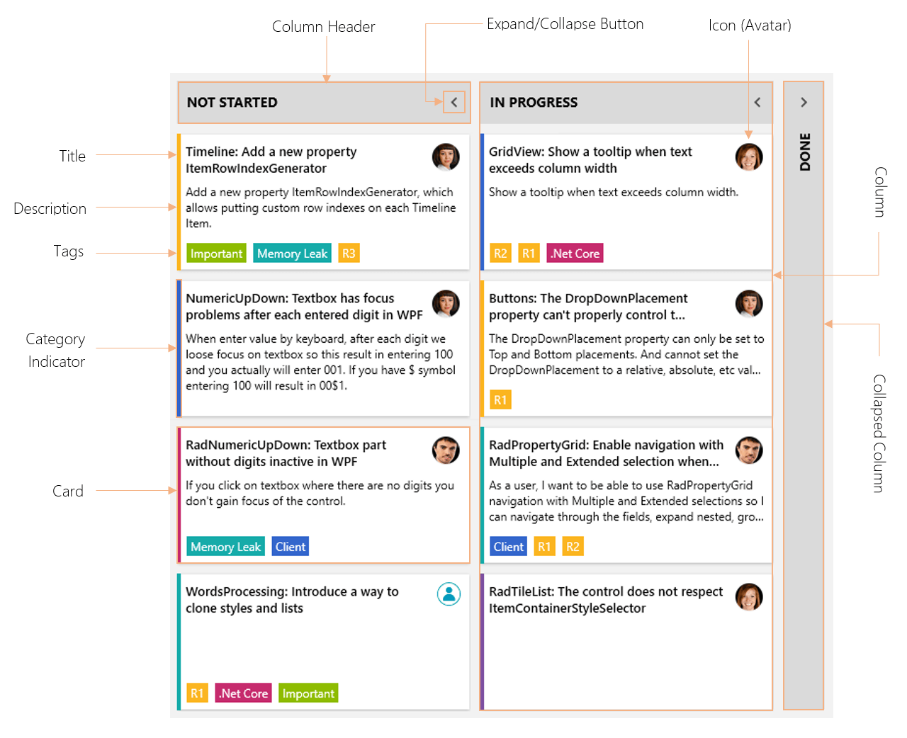
A task board has zero to many columns, each containing zero to many cards – a layout, commonly seen in Kanban boards. Its visual structure consists of:
- Column - one of the most essential building blocks of the control, which holds all the cards for a logical group. Can be collapsed, renamed or auto-generated based on the underlying data source.
- Column Header - represents the logical group member of a data source as a header of the column inside the control.
- Expand/Collapse Button– a button, situated at the very right of the column header, used for switching between the column’s normal (expanded) and collapsed state.
- Card – core element of the control, used for visualization of the task on the board. Can be dragged to another column or reordered inside its parent column.
- Card Title– the element at the very top of the card, which represents the title of a given task.
- Card Icon– the element at the very right of the card, next to its title. Represents the container for the icon image of a given task.
- Card Description - the element below the card title, which displays the description of a given task.
- Card Tags– a collection of highlighted objects applied to a given item, situated at the very bottom of a card.
- Category Indicator– a tiny visual at the very left of a card, designed to serve as a logical category indicator.
Now that you know what’s inside, I am hopeful that you'd certainly order the dish.
Getting Started in Minutes
Not sure where to start? Time to walk you through the creation of a simple sample app with the brand-new task board then. I promise, it will take just a few minutes.
Needed “materials” – a WPF application with reference to the Telerik.Windows.Controls assembly plus a collection of the control’s built-in TaskBoardCardModel.
public class ViewModel : ViewModelBase

{
    ...

    public ViewModel(){Data = GetTasks(); }
    ...

    public ObservableCollection<TaskBoardCardModel> GetTasks()
    {
        ObservableCollection<TaskBoardCardModel> tasks = new ObservableCollection<TaskBoardCardModel>();

        tasks.Add(new TaskBoardCardModel() {
            Assignee = "Vicky",
            IconPath= @"/TaskBoardBlogApp;component/vickygr30x30.png",
            Title = "NumericUpDown: Textbox has focus problems after each entered digit in WPF",
            Description = "When enter value by keyboard, after each digit we loose focus on textbox so this result in entering 100 and you actually will enter 001. If you have $ symbol entering 100 will result in 00$1.",
            State = "Not Started",
            CategoryName = Categories[1].CategoryName,
        });

        tasks.Add(new TaskBoardCardModel() {
            Assignee = "Vicky",
            IconPath = @"/TaskBoardBlogApp;component/vickygr30x30.png",
            Title = "RadNumericUpDown: Textbox part without digits inactive in WPF",
            Description = "If you click on textbox where there are no digits you don't gain focus of the control.",
            State = "In Progress",
            CategoryName = Categories[0].CategoryName,
        });

        tasks.Add(new TaskBoardCardModel() {
            Assignee = "Vicky",
            IconPath = @"/TaskBoardBlogApp;component/vickygr30x30.png",
            Title = "MaskedTextBox: Incomplete value displayed with special symbol like '-' and '_'",
            Description = @"The value should not include symbols like '-' or '_'.",
            State = "Ready For Test",
            CategoryName = Categories[2].CategoryName,
        });

        ...
    }

}
The XAML part is on me, here it goes:
<telerik:RadTaskBoardItemsSource="{Binding Data}"GroupMemberPath="State"/>Didn’t expect a single line of code, did you? Hitting F5 and the results are there!
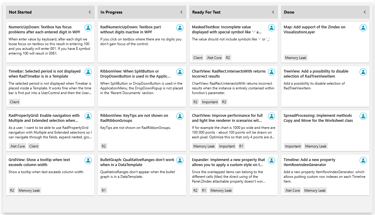
You can go backstage at the “Getting started with RadTaskBoard” show to reveal all its wonders on the Telerik UI for WPF TaskBoard documentation. A tip from me - make sure to check all sections of the documentation to explore the full package of opportunities that the control provides.
Dragging and Reordering
The last thing your users need is a non-intuitive UI. Writing this in the context of a task board control, the drag and drop support is an essential one, I believe. And it’s one of my favorite features of the control.
With the RadTaskBoard, you can move items from one column to another by using the built-in drag-drop functionality.
Wait, wait. You can even move cards from one board to another. Yes, we can call that a seamless integration and it does not end here. What do you think about the combination of Drag & Drop and Touch Support? I simply love it.
I just saw the title of this section and forgot to mention a few words about the ability to reorder the items. Well, it’s enabled by default. You can arrange the order of the card items within the columns to your liking.
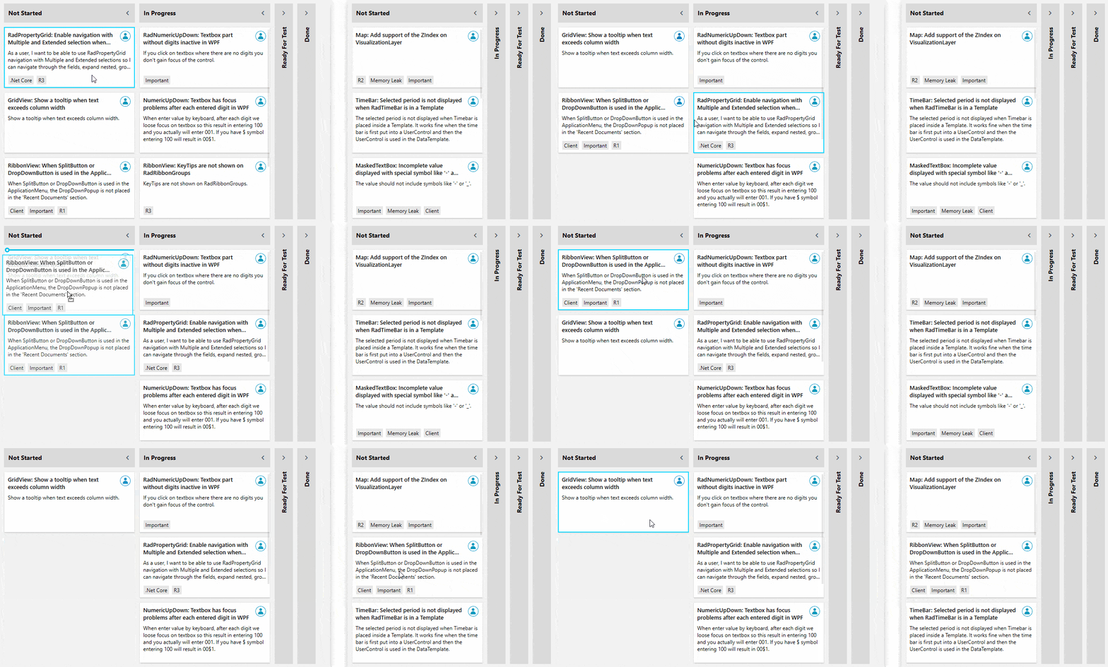
If by some (unimaginable) occasion, you need to prevent the user from moving things around with the mouse or with their fingers, you can do so by setting the IsDragDropEnabled property to false. Oh, and that blue border around the card shows the currently selected card. You can disable it by setting the CanUserSelect property to false.
Flexible Customization and Theming
Now I am the one wondering where to start.
Customizing Columns
The TaskBoardCardModel collections are added to the respective Column depending on the GroupMemberPath property of the RadTaskBoard control. The mechanism for defining those columns is your choice. You can go for an automatic columns definition, or a manual one. If you go for the automatic generation, you can always cancel the same for a specific column.
The properties of the TaskBoard’s columns include GroupName, IsExpanded, ColumnWidth, CollapsedColumnWidth, ColumnHeader, ColumnHeaderTemplate ColumnHeaderHeight, Items, etc. They are all self-explanatory, aren’t they?
One of the most important visual elements of the column is its header. Let’s create a custom column header with uppercase text and information about the items’ count for a column.
<telerik:RadTaskBoard ItemsSource="{Binding Data}" GroupMemberPath="State">
    <telerik:RadTaskBoard.Resources>
        <telerik:UppercaseConverter x:Key="UppercaseConverter"/>
    </telerik:RadTaskBoard.Resources>
    <telerik:RadTaskBoard.ColumnHeaderTemplate>
        <DataTemplate>
            <StackPanel Orientation="Horizontal">
                <TextBlock Text="{Binding GroupName, Converter={StaticResource UppercaseConverter}}" />
                <TextBlock Margin="10 0 0 0" Text="{Binding Items.Count}" Foreground="{telerik:FluentResource ResourceKey=AccentBrush}"/>
            </StackPanel>
        </DataTemplate>
    </telerik:RadTaskBoard.ColumnHeaderTemplate>
</telerik:RadTaskBoard>
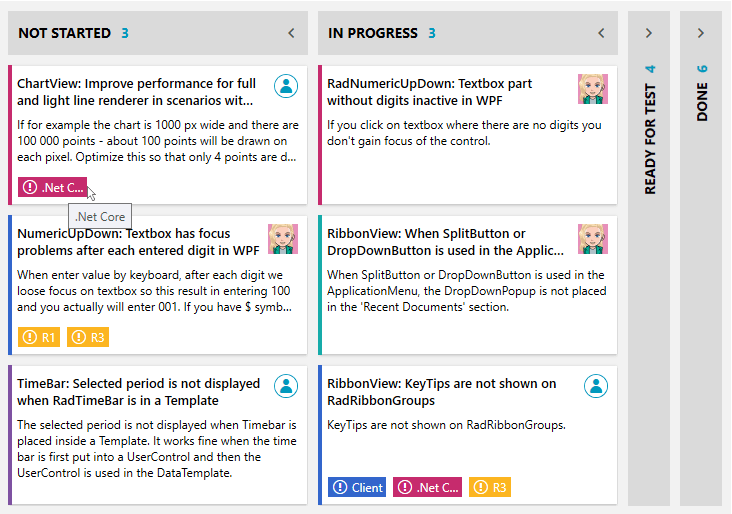
And maybe check how it looks?
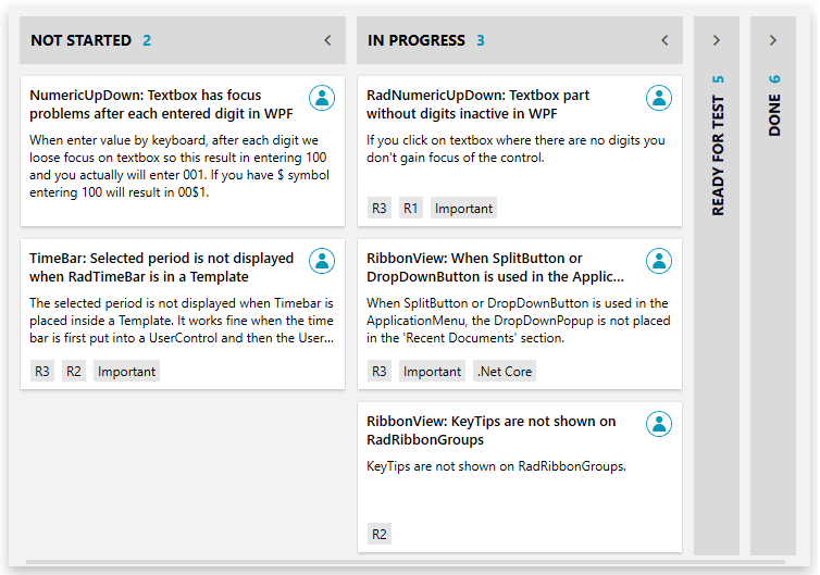
See that space between the columns? You can control this one as well with the ColumnOffset property (yes, it’s a double).
Playing with A Deck of Cards
I know that choosing our pre-defined card template is a really nice place to start, but depending on your users’ needs, you might need to design your own cards. You’re the one deciding how to play your cards right. Yet, I’ll do my best to give you an ace up your sleeve. Shall we begin?
<telerik:RadTaskBoard ItemsSource="{Binding Data}" GroupMemberPath="State" Categories="{Binding Categories}">
<telerik:RadTaskBoard.ItemTemplate>
<DataTemplate>
<telerik:RadTaskBoardCard
Assignee="{Binding Assignee}"
CategoryName="{Binding CategoryName}"
ShowCategoryIndicator="True"
Content="{Binding Description}"
Header="{Binding Title}"
Icon="{Binding IconPath}"
Tags="{Binding Tags}">
<telerik:RadTaskBoardCard.TagTemplate>
<DataTemplate>
<Border Background="{Binding TagColor}" BorderThickness="1" Margin="0 0 5 2">
<StackPanel Orientation="Horizontal" ToolTip="{Binding TagName}">
<telerik:RadGlyph Glyph="" Foreground="White" Margin="4 0 0 0"/>
<TextBlock Text="{Binding TagName}" Padding="4 2" MaxWidth="50" Foreground="White" TextWrapping="NoWrap" TextTrimming="CharacterEllipsis"/>
</StackPanel>
</Border>
</DataTemplate>
</telerik:RadTaskBoardCard.TagTemplate>
</telerik:RadTaskBoardCard>
</DataTemplate>
</telerik:RadTaskBoard.ItemTemplate>
</telerik:RadTaskBoard>The above snippet uses the RadTaskBoardCard as an ItemTemplate of the RadTaskBoard. It is so fancy and has everything you need, plus a bonus from me – a custom template for the tags. Oh, it also has categories. And tooltips for the tags, and my avatar.
Theming
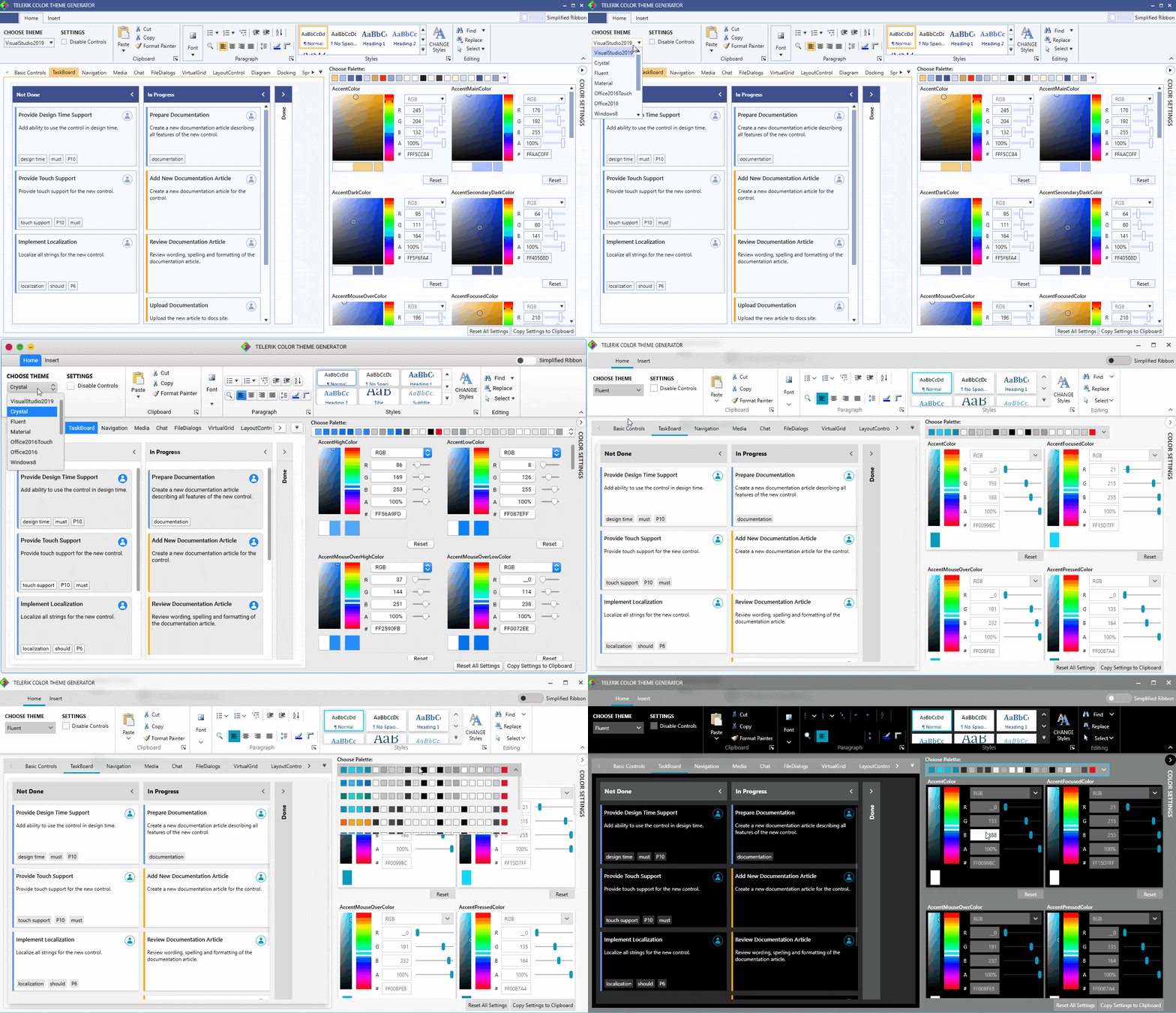
Just like all other members of the Telerik UI for WPF’s big family, this too comes with the full variety of themes. If this is the first time you're hearing about them, check the full list here.
Oh, and if you want to customize the theme colors, head to the Color Theme Generator Treasury right away, it already has this new gem included.
Try It Out and Share Your Feedback
Be the first to get the latest version of Telerik UI for WPF and explore all the “R1 2020 wonders”. And don’t forget to try out the new RadTaskBoard control. For existing users, you can get the latest bits in your account. If you are new to Telerik UI for WPF, you can get a free 30-day trial:
P.S. One of the keys to a successful project management is undoubtedly the tool used for it. You all know very well that this tool requires a constant improvement. Thus, your feedback is more than welcome and highly appreciated – don’t be shy to share it!
Feel free to send us your comments and feedback by using the comment section below or the Feedback Portal.