We've created an easy way to instantly turn your editor control into a file or a folder selector. Now in Telerik UI for WPF, you can take advantage of another powerful control – the RadFilePathPicker.
The RadFilePathPicker is a control which allows users to select a file or a directory from the file system or directly type the full path to it in the editor. Like every control from Telerik UI for WPF, it comes with the complete set of pre-defined themes. Of course, if you choose to do so, you can completely re-design it, depending on your needs.
Template Structure
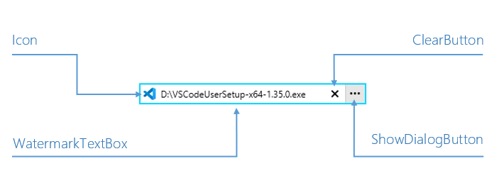
The control contains an absolutely amazing set of ingredients. It features a dynamically changing Icon, which is fully customizable through an IconTemplateSelector (see below for more on that). A watermark comes next, which has a very important weapon called clear button. Last, but not least – it has a button that opens a RadFileDialog whose type is fully controllable through the DialogType property.

Available Dialog Types
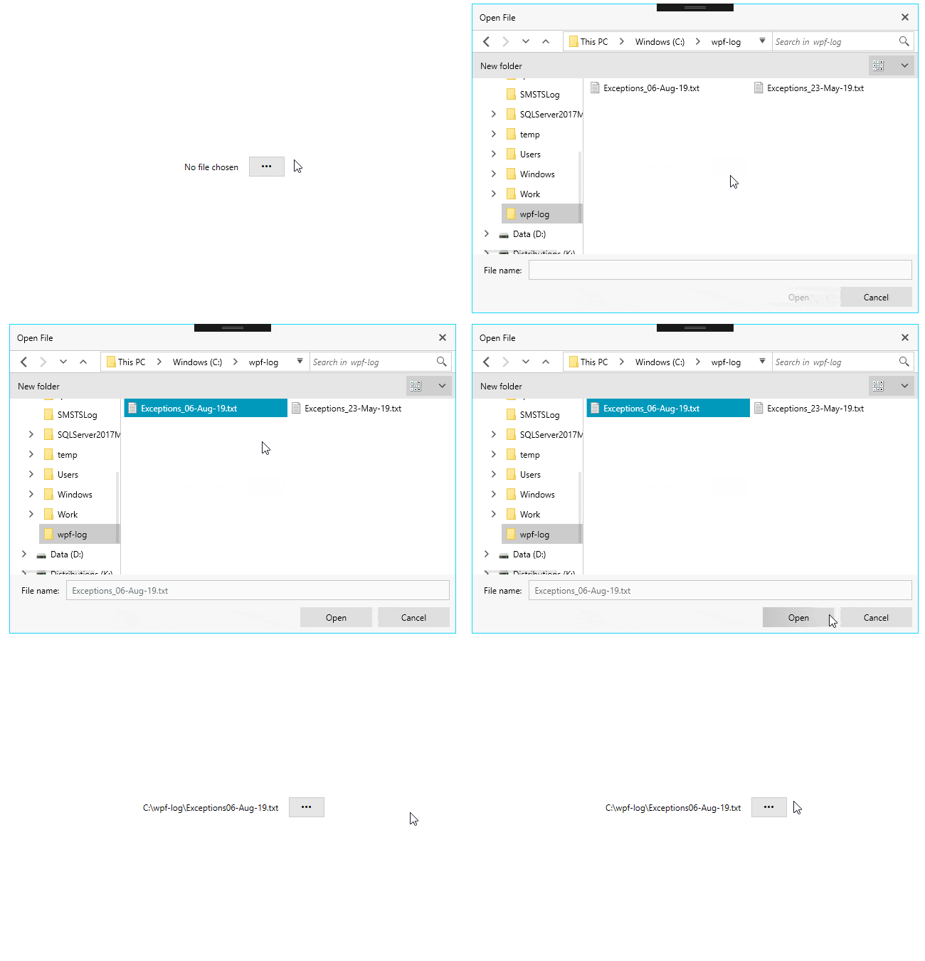
Speaking of dialogs, what about the available dialog types? Well, they are determined by the DialogType enumeration, which has the following options – OpenFile, OpenFolder and SaveFile. The control opens our awesome file dialogs by default - if this is the first time you've heard about them, check this article for more. You could always open another window (MS or a custom one) if you want to – just handle the DialogOpening event.
How to use the IconTemplateSelector?
With ease. The default icon is an instance of FilePathPickerIconTemplateSelector. It exposes the EmptyTemplate and NonEmptyTemplate properties. It already flashed across your minds that these two properties are related to the FilePath, didn’t it? Oh, and if you don’t want to have an icon at all, just set the IconVisibility property to Collapsed. Icons are cool. Let’s create a quick custom FilePathPickerIconTemplateSelector:
<!-- Icons made by https://www.flaticon.com/authors/smashicons" from https://www.flaticon.com/ --><StackPanelMargin="50"> <StackPanel.Resources> <DataTemplatex:Key="CustomEmptyTemplate"> <ImageSource="emptyIcon.png"/> </DataTemplate> <DataTemplatex:Key="CustomNonEmptyTemplate"> <ImageSource="nonEmptyIcon.png"/> </DataTemplate> <telerik:FilePathPickerIconTemplateSelectorx:Key="CustomIconTemplateSelector" EmptyTemplate="{StaticResource CustomEmptyTemplate}" NonEmptyTemplate="{StaticResource CustomNonEmptyTemplate}"/> </StackPanel.Resources> <telerik:RadFilePathPickerIconTemplateSelector="{StaticResource CustomIconTemplateSelector}"/></StackPanel>3…2…1… Action!
![]()
Picker Modes
I mentioned hiding the icon but did not mention that you can use the picker in button-only mode by hiding the editor part through the EditorVisibility property. Cool, huh? I think this mode is a perfect match with a label.
<StackPanelMargin="50"Orientation="Horizontal"UseLayoutRounding="True"HorizontalAlignment="Center"VerticalAlignment="Center"> <StackPanel.Resources> <local:FilePathPickerLabelContentConverterx:Key="converter"/> </StackPanel.Resources> <telerik:LabelContent="{Binding FilePath, ElementName=fpp, Converter={StaticResource converter}}"Margin="0 0 10 0"/> <telerik:RadFilePathPickerx:Name="fpp"Width="50"VerticalAlignment="Center"HorizontalAlignment="Center"EditorVisibility="Collapsed"IconVisibility="Collapsed"/></StackPanel>
The file picker is in read only mode by default, which means that you receive a free insurance against errors! Of course, you can set the IsReadOnly property to False and allow text input. Check it, taste it, or even copy-paste it. Here, the clear button will be your magic mistake eraser. You can customize it as well, by using the file input’s ClearButtonContent and ClearButtonContentTemplate properties by the way .
Featured Events
The events that the file path picker exposes are FilePathChanging, FilePathChanged, DialogOpening and DialogClosed. The first two come in handy for validation scenarios or directory restriction. No need to talk about their arguments, right? Well, if there is, you are more than welcome to enjoy the control’s detailed documentation.
Closing Curtain
I hope that the RadFilePathPicker deserved its round of applause and got you excited to dive into it right away. Looking for the best walkthrough options? I can’t think of anything other than the awesome Telerik UI for WPF Controls Demo application.
P.S. We’d love to hear from you. Your honest and direct feedback is the most efficient way for us to improve. Don’t be shy to drop your thoughts in the comment section below and share your suggestions using our feedback portal.
Get the latest version of: Telerik UI for WPF Telerik UI for Silverlight