New TaskBoard and SplashScreen controls, AgendaView for ScheduleView and more are here in the R1 2010 release of Telerik UI for WPF.
Announcing the first official release for this year (and decade) of Telerik UI for WPF and Telerik UI for Silverlight– R1 2020 is live! It brings powerful new controls like TaskBoard and SplashScreen, cool new features like AgendaView for ScheduleView, new Item Templates and .NET Core 3.1 support, as well as many other improvements. Let’s dive in together and explore all the new goodies.
TaskBoard

Introducing RadTaskBoard – powerful new control designed to provide a clean and user-friendly interface for task management applications. This Kanban-like board will allow your end-users to track their tasks in a simple, clean, agile-style manner. Check out the key features below:
- Predefined cards
- Auto-generated or XAML defined columns
- Expand/collapse columns support
- Category (color) indicator of the tasks
- Tags support
- Drag and drop support
- Touch support
- Single selection support
- Automation support
See the control in action our WPF demos and be sure to check out the documentation here.
SplashScreen
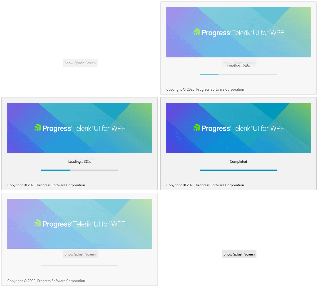
The other new control of this release is RadSplashScreen. As you already might know – the WPF framework allows you display an image as the SplashScreen of the application, while RadSplashScreen will allow you to crate and show a dynamic SplashScreen that contains WPF controls. You can easily display our beautifully themed controls and indicate the load progress status of your WPF app.
Here are the key features of the control:
- Animations: Built-in show/hide animations with option to be customized
- Logo Image: Easily add your logo by setting single property
- Progress Indicator: Using the built-in ProgressBar you could flawlessly indicate the current progress
- Loading Content: Display and change the loading text at run time
- Footer Content: Display your company copyright message there
- Fully Customizable: Easy to display your own UserControl designed per your needs
- Theming: Take advantage of the rich set of Telerik UI for WPF themes
For more details please check the SplashScreen online documentation here.
AgendaView for ScheduleView
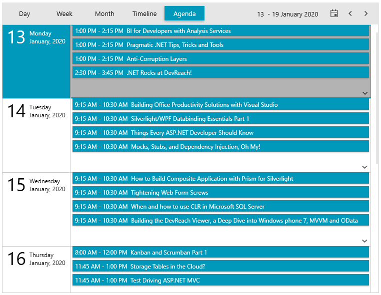
We are adding brand new view mode to RadScheduleView – Agenda View. Easily see a list of the upcoming appointments in a specific time range grouped by the date. The new view provides all the supported features of the control plus a modern appearance. Where there are no appointments in the current range – a customizable message is displayed. See AgendaViewDefition below:
SyntaxEditor (official)
With our previous official release (R3 2019) we introduced the SyntaxEditor control as a beta – a powerful text editor with built-in highlighting and code editing capabilities (in case you missed it check out the release blog here and the dedicated SyntaxEditor blog here). With this release of the RadSyntaxEditor we are bringing in the official version of the control and introducing built-in touch support, enhanced folding taggers, improved folding functionality and a lot of fixes.
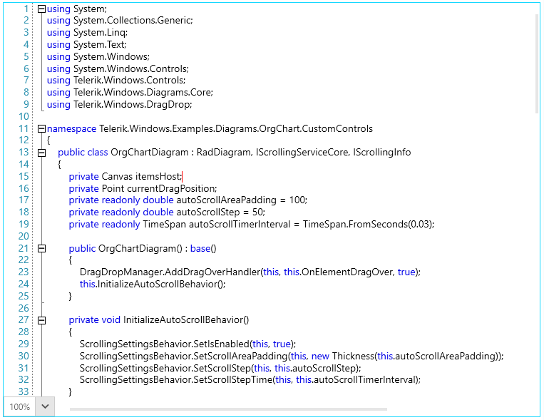
We have also added two new examples in our WPF demos– one demonstrating multiple custom taggers in action and another demonstrating different configurations. Make sure to also check the documentation of the control here.
Happy coding
RichTextBox – Content Controls
Structured Document Tags or Content Controls enable users to add specific semantics to the document: provide the user with predefined values, modifying editing behavior (you can lock the content of the controls, or prevent the entire control from deleting). The content controls in RadRichTextBox can be defined on different levels inside the document structure or nested inside each other.
Currently, RadRichTextBox only visualizes the value of the content controls, and there is no UI that allows you to interact with them (the UI is planned for the next official release). The import and export operations will work with Office Open XML (DOCX) and XAML formats. With other formats, only the current value of the content controls will be exported.
Spreadsheet and SpreadProcessing - Sheets Visibility and New FillSelection Functionality
Sheets Visibility is a mechanism to change the visibility of certain sheets. You can use the context menu or the Hide/Unhide methods to use this functionality.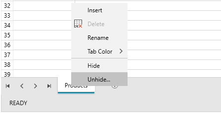
We added new properties and events to the FillSelection functionality. This allows you to control how this feature works in the code behind. Detailed information is available here: Fill Selection.
Map – OpenStreetMapProvider Important Change
In case you missed it OpenStreetMap Foundation has updated its Tile Usage Policy in order to require a valid UserAgent to be passed with the request. That is why we introduced a way to easily pass your UserAgent string for the Standard mode through XAML as shown below:
1.<telerik:RadMapx:Name="radMap"ZoomLevel="1"> 2. <telerik:RadMap.Provider> 3. <telerik:OpenStreetMapProviderAPIKey="your-api-key"StandardModeUserAgent="your custom user agent string"/> 4. </telerik:RadMap.Provider> 5.</telerik:RadMap> For more info about the Map providers – check out this article.
.NET Core – 3.1 Support and Toolbox in the Project Templates
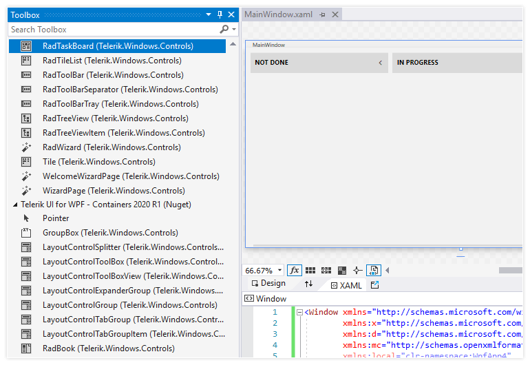
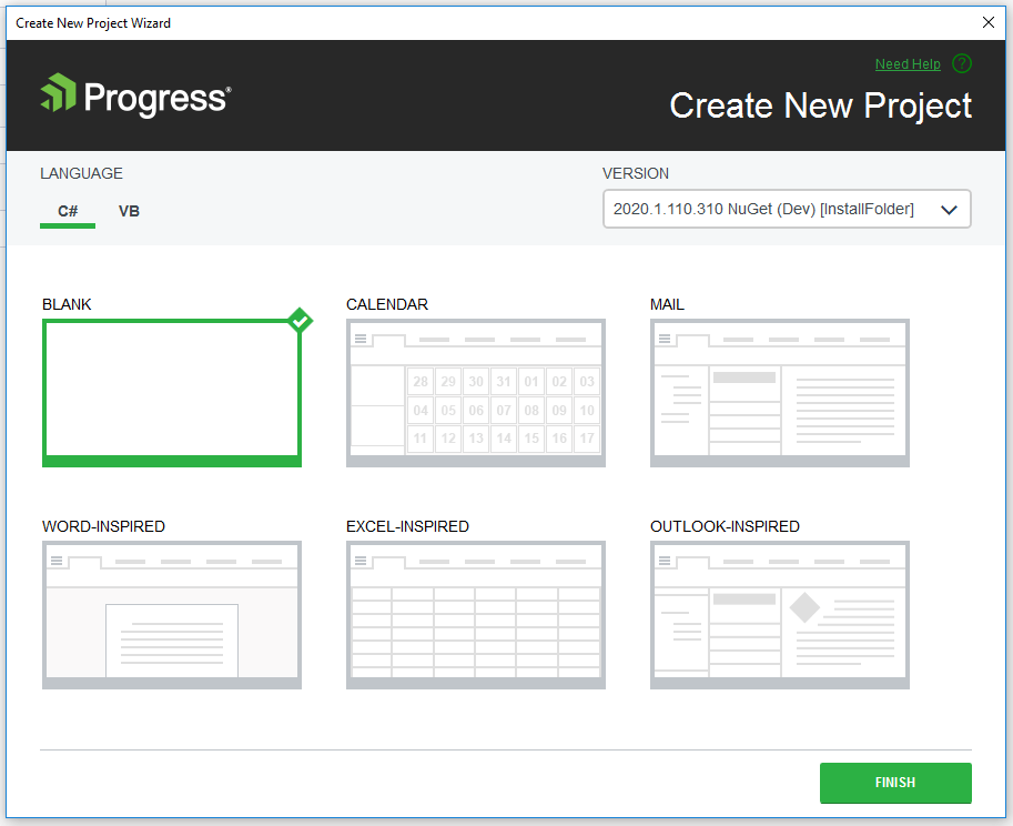
We are also including new Project Templates for .NET Core that refer to our Nuget packages in order to provide you with the same experience as in the .NET Framework project templates. Just create a new Blank project, select the Nuget version and you are ready to take advantage of a fully loaded Toolbox with Telerik UI for WPF controls!
Item Templates (WPF .NET Framework)
We are introducing WPF Item Templates – they will replace the Telerik Scenario Wizard and will allow you to use the predefined item templates through the Add -> New Item context menu in Visual Studio.
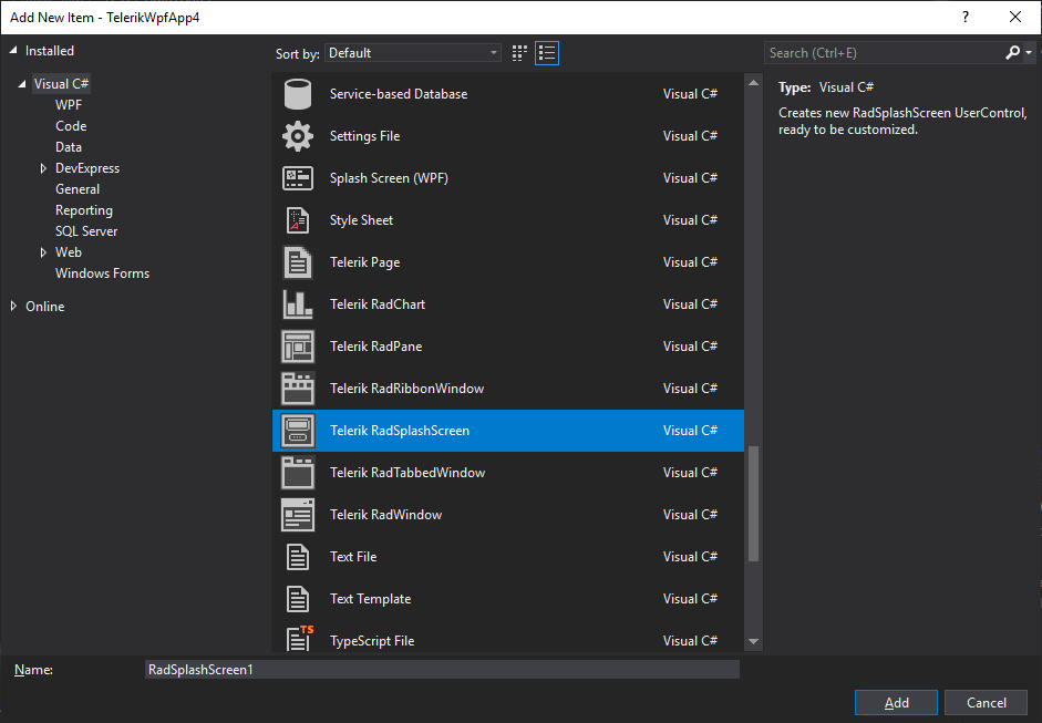
Here is list of available templates:
- Telerik Page: Creates a basic WPF Page, ready to be used with Telerik UI for WPF controls
- Telerik RadChart: Creates a new UserControl with a RadChartView
- Telerik RadPane: Creates a new RadPane UserControl (RadPane is the main content unit of the RadDocking control)
- Telerik RadRibbonWindow: Creates a new RadRibbonWindow UserControl
- Telerik RadSplashScreen: Creates a new RadSplashScreen UserControl, ready to be customized
- Telerik RadTabbedWindow: Creates a new RadTabbedWindow UserControl
- Telerik RadWindow: Creates a new RadWindow UserControl
Other Features
- Docking: PerMonitor V2 DpiAwareness support
- GridView: Added option to search Accent Insensitive (link)
- RichTextBox: Keyboard commands for the new paste options
- WebCam for NetCore: Uses now SharpDX assemblies built against .NET Core
- ChartView for NetCore: Uses now SharpDX assemblies built against .NET Core
Check Out the Detailed Release Notes
We have a lot more! To get an overview of all the latest features and improvements we’ve made, check out the release notes for the products below:
Sign Up for the Webinar
To see the new release in action, please join us on the Telerik R1 2020 webinar, on Tuesday, January 21, 2020 11:00 AM ET - 12:30 PM ET.
Share Your Feedback
Feel free to drop us a comment below sharing your thoughts. Or visit our Feedback portals about UI for WPF, Silverlight and Document Processing Libraries and let us know if you have any suggestions or if you need any particular features/controls.Try out the latest:
UI for WPF UI for Silverlight
In case you missed it, here are some of the updates from our last release.