On smartphones users spend, on average, about three hours inside of mobile apps every day. But there’s a dark side to this — and one that some apps have taken advantage of for their own monetary benefit. This guide will explore some of the more common ethical violations in mobile app design and how to avoid them in your own work.
No one’s ever built a new app and thought, “It’s okay if we don’t make any money off of this.” There was a lot of time and money that went into your product, so of course you want (and need) it to be profitable.
Unfortunately, this can lead some designers down a questionable ethical path.
In many cases, I don’t even think app designers intend to do harm. You’re using design techniques that you know will encourage more users to sign up and use your app regularly.
But have you ever considered how ethical some of those choices are? And if there is an unethical way of designing mobile apps, what can you do to avoid these “evil” practices without compromising your bottom line?
What Do We Mean When We Talk About (Un)Ethical Design?
Think about the dual CTAs we’ve seen on the web the last couple of years. One button — usually in green — says something positive while the other button isn’t a button at all. It’s a hyperlink meant to be ignored. And if it isn’t ignored, the visitor gets served up a plate of sass:
.png?sfvrsn=74c5ed3a_0)
Is this an unethical design choice?
If the intent is to deceive visitors into automatically clicking the element resembling a button, then yes, it most certainly is an unethical design choice. Both options should be presented with equal weight so that users can make up their mind without the subtle design manipulation doing it for them.
There’s also the matter of what the buttons say. This is obviously an extreme example, but it’s not uncommon for these dual CTA scenarios to make the non-button option seem shameful. Even if it’s done tongue-in-cheek, you don’t want visitors walking away feeling bad about the choices they’ve made — because that shame and doubt will trickle over into how they feel about your product as a whole.
As an app designer, you need to find a balance. Can you make your product engaging and worthwhile enough for visitors to install and spend time in it without having to cross an ethical line in the process?
Keep in mind that questionable design ethics don’t always have to do with misleading visitors. In some cases, ethics come into question simply because an app is so addictive that users spend too much time in it and it becomes detrimental to their health. Designing apps to feel exclusive (even if it’s because it’s not accessible) is another no-no.
Ethical Design Techniques for Mobile App Design
Your goal is to make an app so engaging and useful that users want to sign up and use it regularly. But is there a way to do this without having to cross into ethically gray or completely unethical areas?
I can name a few:
1. Never Use Dark Patterns
Dark patterns are a form of design deception — and they come in a wide variety of forms. For example:
- Asking vague or confusing questions to trick users into positive responses.
- Collecting too much information from contact forms.
- Ads disguised as regular content.
- Misdirection (similar to the example above).
- Automatically starting a subscription without reminding users the trial is about to expire.
- Auto-ticking checkboxes so that add-ons are placed in the shopping cart or users are subscribed to a newsletter without knowing.
In other words, if users are tricked or misled in any way because of a design or wording choice, that is a dark pattern.
Take, for instance, the HotelTonight app:
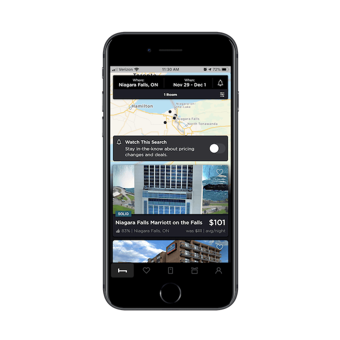
The point of this app is to connect users with last-minute hotel bookings. At first glance, it looks like most travel booking apps. An attractive cover image for each hotel, the average user rating, and nightly price.
However, there’s a dark pattern that enters the page as users scroll through their search results.
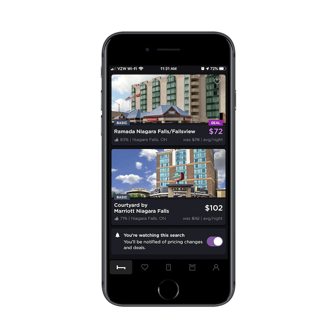
As I scroll through the listings, a purple “DEAL” button bounces down and replaces the price of certain hotels.
When I reached this part of the screen, the Ramada listing originally showed its price as $79 before being quickly replaced by the purple $72. The only thing is, there’s nothing different about this hotel deal from the others on this app.
Take the example above. Users would save $7 a night on the Ramada. What makes that a “DEAL” compared to the other discounts here? If you look at the Courtyard result below it, users save $10 a night, so it’s clearly not based on how much users save. Is it because the Ramada is more favorably rated? I don’t think that’s it either. The “DEAL” callout is inconsistently applied to search results, where some are well-ranked while others aren’t.
So, you have to wonder what’s really driving this. Do these hotels pay HotelTonight an extra fee to sell out their rooms? Or is HotelTonight trying to manipulate the sales of certain listings for other reasons?
Regardless of HotelTonight’s motivations, this is certainly an unethical design choice. Every hotel on this app discounts their last-minute rooms (that’s the whole point of the app!), so a $7 price difference being championed as a “DEAL” over other options is suspicious.
Users should have control over their decision-making, not have their focus pointed toward content the app wants them to go for.
2. Request Permission Only When You Need It
One of the benefits of building a mobile app as opposed to something like a website or PWA is that you can ask users for access to other parts of their smartphones.
That said, it’s very easy to go overboard with sending requests the second users enter the app. You might be thinking that it’s better to get all those permissions out of the way, but your users probably don’t feel the same. I’ll show you why.
Signing into the Snapchat app for the first time, users have to give the following permissions:
.png?sfvrsn=43fb0dee_0)
It’s nice that Snapchat explains why it needs access to the camera. This will at least make users feel more at ease with saying “OK” even though this is one of the first interactions they have with the app.
Next, is the push notifications request:
.png?sfvrsn=572be5a6_0)
Snapchat lets me know that I’ve previously disabled notifications. It’s annoying that it asks again, but this time I say “Yes”. Then, this happens:
.png?sfvrsn=6a8c3faf_0)
I receive the original push notifications permission modal. Again, it’s good that Snapchat explains what it’s going to do with push, but this is very frustrating. I’ve had to interact with three modals so far — two of which were for the same thing — and there’s still another to come:
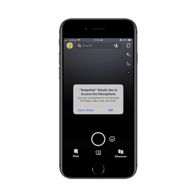
This is the fourth modal to be sent my way in a span of 10 seconds. At this point, I just click “OK” in the hope that I won’t have to see another one of these ever again.
But then I make the mistake of clicking on the location tracking feature in my dashboard and see this:
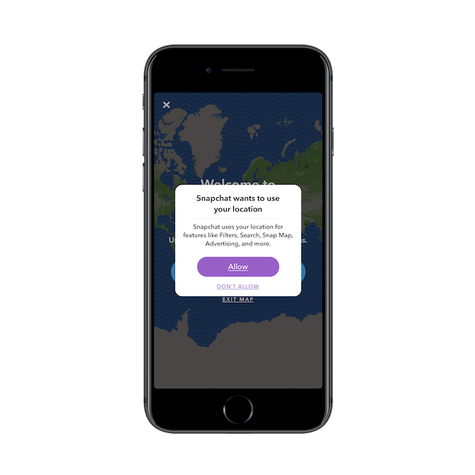
This one is a bit of a relief as it’s custom-designed by Snapchat. So, I take the time to read through it and allow the app to track my location.
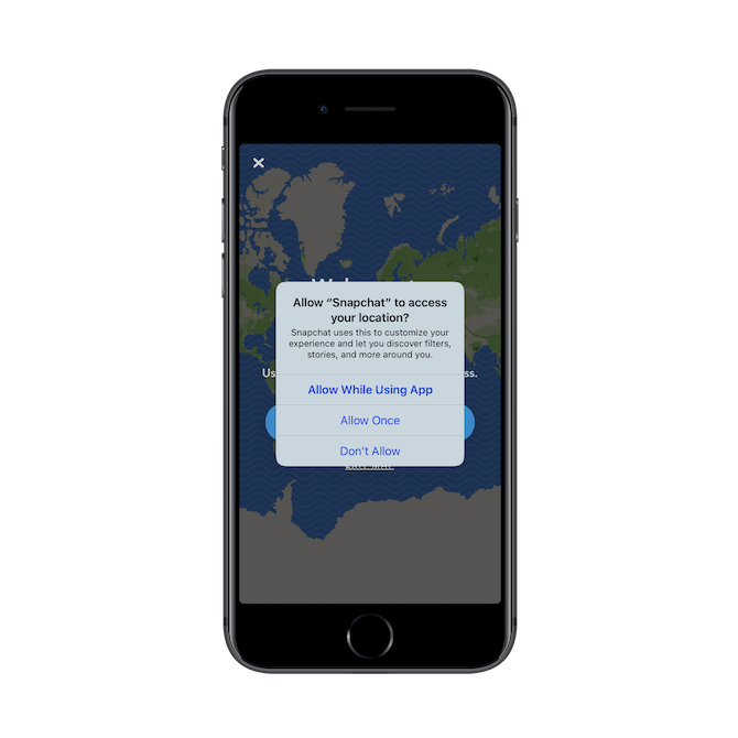
That’s right. Snapchat asks a second time for access to my location, only with a different explanation and using the standard permission modal design. Blegh.
That’s a total of six modals users have to deal with after entering the app for the first time. Is this an ethical issue? Sort of.
While the bombardment of requests is borderline abusive, there’s also the fact that the onslaught of modals makes it easy to slip unnecessary permissions in there. If users are anything like me, they might just click OK, OK, OK simply to get rid of the messages and inside the app.
To get out of this ethically gray area, here’s what The Nielsen Norman Group recommends for designing better permissions modals:
1. Explain why you need permission. Instead of “We want to send you push notifications,” use something like “We want to send you push notifications when breaking news stories hit the wire.”
2. Ask for permission at the right time. In other words, don’t bombard your users with permission modal after permission modal the second they enter the app. Only ask for permission within the right context. For instance, when someone wants to upload an image from their phone, only then will the app ask for camera or file access.
3. Make decision reversal easy. Users should always have full access to the settings of your app. Never hide these controls. After all, you never know when they might want to go back and say, “You know what? I do want to allow you access to my contacts.”
3. Empower Your Users to Protect Themselves
As the web becomes a bigger place, hackers now have more access to user data than ever before. While GDPR was meant to help keep consumers safe, all it really did was introduce another reason for them to develop banner blindness.
Similar to users who might casually dismiss permission modals, the same thing is happening when lookalike GDPR privacy notices appear.
This is a problem. While we can’t reasonably expect users to read every privacy statement put in front of them, we can’t take advantage of it either. Whether or not users see a privacy notice as a nuisance to quickly dismiss, they should have the ability to control their privacy settings at a later point in time.
The same goes for deleting their accounts. I can’t tell you how many times I’ve signed up for an app, only to still be hounded by marketing emails and phone calls from the app salespeople months down the road.
Rather than hide these seemingly minor actions from apps, you should enable access to all of them in the user settings. Let’s look at an app that succeeds in this.
Wickr is an enterprise-grade communications app. Think Whatsapp, but for encrypted and private corporate communications. That’s why it’s no surprise that this is one of the first screens users see upon installing the app:
.png?sfvrsn=be6c8c17_0)
To demonstrate how serious it is about security and privacy, users are welcomed by this privacy notice and asked to agree to the terms before continuing on. Once they’re inside the app, they can take even greater control over their device and its privacy settings:
.png?sfvrsn=d461fd79_0)
Each of these settings panels provide in-depth controls over how their communications are encrypted and stored. Users can easily toggle on and off options as they become useful or relevant to how they use the app.
It would be easy to develop an app like this and leave the privacy as nothing more than a privacy policy or terms of use statement. But, again, we’re talking about the ethics of app development and design. Even if your users don’t ever use these privacy or device settings, it’s important that they be made available. It shouldn’t be up to an app owner or developer to decide how much security is enough for each user.
4. Stop Promoting the Quantity of Engagement
In 2018, consumer app usage reached a new height: globally, consumers spent 1350 billion hours inside of apps that year. In the U.S. alone, that came out to about 3 hours a day.
Now, here’s the dilemma:
There’s a reason certain apps are so engaging (i.e. addictive) that users get caught up in them for hours every day. And, really, apps built for entertainment and socialization should have users engaging with them on a daily basis.
That said, it becomes a problem when apps encourage a greater quantity of engagements instead of quality.
We have more than enough research telling us:
- How bad it is to spend extended periods of time in front of screens.
- How blue light disrupts sleeping patterns.
- Even how smartphones can cause physical issues with our hands and arms.
While I understand that rewards and social integration are useful in getting users to return to your apps and spend more time in them, this can be to the detriment of your users’ health.
You look at a gaming app like Dream Blast, for example, and you see how many things there are to help users make excuses to play one more round.
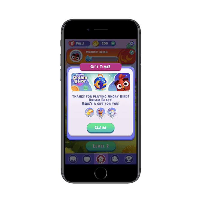
Add to that push notifications that let users know when they haven’t been in the app in a while or when they’re missing out on something (like a team challenge or a friend beat their score), and it only gets worse. This is why apps need to stop encouraging more time and logins.
As I’ve already acknowledged, you need these kinds of apps to be engaging. But there’s a way to do this ethically. First, you have to be responsible with push notifications and emails. Don’t send them at a frequency that encourages users to log in multiple times a day. Once a day is enough of a reminder, if that.
Secondly, more apps need to take TikTok’s lead:
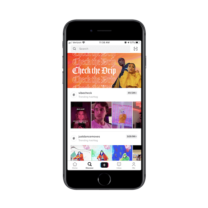
With endless scrolling and FOMO baked into the TikTok experience, you’d think that this app would be a major violator of design ethics. Until you visit the user settings tab:
.png?sfvrsn=6e408b_0)
See “Digital Wellbeing”? This is where users can enable the following setting:
59ce80e7ce0e4d058723fa16c7e8a4c4.png?sfvrsn=53a7c79_0)
When enabled, TikTok will let the user know they’ve spent 60 minutes in the app today and prompt them to close it down. They then have the choice to wait until the next day to start all over again or they can enter their passcode to bypass it. But anyone who would enable this kind of feature is clearly thinking about what extended use of the app does to them, so the one-hour shutdown might be enough to keep their usage in check.
I’d recommend that if you’re building an app that you know is going to be heavily engaging that you include this feature as well. While you can certainly be more responsible with how you design the UX and how you disseminate push reminders, you should also empower your users to do their part as well.
Wrap-Up
There are a number of ways in which you might be violating basic human decency when you design an app. Again, I don’t think it’s intentional a lot of the time. I think it’s more that questionable design trends catch on because they have proven successful in driving up superficial metrics like time-in-app.
Bottom line:
In reality, what we should all be focusing on is designing unique experiences that drive up user retention (which is really the only way to make a sustainable profit in the world of apps).
So, the next time you’re designing an app, don’t focus on designing for sales. Instead, focus on designing for people.