Learn about the improvements in our newly redesigned breadcrumb control in Telerik UI for WinForms, with tips for how to get the most out of it.
Breadcrumbs (or breadcrumb trail) is a secondary navigation system that shows a user’s location in a website or application. The term came from the Hansel and Gretel fairy tale in which the main characters create a trail of breadcrumbs in order to track their way back to the house. Just as described in the fairy tale, users need to know their location within the app, as well as track the navigation history.
The old RadBreadCrumb was composed of StackLayoutPanel that hosts a collection of RadSplitButtonElements. Each RadSplitButtonElement represents a node in the hierarchy to the full path of the selected node. This works correctly, but there were several disadvantages of the current implementation which we wanted to improve. This is why we are happy to announce a brand new RadBreadCrumb control!
RadBreadCrumb Navigation
RadBreadCrumb is a navigation control that allows users to navigate through a tree structure, like the Windows file explorer, the document object model in HTML or the organizational hierarchy structure in a company. It can be used to define the application navigation, or to display more complex hierarchical data.
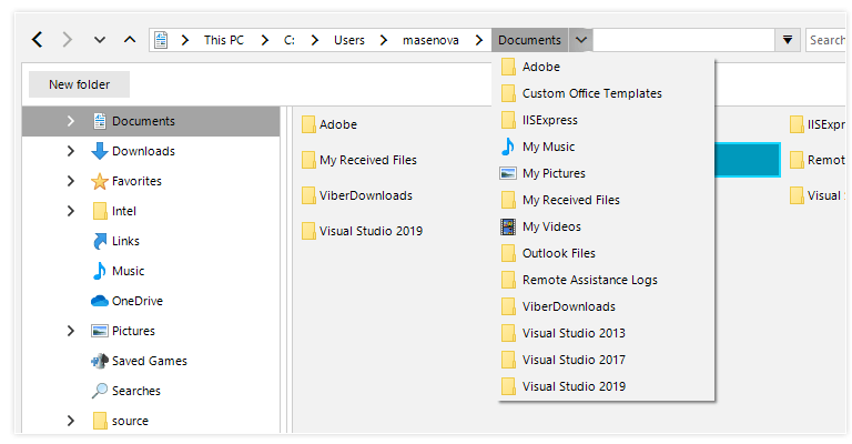
Thanks to its advanced capabilities, RadBreadCrumb will significantly improve the navigation and performance of your application. Here are some of the key features:
TreeView Integration
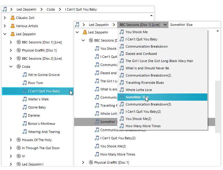
RadBreadCrumb provides an easy way to connect to a RadTreeView control instance, and it will show the path to the currently selected node as a sequence of drop-down buttons. Each button can be used to navigate to a specific node in the tree. Breadcrumbs are most appropriate when your data has a deep hierarchical structure with many levels.
Data Binding
With its powerful data-binding mechanism, the control lets you display hierarchical structures, such as directories and relational data. It can be bound to any IList or IBindingList data source and it will display the data source hierarchical structure, where the user can navigate it. In addition, unbound mode is also supported if you need to populate the items manually.
Text Editing and Auto-Complete
Text editing is very useful feature when the user needs to enter the desired location manually instead of selecting it with the mouse. Complimented by the powerful auto-complete mechanism, it makes this task flawless.
this.radBreadCrumb1.IsTextModeEnabled = true;this.radBreadCrumb1.IsAutoCompleteEnabled = true;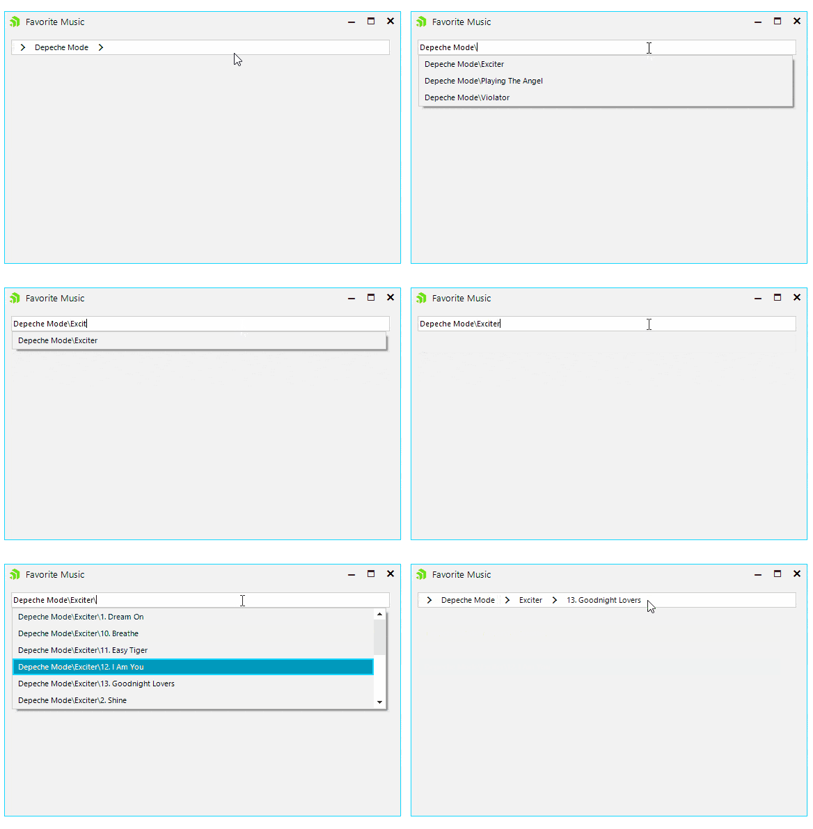
History
Another key feature is that recently visited places can be saved and displayed in a convenient drop-down so the user can navigate between them easily.
this.radBreadCrumb1.IsHistoryEnabled = true;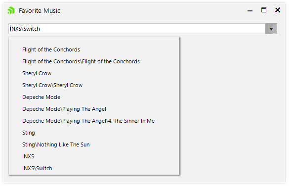
Auto-Hide Items
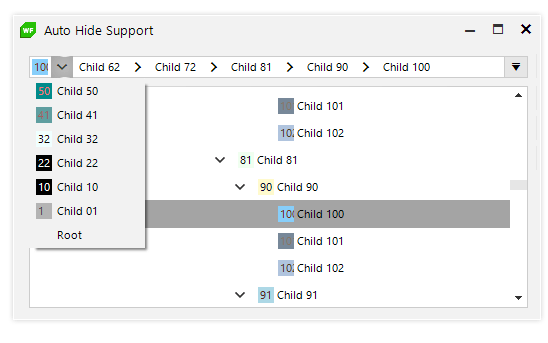
Auto-hide items comes in handy when the hierarchical path is longer than the control length. In this case the RadBreadCrumb control will conveniently display the latter part of the hierarchy, so the user is aware of his selection. All the hidden items will be displayed in a popup menu when click on the header button.
Fully Themable
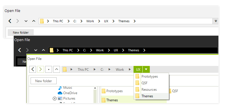
The RadBreadCrumb control is shipped with a rich set of themes that allow you to easily build slick interfaces with the look and feel of some of the latest Windows and Office versions.
Exposed Events
The rich variety of exposed events that the Telerik Presentation Framework provides allows you to easily achieve more complex scenarios by implementing your own logic and customizing the look and feel of RadBreadCrumb in your application. Here are some of them:
- AutoCompleteItemsCreated – This event occurs when auto-complete items are created. Here the user can modify the auto-complete items and/or modify the collection (add, remove, move or replace items).
- SplitButtonCreating – In this event handler the users can replace the button with a custom one, or cancel creating RadSplitButtonElement for the associated RadTreeNode.
- SplitButtonCreated – For each node in the path hierarchy a SplitButtonElement is created. In this event handler the users can set button properties, modify one or more items of the SplitButton.Items collection or modify the collection (add, remove, replace items).
- HistoryItemCreated – In this event handler the user can access the AssociatedMenuItem in order to modify it or prevent it from being added to the history.
privatevoidRadBreadCrumb1_HistoryItemCreated(objectsender, Telerik.WinControls.UI.BreadCrumb.AssociatedMenuItemEventArgs e) { e.MenuItem.FillPrimitive.BackColor = Color.Aquamarine; e.MenuItem.ForeColor = Color.BlueViolet; }intcounter = 0; privatevoidRadBreadCrumb1_SplitButtonCreated(objectsender, Telerik.WinControls.UI.BreadCrumb.SplitButtonCreatedEventArgs e) { if(counter++ % 2 == 0) { return; } e.SplitButtonElement.ActionButton.ForeColor = Color.Green; e.SplitButtonElement.ArrowButton.ForeColor = Color.Goldenrod; }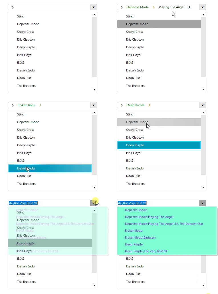
- CollapsedItemsCreated – This event occurs when there is not enough space to fit all items and all collapsed items have their corresponding menu items created. In this event handler the user can add, remove, reorder the items in that will appear as collapsed.
- PathParsing – Handling this event the user can change the path, or cancel the parse operation at all.
- PathParsed – This event occurs when a path has been evaluated and a RadTreeNode is about to be selected in the RadBreadCrumb. In this event handler the user can change selected RadTreeNode.
More detailed information about this control is available here.
Check Out the Latest Version and Share Your Feedback
Make sure to download a free trial of the latest version of the Telerik UI for WinForms suite, and explore all the new features that came with the Telerik R3 2019 Release.
You can also visit our Feedback portal and drop us a line if you have any suggestions or if there are any particular features/controls you would like to see.