In this post you'll learn about 5 things you can do to keep your monetization elements from disrupting the experience and losing users.
You put a lot of thought into designing the components that make up a mobile app. How large to size them, where to place them, how to make interactive elements click-worthy, etc.
But it’s not just the app content that deserves this kind of consideration. So too do the monetization elements within it. In-app purchases, ads, ad-free subscriptions, paywalls — you want these monetization elements to be present without disrupting the experience.
So, how do you do this? How do you balance the needs of the company (i.e. to make money) with the desires of the users (i.e. to get something valuable or enjoyable from the app)?
Let’s look at what you can do to integrate monetization elements into an app without annoying users or compromising how much money your clients make.
How to Design App Monetization the Right Way
When there’s no upfront monetary investment from users, it’s too easy for them to delete an app from their home screen if they’re unhappy with it. That’s why, when you’re designing free or freemium apps, the experience has to come first. If monetization elements take a front seat to the app’s content, you’re basically handing your users an excuse to abandon the app shortly after downloading it.
So, let’s make sure that doesn’t happen.
Tip #1: Let Them Get to the Content First
When a user steps inside of an app, their goal is to get right into the meat of it, not to get distracted by one of the app’s attempts to make money.
The BBC News app is guilty of this faux pas: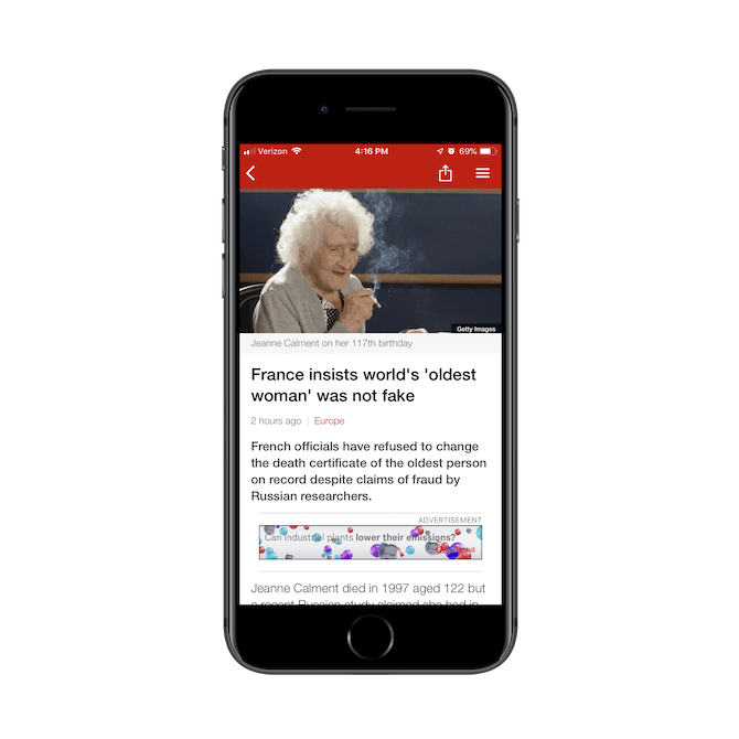
The BBC News app inserts a banner advertisement above the fold in every article. In this article entitled “France insists world’s oldest woman’ was not fake”, an ad for Exxon Mobil is shown.
Whenever a user opens a new article, they’re greeted by standard intro features (like the cover image and intro summary) along with a banner ad. This isn’t a one-off example either.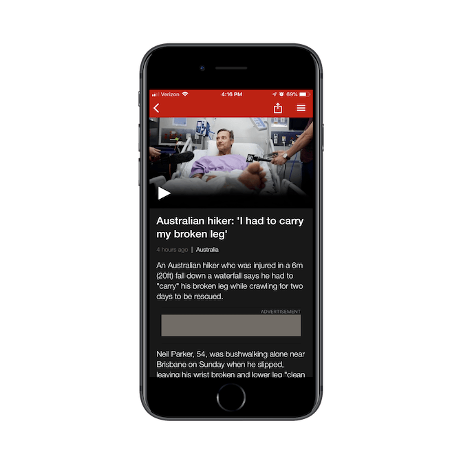
An example of a BBC News page with an advertisement placed above the fold. In this example, the ad isn’t loading.
In this screenshot, you can see that the ad hasn’t even loaded yet. This is about three seconds after landing on the page, and it happens on most pages opened for the first time in the app.
So, not only does a banner ad taking up prime real estate above the fold on each page of the app, but it’s extra distracting because it doesn’t load quickly.
Key Takeaways:
- Unless your banner ad can stick to the bottom of the app and stay out of the way, don’t put it above the fold.
- Make sure you’re using a reliable third-party ad service, so users aren’t distracted by slow-loading ads.
Tip #2: Go with Less Intrusive Elements When Possible
Podcasts, in general, tend to have some sort of monetization attached to them, usually in the form of sponsor ads that air during episodes. But it’s not just podcast hosts that need to make money off of their shows. Podcast player apps do, too.
The Overcast mobile app, for instance, has chosen to monetize with a premium subscription option: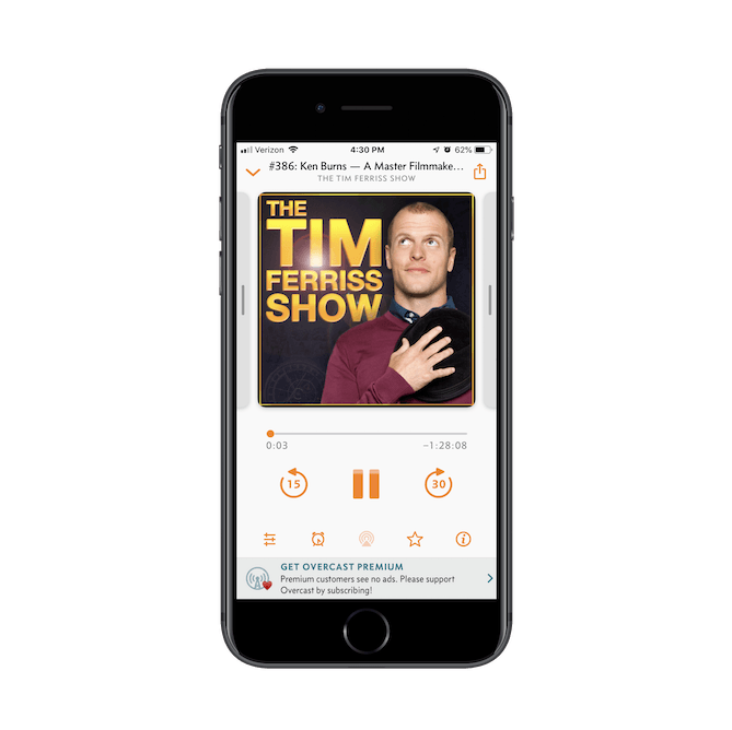
The Overcast podcast player app has shows for podcasters like Tim Ferriss. It uses a small banner ad to promote its ad-free subscription service.
The sticky banner ad below the episode is nicely done. Its design is somewhat subdued and serves as a gentle reminder that users can subscribe to support the app as well as to remove ads from the experience.
If interested, the user can click on the ad (placed in the thumb zone), quickly subscribe to Overcast, and configure their premium settings:.png?sfvrsn=9f42880c_0)
Overcast provides users with a premium subscription offer that removes banner ads altogether.
Overcast makes it really easy for this upgrade to take place, and it’s completely up to the user to initiate it.
The Apple Podcasts app, on the other hand, gets too pushy with its monetization.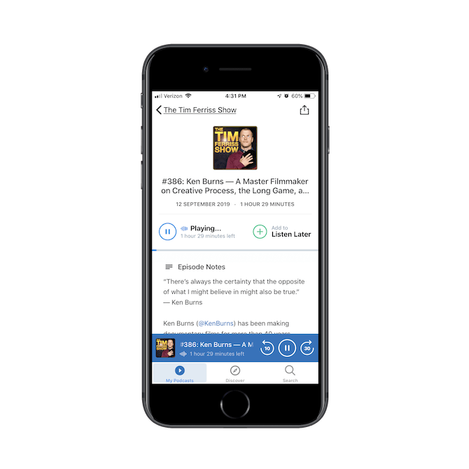
The Tim Ferriss Show plays on the Apple Podcasts app.
This is the same exact podcast and episode as the one shown on the Overcast example above. However, it takes no more than a couple seconds before this interstitial ad appears: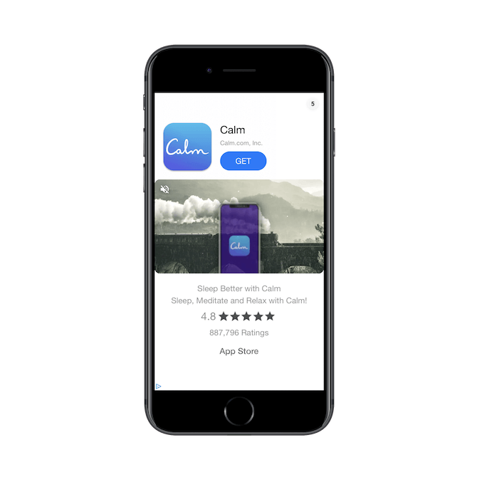
An ad for the Calm app appears shortly after pressing play on an episode in the Apple Podcasts app.
This is an ad for a different app and takes up the entire screen for at least five seconds. Once it’s dismissed, users can return to the episode. But while that ad displays, they’re left without any ability to control what they’re listening to.
Even though Apple Podcasts is using external ads to monetize its app, they could’ve chosen a less intrusive way to go about serving them to users.
Key Takeaways:
- Less is more. If you can display an ad as a sticky banner instead of a disruptive interstitial, do it.
- Never immediately deprive your users of control over their experience. For instance, in gaming apps, they usually wait to show an interstitial until after the first round is played. The same should be done with other kinds of app content.
Tip #3: Limit How Many Monetization Elements You Use
If you know your users well enough, then you know what type of monetization they’re most likely to go for. And while it might seem like a smart idea to utilize as many money-grabbing strategies as possible to maximize your results, it could backfire.
The WordScapes mobile app is an app I suspect this happens with often: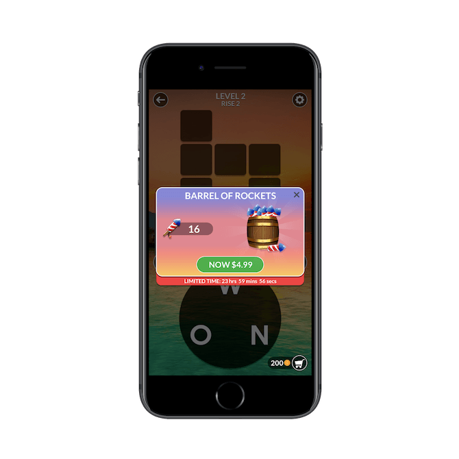
One of the first things users see in the WordScapes app is a pop-up offering 16 rockets in exchange for $4.99.
This in-app purchase pop-up appears within a second of opening the first game board in the app. While it’s certainly easy enough to dismiss, it’s just the start of what’s to come.
After the very first short round is completed in WordScapes (which maybe takes five seconds), this mobile ad plays for 30 seconds: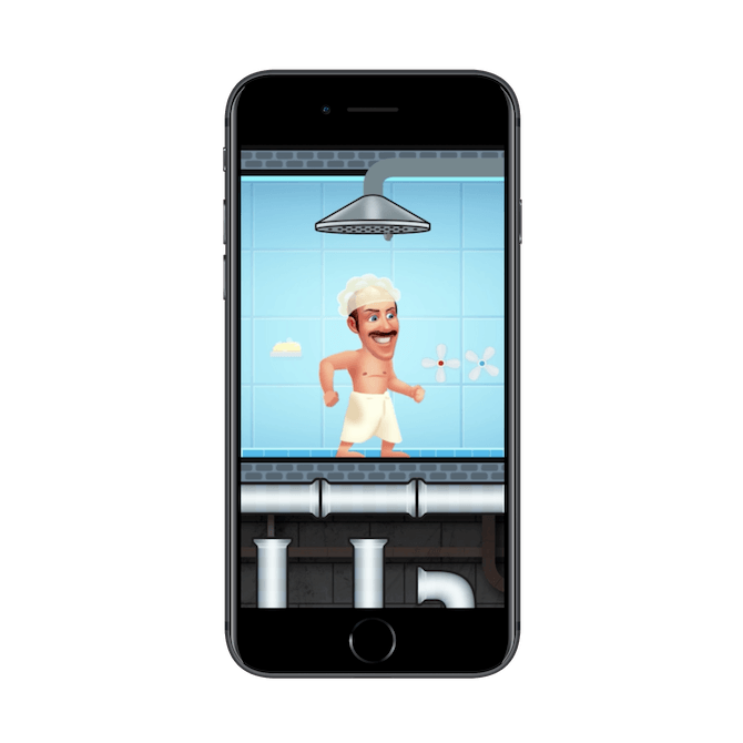
A video ad plays in between rounds in the WordScapes app.
There’s no way to dismiss this ad. Users have to wait 30 seconds before they’re allowed to “X” out of the interstitial. To make matters worse, after they close the ad and go to the next game board, this is what they see: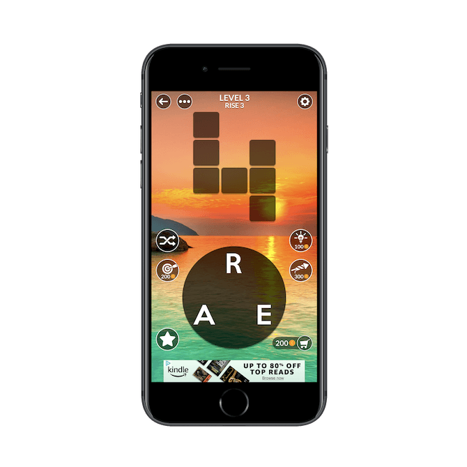
WordScapes places banner ads at the bottom of their game boards. This one is for a deal on Kindle.
This is the third monetization element shown to new users and it takes place within the first 60 seconds of stepping inside the app. It’s just overkill.
Key Takeaways:
- Your users know that you need to monetize, but don’t take that for granted. Pick one type of monetization and commit to it.
- Give your users some breathing room between monetization elements, whether it’s measured in minutes or pixels.
Tip #4: Don’t Mislead Users into Engaging
Dark patterns should always be a no-no. And, yet, even some of the most popular mobile apps use them.
Take, for instance, Bumble:.png?sfvrsn=f33718de_0)
Bumble places a link to its Bumble “Beeline” upgrade in each user’s match queue.
Users can view their Match Queue from the bar at the top of the messaging tab. These are the people the user has matched with. The first circle (the one highlighted in green) is different though.
See how it says “50+”? This is what’s known as the Beeline: all the potential matches who’ve already swiped right on the user. However, this isn’t a shortcut to that list. It’s a link that takes users to a page where they can upgrade to a paid subscription if they don’t have one already.
Once users have spent enough time in Bumble, they’ll learn to avoid that button. However, it can get annoying when it’s accidentally clicked and they’re forced to leave their messaging and match queue, only to have to dismiss the upgrade request once again.
Another kind of dark pattern that appears on mobile apps comes in the form of this one from Angry Birds: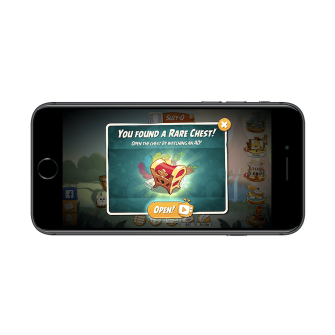
Angry Birds gets users excited about their discovery of a rare chest. The call to action button says “Open!”, but the video symbol next to it indicates that there’s an ad waiting.
This is a misleading pop-up, especially for gamers who are used to moving swiftly from bird to bird, and game board to game board. What’s going to happen a lot of the time is that they’ll see this message, “You found a rare chest!”, along with the call-to-action to “Open!”, and immediately click the button. But that video icon next to the CTA tells a different story.
This isn’t just an invitation to collect a reward, something that Angry Birds users chase after. This is a not-so-subtle attempt to get users to watch a video ad.
Something similar happens with this pop-up: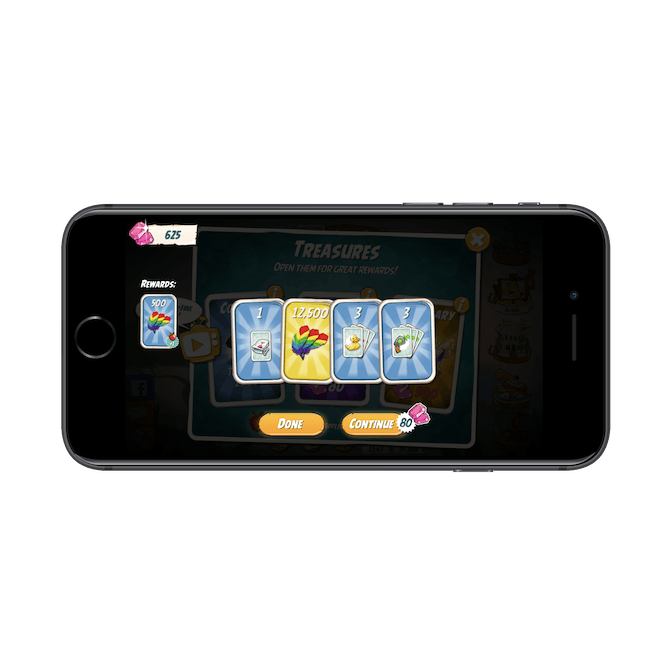
The Angry Birds app gives users a chance to win extra rewards. However, in this second drawing, it doesn’t clearly explain that it will cost them their earned gems in order to take another turn.
Here’s what’s happening:
- Users are shown five cards as “Rewards” opportunities.
- The first card revealed is free.
- Everything after that, though, costs them 80 gems.
Now, the “Continue” button shows the cost of picking another card. That said, if users are flying through the app, trying to get through the distracting pop-ups and back to the game, they might not take enough time to look closely at what the “Continue” button says.
In a sense, apps like Angry Birds design their buttons and experience this way so that users unintentionally use up their coins/gems/money. That way, when they’re in a bind during the game and have nothing left to barter with, they’re forced to buy something with real cash.
Key Takeaways:
- Don’t use dark patterns. Period.
- Always make it 100% clear if users have to exchange something in order to claim a reward, whether it’s time, game cash, or real cash.
Tip #5: Move the Upgrade Button out of the Thumb Zone
There’s nothing wrong with monetizing a mobile app. But as we’ve seen, when those monetization elements distract users from the app’s content, or the users are misled into engaging with them, that’s a problem.
One way to play it safe is by, first, clearly labeling where your upgrades live and, secondly, moving the button out of the thumb zone.
Canva does this well:![]()
The Canva mobile app places a crown icon in the top-right corner of the app for anyone who wants to upgrade to a subscription.
By now, the crown icon is a recognizable symbol in mobile apps. Users are going to see it and realize that’s where the premium upgrade lives (especially since it’s tucked out of the way).
Another mobile app that’s done a good job of promoting its subscription upgrade without getting in the way of the content is Duolingo:.png?sfvrsn=a127f03c_0)
Duolingo has clearly labeled its upgrade button as “Try Plus” and places it in the top-right corner of the app. It’s only present on the home screen.
Rather than rely on a symbol to tell users “This is where you can upgrade!”, Duolingo uses an embossed blue button that says “Try Plus”.
There’s absolutely no surprise about what’s hiding behind that button and, yet, it doesn’t get in the way. It only exists on the home screen and it always stays in the top-right corner and away from the thumb zone.
Key Takeaways:
- Freemium app monetization is one of the less obtrusive ways to make money with an app.
- When you advertise subscriptions, be sure to design them in a way that they’re easy to identify without getting in the way.
Your App Can Still Be Profitable, Just Design It Carefully
If users download an app with the promise that it’s free, the last thing they want is to be hit over the head with ads or tricked into in-app purchases. Even if an app is advertised as Free but with in-app purchases, there’s no excuse for disrupting the experience… at least in the eyes of your users. They understand that an app is going to ask if they want to spend money at some point. So, design these elements in a way that lets them decide if or when that happens.