Our November 2019 Telerik UI for Blazor releases continue, and we are happy to announce the latest version, 2.4.0, of Telerik UI for Blazor is available for download. It includes Blazor Components Localization, Grid Scrolling and Compatibility with .NET Core 3.1 Preview 3.
Just two weeks after we released Telerik UI for Blazor 2.3.0, which included new BlazorComboBox and Grid Column Resizing, in 2.4.0 we included something big - you can now translate the messages of UI components in Blazor apps. And because we know how important it is for you to continuously enhance the Blazor Grid in this release we worked on enabling you to set the Width property in addition to setting the Grid Height. Last, but not least, in 2.4.0 we have also ensured that Telerik UI for Blazor is compatible with Preview 3 of .NET Core 3.1. Read ahead to find out more.
New Localization in UI for Blazor Components
Globalization is the process of implementing an application that works in multiple cultures and one of its important aspects is Localization, i.e. being able to customize an app for a given language.
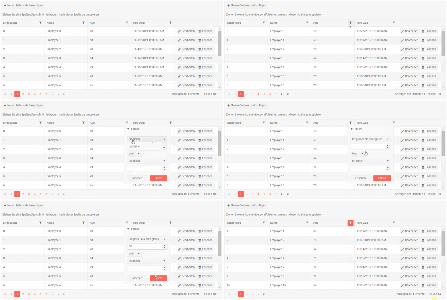
Because we know that Localization is crucial for applications that need to run on markets in different countries, in this release we set the stage for Globalization by implementing Localization. Now you can translate texts and messages related to Blazor UI components.
More details on how to enable Localization in your Blazor app and how Localization works in Telerik UI for Blazor can be found in the official documentation article.

Example of Grid Localization - translated user interface including logical operators
We will continue our efforts to extend your Blazor app Globalization capabilities, and in the upcoming releases you will be able to adapt the components to different cultures and have right-to-left support.Blazor Grid Enhancement Column Width and Scroll
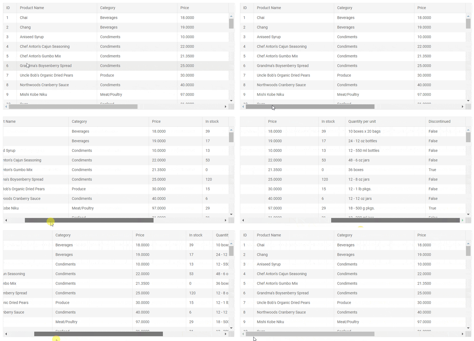
You can now control the Grid Width behavior and,depending on the settings you apply, you can have different distribution and potentially Grid Scroll.
In the basic case when no column widths are set, the available Grid width is distributed evenly between all Grid columns. In case all column widths are explicitly set and the cumulative column width is greater than the available Grid width, a horizontal scrollbar appears and all set column widths are respected.

For details on the various scenarios of styling the Telerik UI for Blazor Grid using Width, Height and CSS settings, check out the following articles: Grid Column Width and Grid Styling.
Telerik UI for Blazor is Compatible with the .NET Core 3.1 Preview 3 Release
Just days after Microsoft announced the release of Preview 3 of .NET Core 3.1, we happy to state that Telerik UI for Blazor 2.4.0 is fully compatible.
.NET Core 3.1 is a short release focused on key improvements in the two big additions to .NET Core 3.0. - Blazor and Windows desktop. Microsoft has announced that 3.1 will be a long-term support (LTS) release with an expected final ship date of December 2019.
Download Telerik UI for Blazor 2.4.0
Download the latest version of Telerik UI for Blazor Native Components from the Telerik UI for Blazor page and help us shape the future of UI for Blazor by sharing your ideas, features requests and comments with us on the official Telerik UI for Blazor feedback portal.
Happy Blazor Coding!