Before users sign up for your web app, your sales page first needs to convince them to open their wallets. Or, at the very least, to hand over their email addresses so they can try it out for free.
While copywriters are responsible for crafting the messaging that convinces prospective customers to take action, designers and developers have some work to do as well. Namely, it’s your job to design a website or landing page so that visitors can’t help but trust the company behind it.
By placing trust builders at key points around the sales pathway, you can put any remaining hesitations or fears to rest, so your app’s prospective users can convert with ease.
Here are some ways to earn the trust of users before they ever step inside your app:
1. Display Customer Testimonials
Thanks to the internet, it’s not just recommendations from friends and family that help consumers make buying decisions anymore. Social proof, like customer testimonials, works nearly as well.
But you can’t always rely on potential app users to ask about your app on social media or in online forums. You’re going to need to provide that proof on your website — and to place it as close as possible to the part of the landing page where they decide to sign up.
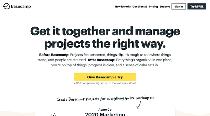
The popular project management software Basecamp has a good example of a sales page:
The home page for the Basecamp project management software displays a clear benefits-driven message and yellow “Give Basecamp a Try” button.
Even the most convincing of value statements aren’t always enough to compel visitors to click the call-to-action button right away. That’s why you need to plant your social proof a scroll or two below this first section. In doing so, you’ll give visitors a chance to work through the doubts in their mind with solid proof.
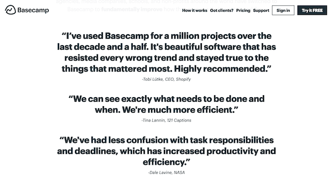
This is how Basecamp gives it to them:
Basecamp’s sales page includes testimonials from high-profile clients like Shopify and NASA. The testimonials are written in oversized bold font, so they’re impossible to miss.
These testimonials are impossible to miss with their oversized and heavily bolded text. And if the rave reviews aren’t convincing enough, a quick glance at the notable clients who left them should convince prospects to take the next step.
If your app doesn’t have many testimonials to tout just yet, that’s okay! You could do as Help Scout does and show off some of your high-profile users’ logos:.png?sfvrsn=37ec3f07_0)
Help Scout includes logos for GrubHub, Trello, Buffer, Pocket, Tuft & Needle and Tradesy just below its signup form.
Also note how it quietly invites users to “join 10,000+ companies.” Even if you don’t have big brand names backing your app, this is another way to leverage your current user base as social proof.
2. Flaunt Your Expert Reviews
Your customers aren’t the only ones who can comment on the quality of your app. Professional reviewers and aggregate review sites can, too. As a SaaS company, it’s going to be especially important to get their thumbs-up when they’re pitting your app directly against the competition in roundups like “The 10 Best Healthcare SaaS Companies” or “The 8 Best Productivity Apps of 2019.”
Scoro, for instance, shows off some of the impressive scores it’s received from popular technology review sites:.png?sfvrsn=b085ab8b_0)
Scoro shows potential users of its app how well it scores with expert reviewers. Capterra gave it a 4.5, G2 Crowd gave it a 4.7, GetApp gave it a 4.6 and Software Advice gave it a 4.5.
This section lives much closer to the bottom of the sales page rather than up top. This gives consumers the chance to read through the benefits and features of the app before they’re being shown how awesome other people think it is.
Now, while this is a good tactic to help build trust, be careful with it.
I ran across a similar reviews callout on the mHelpDesk website:.png?sfvrsn=bc4e5672_0)
mHelpDesk Reviews shows off top ratings. Capterra gave them a 5-star rating, Trustpilot gave them a 5-star rating, and they’re the #1 reviewed field service software with Software Advice.
However, this one didn’t sit right with me as the reviews just seemed too perfect. So, I decided to look up the reviews for myself. In reality:
- Capterra gave it a 4.5.
- Trustpilot gave it a Trust Score of 7 out of 10.
- And, as far as I can tell, there are a couple other field service apps like Housecall Pro and Jobber that perform better than mHelpDesk with Software Advice.
If you’re going to leverage reviews to build trust in your app, make sure they’re real. I know it might sound better to claim a perfect score, but it’s not realistic and is an obvious red flag that something’s amiss. What was supposed to help you build trust with prospective customers will only do the opposite.
3. Allay Remaining Concerns with FAQs
The sales page for your app is the perfect place to answer any remaining questions consumers have — even if they’ve already been answered elsewhere on the site.
If you’re unsure of what the most common concerns are that keep consumers from pulling the trigger, start with the basics about pricing. You can use monday as an example of how to do this:.png?sfvrsn=21e73248_0)
Monday provides answers to frequently asked questions about price. How much it costs. Which plan is best. How to manage billing. Who can use it. Can plans be changed. Discounts available to non-profits.
It’s a simple list of questions that any user might ask when signing up for project management software.
A lot of SaaS companies use a similar formula for designing their FAQs. Calendly has another good example to follow:.png?sfvrsn=5425ae13_0)
Calendly provides users with last-minute questions they have about the software. What happens after the free trial. Can multiple users use it. How does renewing work. Is it possible to upgrade/downgrade. Do non-profits get special pricing. What payment methods are accepted.
Where you place the FAQs is important, too.
In both examples, they appear directly beneath the pricing table. That way, if users get through the side-by-side comparison of plans and are still feeling wary about making a choice between them (or at all), the FAQs should curb those concerns. You can always update these later as you collect more data on your users.
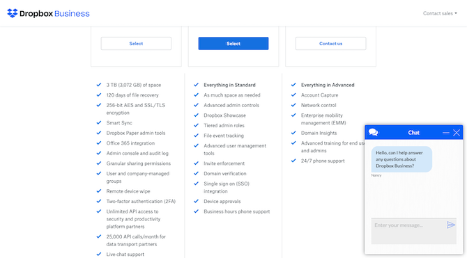
You can also include a chatbot as a failsafe, like Dropbox does:
Dropbox opens a chatbot on its sales page once a user has scrolled past the pricing tables.
This chatbot only appears once a visitor has scrolled past the pricing tables and it offers to do the same exact thing your FAQs do (except maybe more conveniently). That way, if a prospective user doesn’t feel like reading through the FAQs or can’t find an answer to their question there, the chatbot serves as a backup.
4. Don’t Put a Credit Card Field on the Form
Purchasing software is tricky as it’s not the kind of product you can return to a store. That’s why many SaaS providers offer free trials or demos so users can get first-hand experience with an app before they hand over their credit card information.
That said, have you ever encountered something like Office 365 has done here?.png?sfvrsn=f20e3b9c_0)
Office 365 gives users 1 month free to try out its software, but requires a credit card upfront.
If you’ve ever tried to sign up for a free trial, only to discover that the company still asks for your payment information, you’ve probably hesitated, right? It’s like:
“Why should I give you my credit card information if this is a free trial? Are you hoping I’ll forget about it so you can bill me without my noticing?”
It just doesn’t send the right signals to consumers if you’re asking for a credit card in exchange for a free trial.
Instead, keep your forms free of the credit card field as Dropbox’s free trial page does:.png?sfvrsn=be7d1b54_0)
Dropbox gives business users a 30-day free trial, but doesn’t ask for credit card information in the signup form.
It might seem like a small detail, but a credit card field in a free trial form can add to the worries many users have about making purchases online.
5. Place Security Trust Seals By Your Form
Whether your users are about to sign up for a trial run or are going full steam ahead with a purchase, you want to reinforce the idea that this is a safe place to do so.
The final sales page for your app will contain a form. In some cases, it’ll be an abbreviated form like the one ProofHub uses to start users on their free trial:.png?sfvrsn=4eb534e4_0)
ProofHub’s final sales page includes a summary of what the free trial includes plus a short contact form. At the end, the Terms of Service and Privacy Policy links are clearly highlighted.
Notice how just below the grayed-out “Continue” button there is a line with links to their Terms of Service and Privacy Policy. Since there’s no exchange of payment information just yet, these are really the only kinds of security seals that are needed.
Also, by making the links stand out in green and underlined, users who are nervous about how their information will be used can quickly check on the company’s terms before committing to the free trial.
On the other hand, if users are able to buy your app without a free trial or demo first, you’re going to have to bulk up your design with more security seals.
For example, this is the sales form for MINDBODY:.png?sfvrsn=d6ab004c_0)
MINDBODY’s sales page includes a multi-step purchase form with packages and associated prices clearly laid out.
Prospective customers who get to this point and start worrying about the security of the transaction might scroll down for some sort of assurance. And MINDBODY has provided a ton of it.
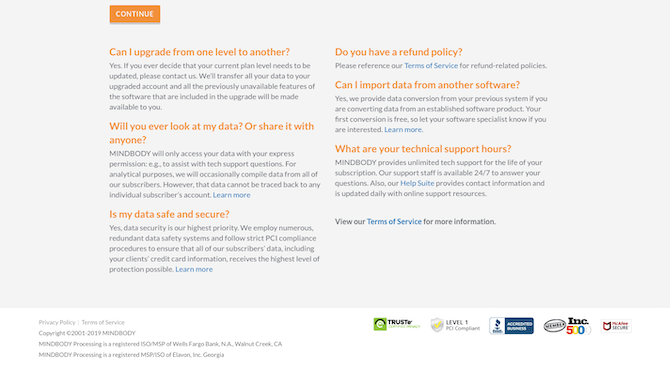
MINDBODY uses various trust marks to seal the deal: FAQs, a link to the Terms of Service, security seals from TRUSTe and McAfee, a Level 1 PCI compliance sticker, a BBB accreditation and an Inc. 500 member sticker.
This sales page only requires one scroll to see all of it. The top-half is the purchase form. The bottom half is all about reinforcing trust. It includes security trust marks like:
- Frequently Asked Questions
- Links to the Terms of Service and Privacy Policy pages
- TRUSTe privacy certification seal
- Level 1 PCI Compliant sticker
- BBB accreditation
- Inc. 500 Member sticker
- McAfee Security seal
Let’s face it: if a consumer has gotten this far, they’ve already convinced themselves that they need this software. It’s now up to you to make sure there are no remaining concerns about what happens once they submit their payment.
Is Your Sales Page Missing Key Trust Marks?
When you’re trying to sell a web or mobile app to a new user, it’s not enough to tell them why they should do so with value-driven copy. Consumers need your website to assure them that this is the right decision, which means providing them with hard proof that they’re in good hands.
To do this, make sure to outfit critical points in the website — and especially on the sales pages — with trust marks that put those fears at ease.