Ratings are a critical part of how we make our decisions online, and being able to incorporate a high quality rating system into your app is essential to get your own reviews. Read on to learn how you can do this easily for your Xamarin apps.
These days, most of our decisions regarding online products or services are made based on the rating obtained thanks to previous consumers. For example, if we want to watch a movie or buy a product, we will always look for the best rated.
And it’s because these interfaces have certain features that we are able to add a score to the service or product.
To keep our application top-notch, in this post we will be learning how to use the Telerik UI for Xamarin Rating Control! The explanation will be divided into the following topics:
Starting with the implementation
Playing with rating shape
Adding templates

But... What Exactly is the Rating Control ?
Rating is a Telerik control that allow us to add a rating. We can add it to any functionality we want in our Xamarin Forms application.
First of All, What Do I Need?
- Install Telerik in your Visual Studio
- Add Telerik NugetPackage (See the instructions here)
⚠ Important: Telerik has a free trial that allows us to explore all the great components they offer for us to use in our Apps.
Let’s Start!
Starting with the Implementation
The implementation is so simple, you just need to add the following points! Add the namespace
xmlns:rating="clr-namespace:Telerik.XamarinForms.Input;assembly=Telerik.XamarinForms.Input"
Add the control in the following simple way!
<rating:RadShapeRating x:Name="StartRating"/>
Take into account the following information!
- ⭐ - The default shape is the star
- 5 - The qualification is based on five
Playing with Rating Shape
Once implemented, the Rating Control also lets you play with the shape! Here are some options!
Circle
<rating:RadShapeRating ItemShape="{x:Static rating:Geometries.Circle}" x:Name="CircleRating”/>
Heart
<rating:RadShapeRating ItemShape="{x:Static rating:Geometries.Heart}" x:Name="HeartRating"/>
Diamond
<rating:RadShapeRating ItemShape="{x:Static rating:Geometries.Diamond}" x:Name="DiamondRating"/>
It’s important to note that the property that makes this change possible is ItemShape.
Adding Templates
Good news! You also can add a rating template! To use it, you just have to know the following structure.
Inside the <rating:RadTemplatedRating> tags, you must add the images that will be getting the control, both selected and unselected. Let’s start with the Unselected image:
<rating:RadTemplatedRating HeightRequest="55">
        <rating:RadTemplatedRating.ItemTemplate>
            <DataTemplate>
                <Image Source="Sad.png" />
            </DataTemplate>
        </rating:RadTemplatedRating.ItemTemplate>
Then, add the image that will be taken when the rating is Selected:
<rating:RadTemplatedRating.SelectedItemTemplate>
            <DataTemplate>
                <Image Source="Happy.png" />
            </DataTemplate>
        </rating:RadTemplatedRating.SelectedItemTemplate>
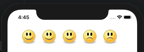
Finally, you can have a control with happy faces as qualifications and sad faces as unselected points. And the result will be just like this!

<rating:RadTemplatedRating HeightRequest="55">
        <rating:RadTemplatedRating.ItemTemplate>
            <DataTemplate>
                <Image Source="Sad.png" />
            </DataTemplate>
        </rating:RadTemplatedRating.ItemTemplate>
        <rating:RadTemplatedRating.SelectedItemTemplate>
            <DataTemplate>
                <Image Source="Happy.png" />
            </DataTemplate>
        </rating:RadTemplatedRating.SelectedItemTemplate>
    </rating:RadTemplatedRating>
Done! The Rating Control is implemented. Thanks for reading!!
References:

