The service pack for our third release this year (R3 2019) is now live! It comes packed with 60+ improvements and new features for SyntaxEditor, VirtualGrid, GridView, ChartView and other controls. Let me guide you through what is new in Telerik UI for WPF and Telerik UI for Silverlight.
SyntaxEditor: Folding Improvements
With the R3 2019 release we debuted the beta version of the great new SyntaxEditor control (in case you missed it – make sure to check out the release blog). With the initial release its folding functionality was pretty much limited to C# and JS code files - collapsible regions were created only for methods/classes that use curly brackets ('{', '}').
In this Service Pack we added separate classes which can be used for particular language files - CSharpFoldingTagger, VisualBasicFoldingTagger, BracketFoldingTagger (suitable for JavaScript). In addition, the FoldingTaggerBase class can be now extended for you own custom languages. Now C# and VB folding taggers prepare collapsible regions for methods, classes, namespaces, properties, usings/imports, blocks, summaries, multiline comments and regions. See below how cool the C# and VB files look now:
C#: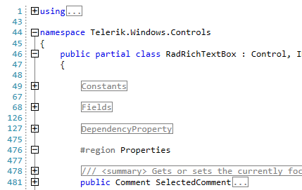
VB: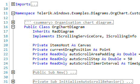
Custom folding region definitions can be added easily if you need additional auto-created folding regions in your app – for example:
this.foldingTagger.FoldingRegionDefinitions.Add(newFoldingRegionDefinition("#if", "#endif"));We have also added lots of virtual methods in all folding tagger classes. For example, you can override GetFoldingRegionTitle and GetFoldingRegionToolTipContent to customize the folding title or the tooltip content of the folding area.
Check out the full documentation of the control here and the Taggers section for more details about the new features. And if you have any feedback about the control please let me know in the comments section or in our Feedback portal.
GridView: Improvements
- Default Styles Can Now Be Combined with Custom Styles when Exporting - The arguments of the ElementExporting and ElementExportingToDocument events now have the default style for the exported element if the ExportDefaultStyles property of the export options is set to True. This means that you can now customize the default styles if you desire, by now any custom styles were overridden by the default styles. (link)
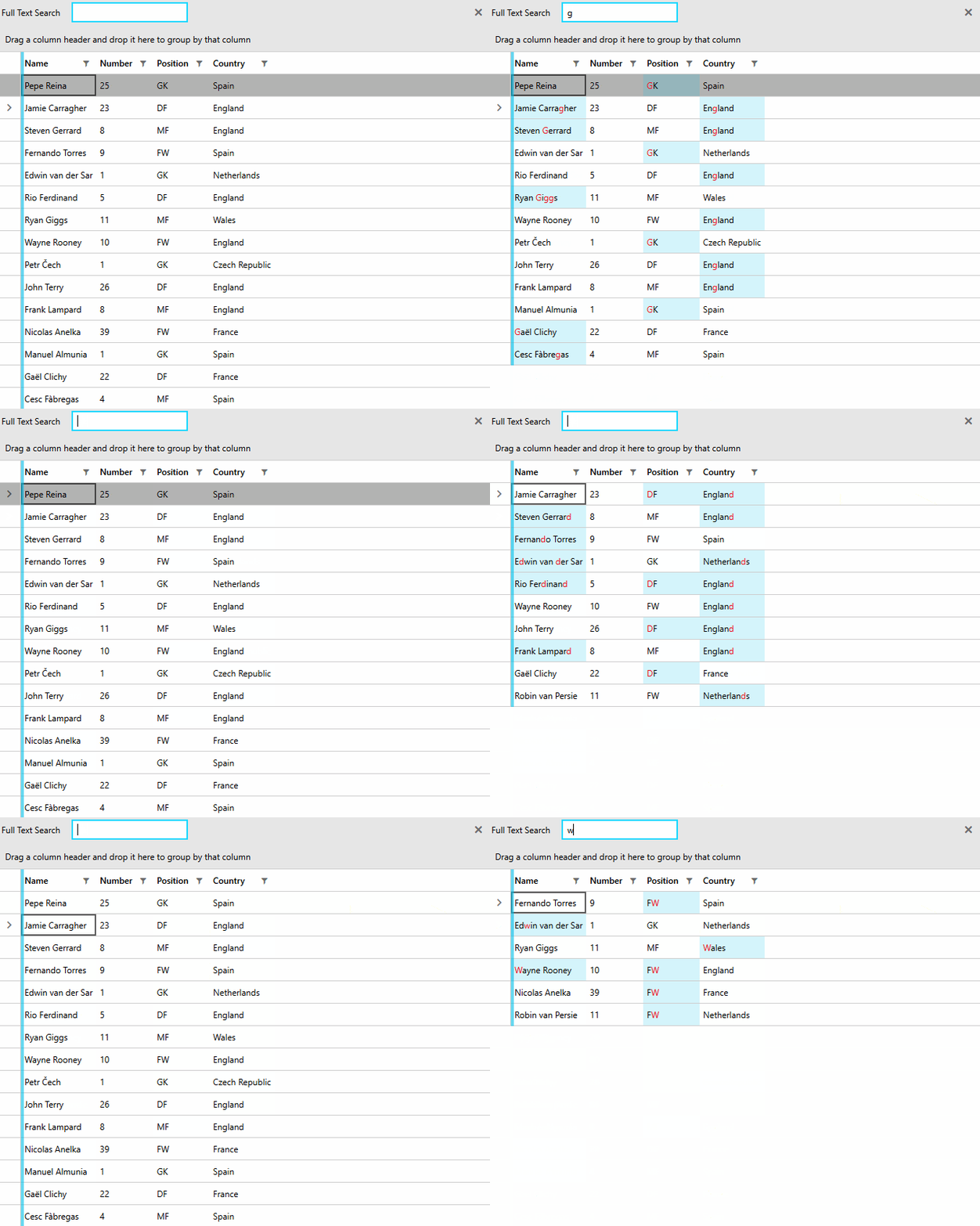
- Search in Enum Values - It is now possible to highlight the values of an Enum column through the control's search panel. (link)
- Keep the Filtering Popups Open - The new FilteringDropDownStaysOpen property controls whether the filtering dropdowns should stay open when a click outside of the popups occurs. When set to True, the popups will only close on a click on either the close button or the respective filtering funnel icon. (link)
VirtualGrid: Tooltip Support
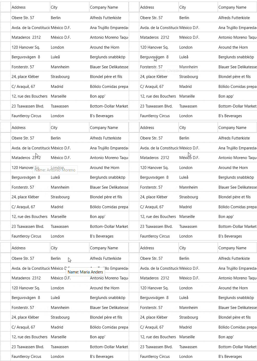
We added ToolTip support to the list of RadVirtualGrid's features. Now you can visualize information in a ToolTip while hovering over a cell. The ToolTip functionality is disabled by default. To enable it, you need to set the ShowCellToolTip boolean property of the RadVirtualGrid.
Check our help documentation for more info.
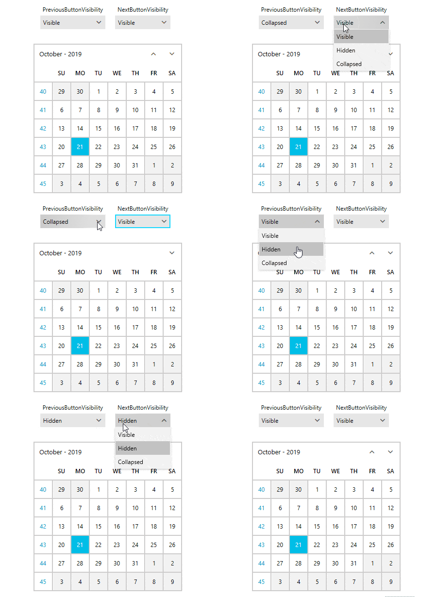
Calendar: Options to Hide Previous and Next Buttons
We added an ability to control navigation arrow visibility through the PreviousButtonVisibility and NextButtonVisibility properties. They are Visible by default. In order to hide them, just set the corresponding property either to Hidden, or Collapsed. You can see it in action in the following GIF:
ChartView: New Way to Stack the Values
If it happens that you are displaying negative and positive values in the same category within the Area series for example, you might have noticed that those values are stacked separately. With this release it is now possible to stack them together (as seen in the charts in MS Excel for example). You simply need to set the RadChartView ChartViewExtensions.StackNegativeValuesSeparately attached property to False. See the difference below: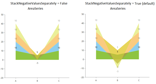
For more details check out this help article from our online help documentation.
RibbonView: Disable the Keyboard Navigation for Specific Controls
We added option to stop the RibbonView keyboard navigation for particular controls and let their own keyboard navigation work. This can be achieved by setting the attached telerik:KeyTipService.IsKeyboardNavigationEnabled property to the control. See the following code snippet:
<telerik:RadRibbonViewtelerik:KeyTipService.IsKeyTipsEnabled="True"> <telerik:RadRibbonTabHeader="Home"telerik:KeyTipService.AccessText="H"> <telerik:RadRibbonGroupHeader="My Group"> <telerik:RadRibbonComboBoxtelerik:KeyTipService.AccessText="T"telerik:KeyTipService.IsKeyboardNavigationEnabled="False"> <telerik:RadRibbonComboBoxItemContent="Test 1"/> <telerik:RadRibbonComboBoxItemContent="Test 2"/> <telerik:RadRibbonComboBoxItemContent="Test 3"/> <telerik:RadRibbonComboBoxItemContent="Test 4"/> </telerik:RadRibbonComboBox> </telerik:RadRibbonGroup> </telerik:RadRibbonTab> </telerik:RadRibbonView>For more info check out this section of the Keyboard Support article of RadRibbonView.
Check Out the Detailed Release Notes
We have a lot more! To get an overview of all the latest features and improvements we’ve made, check out the release notes for the products below:
Share Your Feedback
Feel free to drop us a comment below sharing your thoughts. Or visit our Feedback portals about Telerik UI for WPF, Silverlight and Document Processing Libraries and let us know if you have any suggestions or if you need any particular features/controls.
And if you haven’t already had a chance to try our UI toolkits, simply download a trial from the links below:
UI for WPFUI for Silverlight
In case you missed it, here are some of the updates from our last release.