In this tutorial, we’ll see how we can utilize Kendo UI components when building an event scheduler.
Kendo UI is a library used for building applications at a faster pace. Kendo UI provides UI components for libraries like jQuery, Angular, React and Vue, and it comes packed with over 20 components for creating charts, data tables and drag-and-drop pages.
Kendo UI is customizable; it also provides a set of themes for Material UI, Bootstrap, etc.; and it comes packed with an icon set and a color palette. Kendo UI components are distributed as multiple npm packages, so there’s no fear of bloating your application with unnecessary components and increasing your build bundle.
Angular is a JavaScript framework for creating a web application. It offers the best practices and tools to ease the development of applications. Angular uses declarative templates, dependency injection and Observables to power applications that can be run on several platforms.
We’ll be using some of the components provided by Kendo UI to build a simple task scheduling application. The application will let users create tasks by specifying start and end dates alongside appropriate descriptions. The event will be displayed on a scheduler (calendar) component.
To get started with the tutorial, you’ll require a basic understanding of Angular. Also, ensure you have Node installed on your personal computer. If you have no prior knowledge of Angular, kindly follow the official tutorial here and download Node for your PC here if you haven’t already.
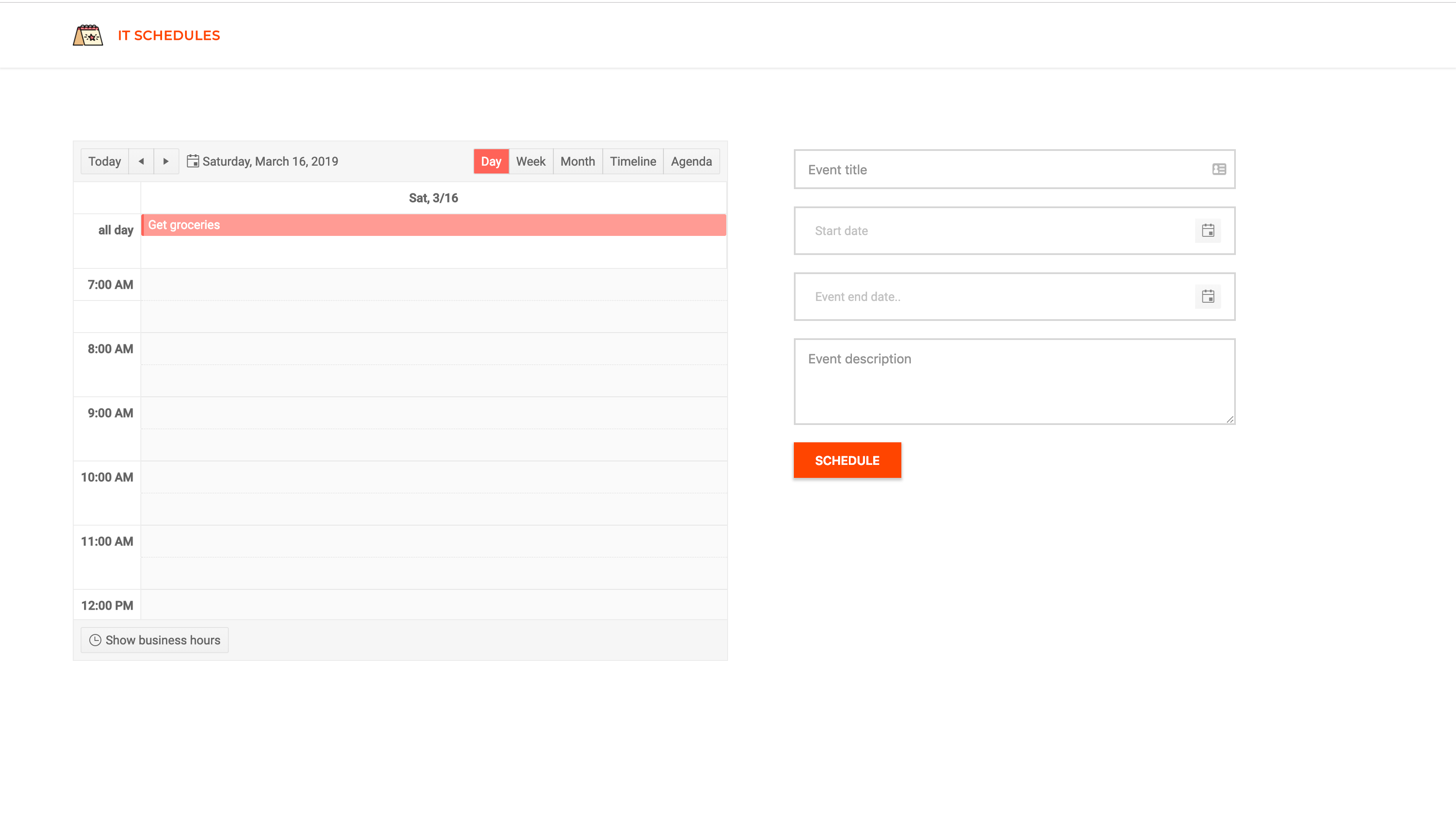
Here’s a screenshot of what we’ll be building:

Initializing the Application and Installing Dependencies
To get started, we will use the CLI (command line interface) provided by the Angular team to initialize our project.
First, install the CLI by running npm install -g @angular/cli. npm is a package manager used for installing packages. It will be available on your PC if you have Node installed; if not, download Node here.
To create a new Angular project using the CLI, open a terminal and run:
ng new kendo-scheduler --style=scss
This command is used to initialize a new Angular project; the project will be using SCSS as the pre-processor.
Next, run the following command in the root folder of the project to install dependencies:
ng add @progress/kendo-angular-scheduler
ng add @progress/kendo-angular-dateinputs
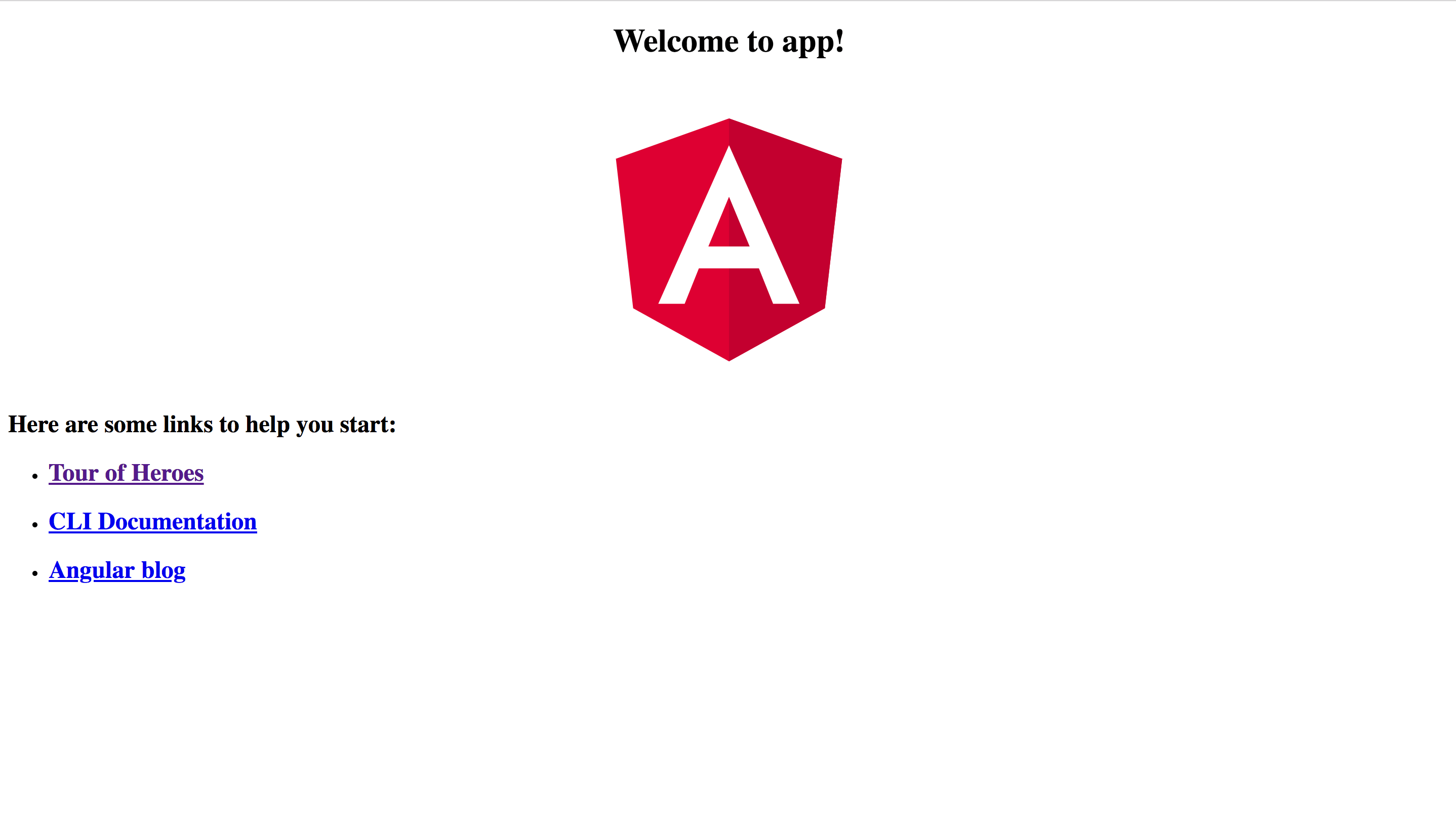
Open a terminal inside the project folder and start the application by running ng serve. If you open your browser and visit the link http://localhost:4200 you should see the screenshot below if everything went well.

Calendar Component
We’ll be creating a component to hold the event scheduler. This component will render Kendo UI’s event scheduler component. The component will display the events entered by the user. To generate the component, run the following command:
ng generate component scheduler
Open the newly created scheduler.component.html file and update the contents with the snippet below:
<div><kendo-scheduler[kendoSchedulerBinding]="events"[selectedDate]="selectedDate"
        style="height:600px;"><kendo-scheduler-day-view[startTime]="startTime"></kendo-scheduler-day-view><kendo-scheduler-week-view[startTime]="startTime"></kendo-scheduler-week-view><kendo-scheduler-month-view></kendo-scheduler-month-view><kendo-scheduler-timeline-view></kendo-scheduler-timeline-view><kendo-scheduler-agenda-view></kendo-scheduler-agenda-view></kendo-scheduler></div>
In the snippet above, we’re rendering the scheduler component provided by Kendo UI. This component will receive an array of events as an input. Also, it will take some control components like the day-view, week-view, etc. components. These components act as controls for the scheduler and can be used to update the current display of the scheduler.
Next, we’ll update the scheduler component file to declare the variables we used in the template file:
import{ Component, OnInit, Input }from'@angular/core';exportinterfaceEvent{
      Title: String;
      Description: String;
      Start: Date;
      End: Date;}

    @Component({
      selector:'app-scheduler',
      templateUrl:'./scheduler.component.html',
      styleUrls:['./scheduler.component.scss']})exportclassSchedulerComponentimplementsOnInit{constructor(){}
      @Input() events: Event[];
      startTime ='7:00';
      selectedDate =newDate();ngOnInit(){}}
The component will receive events from a parent component using Input bindings. Also, we’ll set the current date on the scheduler using the selectedDate variable, the same goes for the startTime.
Next, we’ll render the component within the app.component.html file. Open the file and update it to be similar to the snippet below:
<!-- app.component.html --><header><!-- header comes here --></header><main><divclass="scheduler"><app-scheduler[events]="events"></app-scheduler></div><divclass="event-form"><!-- Event form component comes here --></div></main>In the snippet, we’re passing an array of events to the scheduler component. The events will be managed by the app component.
Next, we’ll throw in some styles for the component. Copy the snippet below into the app.component.scss file:
main{display: flex;width:90%;margin:5% auto;.scheduler{flex:11;}.event-form{flex:11;}}Next, we’ll update the component file to declare the variables we used in the template file:
// app.component.tsimport{ Component }from'@angular/core';
    @Component({
      selector:'app-root',
      templateUrl:'./app.component.html',
      styleUrls:['./app.component.scss'],})exportclassAppComponent{
      events: Event[]=[];onNewEvent(event: Event){this.events =this.events.concat(event);}}
First, we declare the events variable which is an array, the events array will be populated by the onNewEvent method. This method will be called whenever a new event is created.
Next, we’ll include the external assets the application will be using. We’ll be using the Montserrat and Roboto fonts. Also, we’ll update style.scss file to include the Kendo UI component stylesheets and application-wide styles.
Open the index.html file and include the link to the external fonts:
<!doctype html><htmllang="en"><head><metacharset="utf-8"><title>EventScheduler</title><basehref="/"><metaname="viewport"content="width=device-width, initial-scale=1"><linkrel="icon"type="image/x-icon"href="favicon.ico"><linkhref="https://fonts.googleapis.com/css?family=Roboto:400,500|Montserrat:400,500"rel="stylesheet"></head><body><app-root></app-root></body></html>Then open the style.scss file, we’ll be overriding the default style of some Kendo UI components and the default CSS properties of the body and html elements:
// styles.scss/* You can add global styles to this file, and also import other style files */.k-autocomplete,
    .k-dateinput-wrap,
    .k-dropdown-wrap,
    .k-picker-wrap,
    .k-multiselect-wrap,
    .k-numeric-wrap {border: none !important;}body {padding:0;margin:0;font-family:'Roboto', sans-serif;}
Header Component
The header component will display the application logo and very little information. This component is mostly a display component.
Run the following command to create the header component:
ng generate component header
Next, open the src/app/header/header.component.html file and update it to look like the code below:
<!-- src/app/header/header.component.html --><header><divclass="brand"><imgsrc="/assets/images/logo-2.png"><h5>It Schedules</h5></div></header>Note: Image asset used can be found here in the GitHub repository. The logo asset is from https://flaticon.com.
Next, we’ll style the header. Open the header.component.scss file and update it with the snippet below:
header {display: flex;align-items: center;font-family:'Montserrat', sans-serif;margin:0;padding:20px 5%;color: whitesmoke;box-shadow:01px 2px 0rgba(0, 0, 0, 0.1);.brand {flex:1;display: flex;align-items: center;img {height:35px;margin-right:17px;}h5 {font-size:15px;margin:0;text-transform: uppercase;letter-spacing:0.5px;font-weight:600;color: orangered;}}}Just a couple of styles to beautify the header.
Then we’ll update the app.component.html file to render the header component:
<header><app-header></app-header></header><main>
      ...
    </main>
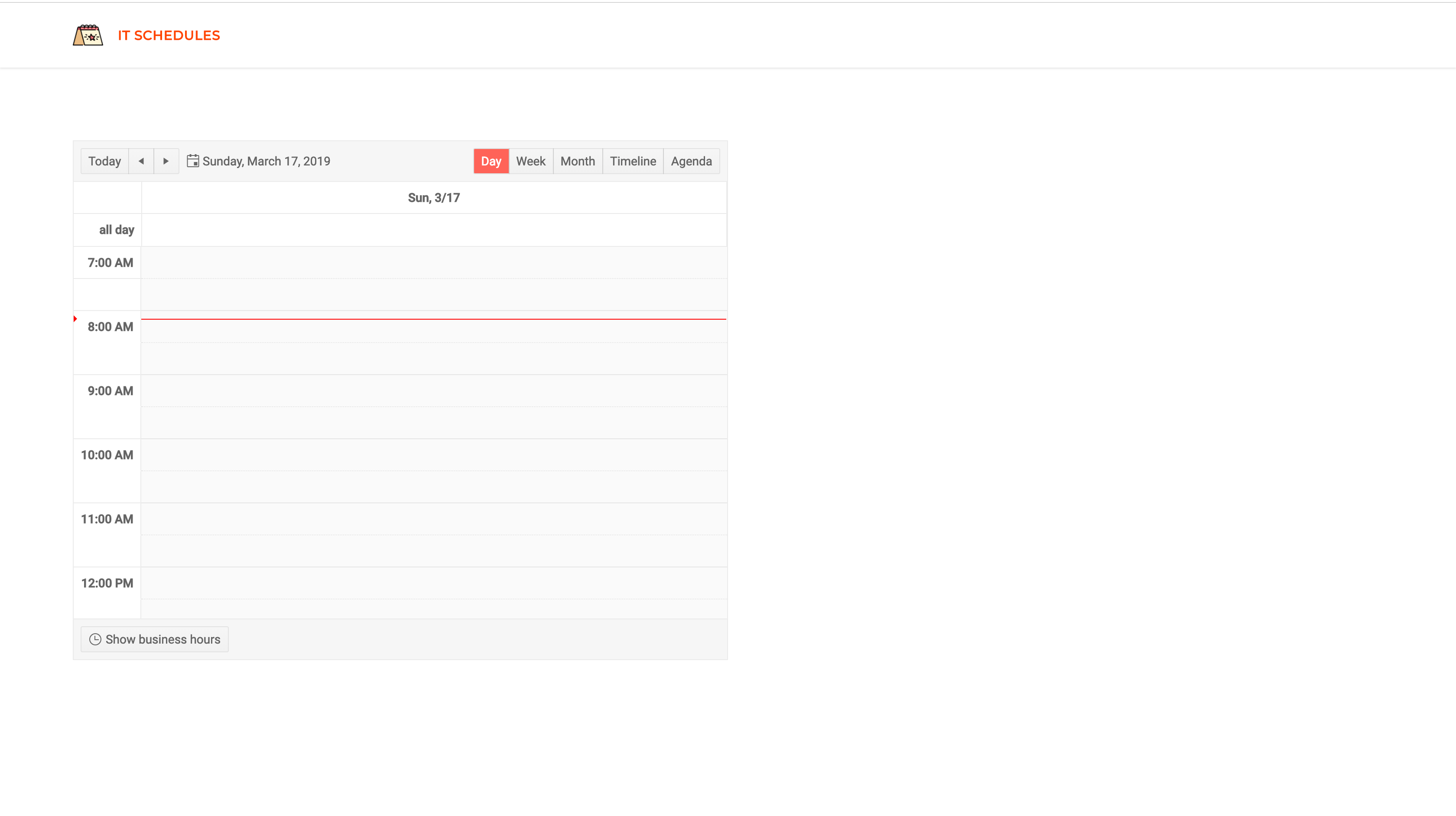
If you visit http://localhost:4200, you should see the latest view of the application. The header and the scheduler are visible. Next, we’ll create the event form component that will be used for creating new events. Ensure the Angular dev server is running before testing.

Event Form Component
Now that we’ve successfully set up the scheduler component, let’s create an EventForm component that will be used for scheduling new events. The component will render a form and some input fields for inputting information relevant to the event.
Run the command below to generate the component:
ng generate component event-form
Open the event-form.component.html file and copy the content below into it:
<form(submit)="handleSubmit()"[formGroup]="eventForm"><divclass="input-holder"><inputtype="text"placeholder="Event title"formControlName="title"/></div><divclass="input-holder"><kendo-datepickerformControlName="start"placeholder="Start date"></kendo-datepicker></div><divclass="input-holder"><kendo-datepickerformControlName="end"placeholder="Event end date.."></kendo-datepicker></div><divclass="input-holder"><textareaplaceholder="Event description"rows="4"formControlName="description"></textarea></div><divclass="input-holder"><buttontype="submit">Schedule</button></div></form>For the form, we’ll be using the Reactive
Forms approach to managing the input elements. Since we’ll be selecting dates, we’ll make use of the DatePicker component by Kendo UI. The component is easy to use and all we have to do is pass the formControlName directive to the component and we can receive the values from the component.
Let’s style the component a bit. Open the event-form.component.scss file and update the file with the styles below:
// src/app/event-form/event-form.component.scssform {display: flex;flex-direction: column;margin-left:10%;font-family:"Roboto" sans-serif;}.input-holder {margin:10px 0;display: flex;justify-content: flex-start;}.input-holder > button {justify-self: center;padding:12px 25px;border-radius:0;text-transform: uppercase;font-weight:600;background: orangered;color: white;border: none;font-size:14px;letter-spacing: -0.1px;cursor: pointer;}input,
    textarea,
    kendo-datepicker {padding:12px 15px;border:2px solid rgba(0, 0, 0, 0.2);border-radius:0;width:70%;opacity:0.8;font-size:15px;font-weight: normal;}kendo-datepicker{width:75%;}input:focus,
    textarea:focus,
    button:focus,
    kendo-datepicker:focus {border:2px solid orangered;outline: none;box-shadow:02px 3px 1px rgba(0, 0, 0, 0.2);}
Finally, we’ll update the component to create the variables and event handlers used in the template file. Update the event-form.component.ts file to be similar to the snippet below:
// src/app/event-form/event-form.component.tsimport{ Component, OnInit, EventEmitter, Output }from'@angular/core';import{ FormControl, FormGroup }from'@angular/forms';

    @Component({
      selector:'app-event-form',
      templateUrl:'./event-form.component.html',
      styleUrls:['./event-form.component.scss'],})exportclassEventFormComponentimplementsOnInit{constructor(){}

      eventForm: FormGroup =newFormGroup({
        title:newFormControl(''),
        description:newFormControl(''),
        start:newFormControl(),
        end:newFormControl(),});

      @Output()
      newEvent: EventEmitter<Event>=newEventEmitter();handleSubmit(){const event =this.eventForm.value;this.newEvent.emit({...event,});this.eventForm.reset();}ngOnInit(){}}```

In the snippet above, we created a form group object called `eventForm`. This will manage the multiple form controls being used. Next, we’ll create an [EventEmitter](https://angular.io/api/core/EventEmitter) property (`newEvent`), and this variable will be used to notify the parent component of new events.

The `handleSubmit` method is an event handler called when the form is submitted. After submission, the method will get the value of the `eventForm` and emit it to the parent component using the `newEvent` property.

The `[FormGroup](https://angular.io/api/forms/FormGroup)` and `[FormControl](https://angular.io/api/forms/FormControl)` classes depend on the [ReactiveFormsModule](https://angular.io/api/forms/ReactiveFormsModule) to function, so we’ll update the `app.module.ts` file to include this module. Open the file and update the `imports` array with the [ReactiveFormsModule](https://angular.io/api/forms/ReactiveFormsModule):

```typescript
    //src/app/app.module.tsimport{ BrowserModule }from'@angular/platform-browser';// ... other importsimport{ ReactiveFormsModule }from'@angular/forms';

    @NgModule({
      declarations:[// ...],
      imports:[// ...
        ReactiveFormsModule,],
      providers:[],
      bootstrap:[AppComponent],})exportclassAppModule{}```

Next, we’ll update the `app.component.html` file to render the event form.

```html
    <header><app-header></app-header></header><main><div class="scheduler"><app-scheduler [events]="events"></app-scheduler></div><div class="event-form"><app-event-form(newEvent)="onNewEvent($event)"></app-event-form></div></main>
After this update, you can navigate to http://localhost:4200 to view the current state of the application:

Note: Ensure the Angular dev server is running before visiting the link above. Run
ng serveornpm startif you haven’t already.
Conclusion
In this tutorial, we’ve seen how easy it is to get started using Kendo UI components for Angular. A scheduler can be easily created using the component from Kendo UI. The components were easy to use and configure. Kendo UI also has a range of components to select from when building applications using Angular, React, Vue and jQuery. You can find the source code for this demo application here. Happy coding.