It’s so hard these days to get your app to stand out from the sea of other apps scrambling to do the same thing. They make the same promises, tout the same features, and might even design their website to look similar to your own.
Having tested many SaaS and mobile apps over the years, I can tell you that there’s one thing many designers get wrong when it comes to the website:
The quantity of calls to action.
The CTA is a critical component of anything you build, be it the app itself or the website that sells it. And while a lot of focus tends to be placed on the quality of CTA design (e.g. colors that convert, sizing for visibility, placement for clickability), what about quantity?
If you want people to download or buy your app, you have to remove all barriers to entry. And one of the first barriers you should look at is the call-to-action.
The Problem with Too Many Calls to Action
The primary goal of your website is to get users to convert into app users. That doesn’t mean you can’t have secondary goals, like subscribing people to the newsletter, educating them about your product, and so on.
But if you can convince them to take action and convert right away, why bother presenting them with other CTAs that only slow down or confuse the process?
That said, I get that it’s not always easy to design your website with a single call-to-action button as Spotify has done: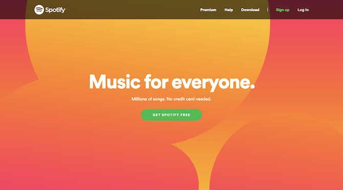
Spotify only has one panel and one call-to-action button “Get Spotify Free” on its website.
You have to be in a very comfortable spot in your market to put out a website like this and know that users are going to click on “Get Spotify Free” without needing anything else from you. However, that doesn’t excuse making poor choices about how you present other CTAs on the home page.
Let’s look at some of the common CTA offenses and what you can do to fix them:
A CTA Free-for-All
As I mentioned before, it can be tough entering an app on the market that’s already overcrowded or dominated by a clear frontrunner. Which is why you might be tempted to throw everything you have at visitors to try and convince them to convert.
Let me show you an example.
This is the top of the home page for Bitly:.png?sfvrsn=671c6f06_0)
The top of the Bitly home page has three similar-looking call-to-action buttons: “Get a Quote”, “Get Started for Free”, and “Shorten”.
While there are too many CTAs competing for attention above the fold, the rest of the home page does a good job of tightening up the focus.
This is what visitors see if they scroll one time:.png?sfvrsn=ccc92ae2_0)
A scroll down the Bitly page reveals some information about the product along with a “Get Started” button.
The third and final scroll reveals this:.png?sfvrsn=7a332b_0)
The third and final scroll on the Bitly page again shows a “Get Started for Free” CTA button.
So, although there’s a bit of conflict at the top of the page, the rest of it seems to be telling visitors: “Go ahead and try us out for free.”
Overall, it’s not a terrible way to handle the home page, though it could stand some tightening up above the fold. That said, it appears that competitor Rebrandly decided to copy their website after Bitly’s… sort of.
This is the top of the Rebrandly home page: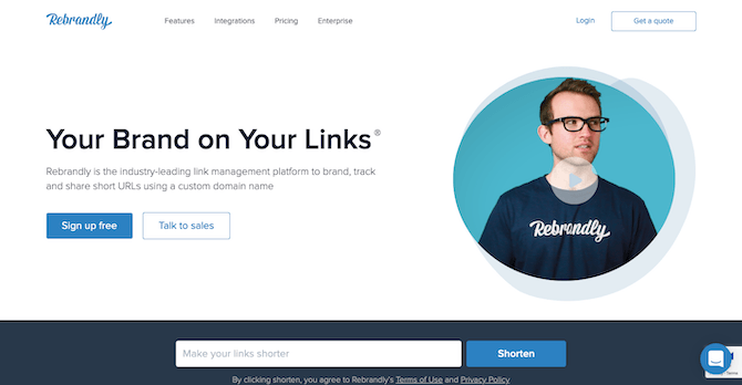
Rebrandly includes four competing calls-to-action on its home page: “Get a quote”, “Sign up free”, “Talk to sales”, and “Shorten”.
If you disregard the style of designs used (illustrative versus video), this home page is eerily similar. The only problem is, it went a little overboard with its calls to action. There are now two blue CTAs for “Sign up free” and “Shorten” and two white CTAs for “Get a quote” and “Talk to sales”.
You could argue that the blue CTAs are the ones calling primarily for attention. However, let’s look at how the rest of the page handles it.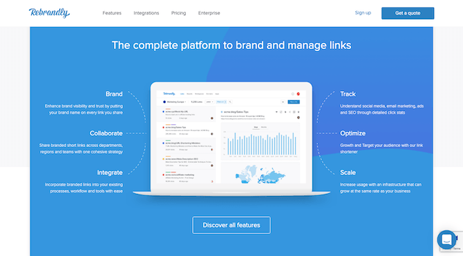
Rebrandly invites visitors to “Discover all features” just below the fold of the home page.
The first section visitors see below-the-fold is a highlight of the features. This is in the same spot as the benefits section on Bitly’s website. But notice how the calls to action differ. With Bitly, the primary call was to “Get Started”, whereas here they’re being asked to learn more about the features.
The remainder of the home page continues to add new distractions in the path of visitors: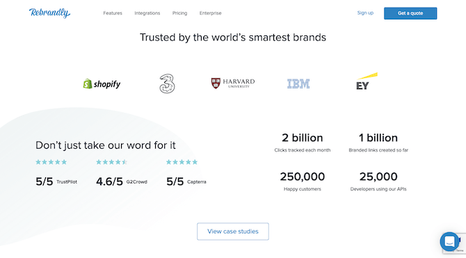
Rebrandly shows off client logos, online reviews, and user stats on its home page with a CTA to “View case studies”.
Rather than just leave it as, “Look at how happy our clients — many of whom you know — are with us!”, this section asks visitors to view their case studies.
On and on this goes, until the very bottom of the page where visitors are once again introduced to the primary call to action:.png?sfvrsn=5d3a8215_0)
Rebrandly gets creative with its primary CTA, this time labeling it “Start Rebranding Now” and pointing to a different link.
There are a couple problems with this. For one, “Start Rebranding Now” has never been used before. That’s because the top of the page was all about giving visitors a way to try the tool for free. This actually drives them to the Pricing page to buy the app.
So what visitors end up with is four different options in terms of how to get started:
- Request a quote.
- Talk to a sales rep.
- Try the tool for free.
- Buy it.
It’s okay to provide other options, like on a quote request form or on the contact page. What’s not okay is to throw so many choices at visitors within seconds of landing on the site and expect them to decide how to get in touch or take first steps.
To fix this CTA overload, Brandly would need to decide where they want to funnel traffic through and commit to it on the home page.
Inconsistency in Presentation
It’s not only risky to use too many CTAs because of the confusion it causes, it’s also risky because it gives you more opportunities to add inconsistency to the design.
Visitors might not realize they’re doing it, but they’re looking for consistently designed components to quickly steer them in the direction they want to go in. So, when your buttons are calling them to do different things, but designed the same way, this can be a big problem.
Let’s look at an example that works from monday.com:.png?sfvrsn=e0d3a313_0)
monday.com uses the same “Get Started” CTA in red throughout its home page.
The “Get Started” button you see above is the same one — size, color, and wording — that appears as visitors make their way down the home page. The only other time they encounter a clickable element, it’s in the form of a hyperlink. In this example, the link is “See all features”:.png?sfvrsn=eb32ef04_0)
monday.com also includes clickable links that invite visitors to learn more about their product, but the primary goal is always to “Get Started”.
This design choice makes it much easier for visitors to stay focused on their primary goal and not get distracted by other CTAs. The links are there, but they’re not as prominent.
Now, there are two ways that inconsistency can rear its head and cause havoc with CTAs. The first is if you design all buttons to be the same color. The second is if you change the color of an already established button. MoEngage makes both of these mistakes: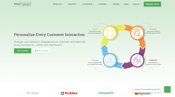
MoEngage uses its brand green to color all of its CTA buttons, including “Request Demo” and “Get Started”.
MoEngage’s brand green is what they use to color each CTA button, which includes the “Request Demo” and “Get Started” buttons seen here and 12 “Learn More” buttons down below..png?sfvrsn=545178d9_0)
MoEngage includes 12 different “Learn More” buttons on its home page to educate visitors on its product and features.
The only time the color changes is when the primary “Get Started” CTA reappears and is turned into a ghost button (white with color text):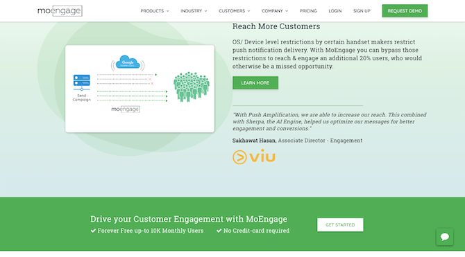
MoEngage displays its primary CTA a second time on the home page. This time, “Get Started” is unrecognizable in white.
There are a couple reasons why it’s a problem to design CTAs this way:
First, visitors don’t get a break. These kinds of visual cues let them know when they can stop and take action. But when all of the visual cues are begging them to stop, you’re just adding more time and frustration to the process.
Secondly, the reintroduction of the primary CTA is expected once a visitor scrolls past the fold. But when the reality of its reintroduction deviates from that expectation (it’s now a white button with green text, for instance), there’s a chance they could miss it.
Redundant Requests
There’s typically a rhythm to a home page, regardless of how long or short it is. The hero banner calls visitors to take the primary action (usually sign up, demo, or try for free). Then, there’s some talk about benefits or features, with maybe some social proof thrown in. Finally, the primary call to action is introduced once more.
While those sections between the primary CTAs might be useful in selling visitors on your app, that doesn’t mean you need to distract them from conversion by continually asking them to learn more.
Let’s use the Toggl home page, for example:.png?sfvrsn=c18dfe25_0)
The Toggl design above-the-fold looks great, complete with a red “Signup” button.
This is a beautifully designed hero banner. Scroll down, though, and you’ll find section after section where visitors are repeatedly asked to explore “All Features”..png?sfvrsn=658de244_0)
Toggl’s home page repeatedly uses the “All Features” CTA to invite users to learn more about the product.
It’s okay to split your benefits or features this way on the home page. That’s not what the issue is. The issue is that there are too many buttons asking visitors to stop, consider whether they want to click, and then move on. And even if they decide they don’t want to explore “All Features”, the next three sections ask if they’re sure they don’t want to learn more.
Let’s turn our attention to Yummly now:.png?sfvrsn=801e7f8a_0)
Yummly consolidates all of its app’s features into a single panel on the home page. There is no CTA present in this section.
This is the part of the home page that shows off Yummly’s features. It’s simply done and all of the information is neatly consolidated. Notice how there’s no CTA either. This allows the website to educate visitors about the product without sending them down a rabbit hole.
Again, the more CTAs you add to the page, the longer it’s going to take visitors to convert. So, in addition to looking for extraneous CTAs to remove, you might want to consider tightening up the design too.
Wrap-Up
Whether your CTAs are distracting, confusing, or just eating up too much of their time, visitors aren’t going to be happy that something as simple as a button made it so hard for them to get a solution they need.
There are so many things that could stand in the way of visitors deciding to become your app users. So, why give them another reason with too many CTAs?