Get the details on the latest release of Telerik UI for Blazor including the Blazor Grid Hierarchy and DataTimePicker controls, compatibility with ASP.NET Core 3.0 RC and other important changes.
As Blazor technology is rapidly evolving, so is our suite of Telerik UI for Blazor controls. It's been just a few months since the first release, but we are already happy to provide you the top 22 (and counting!) native Blazor components. In this blog post, we want to share with you what’s included in the new 2.0.0 release – just a week before the official release of Blazor by Microsoft. Read on to find out more about Blazor Grid Hierarchy, DataTimePicker, compatibility with ASP.NET Core 3.0 RC and some important changes.
Blazing Fast Compatibility with ASP.NET Core 3.0 Release Candidate!
The official Release Candidate of ASP.NET Core 3.0 is here and Telerik UI for Blazor is not only getting bigger, but also stronger. We are now fully compatible with all RC updates published by Microsoft.
Breaking Changes
We aimed to simplify your work and increase the usability of the components so with the 2.0.0 release we are introducing the following amendments:
- Namespace change– all components are now moved into a single namespace - Telerik.Blazor.Components, and all common classes, such as enums, in the Telerik.Blazor namespace. To make you coding easier, you longer need to declare a separate namespace for each Component used in your page - just include @using Telerik.Blazor and @using Telerik.Blazor.Components in the ~/_
Imports.razorfile. - Change of inner tag names - the root-level components keep their names following the convention
<TelerikComponentName>,and, for brevity, theTelerikprefix is removed from all child tags. - Collections and state manipulation - some methods that manipulated collections or state are now gone. The way to alter collections is to use conditional markup and loop over collections from a view model. To alter state, use parameter binding.
For further details and demo code examples, refer to the article Breaking Changes in Telerik UI for Blazor 2.0.0.
New Blazor Grid Hierarchy
As the Blazor Grid component has been the first or most requested item by our customers and adopters, we are placing effort to regularly take into consideration your feedback and roll it into our in the component.
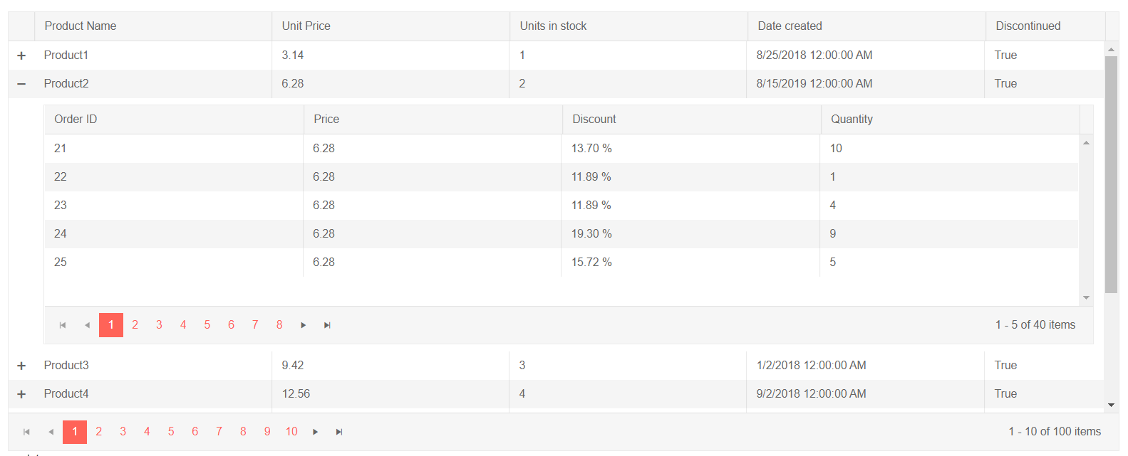
With the 2.0.0 release data no longer has to be flat, as we are introducing Blazor Grid Hierarchy– now you can organize your records into a parent-child relationship structure and make use of the master - detail templates.
@page "/grid/hierarchy"<h4>Hierarchy</h4><TelerikGrid Data="@GridData" Height="550px" Pageable="true" PageSize="10" Sortable="true" > <GridColumns> <GridColumn Field=@nameof(Product.ProductName) Title="Product Name"/> <GridColumn Field=@nameof(Product.UnitPrice) Title="Unit Price"/> <GridColumn Field=@nameof(Product.UnitsInStock) Title="Units in stock"/> <GridColumn Field=@nameof(Product.CreatedAt) Title="Date created"/> <GridColumn Field=@nameof(Product.Discontinued) Title="Discontinued"Width="150px"/> </GridColumns> <DetailTemplate> @{ var product = context asProduct; <TelerikGrid Data="@product.OrderDetails" Height="300px" Pageable="true" Sortable="true" PageSize="5"> <GridColumns> <GridColumn Field=@nameof(OrderDetails.OrderId) Title="Order ID"/> <GridColumn Field=@nameof(OrderDetails.UnitPrice) Title="Price"/> <GridColumn Field=@nameof(OrderDetails.Discount) Title="Discount"> <Template Context="order"> @(String.Format("{0:P2}", (order asOrderDetails).Discount)) </Template> </GridColumn> <GridColumn Field=@nameof(OrderDetails.Quantity) Title="Quantity"/> </GridColumns> </TelerikGrid> } </DetailTemplate></TelerikGrid>In the <DetailTemplate>, you can access the model for the row through the context, apply custom formatting of data or use other components to visualize related detailed data. The example below uses in its <DetailTemplate> another <TelerikGrid Data="@product.OrderDetails"> component for showing detailed data related to each main record in the master grid <TelerikGrid Data="@GridData">.
Telerik UI for Blazor Grid Hierarchy
When you define a detail template, users can expand and collapse the detailed data via a button that is rendered at the beginning of each row.
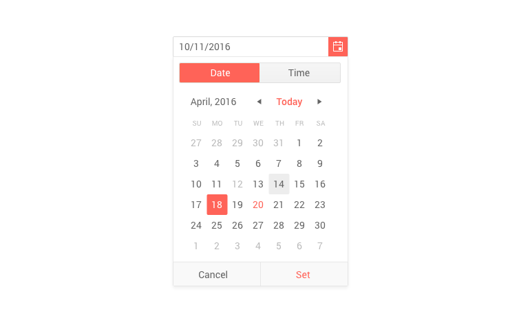
New Blazor Component: DateTimePicker
A couple of weeks ago we introduced with the 1.6.0 release the Blazor TimePicker component, and with the current 2.0.0 release we are adding DateTimePicker.
To use the Telerik DataTimePicker simply add the <TelerikDateTimePicker> tag and bind it to data:
<TelerikDateTimePicker@bind-Value="@DateTime.Now"></TelerikDateTimePicker>
As with the rest of our date and time controls, the Telerik DateTimePicker for Blazor has multiple other configuration properties so that you can adapt the usage of the component such as: formatting of values, Min, Max, Value and Width.
If you need to perform validation you can make use of the seamless support and integration with Blazor's Forms and Validation valid for all our input control. More on Telerik UI for Blazor components validation can be found in the article here.
Blazor Keynote at BASTA Conference
We are excited to invite you to an exciting keynote speech by our Manager of Software Engineering Pavlina Hadzhieva Goodbye, Client-side JavaScript – Hello, Blazor at BASTA conference.
Come meet us at the Progress Telerik Booth to chat about the future of Blazor and take part in our “Code for Charity” game.
Download Telerik UI for Blazor 2.0.0
We encourage you to visit the Telerik UI for Blazor overview page and download the Telerik suite of 25+ native Blazor components! We are continuously working on expanding the Blazor demos and enriching the documentation, so that you have a smooth experience.
Share Your Feedback!
We encourage all our early adopters and fans to continue providing valuable feedback! If there are features you are missing, or components you need, please head over to the official Telerik UI for Blazor feedback portal and submit your ideas and have a direct impact on our roadmap!
Happy Blazor coding!
