Have you ever had to display a map representing geographical data inside your mobile application? Or to provide seat selection options to your users for an event or airplane boarding? If so, the latest addition to the Telerik UI for Xamarin suite - the Map component - will come in handy.
In short, RadMap for Telerik UI for Xamarin is a data visualization control used to render shapes consisting of points, lines and polygons (areas). The shapes are read from ESRI shape files. The shape file format is now a common format for storing geometric location along with associated attribute data of spatial features. If you’d like to learn more about the shape file format, you can go through its specification here.
In this post I am going to briefly introduce you to the Map control and its main features, such as support for multiple layers, selection, pan and zoom as well as conditional styling.
Set up the Xamarin Map Control
As I mentioned in the introduction, RadMap works with shape files. Shape files usually represent maps, but they can be used in other scenarios as well. For example, they can store information for various types of schemes – like theater seats, airplane seats distribution or floor plans, just to name a few.
You can download ready-to-use shape files or create your own (if you’d like to visualize a specific scheme) with any of the GIS software available on the market.
A good collection of free and ready-to-use shape files presenting the world map can be found on the Natural Earth website.
In the example we're going to create in this post we will use the Countries shape file from the resource referred to above. Keep in mind that although its name indicates a singular file, a shape file is actually a collection of at least three basic files: .shp, .shx and .dbf. For our purposes we would need only the .shp and the .dbf files.
So, let’s stop talking and start coding.
First, we will need to include the .shp and .dbf files to our Xamarin.Forms project and set their Build Action to “Embedded resource.” Setting the build action is an important step as otherwise the files can't be read.
Then, the Countries shape file should be assigned to the Map through a ShapefileLayer instance. Check below the Map XAML definition with the ShapefileLayer added:
<telerikMap:RadMapx:Name="map"> <telerikMap:RadMap.Layers> <telerikMap:ShapefileLayer> <telerikMap:ShapefileLayer.Reader> <telerikMap:MapShapeReaderx:Name="countriesReader"/> </telerikMap:ShapefileLayer.Reader> </telerikMap:ShapefileLayer> </telerikMap:RadMap.Layers></telerikMap:RadMap>You would also need to add the telerikMap namespace:
xmlns:telerikMap="clr-namespace:Telerik.XamarinForms.Map;assembly=Telerik.XamarinForms.Map"And here is how the .shp file and the corresponding data file (.dbf) are loaded through the reader:
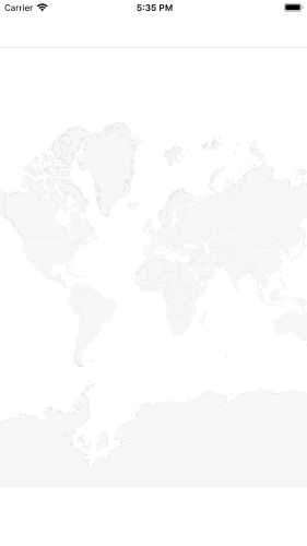
var source = MapSource.FromResource("XamarinApp.ne_10m_admin_0_countries.shp");this.countriesReader.Source = source; var dataSource = MapSource.FromResource("XamarinApp.ne_10m_admin_0_countries.dbf");this.countriesReader.DataSource = dataSource;At this point, if we run the app on iOS emulator, we see this:
Display Labels in a Xamarin Map Control
The dbf file that we just loaded through the DataSource of the map reader contains additional information for each shape in the form of attributes. We could show shapes labels, for example, or apply different styling to the shapes according to some criteria taken from the attribute’s details.
You could check all the loaded shapes and their attributes by looking into the Shapes property of the MapShapeReader instance:
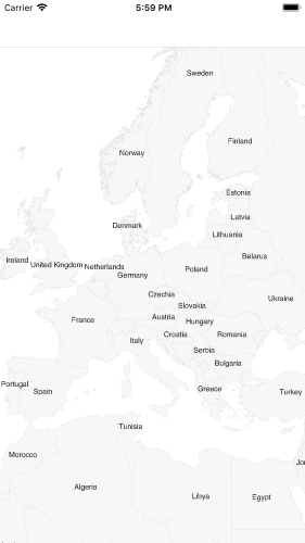
var countries = countriesReader.Shapes;In our case, there is an attribute with key “NAME” which holds the name of the country represented by each shape. So, we can easily display labels and customize their appearance through the LabelAttributeName and ShapeLabelStyle properties, respectively, like this:
<telerikMap:RadMapx:Name="map"> <telerikMap:RadMap.Layers> <telerikMap:ShapefileLayerLabelAttributeName="NAME"> <telerikMap:ShapefileLayer.Reader> <telerikMap:MapShapeReaderx:Name="countriesReader"/> </telerikMap:ShapefileLayer.Reader> <telerikMap:ShapefileLayer.ShapeLabelStyle> <telerikMap:MapShapeLabelStyleTextColor="#1E1E1E" FontSize="10"/> </telerikMap:ShapefileLayer.ShapeLabelStyle> </telerikMap:ShapefileLayer> </telerikMap:RadMap.Layers></telerikMap:RadMap>When viewed in the iOS device simulator, the map should look something like this:
Apply Different Styles
The appearance of the rendered shapes can be customized through the ShapeStyle property, which provides the means for defining FillColor, StrokeColor and StrokeWidth for each shape. In addition, different styles could be applied to distinguish different areas through the ShapeStyleSelector.
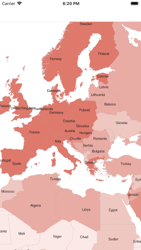
In our example we will use the “INCOME_GRP” attribute which holds information about each country’s income to set separate colors to the countries according to the income value.
First, let's create the custom style selector that should inherit from MapShapeStyleSelector class:
publicclassIncomeShapeStyleSelector : MapShapeStyleSelector{ publicMapShapeStyle HighIncomeShapeStyle { get; set; } publicMapShapeStyle LowerHighIncomeShapeStyle { get; set; } publicMapShapeStyle MiddleIncomeShapeStyle { get; set; } publicMapShapeStyle LowerMiddleIncomeShapeStyle { get; set; } publicMapShapeStyle LowIncomeShapeStyle { get; set; } publicoverrideMapShapeStyle SelectStyle(objectshape, BindableObject container) { var attributesShape = shape asIShape; if(attributesShape != null) { var scaleRank = Double.Parse(attributesShape.GetAttribute("INCOME_GRP").ToString().Substring(0, 1)); switch(scaleRank) { case1: returnthis.HighIncomeShapeStyle; case2: returnthis.LowerHighIncomeShapeStyle; case3: returnthis.MiddleIncomeShapeStyle; case4: returnthis.LowerMiddleIncomeShapeStyle; default: returnthis.LowIncomeShapeStyle; } } returnnull; }}Then, we would need to define It in XAML as a resource:
<ResourceDictionary> <local:IncomeShapeStyleSelectorx:Key="IncomeShapeStyleSelector"> <local:IncomeShapeStyleSelector.HighIncomeShapeStyle> <telerikMap:MapShapeStyleFillColor="#DE796C"StrokeColor="#BC9896"/> </local:IncomeShapeStyleSelector.HighIncomeShapeStyle> <local:IncomeShapeStyleSelector.LowerHighIncomeShapeStyle> <telerikMap:MapShapeStyleFillColor="#E49388"StrokeColor="#BC9896"/> </local:IncomeShapeStyleSelector.LowerHighIncomeShapeStyle> <local:IncomeShapeStyleSelector.MiddleIncomeShapeStyle> <telerikMap:MapShapeStyleFillColor="#E9ACA4"StrokeColor="#BC9896"/> </local:IncomeShapeStyleSelector.MiddleIncomeShapeStyle> <local:IncomeShapeStyleSelector.LowerMiddleIncomeShapeStyle> <telerikMap:MapShapeStyleFillColor="#EFC7C1"StrokeColor="#BC9896"/> </local:IncomeShapeStyleSelector.LowerMiddleIncomeShapeStyle> <local:IncomeShapeStyleSelector.LowIncomeShapeStyle> <telerikMap:MapShapeStyleFillColor="#FBE9E7"StrokeColor="#BC9896"/> </local:IncomeShapeStyleSelector.LowIncomeShapeStyle> </local:IncomeShapeStyleSelector></ResourceDictionary>And lastly, apply it to the ShapefileLayer instance:
<telerikMap:RadMapx:Name="map"> <telerikMap:RadMap.Layers> <telerikMap:ShapefileLayerLabelAttributeName="NAME" ShapeStyleSelector="{StaticResource IncomeShapeStyleSelector}"> <telerikMap:ShapefileLayer.Reader> <telerikMap:MapShapeReaderx:Name="countriesReader"/> </telerikMap:ShapefileLayer.Reader> <telerikMap:ShapefileLayer.ShapeLabelStyle> <telerikMap:MapShapeLabelStyleTextColor="#1E1E1E" FontSize="10"/> </telerikMap:ShapefileLayer.ShapeLabelStyle> </telerikMap:ShapefileLayer> </telerikMap:RadMap.Layers></telerikMap:RadMap>Running the application after the latest changes should look like this:
Select Shapes
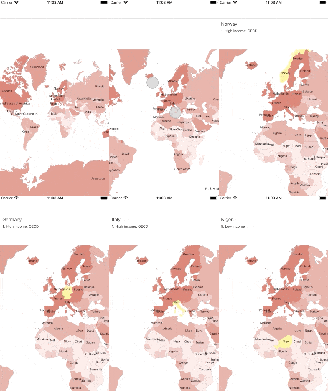
RadMap supports single and multiple selection of shapes to help draw users’ attention on specific areas. By default, the selection is turned off, so we would need to enable it by setting the SelectionMode property of the ShapefileLayer instance to either “Single” or “Multiple” per our preferences.
In addition, we can access the selected elements through SelectedShape / SelectedShapes properties according to the chosen selection mode.
Check the needed changes below:
<telerikMap:RadMapx:Name="map"Grid.Row="1"> <telerikMap:RadMap.Layers> <telerikMap:ShapefileLayerLabelAttributeName="NAME" ShapeStyleSelector="{StaticResource IncomeShapeStyleSelector}" SelectionMode="Single" SelectedShape="{Binding SelectedShape, Mode=TwoWay}"> <telerikMap:ShapefileLayer.Reader> <telerikMap:MapShapeReaderx:Name="countriesReader"/> </telerikMap:ShapefileLayer.Reader> <telerikMap:ShapefileLayer.ShapeLabelStyle> <telerikMap:MapShapeLabelStyleTextColor="#1E1E1E" FontSize="10"/> </telerikMap:ShapefileLayer.ShapeLabelStyle> <telerikMap:ShapefileLayer.SelectedShapeStyle> <telerikMap:MapShapeStyleFillColor="#FFF399" StrokeColor="#FFFBAE"/> </telerikMap:ShapefileLayer.SelectedShapeStyle> </telerikMap:ShapefileLayer> </telerikMap:RadMap.Layers></telerikMap:RadMap>Where SelectedShape property is defined like this;
privateIShape selectedShape; publicIShape SelectedShape{ get { returnthis.selectedShape; } set { if(this.selectedShape != value) { this.selectedShape = value; if(this.selectedShape != null) { this.CountryName = this.selectedShape.GetAttribute("NAME").ToString(); this.CountryIncome = this.selectedShape.GetAttribute("INCOME_GRP").ToString(); } this.OnPropertyChanged(); } }}Here is the result after running the updated code on iOS:
Xamarin Map Layers Support
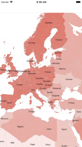
RadMap has a multi-layered architecture, so we could add more layers displaying different types of elements on the same map. Let’s explore this option by adding, for example, the Roads shape file (from the Natural Earth collection) in our example.
<telerikMap:RadMapx:Name="map"> <telerikMap:RadMap.Layers> <!-- countries layer --> <telerikMap:ShapefileLayer> <telerikMap:ShapefileLayer.Reader> <telerikMap:MapShapeReaderx:Name="roadsReader"/> </telerikMap:ShapefileLayer.Reader> </telerikMap:ShapefileLayer> </telerikMap:RadMap.Layers></telerikMap:RadMap>Add the shp file to the roadsReader:
var roadsSource = MapSource.FromResource("XamarinApp.ne_10m_roads.shp");this.roadsReader.Source = roadsSource;And we will have the roads visualized on the map:
Configure Pan and Zoom
Last but not least, I would like to mention the interaction feature of the Map – the control provides pan and zoom functionality that will help the end users of your app interact with the view and inspect it in more details.
You can choose between a few interaction modes to provide the needed user experience. The available options are only Pan, only Zoom, PanAndZoom (which is the default value) as well as None. The selected one is applied through the InteractionMode property of the Map.
In addition, you can configure the minimum and maximum allowed zoom levels. Please check the Key Features documentation topic for more details on this.
Try it out and Share your Feedback
I hope I have managed to give you an overview on the basic features of the Map control in Telerik UI for Xamarin. Don’t forget to check out the various demos of the controls in our Sample Browser and the Telerik UI for Xamarin Demos application.
As always, we would love to hear your feedback about the Map control and how we can improve it. If you have any ideas for features to add, do not hesitate to share this information with us on our Telerik UI for Xamarin Feedback portal.
Still haven't tried Telerik UI for Xamarin? The free trial is right here waiting for you to give it a try and explore all the components provided in the suite.