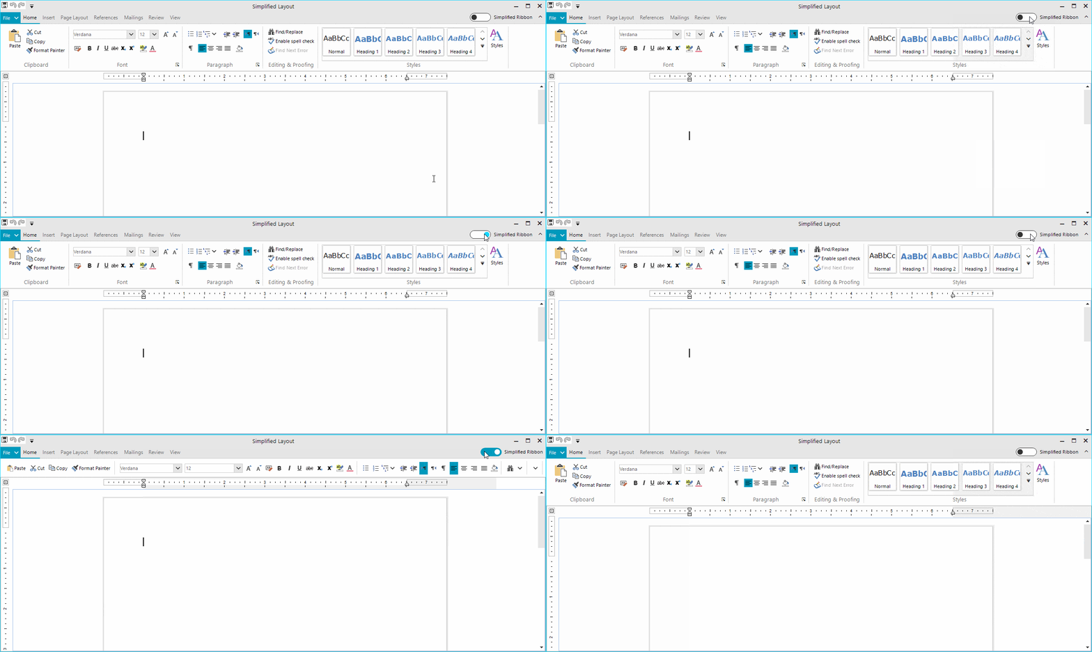
We introduced the new Simplified mode in RadRibbonBar in the Telerik UI for WinForms R2 2019 release. This powerful feature allows modernizing new or existing ribbon controls to incorporate a more compact UI and save valuable screen space.

Concept of Simplified Ribbon
The RadRibbonBar control has been around for quite some time. The control has served its purpose well, which is to provide the end user with a convenient UI allowing them to easily and intuitively invoke commands. UI Design and UX in general have also evolved through the years and now some people may say that the traditional layout of the ribbon control is bulky and not following the latest design trends. To be honest, that seems to be fair. Recently Microsoft introduced a new Simplified mode in their online Office suite. Hopefully, we will soon see this in the desktop versions of the same products. The Simplified mode of the ribbon bar is cool and sleek, moreover it is compact.
Such UI is invaluable when the screen space is limited, not to mention it is more user friendly as it puts only the most important commands at focus, and I personally enjoy it when working with Word in Office 365. This inspired us to implement a new layout mode in RadRibbonBar so that the control catches up to the modern UI trends.
How the Simplified Ribbon Bar Works
We wanted to provide a solution which would work equally well with ribbon controls already part of existing applications as it would with ribbons in new projects. It was imperative that the new feature did not impose limitations on the existing APIs in the control. We wanted the developers to keep on using the ribbon the way they were already doing it and to have the new option for switching the layout available at run-time. I should also say that the new feature is not built for a specific theme and it is supported equally well by all of our 27 themes.
Layout Mode
RadRibbonBar now has a LayoutMode property which is an enumeration with the available layouts. Currently the possible ones are Default and Simplified:
this.radRibbonBar1.LayoutMode = RibbonLayout.Simplified;Simplified Ribbon Height
A single property controls the height of the entire ribbon control when it is in Simplified mode. This allowed us to have different heights depending on the applied theme. This property also gives freedom to change the height depending on their actual scenario.
this.radRibbonBar1.SimplifiedHeight = 105;Layout Toggle Button
This button is responsible for switching the layout. It is located in the top right corner of the control. By default, the button is not visible, yet it can be easily displayed by setting a single property:
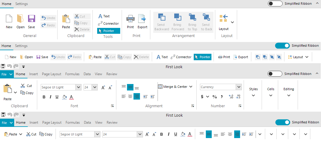
this.radRibbonBar1.ShowLayoutModeButton = true;We decided to set the ShowLayoutModeButton property to true, in our own RadRibbonBar implementations part of the RadRichTextEditor, RadSpeadsheet, and RadDiagram controls. The animation at the beginning of the blog shows the default and simplified layouts in RadRichTextRibbonBar. Here is a screenshot showing the ribbon in the diagram and spread controls.
Run-time support
The Simplified layout mode is available only at run-time. The Developer still needs to set up the UI building groups and sub groups in the traditional layout mode. Then at run-time they can switch the layout and have the new modern look. This approach allowed us to support ribbon controls which were already shipped. For the developer, this meant that they could provide their end users with a new cool feature without having to do anything on their side.
Simplified Layout
The main idea in the Simplified layout mode is to have all the items building the various groups in RadRibbonBar arranged in a single row. This posed several challenges while implementing the feature.
- Infinite Nesting: The traditional layout can be really complex, and groups can be nested in each other. The first thing we did is to flatten the structure and reparent all of the elements to be direct children of the main ribbon group. This can be seen clearly in the Clipboard and Font groups of the screenshot above. It was also a challenge to implement the transition from Simplified to the Default mode and restore the original arrangement.
- Element Properties: We did our best to handle as many scenarios as possible so that the control looks good when switched to the Simplified mode. In order to achieve this, we had to change some of the element properties so that they look good in a single row. For example, the Paste drop-down button in the Clipboard group originally had the TextImageRelation property set to ImageAboveText and this looks perfect in the default layout. Such text-image relation, however, did not make sense in the Simplified mode, so we changed the element to display the image before the text. We also changed some other properties as well as the images in order to decrease the height of the various elements and fit them in a single row. We have a documentation article listing them.
- Customization: As many element properties were being changed while switching the layout mode, we had to provide the developers an API to control this process. The ItemStyleChanging event is firing for each of the changed properties and it can be subscribed via the main element of the control: RadRibbonBar.RibbonBarEelement. The event is cancellable as in certain scenarios the developer might decide that that a particular property for a particular element should not be changed. The arguments provide information about the element, the group where it is located, the property, the old and new property values as well as the context in which the change operation is being executed. For example, we have decided that the gallery items in the Simplified mode will display only text, however, in certain cases one may need to use a different display mode. If that is working well in a client's application, the event's NewValue argument can be changed. We have a nice documentation article on Customizing the Simplified Ribbon demonstrating this with the RichTextEditorRibbonBar:
privatevoidRibbonBarElement_ItemStyleChanging(objectsender, Telerik.WinControls.UI.ItemStyleChangingEventArgs args){ if(args.Context == ItemStyleContext.DefaultToSimplified) { if(args.Element isRadGalleryItem && args.Property == RadButtonItem.DisplayStyleProperty) { args.NewValue = DisplayStyle.Image; } }}Try it Out
Make sure to download and try the latest version of Telerik UI for WinForms to explore all the new features and themes. It is available jn your Telerik Account, or if you are new to Telerik UI for WinForms, you can get a fully featured 30 day free trial here.
We'd love to hear how this all works for you, so please let us know your thoughts by visiting our Feedback portal or by leaving a comment below.
