The R2 2019 Service Pack is live today and brings new features in the DesktopAlert, Map and DiagramRibbon controls, in the VisualStudio2013 theme, as well as many improvements in our major controls. Let's see what's new in Telerik UI for WPF and Telerik UI for Silverlight with the latest Service Pack.
DesktopAlert: Display Alerts with Auto Height and Hide Alerts from the Task Switcher
One of my favorite controls is RadDesktopAlert and I'm happy to share that the control gains two desired features this service pack:
- Auto height– it is possible now to display alerts with auto height by simply setting the height of the control to double.NaN.
- Hide from task switcher– by setting the ShowInTaskSwitcher property to false. The alert will not be visible in the Alt + Tab menu of Windows. (read more in the docs)
Make sure to check them out!
Map: Add Request/Response Headers to the WebClient
If you are implementing a custom map provider you may find this useful. We have added a WebHeaders property of the MultiScaleTileSource, that will allow you to add request/response headers to the WebClient of the provider. For example now you can easily set a User-Agent/Referrer header. For more details please refer to this help article from our documentation.
DiagramRibbon: Simplified Ribbon Mode
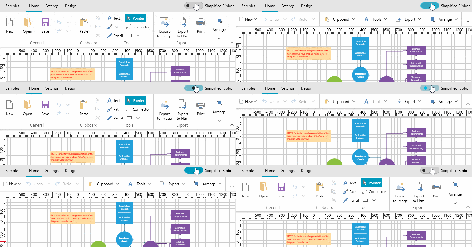
In R2 we added new simplified layout mode to RadRibbonView (check this blog post out in case you have missed it), now with the service pack the feature is available for RadDiagramRibbon as well. You can now enjoy the new modern simplified ribbon layout available out of the box with RadDiagramRibbon – see it below in action:
For more details check this article from our online help documentation.
TabControl: Close Tabs by Clicking the Middle Mouse Button
We added an ability to close the Tabs using the middle button. The option is disabled by default. In order to enable it, just set the CloseTabsOnMouseMiddleButtonDown property to true. You can see it in action in the WPF demos here– check the PinAndClose example from the TabControl demos.
TabbedWindow: Many Improvements
As you may know, in R2 we released brand new RadTabbedWindow control, that allows creating browser-like user interface within WPF application. For this Service Pack we polished it in order to make it better - so if haven't tried it, please do so!
One significant change that you should know about if you are using the control is that we changed the Items property type - from ObservableCollection<RadTabItem> to IList.
Please let us know if you have any feedback and make sure to check out this blog explaining how to use XAML islands in RadTabbedWindow (it is pretty )!
VisualStudio2013 Theme: Customize the ReadOnly Appearance of the Controls
We added three new properties to the VisualStudio2013 palette that will allow you to easily modify the appearance of the controls that have a ReadOnly state. The new properties are:
- ReadOnlyBackgroundBrush: Used as a background of elements that are in a read-only state.
- ReadOnlyBorderBrush: Used in borders inside elements that are in a read-only state.
- ReadOnlyOpacity: Used for text in inputs when they are in a read-only state.
For more info about the Theme please check the VisualStudio2013 Theme article. You can see them in action in the Color Theme Generator for WPF application.
Check Out the Detailed Release Notes
We have a lot more! To get an overview of all the latest features and improvements we’ve made, check out the release notes for the products below:
Share Your Feedback.
Feel free to drop us a comment below sharing your thoughts. Or visit our Feedback portals about Telerik UI for WPF, Silverlight and Document Processing Libraries and let us know if you have any suggestions or if you need any particular features/controls.
And if you haven’t already had a chance to try our UI toolkits, simply download a trial from the links below:
UI for WPF UI for Silverlight
In case you missed it, here are some of the updates from our last release.