Pie and donut charts are circles with slices that represent categories (the donut has a hole in the middle). See how you can easily add these to your apps to visualize a variety of data.
In my last post on the topic, we covered scatter and bubble charts in Vue with Kendo UI. In this post, we will review the pie and donut chart.
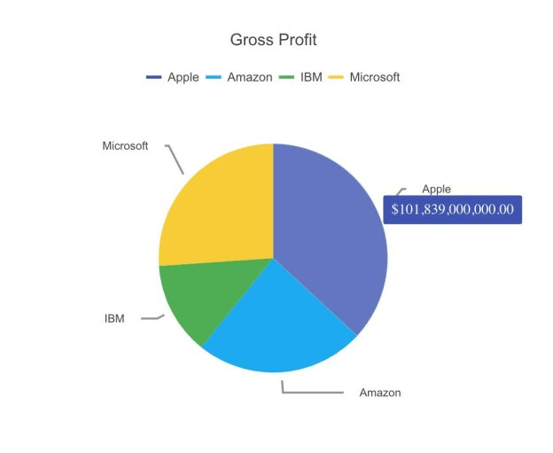
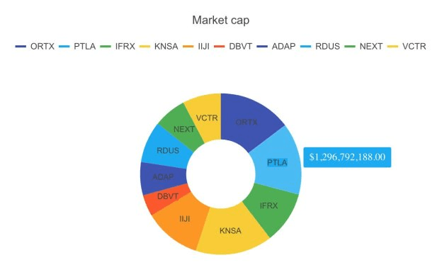
A pie chart is a circle with slices that represent each category. A donut chart is similar to a circle chart except there is a hole in the center. The purpose of these charts is to show how each category compares to the total value of all the categories. Pie and donut charts are best used when you have only a few categories and the total adds up to 100%. For example, you can build a chart showing spending by category. The categories could be bills, food, and entertainment. Combined, they make up your total spending. Up next, we will build a pie chart showing profit by stock. Then we will make a donut chart showing market cap by stock.
Creating the Pie Chart
First, we will create a pie chart using local data. We will need to initialize a Vue project using the webpack-simple template. Then install the Charts package, Kendo UI, and a theme. The following commands install these packages.
npminstall --save @progress/kendo-ui
npminstall --save @progress/kendo-theme-default
npminstall --save @progress/kendo-charts-vue-wrapper
Next, we import the packages in our main.js file then register the Chart component globally and add it to the component list.
import Vue from'vue'import App from'./App.vue'import'@progress/kendo-ui'import'@progress/kendo-theme-default/dist/all.css'import{ Chart, ChartInstaller }from'@progress/kendo-charts-vue-wrapper'

Vue.use(ChartInstaller)newVue({
  el:'#app',
  components:{
  Chart
  },
  render: h =>h(App)})
In the App.vue file we add the chart component to the template. We will set the chart’s title, legend, tooltip, series, and theme. The following is the template.
<template><divid="app"><kendo-chart:title="title":legend="legend":tooltip="tooltip":series="series":theme="'material'"></kendo-chart></div></template>The value of the chart’s attributes will be defined in the data of the script. The most important configuration is the series. The series type is set to pie. The series data contains an array with each element specifying the category and value. The categories are Apple, Amazon, IBM, and Microsoft. The values are the gross profit reported on each company’s 2017 income statement. The data was taken from the Nasdaq website. This is the updated script.
<script>exportdefault{
  name:'app',data(){return{
     title:{
      text:'Gross Profit'},
     legend:{
      position:'top'},
     tooltip:{
      visible:true,
      format:'${0:N}',},
     series:[{
      type:'pie',
      data:[{
        category:'Apple',
        value:101839000000},{
        category:'Amazon',
        value:65932000000},{
        category:'IBM',
        value:36227000000},{
        category:'Microsoft',
        value:72007000000}],
      labels:{
        visible:true,
        template:'#: category #'}}]}}}</script>
This is the link to the repository for the code: https://github.com/albertaw/kendoui-piechart
Donut Chart
Next, we will create a donut chart. This time we will use data from an API. That means we will need the DataSource component. The following command will install the DataSource package.
npminstall --save @progress/kendo-datasource-vue-wrapper
Next, we will import the package in our main.js file, register the component globally, and add it to the component list. This is the updated file:
import Vue from'vue'import App from'./App.vue'import'@progress/kendo-ui'import'@progress/kendo-theme-default/dist/all.css'import{ Chart, ChartInstaller }from'@progress/kendo-charts-vue-wrapper'import{ DataSource, DataSourceInstaller }from'@progress/kendo-datasource-vue-wrapper'

Vue.use(ChartInstaller)
Vue.use(DataSourceInstaller)newVue({
  el:'#app',
  components:{
  Chart,
  DataSource
  },
  render: h =>h(App)})
Next, we declare the DataSource component inside the template of our App.vue file. The DataSource needs a name to reference it by, a data type and a URL. The data type is JSON. The URL is an API endpoint provided by IEX and is the following:
https://api.iextrading.com/1.0/stock/market/list/gainersThe API will return a list of stocks that are considered gainers. The chart component will remain nearly the same except we will add a reference to our DataSource component. This is the updated template:
<template><divid="app"><kendo-datasourceref="dataSource":transport-read-url="'https://api.iextrading.com/1.0/stock/market/list/gainers'":transport-read-data-type="'json'"></kendo-datasource><kendo-chart:data-source-ref="'dataSource'":title="title":legend="legend":tooltip="tooltip":series="series":theme="'material'"></kendo-chart></div></template>In the script, we will change the title and the series data. The series type becomes donut. We will no longer list a category and value for each data item. Instead, we will specify a field and categoryField. We will use the marketCap field for our values and the stock symbol for the categories. This is the updated script.
<script>exportdefault{
  name:'app',data(){return{
     title:{
      text:'Market cap'},
     legend:{
      position:'top'},
     tooltip:{
      visible:true,
      format:'${0:N}',},
     series:[{
      type:'donut',
      field:'marketCap',
      categoryField:'symbol',
      labels:{
        visible:true,
        template:'#: category #'}}]}}}</script>
This is the link to the repository: https://github.com/albertaw/kendoui-donutchart
Summary
We built a pie chart using local data to compare profit by stock. Then we created a donut chart using remote data to compare market cap by stock. The segments of each chart represent a percentage of the total. Based on the data supplied the component will automatically calculate the percentages. When constructing a pie or donut chart it is important to identify what the categories are and that they add up to 100%. In our examples, the stocks were the categories. All of the values summed together made up our total. Then they were converted to percents so we could see what share of the total each category had.
In the next article, we will learn how to build an area chart. An area chart is like a line chart but the space between the line and axis is filled in.
Resources
- Pie Chart Repo
- Donut Chart Repo
- Vue Webpack-Simple Template
- DataSource Overview
- Charts Overview
- Kendo UI Vue Docs and Demos
- Vue.js Webpack-Simple Template
- Kendo UI Online Editor
Try Out Kendo UI for Yourself
Want to start taking advantage of the more than 70+ ready-made Kendo UI components, like the Grid or Scheduler? You can begin a free trial of Kendo UI for Vue today and start developing your apps faster.
Angular, React, and jQuery Versions
Looking for UI component to support specific frameworks? Check out Kendo UI for Angular, Kendo UI for React, or Kendo UI for jQuery.