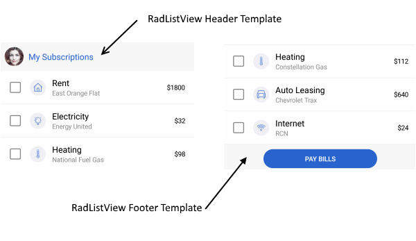
The Telerik UI for Xamarin ListView control now features Header and Footer support, giving you new opportunities to customize the experience for your users.
With Telerik UI for Xamarin, you can now add custom content to the top and bottom of your list view using the HeaderTemplate and the FooterTemplate properties of the ListView. You can use them in your mobile app to display descriptive information about the content (list view items). In this blog post I will show you how both templates can be added to the RadListView control.

HeaderTemplate
The HeaderTemplate can be used for adding custom content to the top of the items container. It could be used in different cases, for example to add text which gives an overview for the list view content. The snippet below shows how to add the HeaderTemplate:
<telerikDataControls:RadListView.HeaderTemplate> <DataTemplate> <LabelText="All mail"/> </DataTemplate></telerikDataControls:RadListView.HeaderTemplate>FooterTemplate
The RadListView FooterTemplate is displayed at the bottom of the list view items. Here's a sample use-case scenario: say the items in the list view are messages and you want to execute some operation to all/some of them - in the footer template you can add a button that, when clicked, deletes all/the selected messages, or marks them "as read." Here is how a sample Footer Template could be defined:
<telerikDataControls:RadListView.FooterTemplate> <DataTemplate> <ButtonText="Delete all"Clicked="Button_Clicked"/> </DataTemplate></telerikDataControls:RadListView.FooterTemplate>Please note that both templates are scrollable along the items in the ListView. For more details check our help article here.
Using Header and Footer in the Xamarin ListView
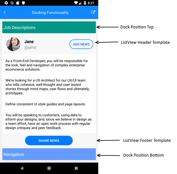
Let’s create a sample app using the HeaderTemplate and the FooterTemplate. For the demo we are going to use the RadDockLayout control. RadDockLayout provides a mechanism for child elements to be docked to the left, right, top or the bottom edge of the screen or to occupy the center area of the layout. You can easily arrange the views in order to achieve a fully featured layout of a page.
Let's create a view model and a business object that will be the source of the list view:
publicclassViewModel{ publicViewModel() { this.Source = newObservableCollection<News>() { newNews("As a Front-End Developer, you will be responsible for the look, feel and navigation of complex enterprise ecommerce solutions."), newNews("We’re looking for a UX Architect for our UX/UI team who tells cohesive, well-thought and user tested stories through mind maps, user flows and ultimately, prototypes. "), newNews("Define consistent UI style guides and page layouts. "), newNews("You will be speaking to customers, using data to inform your designs, and, since we believe in design as a team effort, have an open work process with regular design critiques and peer feedback.") }; } publicObservableCollection<News> Source { get; set; }} publicclassNews{ publicNews(stringdescription) { this.Description = description; } publicstringDescription { get; set; }}Finally, lets declare the RadDockLayout and dock the RadListView control to occupy the remaining space of the screen:
<ScrollViewBackgroundColor="White"> <telerikCommon:RadDockLayout> <GridtelerikCommon:RadDockLayout.Dock="Top" BackgroundColor="#009688" HeightRequest="50"> <LabelText="Job Descriptions"VerticalTextAlignment="Center"/> </Grid> <GridtelerikCommon:RadDockLayout.Dock="Bottom" HeightRequest="50" BackgroundColor="#659BFC"> <LabelText="Navigation"VerticalTextAlignment="Center"/> </Grid> <Grid> <telerikDataControls:RadListViewItemsSource="{Binding Source}"> <telerikDataControls:RadListView.BindingContext> <local:ViewModel/> </telerikDataControls:RadListView.BindingContext> <telerikDataControls:RadListView.HeaderTemplate> <DataTemplate> <telerikPrimitives:RadBorderPadding="5"> <StackLayoutOrientation="Horizontal"BackgroundColor="#F7F7F7"> <telerikPrimitives:RadBorderCornerRadius="30" HorizontalOptions="Start" WidthRequest="60" HeightRequest="60" Margin="10"> <ImageSource="Avatar.png"Aspect="AspectFill"/> </telerikPrimitives:RadBorder> <StackLayoutOrientation="Vertical"Spacing="0"VerticalOptions="Center"HorizontalOptions="StartAndExpand"> <LabelText="Jane"FontAttributes="Bold"TextColor="Black"Margin="0"/> <LabelText="@jane"TextColor="#919191"Margin="0"/> </StackLayout> <telerikInput:RadButtonText="Add news" BackgroundColor="Transparent" BorderColor="#007AFF" BorderRadius="30" BorderWidth="2" Margin="5" WidthRequest="100" HeightRequest="40" Padding="12,3,12,3" HorizontalOptions="End" VerticalOptions="Center" TextColor="#007AFF"/> </StackLayout> </telerikPrimitives:RadBorder> </DataTemplate> </telerikDataControls:RadListView.HeaderTemplate> <telerikDataControls:RadListView.FooterTemplate> <DataTemplate> <telerikPrimitives:RadBorderPadding="5"BackgroundColor="#F7F7F7"> <telerikInput:RadButtonText="Share news" TextColor="White" WidthRequest="200" HeightRequest="40" VerticalOptions="Center" HorizontalOptions="Center" CornerRadius="25" Margin="0, 5, 0, 5" Padding="15,5,15,5" BackgroundColor="#007AFF"/> </telerikPrimitives:RadBorder> </DataTemplate> </telerikDataControls:RadListView.FooterTemplate> <telerikDataControls:RadListView.ItemTemplate> <DataTemplate> <telerikListView:ListViewTemplateCell> <telerikListView:ListViewTemplateCell.View> <StackLayoutOrientation="Vertical"Margin="10, 10, 10, 10"BackgroundColor="White"> <LabelText="{Binding Description}"FontSize="15"Margin="3"TextColor="Black"/> </StackLayout> </telerikListView:ListViewTemplateCell.View> </telerikListView:ListViewTemplateCell> </DataTemplate> </telerikDataControls:RadListView.ItemTemplate> </telerikDataControls:RadListView> </Grid> </telerikCommon:RadDockLayout></ScrollView>The image below shows the final result:

That's all, now you have your list view with header and footer.
Tell Us What You Think
Have we caught your interest with the RadListView new features and the RadDockLayout control? We would love to hear what you think about them. If you have any ideas for features to add, do not hesitate to share this information with us on our Telerik UI for Xamarin Feedback portal.
Don’t forget to check out the various demos of the controls in our SDK Sample Browser and the Telerik UI for Xamarin Demos application.
If you have not yet tried the Telerik UI for Xamarin suite, take it out for a spin with a 30-day free trial, offering all the functionalities and controls at your disposal at zero cost.
Happy coding with our controls!