The R2 2019 release for Telerik UI for ASP.NET MVC and UI for ASP.NET Core has arrived. Check out the latest and greatest including new components like the PDF Viewer and Drawer, or new features like Endless Scrolling in the ListView and data binding for the menu.
May is here and with it I bring the good news about the R2 2019 release for UI for ASP.NET MVC and UI for ASP.NET Core! These products share a lot of commonality so I wanted to cover them both in a single blog post. There’s a lot to cover here so lets jump straight in to things:
Support for ASP.NET Core 3.0 Preview 5
The first big thing that I want to announce here is that the Telerik UI for ASP.NET Core components are now compatible with ASP.NET Core 3.0 Preview 5. This ensures that those of you already looking at ASP.NET Core 3.0 can test our components in this preview version and prime us for the official release of ASP.NET Core 3.0.
New Component: PDF Viewer
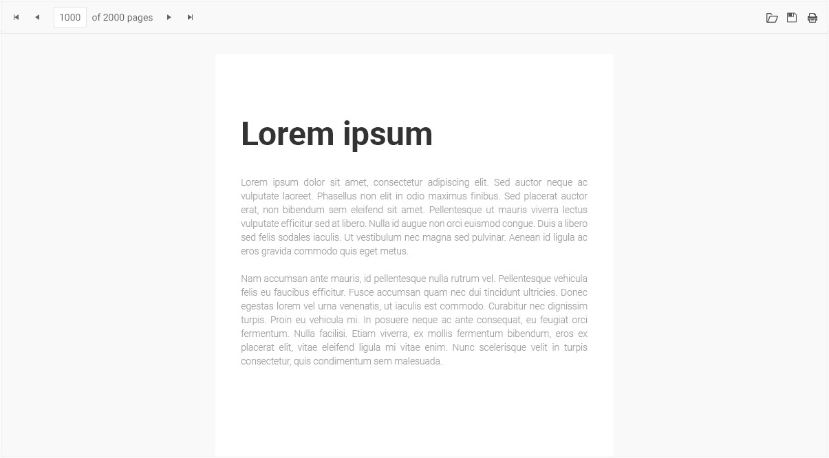
The PDF Viewer component brand new for this release and is designed to let your users view and interact with PDF files without the need to download the file and work with it locally. The UI for ASP.NET MVC and UI for ASP.NET Core PDF Viewer be bound to a PDF file on initial load, or a user can even open a local file to view within their apps. Users can of course download the file they are currently viewing to their own machine. The UI is fully responsive and adaptive, which means the PDF Viewer works well in desktop and mobile scenarios alike.
A big item to bring up here is that the PDF Viewer comes with virtualization already in its first version! In order to make sure we can fit any high-performance scenario we wanted to make sure this was a part of our first release.
Finally, when it comes to actually processing the PDF files you have your choice of working with PDF.js or with the Telerik Document Processing Library to help process your PDF files for viewing and saving.
New Component: Drawer
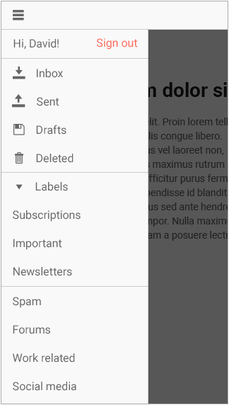
Another new component for R2 2019 is the Drawer widget. While this component has become a go-to for navigation across applications everywhere, just as a quick recap the drawer component is a menu that expands and collapses upon clicking a button (like a hamburger button in many mobile scenarios). Usually this is on the left or right side of the page and it provides a slick way to have navigation with minimal impact on real estate.
Showing or hiding the menu, which can be done in a modal way (overlay on top of content) or by pushing content to the side, can easily be toggled through clicking the drawer button or even through usage of our API. Each menu item comes with a default combination of a text and an icon, but you can also customize how each menu item appears through templates.
The drawer also features a “mini” mode which lets you show the drawer while only rendering the icons that you have chosen - a very compact way to add navigation to your web applications.
Big Focus on the Spreadsheet Component
A component that deserved some attention in the last couple of months was the Spreadsheet component, and with R2 2019 we are bringing a ton of highly requested features to this component.
Image Support
A long awaited feature: adding images to your Spreadsheet is now possible with R2 2019! You can add images to any cell, drag & drop the images around, and of course delete them as well. Any image(s) you add to your document will of course be exported whenever your users save the spreadsheet locally as well.
Cell Comments
This is pretty self-explanatory, but now it is possible for users to add comments in to any cells - bridging the gap even more with existing features they may have with desktop-based spreadsheet solutions.
Additional Events
This has been a big one, especially since it allows for further customization of the Spreadsheet itself. With R2 2019 we introduced a whole slew of new events:
- Changing
- DataBinding
- DataBound
- Paste
- Cut
- Copy
These provide a pretty solid amount of choices to ensure that you can take full control over the Spreadsheet component for ASP.NET MVC or ASP.NET Core to fit any of your application’s requirements.
Mobile & Adaptive Renderings
In order to ensure that our developers do not have to make a choice between desktop or mobile, and instead think about responsive design and Progressive Web Apps (PWAs), we’ve gone through and updated/improved the way two of our bigger components handle mobile devices. Specifically we have started to think about the adaptive rendering which is a bit different than just responsive design.
Adaptive rendering allows you to take over more of the view port and truly adapt to being on a mobile device. Rather than changing what is show or hidden when on smaller screens the component will show alternate UX in order to better suit the functionality of the components.
This has been a part of our Grid and Scheduler components for a while, but it was specifically geared towards hybrid mobile UI rather than a more modern approach of mixing desktop and mobile. So, we’ve updated things to be built-in to the components themselves (rather than rely on our hybrid UI framework) and also updated things for more modern UX design guidelines.
The Grid
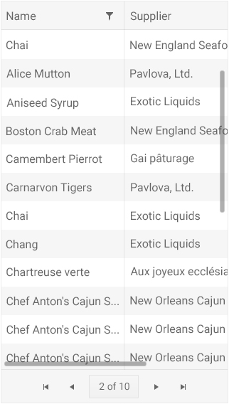
Normally responsive design is brought up with the Grid we need to think about what columns to show or hide, and what other elements we can either remove or compress (pager comes down to a drop down rather than full pager, for example).
However, the Grid has filtering, sorting, user control for showing and hiding columns. All of these feature require UI elements to handle, and more often than not the desktop variations of the UX for interacting with them may be a bit clunky on mobile. Popup menus are pretty bad to deal with on mobile quite honestly. With adaptive rendering we have that in mind and we have created an alternate user experience for interactions with the Grid.
Here’s a sample of adaptive rendering in action. This is the page that appears when you tap on the header icon:
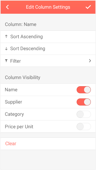
Rather than another popup we now have a ListView with various options we can toggle (sorting), as well as providing switches for showing and hiding columns. Beyond this we also see with the > symbol that there is another level for filtering, which will also display a ListView of options.
A note here is that this isn’t the default behavior of the Grid. By default we assume that you want to work with responsive design. However, this type of functionality is only a configuration option away.
The Scheduler
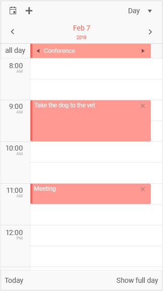
Similar to the Grid, the Scheduler is a bigger component that can benefit from the adaptive rendering style rather than trying to squish everything in to a smaller screen.
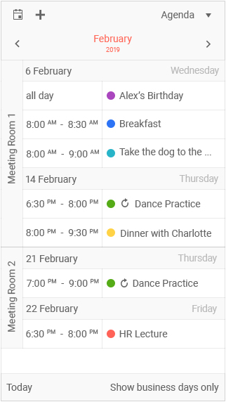
The image here showcases the agenda view, just one of the many views that work on mobile, with some grouping around resources. Tapping on any one of these items brings up an editable form that has a more mobile-friendly UX to help with editing on mobile devices.
Just like the Grid, this isn’t the default option. Instead this is offered through a configuration option to turn on or off.
The DateRangePicker
The DateRangePicker was added in R1 2019 and we almost immediately received feedback around what we can do for mobile devices. While it worked OK-ish, we certainly could improve. So, with R2 2019 the DateRangePicker has an improved mobile experience that should let you showcase the component on any device without concerns!
ListView Gets Endless Scrolling
Endless Scrolling continues to be a popular way of scrolling in our larger list-based components. This type of scrolling functions by loading more data once a user scrolls to the bottom of the current page, then the next set of data gets loaded. So, under the hood it operates similar to paging but to the end-user it seems like they can just continue to scroll.
The ListView is no exception to having this be a popular request, in fact it was the top-rated feature within our feedback portal until just now. With R2 2019 we can now mark this feature request as done because the ListView officially supports endless scrolling!
Miscellaneous Enhancements
Bind Menu to DataSource
With R2 2019 the Menu component supports being data bound via a DataSource! This means you can connect your menu to any back end (WebAPI maybe?) and pull in the data items from your data store.
DataSourceResult & DataSourceRequest Get Their Own Package
Previously the DataSourceResult and DataSourceRequest functionality that UI for ASP.NET MVC and UI for ASP.NET Core relies on has been built-in to the libraries. However, with these two products and our newly launched UI for Blazor all taking advantage of this code we wanted to make things a bit more modular. So, with R2 2019 we have separated out this functionality to the Telerik.DataSource package. This means you can use this whenever you are using filtering, sorting, grouping and paging on the server - all without depending on MVC.dll or Kendo.MVC.dll!
A quick note to make here is that while we recommend thinking about migrating to using Telerik.DataSource where you can, we haven’t removed the code internally to our libraries yet to ensure that we don’t introduce breaking changes!
Improved UI for ASP.NET MVC and Core Docs
We have also gone through the existing MVC and Core documentation resources and tried to update the API sections for both products. While we always try to improve documentation between every release, I wanted to especially highlight this as we spent some time on making the API of these two libraries easier to navigate through.
Upcoming R2 2019 Webinar
Want to see everything I brought up here in action? Looking for more information on other .NET UI libraries from Telerik? Well you’re in luck because on Wednesday, May 29th, at 11:00 AM ET we have the official R2 2019 Telerik webinar! Seats are limited so make sure that you click on that link I just posted and reserve your spot today!