The R2 2019 release for Kendo UI for Angular is here! Read about the updates we've done to the Scheduler, Editor, and Grid components along with new components and other various updates!
May is here and while the dust from ng-conf may have just settled I want to stir up some more hype for Angular by talking about the R2 2019 release of the Angular components in the Kendo UI bundle!
There’s a lot to cover, so let’s just jump straight in to things.
The Angular Scheduler Gets Plenty of Improvements
The Scheduler is one of our bigger components that I know quite a few of you have already picked up and worked with. While the initial version of the Scheduler was a bit bare bones, we’ve been working hard on adding features that are requested by users as well as look at our other Scheduler components in other suites for inspiration and ideas.
From R1 to R2 we were able to add quite a few features!
Resize Events
This is pretty big feature for any scheduler or calendar implementation, and while we did release this feature earlier in the year it still falls under what we did between R1 and R2 2019. So, your end users can now easily update the duration of any event by simply resizing the event and dragging the top or bottom of the event to the desired time slots.
Check out a demo of the resizing of events in action right here.
Drag & Drop Events
In a similar vein to resizing events, it is also important for your users to be able to freely drag and drop events around the calendar surface. So, with the latest edition of the Angular Scheduler you can easily enable this in any editable Scheduler, which of course also includes the ability to prevent certain items from being dragged around, or limiting where they can be dropped. Here’s a demo that showcases how the drag and drop functionality works!
Multi-Day & Work Week Views
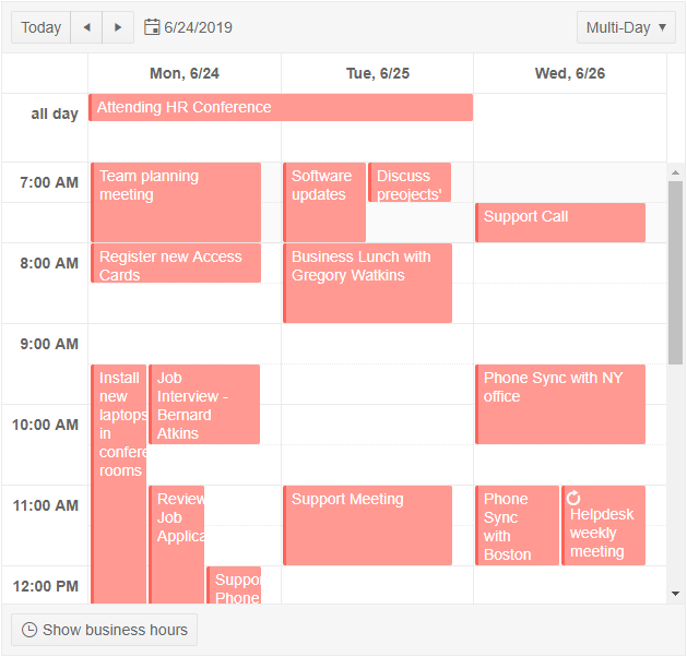
Just how your schedule is display is of course also important. Often times in calendar clients like Outlook or Google Calendar you have the ability to switch between a few different views (single day, multiple days, work week, agenda view etc.). While we’ve already had quite a few of these views created already, with the latest bits we have Multi Day & Work Week views that can be either the default view for all of our Scheduling needs, or just one of many views that you allow your users to select from. To see how you can add this in your Angular applications today, jump over to the Kendo UI Angular Scheduler demo section to see an interactive demo and source code for how to implement these!
Export to PDF
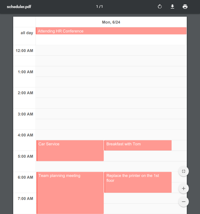
The section title kind of gives things away here, but the Kendo UI Angular Scheduler now supports exporting the current view to PDF with the click of a single button! Initial configuration is really just a single line of code as well, with more advanced configuration options available, so adding this to your existing Scheduler implementation is a breeze! Here’s a demo of the PDF export in action.
Current Time View
Sometimes we get stuck deep in our calendar where we may not necessarily know where we are compared to the current time, hence the new ability for the Kendo UI Scheduler to give a nice little line to indicate what the current time is. Jump over to the Scheduler demo and click on “Today” to see how this works in real time.
Tools, tools, and more tools for the Rich Text Editor
Kendo UI’s rich text editor for Angular is a very fresh component and we’ve worked hard on adding as much functionality as possible to this frequently-used and requested component. Specifically these are the new tool options that we were able to add for R2 2019.
- Format drop down showcases different formats
- Insert Image Dialog
- Insert File Dialog
- Subscript & Superscript
- View HTML tab
- Font Picker & Font Size Picker
- Text Align and Justify content
- Clear formatting button
- Localization
- Right-to-left (RTL) support
That’s a whole lot of features to add! This is of course only the beginning, but with these features we’re already bringing in the most critical features for rich text editing in to your Angular applications! This Editor demo highlights all of these tools out of the box so head over there and play around with these new features!
Additions to the Grid
Everyone loves the Grid, and with good reason! With this release we managed to add a couple of more features to this popular component.
Endless Scrolling
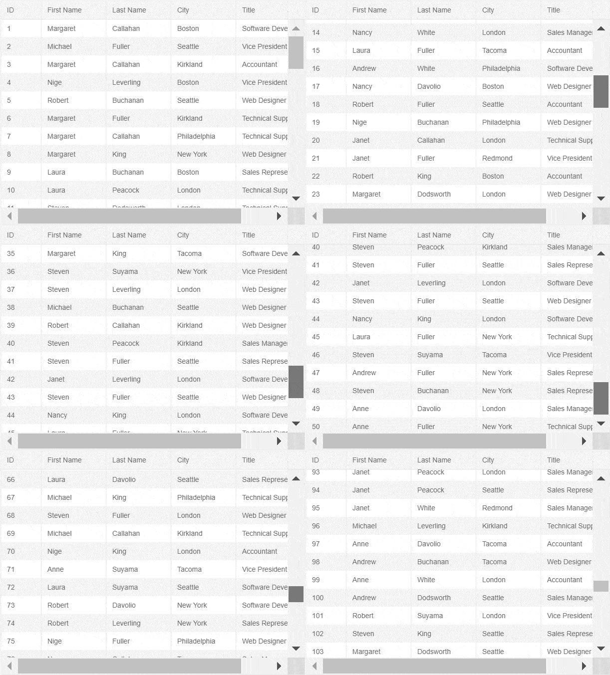
Endless Scrolling provides a new way for users to scroll through large sets of data, with more data being loaded every time the scroll bar reaches the bottom of the scrollable area. All features of the Grid (filtering, sorting, grouping, etc.) can be used with this mode of scrolling, but it does remove the need for an actual pager at the bottom of the Grid. To see his in action, check out our Grid Endless Scrolling demo.
Cell Spanning
The name kind of gives it away, but the Kendo UI Angular Grid now support spanning of cells both in the same row (column spanning) as well as in the same column (row spanning).
Excel Export Supporting Expand/Collapse Functionality
An interesting feature that I personally didn’t even know Excel could do is expand and collapse certain sections with a traditional plus/minus toggle button. Well, turns out it can and also turns out we can support it! So, if you’re using grouping in the Kendo UI Grid and want to allow the exported document to provide expand and collapse icons for your groups that can easily be done. Head over to this Grid demo to see how!
Two Big Items for the DropDowns
The DropDownList group of components also received two big updates: grouping and virtualization
Grouped Lists
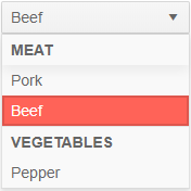
With the latest bits you can now define a particular field to group the data items within a drop down, rather than just list out all items without a specific order. This has been requested for some time so I’m happy to say it is delivered for R2 2019!
Virtualization (Soon)
This is another huge feature for DropDown components - especially in scenarios with a large list of data. While this is not available as of today (May 15th 2019), it will be available over the next couple of weeks. So, if you're reading this in the future virtualization should already be a part of the package!
I still wanted to bring this up in today's announcement blog post as I know it is a very important feature for many of you using the drop downs. We have the implementation more or less up and running, but there are tweaks we want to do before actually releasing the feature to make sure it is up to our regular standards.
New Component: ColorPicker
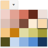
A brand new widget that we added with this release is the Angular ColorPicker component. This is a pretty useful component to use whenever a choice of color needs to be involved within your application.
Whether it is from a list of predefined colors that appear once you click on the drop down like in the image above, or if you want to provide a gradient selection to self-select the perfect color, or even forego the entire drop drop and just render color blocks or the gradient right on the page - it’s all possible with the Kendo UI ColorPicker!
Accessibility
Accessibility is always something that we take very seriously on the Kendo UI teams, and Angular is no exception. We try to make our components compatible with WCAG 2.1, Section 508, and WAI-ARIA standards out of the box. However, there are certain scenarios and features that may prohibit certain levels of compliance, so we have created this accessibility documentation article to help ensure WCAG 2.1 compliance when you implement our Angular UI components.
Join Us for the Webinar!
If you want to see what we brought up here in action then you should join myself and my Developer Advocate colleagues for our live Kendo UI Webinar on Thursday, June 6th at 11:00 AM ET! We have limited seats for this webinar so make sure you head over and register to reserve your seat today!