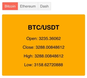
A button group helps you easily display a selection of options for your users. Learn how to easily use a ButtonGroup component in your web apps.
In my last post, we made a button using Kendo UI for Vue. In this post, we will create an app using the ButtonGroup component.
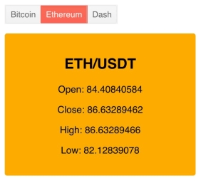
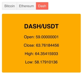
The button group will have three buttons each representing a cryptocurrency. When a button is selected, a card will show displaying the open, close, high and low prices for the currency. To get started, we will initialize our project using the Vue CLI. We are using the CLI because it gives us boilerplate code to work with and has other features to make development easier. We will add the button group component to our main template. Then, create a custom card component to display the currency’s information. Last, set the data for the currency’s card by fetching its API.
Getting Started
First, let’s create a new Vue project from the command line use the webpack-simple template. The following commands will install the Vue CLI, create a project named button-group, and start the app.
$ npminstall -g @vue/cli
$ vue init webpack-simple button-group
$ cd button-group
$ npminstall
$ npm run dev
Next, we will install the Kendo UI npm packages needed for the project.
npminstall --save @progress/kendo-ui
npminstall --save @progress/kendo-theme-default
npminstall --save @progress/kendo-buttons-vue-wrapper
Now, we can import these packages in our src/main.js file. The kendo-buttons-vue-wrapper package contains wrappers for the Button, ButtonGroup, and ToolBarcomponents. We will import the components for the ButtonGroup and the ButtonsInstaller. A button group uses two components: a ButtonGroup which is a container and one or more ButtonGroupButton components which are the individual buttons. We will register our components globally using the ButtonsInstaller and the ButtonGroup and ButtonGroupButton will be added to the component list:
The following is the updated src/main.js file.
import Vue from'vue'import App from'./App.vue'import'@progress/kendo-ui'import'@progress/kendo-theme-default/dist/all.css'import{ ButtonGroup,
        ButtonGroupButton,
        ButtonsInstaller }from'@progress/kendo-buttons-vue-wrapper'

Vue.use(ButtonsInstaller)newVue({
  el:'#app',
  components:{
    ButtonGroup,
    ButtonGroupButton,},
  render: h =>h(App)})
Adding the Components
Next, we will render our component by adding it to the template located in the src/App.vue file. First, we will remove all markup within the #app element and paste the following code:
<kendo-buttongroup:index="0"><kendo-buttongroup-button>Bitcoin</kendo-buttongroup-button><kendo-buttongroup-button>Ethereum</kendo-buttongroup-button><kendo-buttongroup-button>Dash</kendo-buttongroup-button></kendo-buttongroup>The first button is preselected by setting the index property to 0. Also, the msg data in the component’s configuration was removed and the styles were deleted since they will not be used. Now we will create the card component. To do this we will create a new file named Card.vue and add a template, script, and styles for the component.
This is the contents of the file:
<template><divclass="card"><h2>{{ label }}</h2><p>Open: {{ open }}</p><p>Close: {{ close }}</p><p>High: {{ high }}</p><p>Low: {{ low }}</p></div></template><script>exportdefault{
  name:'Card',
    props:{
      label: String,
      open: Number,
      close: Number,
      high: Number,
      low: Number
    }}</script><stylescoped>.card{border:1px solid #ffab00;background-color:#ffab00;border-radius:4px;width:286px;padding:1em;margin-top:1em;text-align: center;}</style>
In App.vue we will import the file in the script and add the card component to the list of components.
<script>import Card from'./Card.vue'exportdefault{
  name:'app',
  components:{
    Card
  },data(){return{}}}</script>
Adding Data for Card Component
The card component is declared in the app template beneath the ButtonGroup component. Its properties will be dynamically set using the info data. This is the card in use:
<Card :label="info.Label" :open="info.Open" :close="info.Close" :high="info.High" :low="info.Low" />We will also add three more properties to the data, btc, eth and dash, to store the data for Bitcoin, Ethereum, and Dash. The data we will be using comes from the Cryptopia API. These are the endpoints we need:
https://www.cryptopia.co.nz/api/GetMarket/BTC_USDT
https://www.cryptopia.co.nz/api/GetMarket/ETH_USDT
https://www.cryptopia.co.nz/api/GetMarket/DASH_USDT
Inside the mounted lifecycle hook we will use axios to get the data from each endpoint and store the results to our data. Axios will need to be installed from the command line.
We will only use one card to show the data. Depending on which button is selected, the data displayed on the card will change. To achieve this, we will need to add an onSelect event to the button group and add its handler to the method list. The handler will get the index of the button that was selected and assign to info the results of either btc, eth, or dash. Last we will add a few custom styles to the app.
This is the updated App.vue file and the final project:
<template>
  <div id="app">
    <kendo-buttongroup :index="0" @select="onSelect">
      <kendo-buttongroup-button>Bitcoin</kendo-buttongroup-button>
      <kendo-buttongroup-button>Ethereum</kendo-buttongroup-button>
      <kendo-buttongroup-button>Dash</kendo-buttongroup-button>
    </kendo-buttongroup>
    <Card :label="info.Label" :open="info.Open" :close="info.Close" :high="info.High" :low="info.Low" />
  </div>
</template>

<script>
import axios from 'axios'
import Card from './Card.vue'

export default {
  name: 'app',
  components: {
    Card
  },
  data () {
    return {
      info: null,
      btc: null,
      eth: null,
      dash: null
    }
  },
  mounted() {
    axios.all([
      axios.get('https://www.cryptopia.co.nz/api/GetMarket/BTC_USDT'),
      axios.get('https://www.cryptopia.co.nz/api/GetMarket/ETH_USDT'),
      axios.get('https://www.cryptopia.co.nz/api/GetMarket/DASH_USDT')
    ])
      .then(axios.spread((btc, eth, dash) => {
        this.btc = this.info = btc.data.Data;
        this.eth = eth.data.Data;
        this.dash = dash.data.Data;
      }));
  },
  methods: {
      onSelect: function (e) {
          if (e.indices == 0) {
            this.info = this.btc
          } else if (e.indices == 1) {
            this.info = this.eth
          } else {
            this.info = this.dash
          }
      }
  }
}
</script>

<style>
  #app {
    font-family: 'helvetica';
  }
</style>


Link to project: https://github.com/albertaw/kendoui-buttongroup
Summary
In this tutorial, we saw how to use the Kendo UI ButtonGroup component for Vue. We had to import the Kendo UI packages and register the ButtonGroup and ButtonGroupButton components globally to our app. We then created a single file component for the Card and included it into the app component. We added new data properties and made a request to an API inside the mounted lifecycle hook to initialize the data. And an onSelect method was added that was bound to the select event in the ButtonGroup component.
In the next tutorial, we will use the ListView component for Vue. This will give us an opportunity to learn how to use the Kendo UI DataSource component which we will rely on in future posts.
Try out Kendo UI for Yourself
Want to start taking advantage of the 70+ ready-made Kendo UI components, like the Grid or Scheduler? You can begin a free trial of Kendo UI for Vue today and start developing your apps faster.
Angular, React and jQuery Versions
Looking for UI components to support specific frameworks? Check out Kendo UI for Angular, Kendo UI for React or Kendo UI for jQuery.