The R1 2019 Service Pack for Telerik UI for WPF and Telerik UI for Silverlight includes over 80 improvements and cool new features, as well as support for Visual Studio 2019 Preview 3. Dive in and check out some of the top highlights coming to the suites.
Fluent Theme: New ScrollBarMode property
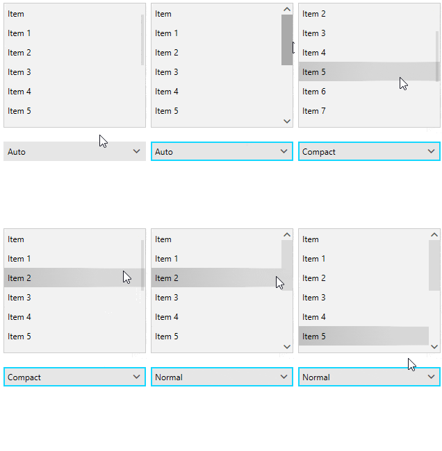
Using the ScrollBarMode property of the FluentPallete youcan now modify the appearance of the scrollbars of all controls that are using ScrollViewer in the ControlTemplate. By design the scrollbars in the theme appear over the content, they are really narrow (compact), and get bigger on mouse over. However, in specific scenarios this behaviour might not be convenient and this is where the new property comes in handy – you can have the ScrollBars always compact, always with their full size or as it is by default in the theme. See the differences between the different modes below and make sure to read the Fluent theme article for more details:

SpreadProcessing: New Chart Customization Options
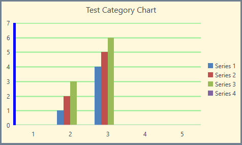
With this version, we added several properties enabling you to customize the look of a chart and its axes. Now you are able to change the outline and fill of the chart shape as well as the outline and major gridlines of the axes. Here is a bit of a code showing the new properties exposed:
FloatingChartShape chartShape = new FloatingChartShape(workbook.ActiveWorksheet, new CellIndex(2, 7), new CellRange(0, 0, 4, 3), ChartType.Column)

{
    Width = 480,
    Height = 288,

};


chartShape.Chart.Legend = new Legend() { Position = LegendPosition.Right };

chartShape.Chart.Title = new TextTitle("Test Category Chart");


chartShape.Outline.Fill = new SolidFill(new ThemableColor(Colors.SlateGray));

chartShape.Outline.Width = 5;

chartShape.Fill = new SolidFill(new ThemableColor(Colors.Cornsilk));


chartShape.Chart.PrimaryAxes.ValueAxis.Outline.Fill = new SolidFill(new ThemableColor(Colors.Blue));

chartShape.Chart.PrimaryAxes.ValueAxis.Outline.Width = 5;


chartShape.Chart.PrimaryAxes.ValueAxis.MajorGridlines.Outline.Fill = new SolidFill(new ThemableColor(Colors.LightGreen));

chartShape.Chart.PrimaryAxes.ValueAxis.MajorGridlines.Outline.Width = 2;


workbook.ActiveWorksheet.Shapes.Add(chartShape);
And here is how the code would change the chart:

MultiColumnComboBox: New DropDownElementStyle and IsReadOnly Properties
We added two new properties to the MultiColumnComboBox control:
- DropDownElementStyle– this allows you to set a custom style for the control in the drop down (GridView by default) and apply all the needed properties. For more info check out this article.
- IsReadOnly– this is a property of the GridViewItemsSourceProvider, and by using it you can control the IsReadOnly property of the GridView in the drop down. Check out the GridViewItemsSourceProvider article here.
GridView: New MouseOverBackground Property and SpreadsheetStreamingExport Enhancements
- GridView gets a new MouseOverBackground that allows you to easily customize the background color of the GridView Cell. You can set this property per cell or per GridView.
- SpreadsheetStreamingExport gets many improvements as well as a new ExportOptions.ColumnWidth property, which allows you to specify a concrete width for the columns when exporting.
TabControl: Access Text Support
The Header of the TabItem now allows you to set access text as a direct string. For example:
<telerik:RadTabControl>
  <telerik:RadTabItem Header="_File" />
  <telerik:RadTabItem Header="_Edit" />
  <telerik:RadTabItem Header="_View" />
</telerik:RadTabControl>
And when the Alt key on the keyboard is pressed the access keys are displayed in the TabItem Header as shown below:

GanttView: Shift and Tab Navigation
The user can now navigate backwards when editing cells in the grid part of the control by pressing the Shift and Tab keys on the keyboard.
.NET Core 3 Preview 2
The second preview of the latest .NET Core version was recently introduced by Microsoft and I'm happy to share that the Telerik UI for WPF .NET Core 3 binaries are now built against it! Make sure to play around with them and please share any feedback that you have.
VisualStudio 2019 Preview 3
I have good news for all of tech enthusiasts already on VisualStudio 2019 – UI for WPF is compatible to the latest update of latest preview version of VisualStudio 2019. As always, we are providing immediate support for the newest VisualStudio versions, making sure you can always able to benefit from all the cool new features of the IDE.
Check Out the Detailed Release Notes
To get an overview of all the latest features and improvements we’ve made, check out the release notes for the products below:
Share Your Feedback.
Feel free to drop us a comment below sharing your thoughts. Or visit our Feedback portals about Telerik UI for WPF, Silverlight and Document Processing Libraries and let us know if you have any suggestions or if you need any particular features/controls.
And if you haven’t already had a chance to try our UI toolkits, simply download a trial from the links below:
Telerik UI for WPF Telerik UI for Silverlight
In case you missed it, here are some of the updates from our last release.