With native components, the Telerik UI for Blazor Grid templates can fully utilize the the best features of Blazor to highly customize the user experience.
Using a template in an application implies that you're creating a custom experience for your user by leveraging a component or framework you're working with. Because the Telerik UI for Blazor components are native, built from the ground up using the Blazor framework, it can tap directly in to Blazor's best features. Grid component templates can fully utilize the HTML, Razor, and components to completely customize the user experience.
In this article we'll see an overview of what templates are available and simple use cases. We'll use these as building blocks to see just how dynamic a Blazor grid can be when using templates for advanced ideas like custom editors and master-detail views.
Template Types
There are currently three types of templates available for the Blazor grid: column Template, Editor Template, and Row Template. Each has very specific uses and are powerful tools for adapting the grid to your specific needs. Let's start with a quick introduction to each template type.
Column Template
By default, the grid renders the value of the field in the column exactly as it's provided from the data source. We can override this behavior by using a column Template which allows us to take control over the rendering of the object within the column. The Template provides the entire object currently bound to the row in which the column exists, and this object is the template's context. Through the Template we can apply custom formatting, insert additional HTML and images, and display Razor Components using any value from the context.
<TelerikGridColumn Field="@(nameof(SampleData.Name))" Title="Employee Name">
    <Template>
       Employee name is: @((context as SampleData).Name)
    </Template>
</TelerikGridColumn>
The column Template is visible when the current row is not in edit mode. To customize the grid's editing experience we'll use the EditorTemplate.
Editor Template
The EditorTemplate is a template that bound to the editing context. The EditorTemplate defines the inline template or component that will be rendered when the user is editing the field. Although the EditorTemplate acts much like the column Template, it is only shown when the given row is in edit mode.
<TelerikGridColumn Field=@nameof(Employee.VacationDays) Title="Position">
    <EditorTemplate>
        @{
            var employeeToUpdate = context as Employee;
<KendoNumericTextBox Decimals="1" Format="#.0 days" Max="15" Min="0" Step="0.5m" Value="@employeeToUpdate.VacationDays" />
        }
    </EditorTemplate>
</TelerikGridColumn>
The column and editor templates give excellent control over column rendering in the grid. For even more control we can choose to use a row template and completely customize the grid.
Row Template
Unlike the previously mentioned templates, the RowTemplate spans the entire grid for all columns. The row template allows you to define custom rendering for the entire <tr> element for each record. It can be convenient if you want to use templates for most or all of the columns, as it requires less markup than setting individual templates for many columns.
Since the template isn't bound to a specific column, it can use the Context attribute of the RowTemplate to set the name of the context variable. Its type is the model type to which the grid is bound.
<RowTemplate Context="employee">
    <td>
        <span>@employee.Id</span>
    </td>
    <td>
        Hired on: @(String.Format("{0:dd MMM yyyy}", employee.HireDate))
    </td>
</RowTemplate>
<TelerikGridColumns>
    <TelerikGridColumn Field=@nameof(SampleData.Name) Title="Employee Name" />
    <TelerikGridColumn Field=@nameof(SampleData.HireDate) Title="Hire Date" />
</TelerikGridColumns>
Using the three template types we can tackle a wide variety of requirements. Let's look at how flexible the Telerik UI for Blazor Grid can be - what we can accomplish might just surprise you.
Image Template
We'll begin with a simple yet common scenario, embedding an image in a grid column. Let's assume we have a list of users that we need to manage a broad range of details for. It be nice to associate a face with a name, and with a column template we can do just that. Using a column template we can use one or many values from the currently bound item's properties to generate an image element and display an image directly in the column. In this example we'll assume that our product's images are stored on the server with a relative path of /images/, and each image file name corresponds to the productId.
Let's begin without a template to see how the grid is structured without customization.
<TelerikGrid Data=@GridData Height="500">
    <TelerikGridColumns>
        <TelerikGridColumn Field=@nameof(Product.ProductName) Title="Product Name"/>
        <TelerikGridColumn Field=@nameof(Product.UnitPrice) Title="Unit Price"/>
    </TelerikGridColumns>
</TelerikGrid>


@functions {
    public IEnumerable<Product> GridData { get; set; }

    protected override void OnInit() => GridData = ... //fetch data;
}

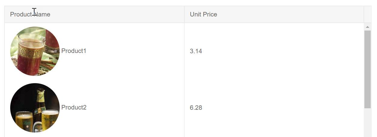
Here we have a basic two column grid with just a text display of each Product Name and Unit Price. Using a template we can transform the Product Name column to display an image alongside the product name.
To access the template, the Product Name column needs to have a TelerikGridColumn component with matching begin/end tags. Inside the component we'll add a Template component which will define our custom rendering. Inside of the template we have access to the context object, this is the current Product in scope. A simple cast of context as Product will give us access to the proper type.
<TelerikGridColumn Field=@nameof(Product.ProductName) Title="Product Name">
    <Template>
        @{
            var product = context as Product;
        }
    </Template>
</TelerikGridColumn>
Now that we have our current Product we can render it how we see fit within the column. Let's add an HTML <img tag and create a path from the ProductId property. We can apply CSS to the image using standard HTML markup class="rounded-circle". Also, since this is Razor, C# string literals are a valid way of formating the path src="@($"/images/{product.ProductId}.jpg")". We'll also display the Product Name property along side the image using simple markup.
<TelerikGrid Data=@GridData Height="500">
    <TelerikGridColumns>
        <TelerikGridColumn Field=@nameof(Product.ProductName) Title="Product Name">
            <Template>
                @{
                    var product = context as Product;
                    <img class="rounded-circle" src="@($"/images/{product.ProductId}.jpg")" />
                    <span>@product.ProductName</span>
                }
            </Template>
        </TelerikGridColumn>
        <TelerikGridColumn Field=@nameof(Product.UnitPrice) Title="Unit Price"/>
    </TelerikGridColumns>
</TelerikGrid>

@functions ...

Because the underlying Razor Components framework supports templates and the Telerik UI for Blazor Grid is built using the framework's native architecture, the grid is a fully capable solution to many problems.
Custom Form
With templates we can fully utilize Blazor's framework features. Inside the template we can add components, logic, and even trigger events. In addition, templates aren't just scoped to the component they're contained in - we can access events and values outside of the template as well. This opens up new possibilities for creating a custom experience.
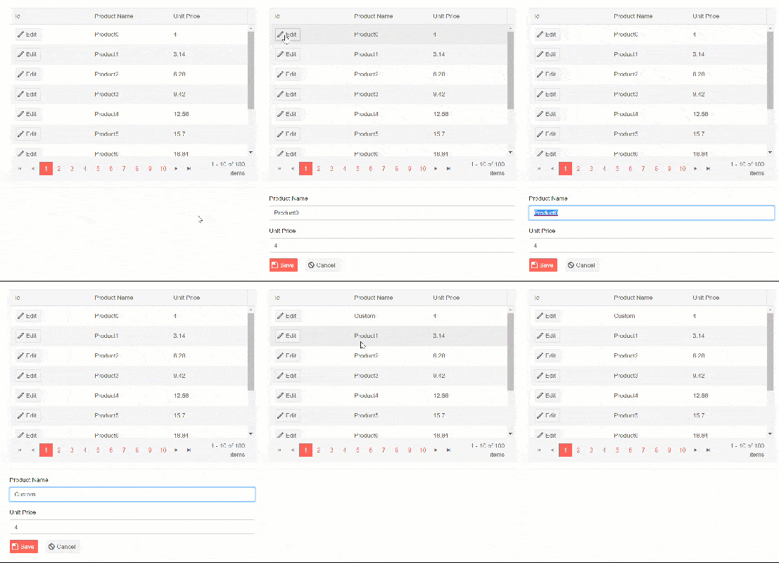
Let's assume we want to create a custom edit experience versus using one of the built in grid editors. This will give us full control over every aspect of the form. The challenge is getting the form to interact with the grid. To make a custom editor we'll need to select an item, place its properties on a form, and save/cancel changes. On the surface this might seem like a complex task, however the framework has extremely flexible data binding mechanics.
Identifying the currently selected object would provide most of what we need to accomplish the task since we can bind its properties directly to form elements. The grid's template gives us access to items that are bound to a grid row, all we'll need is a method of selecting the value and creating a reference to the object. Let's start by creating a placeholder for our object reference using a field named selectedProduct. To create an easy way of selecting a product, a column template with a button will suffice. When the button is clicked, we'll invoke an in-line function to set selectedProduct to the current context.
<TelerikGridColumn Field=@nameof(Product.ProductId) Title="Id">
    <Template>
        <TelerikButton Icon="edit" OnClick="@(_=> selectedProduct = (Product)context)">Edit</TelerikButton>
    </Template>
</TelerikGridColumn>
With the data referenced we can now add a form to display the information and provide save and cancel actions. The form will exist outside of the grid, since the object reference is now scoped to the page we can place the form anywhere outside the grid. The form can be hidden or shown based on if an item is selected using a standard Razor @if block.
@if (selectedProduct != null) {
...form
}
Saving and canceling the edit are also straightforward tasks now. We just need to create buttons with corresponding OnClick events. To cancel the edit, the selectedProduct reference is simply reset to null.
<TelerikGrid Data=@GridData Height=@Height Pageable="true" PageSize=@PageSize>
    <TelerikGridColumns>
        <TelerikGridColumn Field=@nameof(Product.ProductId) Title="Id">
            <Template>
                <TelerikButton Icon="edit" OnClick="@(_=> selectedProduct = (Product)context)">Edit</TelerikButton>
            </Template>
        </TelerikGridColumn>
        <TelerikGridColumn Field=@nameof(Product.ProductName) Title="Product Name" />
        <TelerikGridColumn Field=@nameof(Product.UnitPrice) Title="Unit Price" />
    </TelerikGridColumns>
</TelerikGrid>
<hr />
@if (selectedProduct != null)
{
    <div class="form-group ">
        <label class="control-label" for="productName">
            Product Name
        </label>
        <input class="form-control" bind="@selectedProduct.ProductName" id="name" name="name" type="text" />
    </div>
    <div class="form-group ">
        <label class="control-label" for="unitPrice">
            Unit Price
        </label>
        <input class="form-control" bind="@selectedProduct.UnitPrice" id="unitPrice" name="unitPrice" type="number" />
    </div>
    <div class="form-group">
        <div>
            <TelerikButton Icon="save" Class="k-primary" OnClick="@Save">Save</TelerikButton>
            <TelerikButton Icon="cancel" OnClick="@(_=> selectedProduct = null)">Cancel</TelerikButton>
        </div>
    </div>
}
@functions {
    ...
    Product selectedProduct;

    void Save()
    {
// save logic
        selectedProduct = null;
    }
}

With the ability to share state with other components on the page, the opportunities for template driven experiences are unlimited.
Master-Detail View
Using templates we can completely transform an entire grid row with custom HTML, Razor, and even components. In this next example we'll look at just how advanced we can get with templates by adding a Master-Detail view to a grid.
A likely scenario for any application is one where a data point has many properties with varying importance. Some of those properties should always be front and center, while others might be helpful to have just within reach. This is where a master-detail view can be quite handy. This type of view helps keep extended data out of view until it is requested by the user, while keeping critical data up front all of the time.
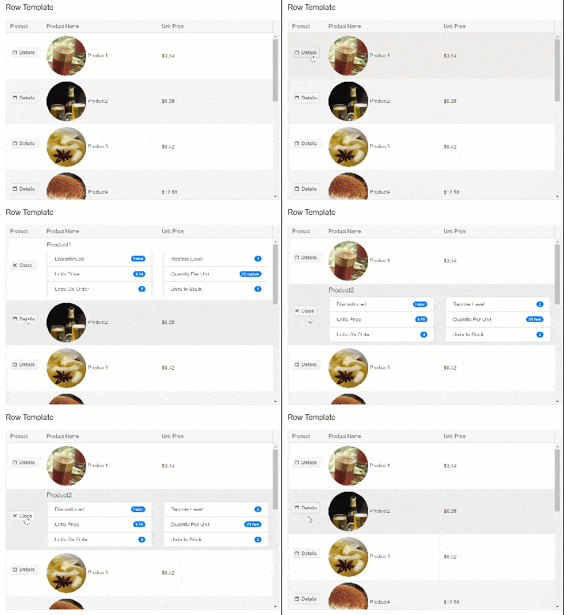
Using the RowTemplate we can define two different states for our row which can easily be toggled by a simple button click. We'll start with the default state which only displays two columns of data. This view is nicely tucked away in a custom component called ProductMasterTemplate and takes a parameter of Product to be displayed in a two column format.
<ProductMasterTemplate Product="@product" />
In addition, we'll use a more complex view to reveal all of the data for a given product in a list view. Once again, we'll encapsulate the view in custom component called ProductDetailTemplate.
<ProductDetailTemplate Product="@product"/>
Within each of these custom components are table data cells <td> that contain Razor code for displaying the properties of a given Product. The contents of the row template must be <td> elements and their number (or total colspan) must match the number of columns defined in the grid. Internally both templates contain markup similar to the following example.
<td>@Product.property</td>
<td colspan="2">
... some view logic
</td>
With the two states clearly defined as components we can focus on switching between the two. Let's begin by defining which item is selected by creating a variable where we can hold a reference to the selected product. As such, we'll name it SelectedProduct. To enable the user to toggle between views, we'll need a set of buttons to display for the user. To show the details we'll simply check the SelectedProduct to see if it matches the current item in the row. Since we're using Blazor, we can easily set the state of SelectedProduct directly in the event handler with an in-line function, OnClick="@(_=> SelectedProduct = ...)".
<RowTemplate Context="product">
        @if (SelectedProduct != product)
        {
            <td>
                <TelerikButton Icon="@IconName.Window" OnClick="@(_=> SelectedProduct = product)">Details</TelerikButton>
            </td>
            <ProductMasterTemplate Product="@product" />
        }
        else
        {
            <td>
                <TelerikButton  Icon="@IconName.Close" OnClick="@(_=> SelectedProduct = null)">Close</TelerikButton>
            </td>
            <ProductDetailTemplate Product="@product"/>
        }
    </RowTemplate>
The completed code below is actually quite simple due to the combination of template and component architecture.
<TelerikGrid Data=@GridData Height="@Height">
    <RowTemplate Context="product">
        @if (SelectedProduct != product)
        {
            <td>
                <TelerikButton Icon="@IconName.Window" OnClick="@(_=> SelectedProduct = product)">Details</TelerikButton>
            </td>
            <ProductMasterTemplate Product="@product" />
        }
        else
        {
            <td>
                <TelerikButton  Icon="@IconName.Close" OnClick="@(_=> SelectedProduct = null)">Close</TelerikButton>
            </td>
            <ProductDetailTemplate Product="@product"/>
        }
    </RowTemplate>
    <TelerikGridColumns>
        <TelerikGridColumn Width="100" Field=@nameof(Product.ProductName) Title="Product" />
        <TelerikGridColumn Field=@nameof(Product.ProductName) Title="Product Name" />
        <TelerikGridColumn Field=@nameof(Product.UnitsInStock) Title="Unit Price" />
    </TelerikGridColumns>
</TelerikGrid>

@functions {
    Product SelectedProduct;
}
Clicking the Details button gives us a slick UI that allows us to drill into grid data.

Conclusion
Because the Telerik UI for Blazor components are native, built from the ground up using the Blazor framework, it can tap directly in to Blazor's best features. Grid component templates can fully utilize the HTML, Razor, and components to completely customize the user experience. Simple templates are useful for formatting or displaying images, while more extensive templates can transform the user interface completely adding entirely new functionality to the grid.
In this post we focused on the grid, however other components like the DropDownList already feature template fields as well. Make sure you download the latest release and try the templates for yourself using our demo repository on GitHub.