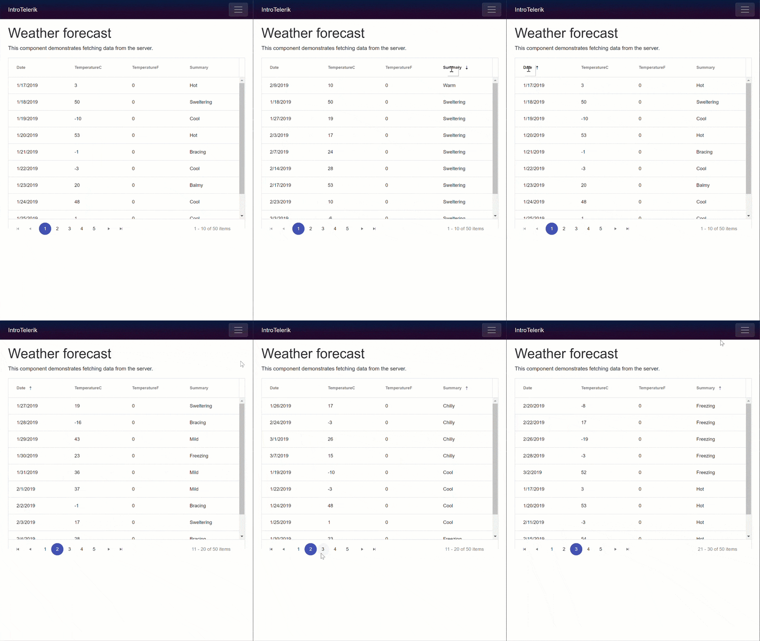
The Telerik UI for Blazor data grid features functionality like paging, sorting, templates, and themes out of the box. Learn how to get started with the grid's basic features today.
Telerik UI for Blazor is a brand new library of UI components for the Razor Components and Blazor frameworks. Even though Telerik UI for Blazor is in an "Early Preview" stage it ships with one of the most popular and versatile UI components, the data grid. The data grid features out-of-the-box functionality like paging, sorting, templates, and themes. In this article we will focus how to get started with the grid's basic features.
Prerequisites
Since the ASP.NET Preview's are moving at a rapid place, it's best to update your bits. Make sure you're on the current version of Razor Components (server-side) and Blazor (client-side) since we'll be working with both. Detailed installation instructions for both frameworks can be found on the Blazor getting started page.
Also be sure that you have enabled the Telerik UI for Blazor free early preview. Even if you have previously enrolled in the preview you may need to revisit this page for the latest version to appear in your feed. With this free account you'll be able to add the Telerik NuGet Package Source.
Before we begin, you may wonder why the Kendo namespace appears when using Telerik UI for Blazor. That's because the Telerik UI for Blazor shares web resources (HTML & CSS) with our Kendo UI brand of components.
Installation
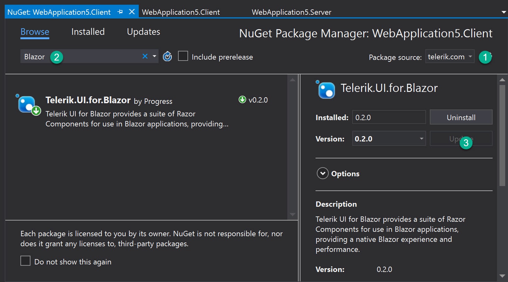
Installing Telerik UI for Blazor requires just a few simple steps. First we'll need to install the package binaries. We'll be using the Telerik NuGet Package Source to install the package. If you don't have the Telerik Package Source already please see the Prerequisites section above.
If you have multiple solutions in your project, install the package to the project which contains the "Pages" folder. These are the views for your application.
We can use the Package Manager dialog, command line, or directly edit the .csproj file of the application.
NuGet
Command line
$ dotnet add package Telerik.UI.for.Blazor
Edit .csproj
<PackageReference Include="Telerik.UI.for.Blazor" Version="0.2.0" />
Once the Telerik UI for Blazor package has been installed, we'll need to make a reference to the components in the package. This will act as a global using statement for our application. Open the root _ViewImports file and add the @addTagHelper *, Kendo.Blazor directive.
_ViewImports.cshtml
@addTagHelper *,Kendo.Blazor
We also need to register the the library with dependency injection. This will resolve any dependencies needed by the components. In the same solution, open the Startup class and register the AddKendoBlazor service.
services.AddKendoBlazor();
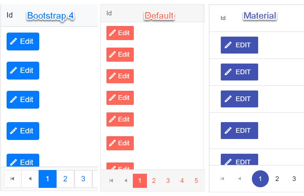
Next we'll need to add the CSS theme files to the application. At the time of writing Telerik UI for Blazor supports three of the Kendo UI themes: Default, Bootstrap 4, and Material Design.
If you have multiple solutions in your project, find the project which contains the "wwwroot" folder. These are the static resources for your application. In the root of the project, add a file named libman.json. LibMan is a client-side library manager built into Visual Stuido (with CLI support) that will fetch static resources and save them to your project.
Add the following configuration to your libman.json file. Save the file and all three component themes will be copied to your wwwroot folder.
{
  "version": "1.0",
  "defaultProvider": "unpkg",
  "libraries": [
    {
      "library": "@progress/kendo-theme-default@3.0.0",
      "destination": "wwwroot/css/kendo-themes/default",
      "files": [
        "dist/all.css"
      ]
    },
    {
      "library": "@progress/kendo-theme-bootstrap@3.0.0",
      "destination": "wwwroot/css/kendo-themes/bootstrap",
      "files": [
        "dist/all.css"
      ]
    },
    {
      "library": "@progress/kendo-theme-material@2.0.0",
      "destination": "wwwroot/css/kendo-themes/material",
      "files": [
        "dist/all.css"
      ]
    }
  ]
}
With the themes installed, reference the desired theme from your application's index.html file.
wwwroot/Index.html
<head>
    ...
    <!-- <link rel="stylesheet" href="/css/kendo-themes/material/dist/all.css" />
    <link rel="stylesheet" href="/css/kendo-themes/default/dist/all.css" /> -->
    <link rel="stylesheet" href="/css/kendo-themes/bootstrap/dist/all.css" />
</head>
That's it! Now we're ready to begin building Razor Components or Blazor applications using Telerik UI for Blazor.
The Grid Component
The The Telerik UI for Blazor KendoGrid (Grid) is a data grid component that is compatible with both Razor Components and client-side Blazor. Thanks to these new breakthrough frameworks, the Grid does not require any JavaScript. The grid component is simple to implement, yet has a robust set of features like data binding, paging, sorting and templates. In addition, Razor Components and Blazor offer unique capabilities for bringing data into the grid. Depending on the mode of operation the data source can pull directly from Entity Framework (Razor Components), or via remote HTTP request (Blazor).
The basic Grid is made up of a few components that define the grid and its columns. The grid itself and its columns have parameters which are used to enable/disable functionality.
<KendoGrid parameters...>
    <RowTemplate/>
    <KendoGridColumns>
       <KendoGridColumn parameters.../>
    </KendoGridColumns>
</KendoGrid>
Let's start with the basic properties and then we'll learn about the different data sources we can use.
Properties
Height
When the height of the Grid is set, it calculates the appropriate height of its scrollable data area, so that the sum of the header rows, filter row, data, footer, and pager is equal to the expected height of the component. If the height of the Grid is changed through code after it's created the Grid it recalculates the height of its data area.
In some special scenarios it is possible to set a height style to the scrollable data area of the Grid by external CSS, which is a div.k-grid-content element.
<KendoGrid Height=@Height ... >
Data
The Grid's data plays a central role in practically all web applications built with Telerik UI for Blazor. The Data parameter accepts any data source that implements the IEnumerable interface. The data may be supplied from sources such as Entity Framework, local arrays and lists, and remote sources like HTTP requests via HttpClient.
@inject WeatherForecastService ForecastService
<KendoGrid Data=@GridData ... >
    <KendoGridColumns>
    ...
    </KendoGridColumns>
</KendoGrid>

@functions {
    public IEnumerable<WeatherForecast> GridData { get; set; }
    protected override async Task OnInitAsync()
    {
        GridData = await ForecastService.GetForecastAsync(DateTime.Now);
    }
}
Columns
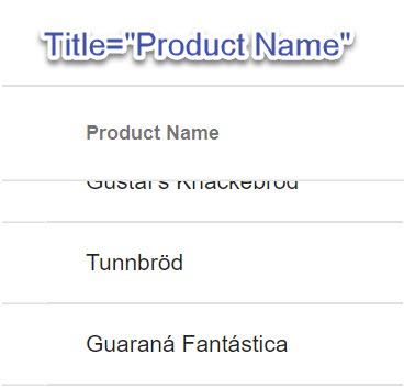
The KendoGridColumns component is the root level configuration of the grid columns. Nested beneath KendoGridColumns are individual KendoGridColumn components. These components are interpreted as column configurations where the Field parameter is a string to which the column is bound. The column will use the property name as the column header by default, but this can be explicitly set using the Title parameter. In the example below, the nameof operator is used to get the string representation of the ProductName property. Since we're dealing with C#, the nameof operator provides better tooling support for refactoring.
<KendoGrid parameters...>
     <KendoGridColumns>
       <KendoGridColumn Field=@nameof(Product.ProductName) Title="Product Name"/>
Sortable
To enable sorting on all Grid columns, simply set the Sortable parameter. When the Sortable parameter is set to true, users can easily click the column headers to change how the data is sorted in the Grid.
<KendoGrid Sortable=bool parameters...>
Paging
With the Grid we have full control over the Pager. The pager can be enabled/disabled through the Pageable parameter. We can also define a PageSize and set the initial Page value.
<KendoGrid Pageable=bool PageSize=int Page=int parameters...>`

Templates
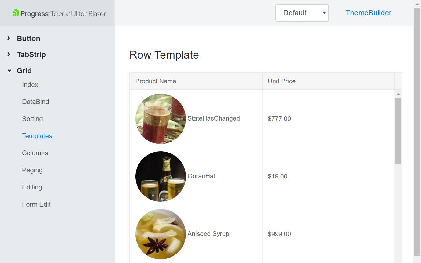
When we would like more flexibility in how our data is displayed, we can tap into the template features of the Grid. Within any column we can simply open a Template component and access an object reference to the current item bound to a given row. The Template content can contain HTML markup, Razor code, or even other Components.
<KendoGrid Data=@GridData>
    <KendoGridColumns>
        <KendoGridColumn Field=@nameof(Product.ProductId) Title="Id"/>
        <KendoGridColumn Field=@nameof(Product.ProductName) Title="Product Name"/>
        <KendoGridColumn Field=@nameof(Product.UnitPrice) Title="Unit Price">
            <Template>
                @(String.Format("{0:C2}", (context as Product).UnitPrice))
            </Template>
        </KendoGridColumn>
    </KendoGridColumns>
</KendoGrid>

@functions {
    public IEnumerable<Product> GridData { get; set; }

    protected override async Task OnInitAsync()
    {
        GridData = await nwContext.Products.ToListAsync();
    }
}
Getting Data
Because the Grid uses the IEnumerable interface for its data source, it has very flexible data binding. Depending on what context your application runs in, either Razor Components (server-side) or Blazor (client-side), you may have different requirements for connecting to data. Let's look at how dependency injection helps connect our Grid to a data source.
Razor Components (server-side operation)
Since Razor Components run in the context of the server, we can connect to directly to data through Entity Framework. One of the benefits to working with Razor Components is that our application doesn't need to create an HTTP request to connect to data.
We'll be using dependency injection to reference an instance of our database context, so we will need to register our service on startup. In the ConfigureServices method of the Startup class:
public void ConfigureServices(IServiceCollection services)
{
    var connection = "my-connection-string";
    var options = new DbContextOptionsBuilder<NorthwindContext>()
                        .UseSqlServer(connection)
                        .Options;
    services.AddSingleton(new NorthwindContext(options));
    ...
}
With our DbContext registered with dependency injection we can now inject the context on our page using the @inject directive. Inject will resolve a reference to an instance of the NorthwindContext and assign it to the nwContext variable. When the page initializes we call ToListAsync on the Products data set and update the GridData property with the results. Since the GridData property is bound to the Grid it will update when OnInitAsync completes.
@using TelerikBlazor.App.Models // Product is defined here
@inject NorthwindContext nwContext


<KendoGrid Data=@GridData>
    <KendoGridColumns>
        <KendoGridColumn Field=@nameof(Product.ProductId) Title="Id"/>
        <KendoGridColumn Field=@nameof(Product.ProductName) Title="Product Name"/>
        <KendoGridColumn Field=@nameof(Product.UnitPrice) Title="Unit Price">
            <Template>
                @(String.Format("{0:C2}", (context as Product).UnitPrice))
            </Template>
        </KendoGridColumn>
    </KendoGridColumns>
</KendoGrid>

@functions {
    public IEnumerable<Product> GridData { get; set; }
    int PageSize = 10;
    bool Pageable = false;
    bool Sortable = false;
    decimal Height = 400;

    protected override async Task OnInitAsync()
    {
        GridData = await nwContext.Products.ToListAsync();
    }
}
Now that we've seen how server-side operation works, let's take a look at using the Grid with Blazor.
Blazor (client-side operation)
Telerik UI for Blazor is compatible on the client, but currently has a known issue which requires disabling the Blazor IL Linker. Without digging into IL Linking too deep, the result of disabling it only results in a larger payload size. This is a temporary situation that will be resolved in later versions of the framework.
To disable IL Linker, open the .csproj file and add <BlazorLinkOnBuild>false</BlazorLinkOnBuild> to the top most property group.
<PropertyGroup>
    ...
    <LangVersion>7.3</LangVersion>
    <!-- add the line below to disable IL Linker -->
    <BlazorLinkOnBuild>false</BlazorLinkOnBuild>
  </PropertyGroup>
Similar to server-side operation, we'll be using the @inject directive. On the client our app is disconnected from the database and we'll need to make an HTTP request for data. Instead of injecting our DbContext we will instead resolve an instance of HttpClient. When the page initializes we'll make an HTTP request using GetJsonAsync and update the GridData property with the results. Since the GridData property is bound to the Grid it will update when OnInitAsync completes.
@using WebApplication6.Shared // WeatherForecast is defined here
@inject HttpClient Http

<KendoGrid Data=@forecasts>
    <KendoGridColumns>
        <KendoGridColumn Field="@nameof(WeatherForecast.TemperatureC)" Title="Temp. ℃"/>
        <KendoGridColumn Field="@nameof(WeatherForecast.Summary)"/>
    </KendoGridColumns>
</KendoGrid>


@functions {
    WeatherForecast[] forecasts;

    protected override async Task OnInitAsync()
    {
        forecasts = await Http.GetJsonAsync<WeatherForecast[]>("api/SampleData/WeatherForecasts");
    }
}
The Grid works with both Razor Components and Blazor using the same markup. The only aspect of the code that changes is how the data is retrieved.
Wrapping Up
The Telerik UI for Blazor Early Preview kicked off with one of the most popular and powerful components, the Grid. We saw how the Grid can quickly make use of paging, sorting, templates, and themes. Leveraging the Razor Components or Blazor frameworks, we can fetch data directly from our database or HTTP and easily bind the data source.
We covered just the basic features of the Grid, but there's much more we can do with templates. In an upcoming article we'll take a closer look at row and column templates to see what is possible.
If you're ready to try Razor Components and Blazor then create an account for the Telerik UI for Blazor free early preview. Once you've signed up feel free to explore our extensive examples on GitHub, and happy coding.